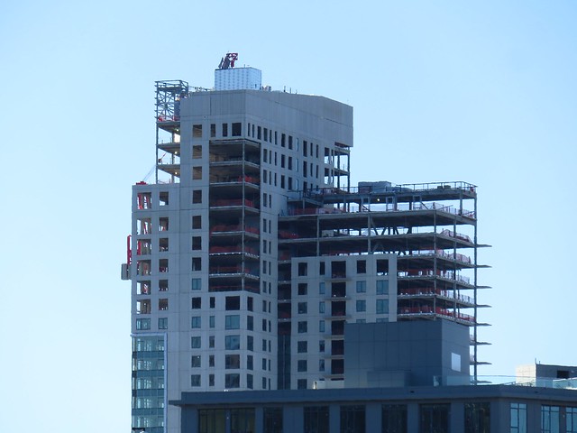
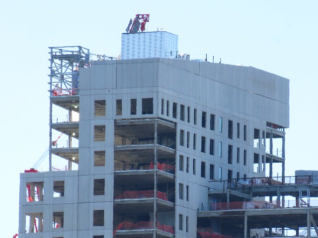
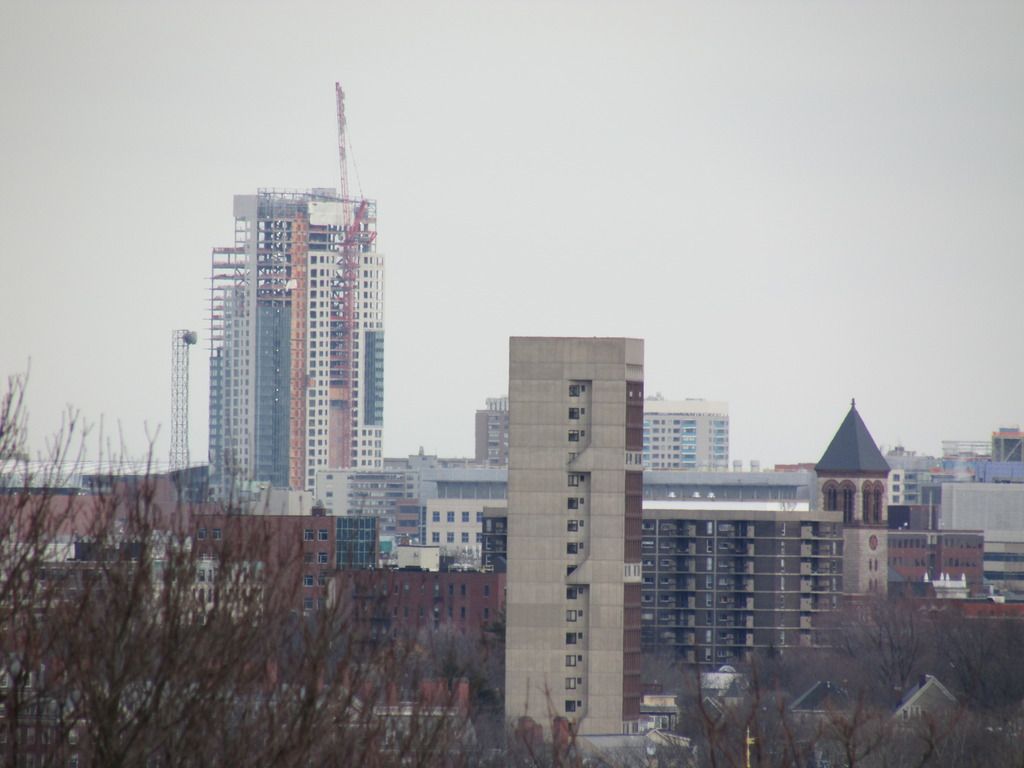
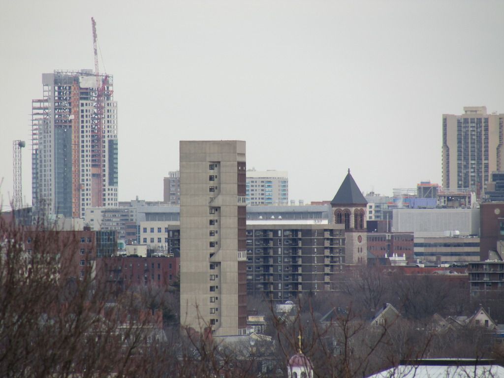
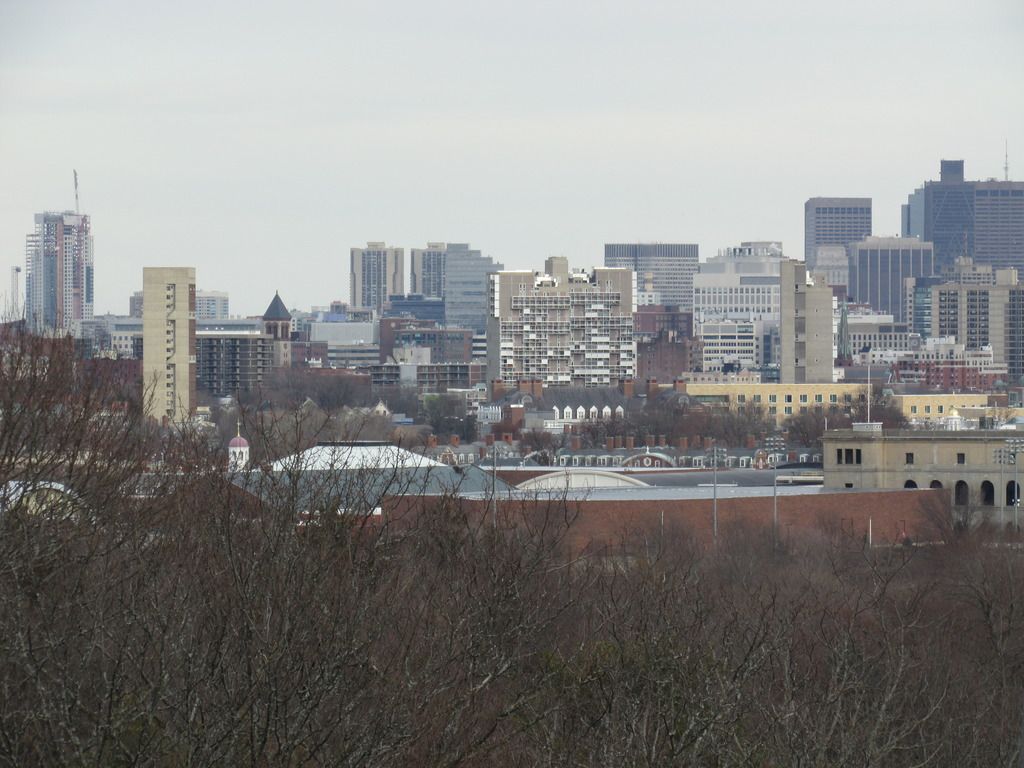
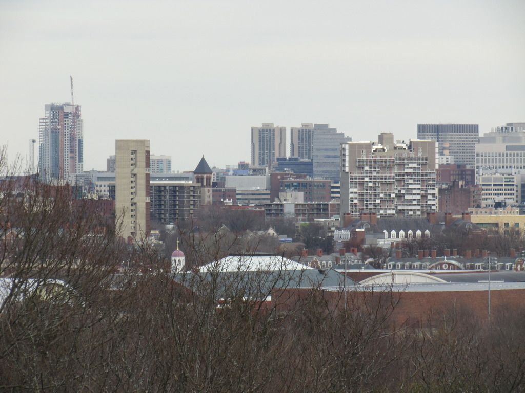
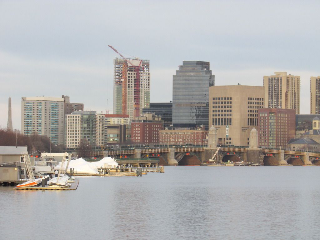
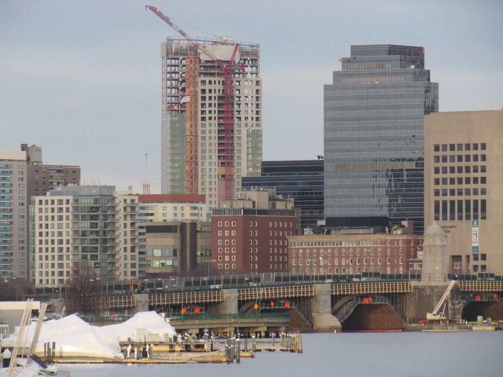
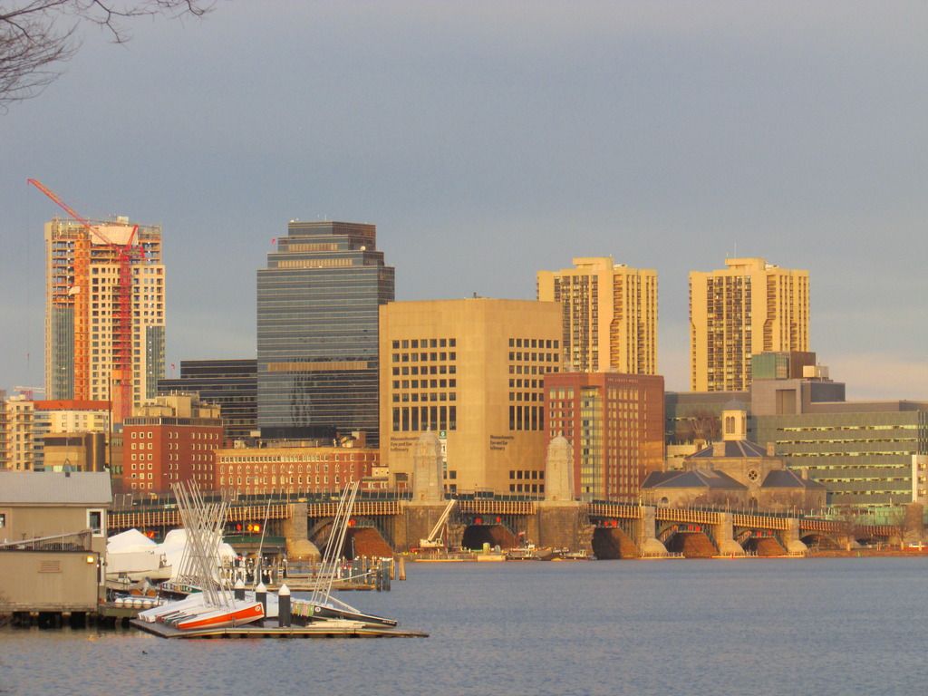
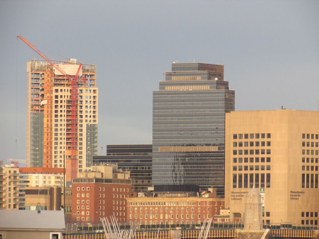
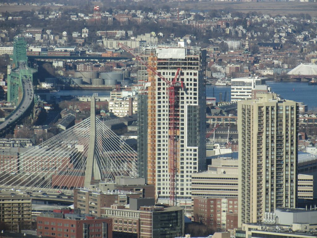
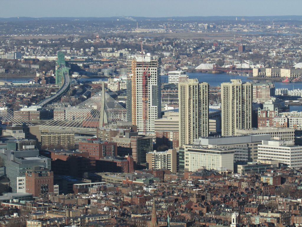
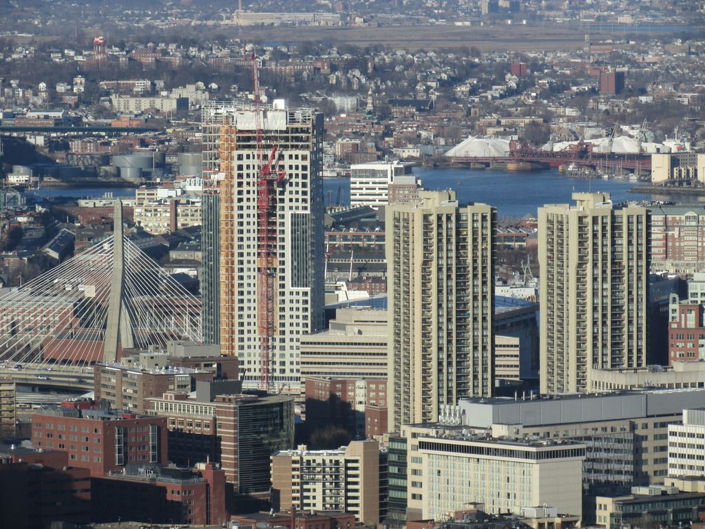
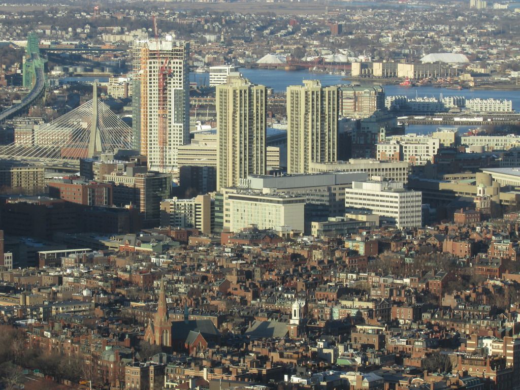
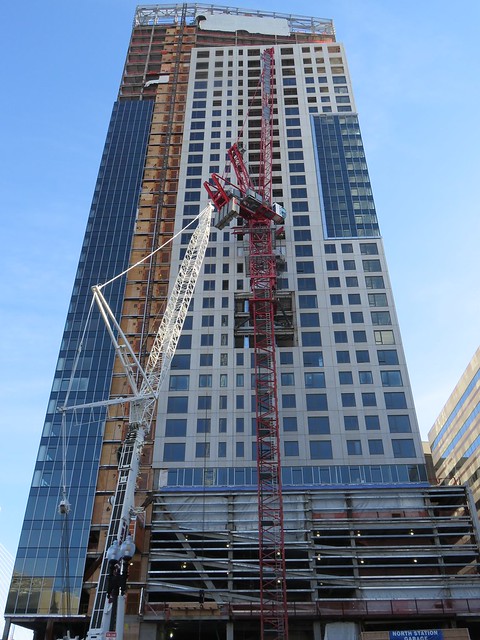
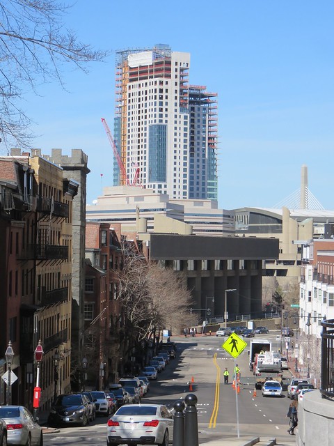
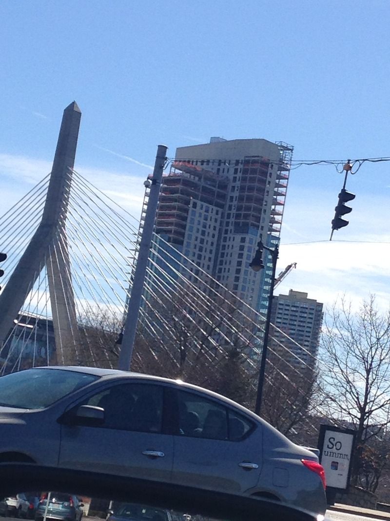
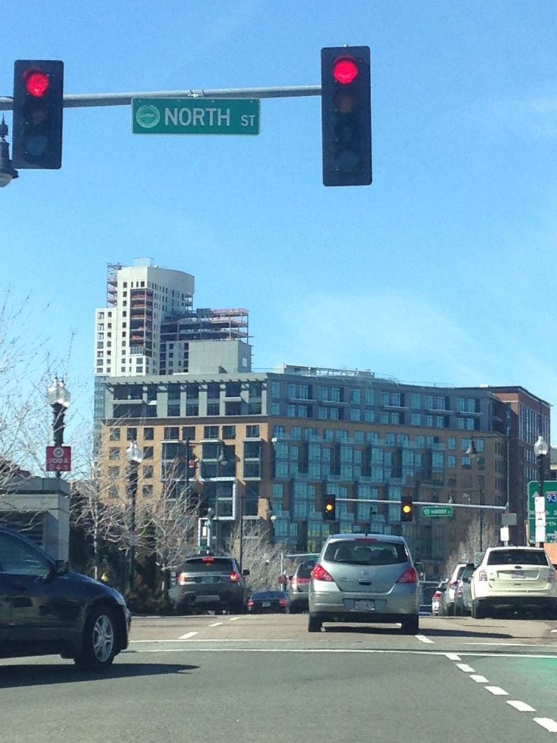
This is turning out better than I thought it would. I never thought it was going to be bad but its definitely turning out better than I figured. The light blue glass really lightens it up and meshes well with the white precast.
I agree but more because I like the massing... It breaks it up and makes it interesting. It's worth noting that the most recent batch of pics show the building in shade, which reduces the whiteness of it. Blue glass or no, it really is too white.

