You are using an out of date browser. It may not display this or other websites correctly.
You should upgrade or use an alternative browser.
You should upgrade or use an alternative browser.
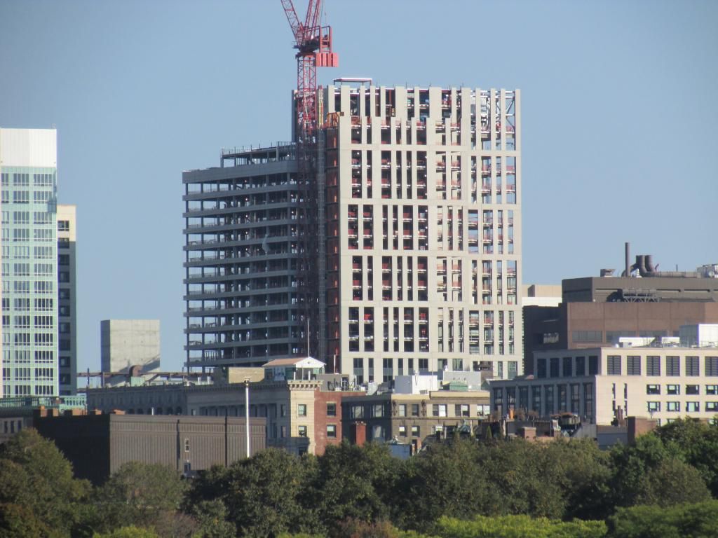
Is it odd that I am starting to like this building as the glass goes in?
Nope. Personally, I think it blows away the nearby Kensington and Archstone buildings. I just wish it was a couple floors taller.
Nope. Personally, I think it blows away the nearby Kensington and Archstone buildings. I just wish it was a couple floors taller.
I have to agree, I also would have loved to see maybe some more curves for this lady, but it is better than Kensington, pt. 2.
- Joined
- Sep 15, 2010
- Messages
- 8,894
- Reaction score
- 271
It's looking great with the glazing going in. I love the Art Deco vibe the strong verticals give, but it's really hurt by the strong horizontals in the adjacent facade. It's a building with a serious identity crisis. This really pushes the limit on the duality of two facades existing in tension with each other. It might be a bit too much tension.
Also I love how we've established a "bottom of the barrel" to which all future developments will be compared... "At least it's better than the Kensington..."
Also I love how we've established a "bottom of the barrel" to which all future developments will be compared... "At least it's better than the Kensington..."
RandomWalk
Senior Member
- Joined
- Feb 2, 2014
- Messages
- 3,331
- Reaction score
- 5,261
The best side, in my opinion, is the one presented to the theater district.
This building and the Kensington both appear to be mooning the Common with their bad sides. In contrast, the Archstone building feels like it is designed to be viewed from the Common, since that angle the visibility the ugly wing.
This building and the Kensington both appear to be mooning the Common with their bad sides. In contrast, the Archstone building feels like it is designed to be viewed from the Common, since that angle the visibility the ugly wing.
This building and the Kensington both appear to be mooning the Common with their bad sides.
From what I can tell, the only side of the Kensington that is truly offensive to the point of sickening is the outside. Otherwise it is pretty nice.
stellarfun
Senior Member
- Joined
- Dec 28, 2006
- Messages
- 5,711
- Reaction score
- 1,544
Thanks kz for this last photo. I have a feeling this horizontal exclamation point of an appendage that is the LaGrange side will look like crap from the Common. Worse than the Kensington.
Blackbird
Senior Member
- Joined
- Feb 2, 2014
- Messages
- 1,207
- Reaction score
- 1,721
the LaGrange side will look like crap from the Common. Worse than the Kensington.
Impossible.
Thanks kz for this last photo. I have a feeling this horizontal exclamation point of an appendage that is the LaGrange side will look like crap from the Common. Worse than the Kensington.
Kensington resembles a building that belongs at the bottom of a waste basket.
From what I can tell, the only side of the Kensington that is truly offensive to the point of sickening is the outside. Otherwise it is pretty nice.
This got a chuckle


