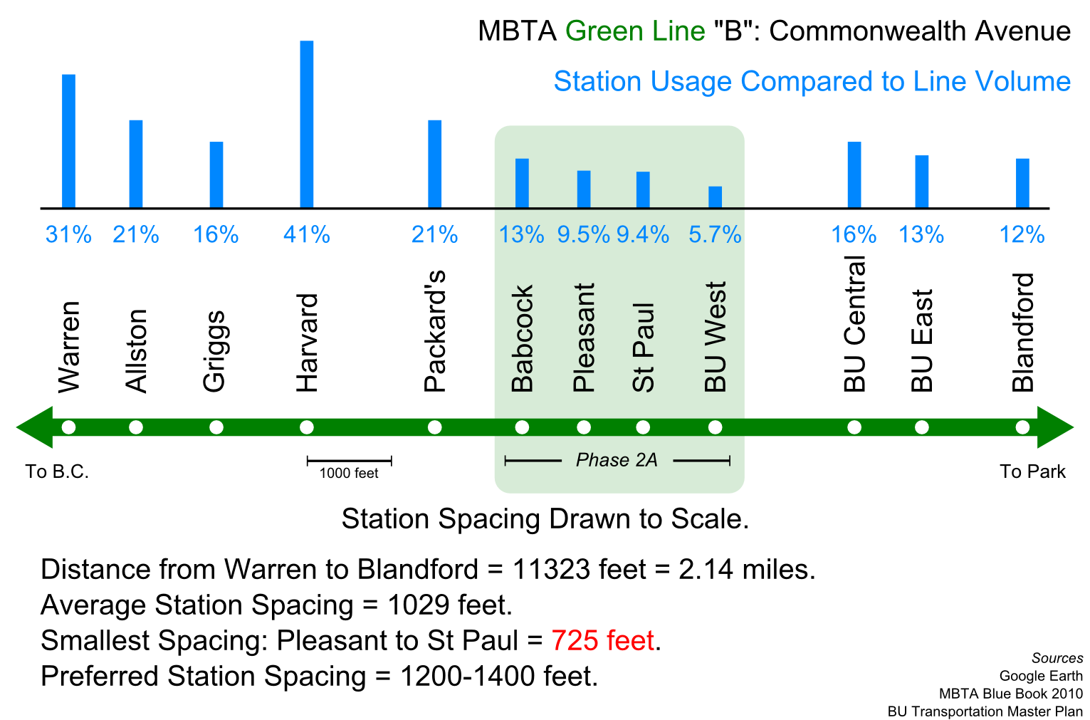
This may be a dumb question but since i don't understand, I'll ask it. Why does station spacing for LRV's (even ones in a dedicated ROW) need to be closer than subway? Does it have something to do with the amount of passengers carried (i.e. 2 cars vs. 3 cars) vs. Heavy rail, or the speed traveled between stops?
For example, F line you talked about station spacing in your post above, why are we ok with making people walk 2000 ft. (for example) to a subway stop, but prefer 1200 feet for LRV? What is it about the difference in mode that affects station spacing?
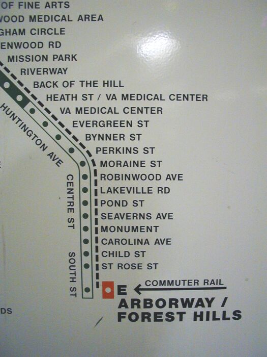
Trolley stops and bus stops literally are the same thing, since all of the major bus routes in town are ex-streetcar routes with stops that are for the most part unchanged in the last 100 years. Street-running was even worse for close stop-spacing, as the old Arborway map indicates:
The only reason the 3 reservations are slightly better than your average bus route is that 'stop consolidation' was a feature from Day 1 of the B, C, E reservations to make them seem more like express routes. Part of the whole ground-up planning of Huntington, Beacon, and Comm Ave. as wide urban boulevards.
The problem is nothing evolved with the times. Those platforms weren't adjusted around road construction that changed the whole nature of the corridor, and consolidation and re-spacing was pretty much blasphemy until the last 10 years when they did the first round of B consolidation. They can't even successfully implement it most of the time it's proposed on bus routes. The slightest pushback and a consolidation plan gets dropped. "We've always done it this way" is the rule. And so both the Green and Yellow lines are really, really creaking under a lot of legacy cruft where changing stops is way harder than it should be. Institutional inertia in the T, and provincial inertia in the city and neighborhoods. I wouldn't say any one party is necessarily at fault, though no one seems to want to take the reins and make themselves final arbiter.
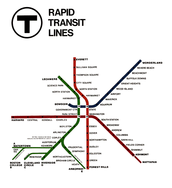
Ironically, the spider map may end up being their own worst enemy here. The iconic Cambridge Seven Assoc. spider map debuted in 1967, and for the first 22 years it only marked every stop on the heavy rail lines, and truncated the GL branches to show only the short-turn stops. Including on the D.
Later they added all the D stops to the GL-detail maps but still left B, C, E totally open to the imagination. See this street-detail 1980 system fold-out map:
http://www.wardmaps.com/viewasset.php?aid=14827. B, C, and E are all blank. In their operating days Arborway and Watertown stops used to be marked by the side of the road by a red stripe painted on the nearest trolley pole, a practice leftover from how BERy used to mark stops at turn of the century. It was just as dodgy as systemwide bus stop signage was until the mass re-signing effort of the last 10 years.
Those hyper-detailed branch maps like that insane Arborway one shown above debuted with the 1989 system map, same year they added small trolley signage at the street-running stops. Before that re-signing effort there were still some B and C platforms that lacked any identifying signs whatsoever. That ended up more or less pouring cement over the routes by conditioning riders to treat every stop as fixed forever. Even the useless ones like Back of the Hill, which was in infill stop added to the 1989 schedule which never existed for all of history prior to that.
They're not exactly getting better about this with those ever-more complex maps lathering on all Silver Line surface stops and key bus routes. I get the motivation to convey as much detail as possible, but the shift towards treating non-fixed stops as fixed stops began as a late-80's PR excuse to explain away all the transit expansion and restoration commitments they were backpedalling from. Which in turn makes people that much more skittish about reconfiguring even basic bus stop spacing and reinforces more status quo.


