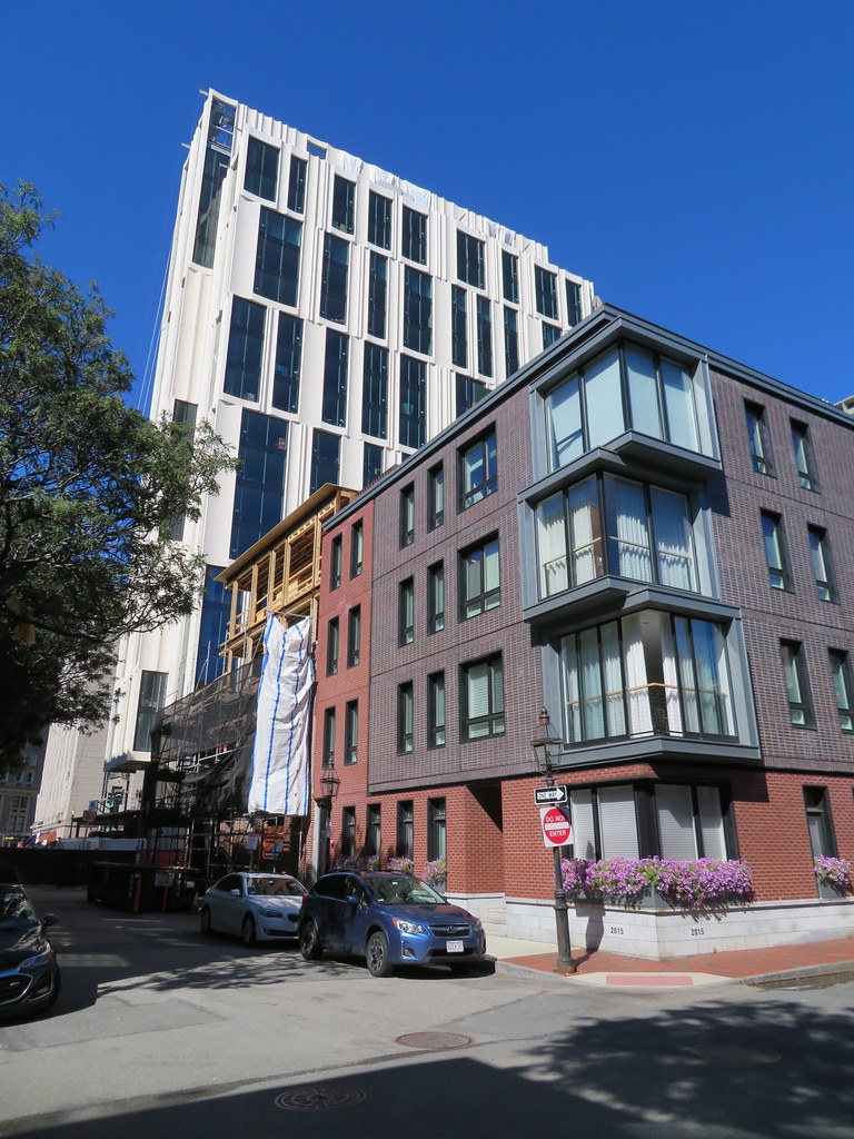
Bay Village Apartment Tower | 212 Stuart St. | Bay Village

Wow yea, @DZH22, you might've accomplished locating Boston's single least flattering angle (great photos regardless!). If you showed me that first one out of context, I'd guess former Soviet bloc or central Asia at first glance.
 
It is not quite as bad at ground level, because there are some red brick row houses you can barely see in the pics.

But from a skyline perspective it is pretty drab.
True, I hang out in Bay Village/South End every weekend and it really isn't that obvious from the street but those pics definitely show it from higher up, especially when driving in from the south on 93 north.
 
If the windows had been lined up vertically it would have looked a bit like the Sudbury, However, with the windows randomly offset it looks sloppy. Also the light grey matte finish cladding looks like putty. A dark grey with a shinier finish might have fared better,
 
Gotta agree with 393b40... it doesn't look so monotonous in person. Having said that I still think it needs an accent color or something to really bring it to life.
 
IMG_20210827_143528325.jpg
IMG_20210827_144101733_HDR.jpg
IMG_20210827_144254675_HDR.jpg
IMG_20210827_144410290.jpg
 
I tend to think the offset windows are a mistake here as they interrupt the vertical fluting pattern. Maintaining a consistent line would have given the building a more elegant feeling and emphasized height rather than the girth of the building.

Interesting observation. By contrast, the offsets get a positive response from me. I generally don't like offset windows, but in this particular case the offsets combine with the curves to give the facade a dynamic quality suggestive of rippling water or ocean waves that I find very pleasing. Aligned windows would result in a static facade that I don't think would be as interesting to look at.

I guess the success of the facade depends on whether you judge it in terms of width-versus-height or static-versus-dynamic.
 
I really like the simplicity of the idea--curved panels and glass panels--with the then complex relationship of the sizes and locations. It's a really elegant building and I'm looking forward to seeing it finished.

Interesting observation. By contrast, the offsets get a positive response from me. I generally don't like offset windows, but in this particular case the offsets combine with the curves to give the facade a dynamic quality suggestive of rippling water or ocean waves that I find very pleasing. Aligned windows would result in a static facade that I don't think would be as interesting to look at.

I guess the success of the facade depends on whether you judge it in terms of width-versus-height or static-versus-dynamic.
 
I walked by this yesterday with some friends and everyone commented on how ugly and instantly old it looks. For me, it came out far worse than the renders. The coloring, the panels, all of it looks disjointed and uneven in all of the wrong ways.
 
I walked by this yesterday with some friends and everyone commented on how ugly and instantly old it looks. For me, it came out far worse than the renders. The coloring, the panels, all of it looks disjointed and uneven in all of the wrong ways.


Beirut. Maybe it has a good felafal place in the lobby.
 
I walked by this yesterday with some friends and everyone commented on how ugly and instantly old it looks. For me, it came out far worse than the renders. The coloring, the panels, all of it looks disjointed and uneven in all of the wrong ways.

I walk by it constantly and am struck by the exact same impression regarding the "instantly old" aesthetic. In that regard, it reminds me of something Le Corb might have done, that has now becoming terribly dull, faded, etc. It is just so incredibly monotonous and dull in appearance.

It reinforces all of the worst, cardboard box-looking qualities of 45 Stuart, Kensington, and perhaps one or two of the other unredeemably blah towers that have gone up around North Station. Have we learned nothing? (he asks rhetorically...)
 
The Stuart St. side is not so bad; the much narrower west facade is asymmetry off the rails and into the gulch of chaotic design.
 

Back
Top