JeffDowntown
Senior Member
- Joined
- May 28, 2007
- Messages
- 5,048
- Reaction score
- 4,226
It is not quite as bad at ground level, because there are some red brick row houses you can barely see in the pics.ugh what a sea of beige
But from a skyline perspective it is pretty drab.
 IMG_1929
 IMG_1933
 IMG_2455
 IMG_2458
 IMG_2465
 IMG_2468
 IMG_2471
 IMG_2475
 IMG_2474
 IMG_3012
 IMG_3013
 IMG_3014
 IMG_3015
 IMG_5850
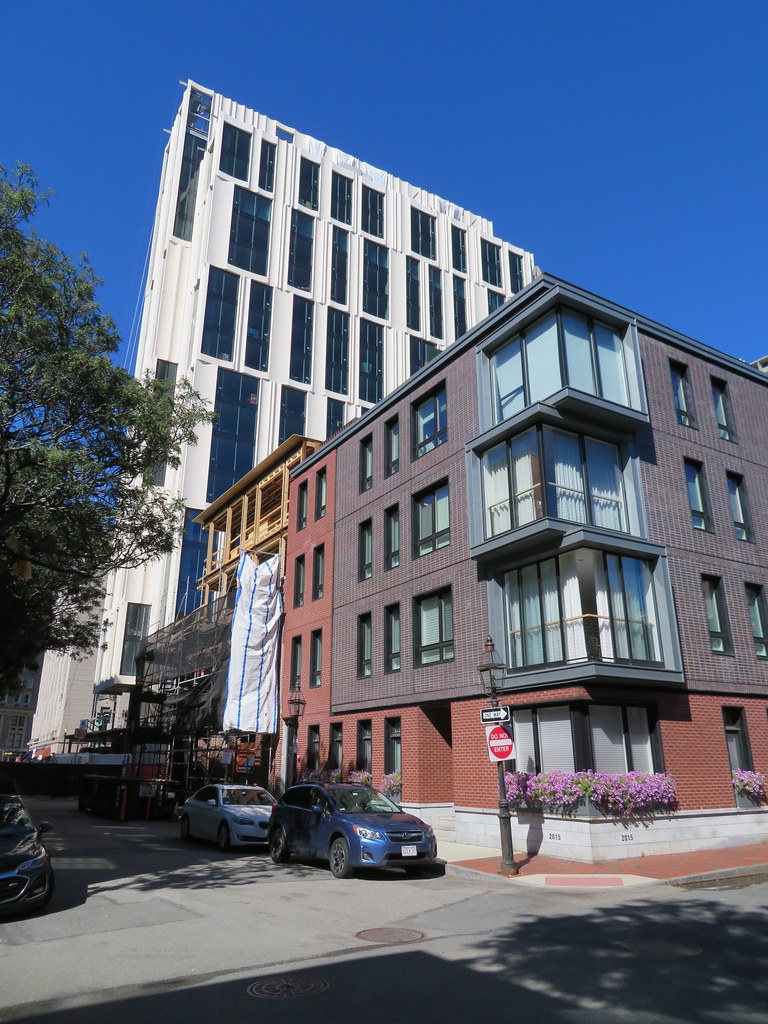 IMG_5864
 IMG_5869
 IMG_5872
 IMG_5873
 IMG_5880
 IMG_5884
 IMG_5896
 IMG_5905