Boston Landing | New Balance Complex | Brighton

Yeah, my point isn't in 1970s EPA regulations but rather the last 10-15 years, where so much--particularly interior design and cars--have gone completely greyscale. Otherwise what about 1980s postmodernism, or '90s vehicles with funky green and purple shades?

dwash is correct in pointing out how flavorless car color choices have become... black, white, grey, silver, dark blue, dark red, and then maybe a bright blue or red. I know all about resale values, but there's more to this trend than just the number you can trade your vehicle in for. We've become incredibly color averse.

Most interior projects I work on nowadays are awash in multiple colours. Thankfully since I mostly work in labs. Glad it's not all white on white on white anymore.

Exterior I think is being afraid to stand out or make a bold statement. You need a good design to highlight it with bold eye catching colours. Making it grey, or soft colored helps it blend and hide amidst all the other scared architectural duds.

One of the reasons people love the tree house so much. It stands out. Not just by virtue of height, but also by it's stand out exterior colors.

The blue at 100 Binney is great for it's boldness (though might be better at 60 Binnet where BLUEbirdbio is... just sayin).
 
Well I'm glad to hear that labs are using color, but I see a lot of residential buildings and office lobbies where there is zero color. Think of One Post Office Square's lobby makeover 5-10 years ago... all white. And residential interiors all seem to be doing their best impressions of a Hilton with grey, light grey, medium grey, charcoal grey, etc.
 
Yeah, my point isn't in 1970s EPA regulations but rather the last 10-15 years, where so much--particularly interior design and cars--have gone completely greyscale. Otherwise what about 1980s postmodernism, or '90s vehicles with funky green and purple shades?

It's the same with clothing. Even with Boston conservatism as a given, the vast number of people dressing in solid black or all dark clothing with only bits of color or patterning is surprising. And very dull.
 
Same EPA, same regulations

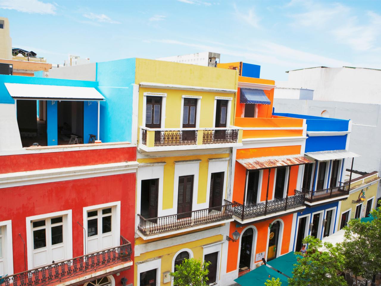
explore-san-juan-colorful-architecture.jpg.rend_.tccom_.1280.960.jpeg
 
It's the same with clothing. Even with Boston conservatism as a given, the vast number of people dressing in solid black or all dark clothing with only bits of color or patterning is surprising. And very dull.

Agreed on all points. And NYC is a good step or two ahead of Boston on the black/grey fashion front (although I think historically that's always been the case). I see it every day here... in the fashion, the cars that all look like potential Uber rides, and the newer buildings and remodels sprouting everywhere.

Sorry, not trying to veer this thread way off course, but when I see a picture like this I get triggered and genuinely wonder what the hell happened.

 
Yes, & yes. There's so much grey skies, we should be adding more color everywhere.

Roxbury, Tremont on the Common, Harbor & Longfellow turd towers.

Southie seems to be more open to color.
 
Last edited:
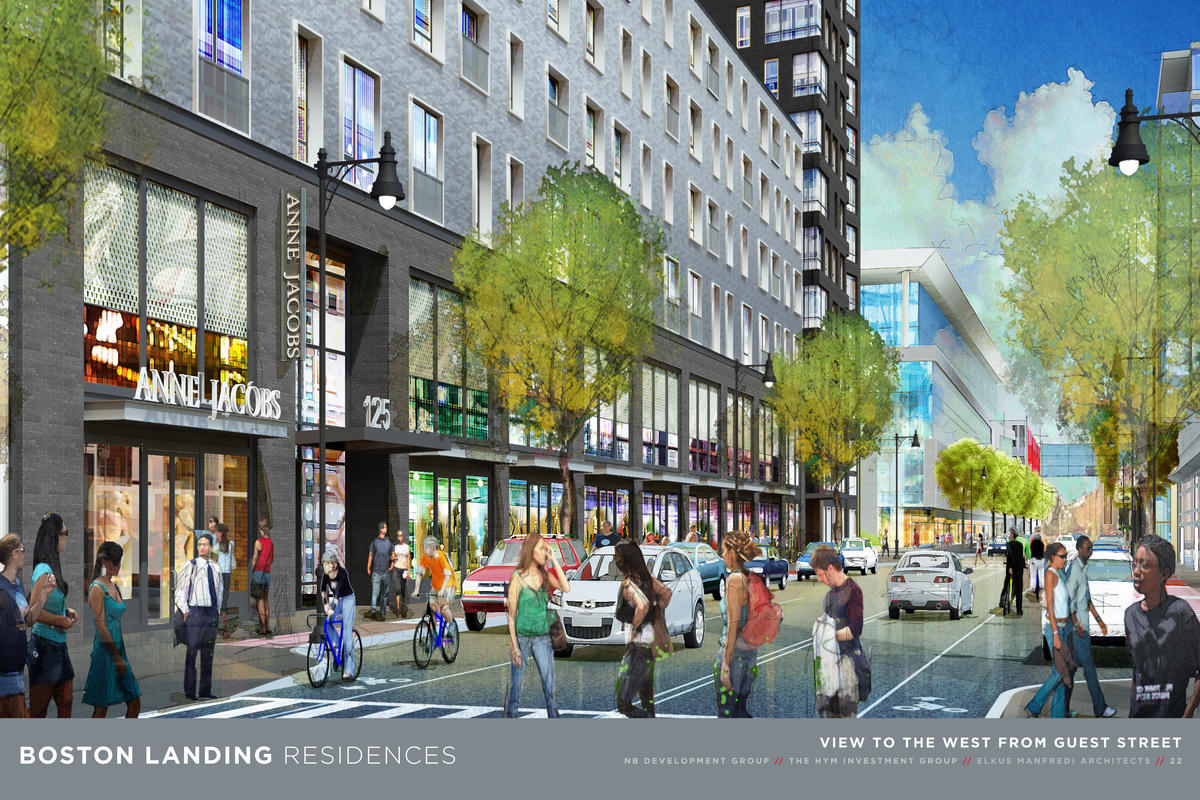
The trees and store fronts will add a smidge of color to the street life and the athletic center adds some blue.

NewBalanceBostonLanding.jpg


These are really the best bet for some color on the skyline depending on how they play it:

yards-main.jpg


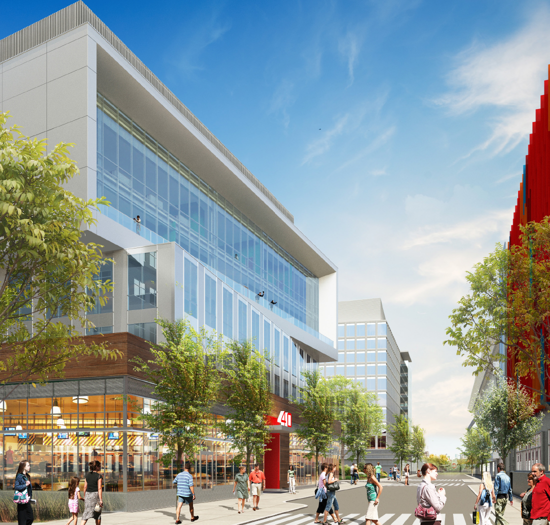
Also the fake wood and store fronts here should add some to the street life as well:

BL_40Guest_Celtics-Exterior04_SEC03-1.jpg


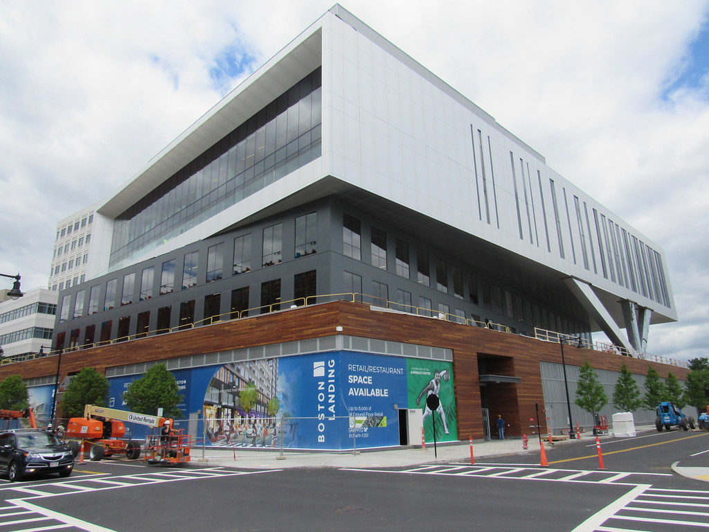
The-Auerbach-Center-New-Balance-Boston-Celtics-Practice-Facility-40-Guest-Street-Brighton-Boston-Landing-Development-Elkus-Manfredi-Architects-Rendering.jpg
 
The difference in material quality between the first and bottom two images is jarring.
 
So, I was chatting with a guy that worked with the architects that designed the New Balance building. I asked him if it was supposed to look like a sneaker or a cruise ship. His answer was basically both, to evoke motion.
 
I love the finished product, but imagine a finer finish had the Auerbach Center name been scaled down and affixed top left with a much smaller Celtics logo floating beneath, centered. This is tacky and unnecessary imho. A real ghetto choice lol. Who did this? lol
 
I love the finished product, but imagine a finer finish had the Auerbach Center name been scaled down and affixed top left with a much smaller Celtics logo floating beneath, centered. This is tacky and unnecessary imho. A real ghetto choice lol. Who did this? lol

I agree that that signage looks bad, but one consideration is likely that practically everyone who sees this will see it from the Pike. From the Pike trench is a much lower viewing angle, so if logo was dropped any lower it would be partially obscured by the bottom edge of the building. The logo and sign will also look further space apart from a lower angle, as the sign is in the foreground. Under different lighting (e.g., at night or with the interior lights turned out) the shadow behind the sign won't show, and the size of the Celtics logo matches the Bruins one next door.

But yeah, no designer would worth their salt with sign off of that arrangement as seen from straight on.
 
In this politically correct state, I can't believe no one has objected to this logo. Maybe now that its so big over the Pike, that may change.

PS - plus he's smoking - not PC!

It's a leprechaun -- nobody cares.

A little history (from Youtube):
-Before 1950 there was no leprechaun, just a shamrock.
-The first leprechaun showed up in 1950, and variants of it were used in 1950-1967. It was squatting and holding up a staff, with a pipe in its mouth but no basketball.
-In 1968 the "leprechaun spinning a basketball" first appeared, with a background of a red basketball. This leprechaun had no pipe in its mouth.
-In 1976 the red basketball was removed and the pipe was brought back. This logo was all white, green, and black.
-The current logo was adopted in 1996 when the Celts moved to the new Garden. This introduced more color (including gold, white-person skin tone, and brown/orange).

If it were up to me, the Celts would go back to the cleaner green and white logo they used in 1976 - 1996. The current one is a bit too 90s for my taste. (I also love their standard classic green and white unis; I'm not a fan of their current "alternates" that incorporate black, gold, and/or grey).

There's a HUGE difference between a team started and traditionally run by people of Irish descent adopting an Irish name and a logo of a fairy from traditional Irish folklore, and, for example, a team started and run by white people adopting an "Indian" name and making up their own "Indian" caricature.

It always baffles me when people try to make the argument that "political correctness has run amok" by citing things that the "pc crowd" doesn't take issue with. "You don't have an issue with this thing; therefore you have an issue with too many things." It's completely backwards logic...

https://www.youtube.com/watch?v=PTDUF3YWIUg
 
It sux ass how all roads lead towards downtown and hardly any cross the city, but damn it makes for some great sightlines. It means that since they lead to downtown... you can see downtown. I just wish it wasnt so damn hilly all around the city and it could be seen from further away. You can see nyc from the friggin tappan zee and miiiiiiles away in New Jersey. You can see Boston from... Newton. 2 pics up tho is what im talking about when your in the city theres a loot of roads with the skyline at the end. I love how the pike and 95 north also put your sightline between the pru and hancock with them on eather side of the road always thought that was a cool effect.

Oh yea this came out great too. Kind of cool to have this new sports city within the city. Just adds another great element of cool areas within Boston. I like that you can watch the Bruins practice here, too bad you cant with the celts but the players are going to love having this new facility. They deserve it!
 
Oh yea whats that facade sampler in the lot next to this for? Do we know whats going there? I dont remember hearing anything get approved.
 

Back
Top