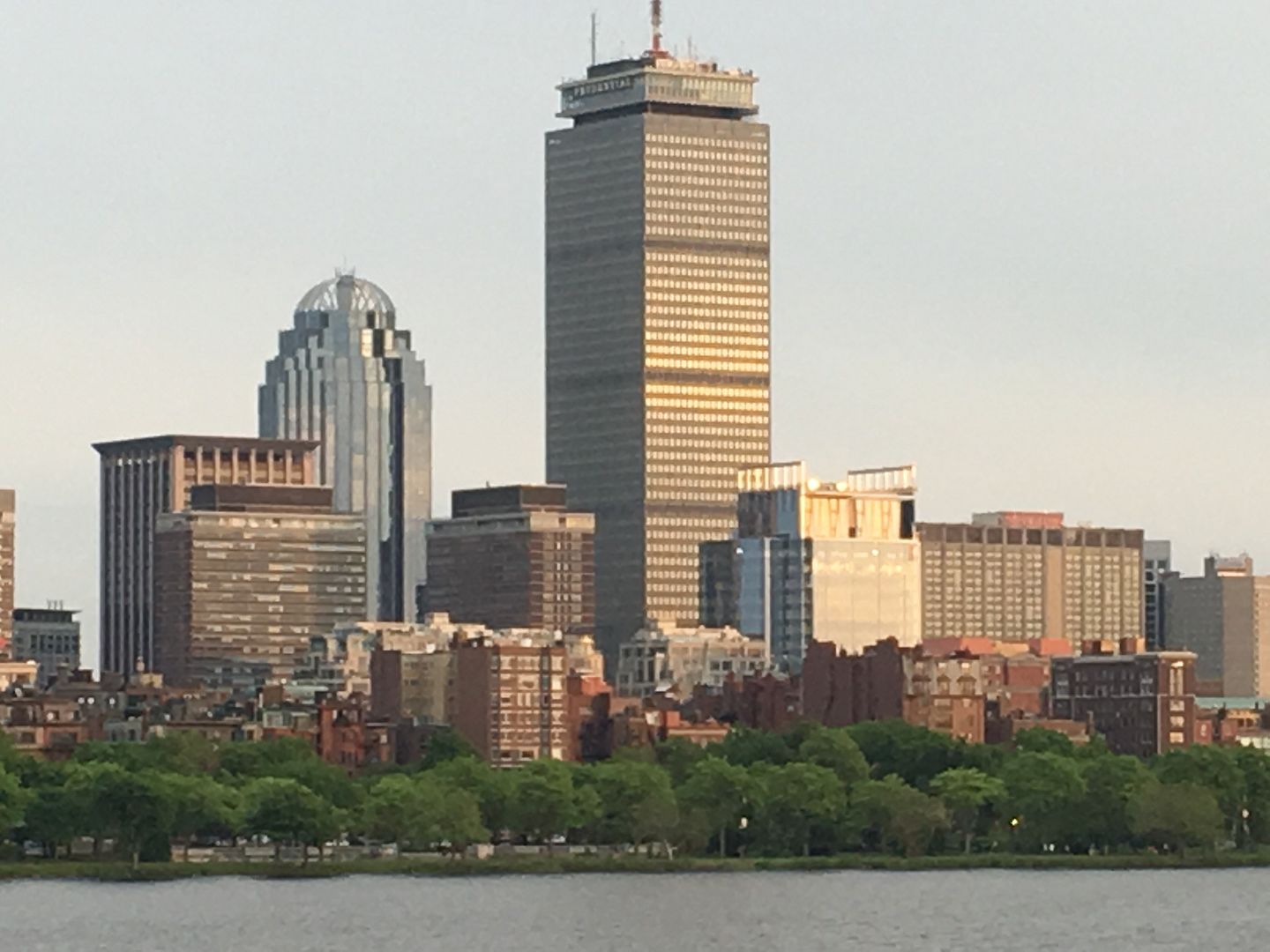
Boston Properties Office Tower | 888 Boylston Street | Back Bay


I wonder if this might feel a little more harmonious if there were big columns at the corners of the bottom layer as well? You could keep the V design and wrap it with a 90-degree crease as it embraced the corner. I'm open to the idea that less harmonious = more better, but at the least my spidey sense / intuition really wants them to be there and keeps complaining that theyre not. (Not for engineering purposes - unlike some of you, i have no fear of a healthy cantilever - but for composition)

EDIT: and maybe not corner V columns speciifically - but something to balance what's there now - aesthetically - because this communicates a lot of tension to me - also, why pop-out trapeziod on the far left but not the far right. I don't need symmetry - but at least a more balanced composition?
 
Office entry lobby looks beautiful lit up at night
 
I wonder if this might feel a little more harmonious if there were big columns at the corners of the bottom layer as well? You could keep the V design and wrap it with a 90-degree crease as it embraced the corner. I'm open to the idea that less harmonious = more better, but at the least my spidey sense / intuition really wants them to be there and keeps complaining that theyre not. (Not for engineering purposes - unlike some of you, i have no fear of a healthy cantilever - but for composition)

EDIT: and maybe not corner V columns speciifically - but something to balance what's there now - aesthetically - because this communicates a lot of tension to me - also, why pop-out trapeziod on the far left but not the far right. I don't need symmetry - but at least a more balanced composition?

Thank you for this. You have helped me understand at least one of the things that makes me feel uneasy, a certain unresolvedness about the base (and the roof).
 
I love the funky asymmetries at the bottom and the relentless symmetry at the top (though the turbines are really annoying--I hope that once 'the moment passes' for green gimmicks in 5-10 years they will find an interesting way to replace them). Though the word is not often associated with architecture, I think it's "entertaining"--something little contemporary Boston buildings do. The plaza is terrific and this is going to be a great corner of Back Bay.
 
Looks very good if you're talking about the first floor.

Unfortunately, the further you distance yourself from it, the worse it gets....
 
Last edited:

Let me add that it's disappointing that the gigantic load-bearing gesture made by the v-columns isn't continued up the height of the tower, and instead terminates meekly in that thin white bracket on the underside of the building's mid-section.

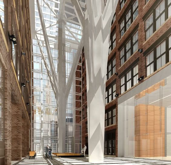
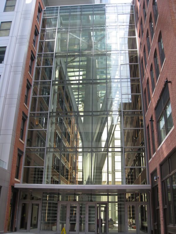
The giant branching columns in the lobby at atlantic wharf are a good counter-example. To be clear I'm not (just) saying that I like the biomimicry whatever at Atlantic Wharf and don't like the techno-geometry here. What'm saying is that you can see and feel the columns at Atlantic Wharf holding up the weight of the building, and even if you stand across the street and look up at the full height of the facade, you can see the continuity from the height of the building down into the columns in the lobby.

russia_wharf_lobby_cbt.jpg


IMG_0150.jpg


AtlanticWharf-300x168.jpg


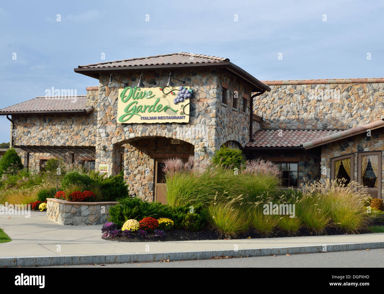
As is, these look a little like an ikea solution, and seem to be cousins of the form-without-function stone arch-without-an-actual-arch that you'd find at an olive garden (except high end here, because Eataly)

exterior-entrance-of-olive-garden-restaurant-with-sign-usa-DGPXHD.jpg


Starting to suspect this may be a turd after all.
 
While I don't love this building I do kinda like all the parts, individually at least. I really dig the ground level; there is something classically dramatic about how the trapezoidal entrances welcome the person coming in. I like the cornice too, but not on this building. It's strange. This building is like a stew where all the ingredients are delicious on their own right but somehow the flavors all cancel each other out and you are just left with a big bowl of "ehhhh".
 
Looks like a skater's paradise in the foreground with the angled edges/chamfered cuts on the "benches." Though it does make for an interesting design. We'll have to see how this turns out.

If its intentionally hard to sit on, its an epic urbanism fail.

Wait and see....
 
While I don't love this building I do kinda like all the parts, individually at least. I really dig the ground level; there is something classically dramatic about how the trapezoidal entrances welcome the person coming in.

Karnak on Boylston?

Karnak-Khonsu1.jpg
 
While I don't love this building I do kinda like all the parts, individually at least. I really dig the ground level; there is something classically dramatic about how the trapezoidal entrances welcome the person coming in. I like the cornice too, but not on this building. It's strange. This building is like a stew where all the ingredients are delicious on their own right but somehow the flavors all cancel each other out and you are just left with a big bowl of "ehhhh".

Nice read on this. It is how I have been feeling but not been able to come up with the words.

cca
 
While I don't love this building I do kinda like all the parts, individually at least. I really dig the ground level; there is something classically dramatic about how the trapezoidal entrances welcome the person coming in. I like the cornice too, but not on this building. It's strange. This building is like a stew where all the ingredients are delicious on their own right but somehow the flavors all cancel each other out and you are just left with a big bowl of "ehhhh".

Similar to CCA, I feel you nicely capture my sentiments about 888 Boylston: nice components, poor integration.

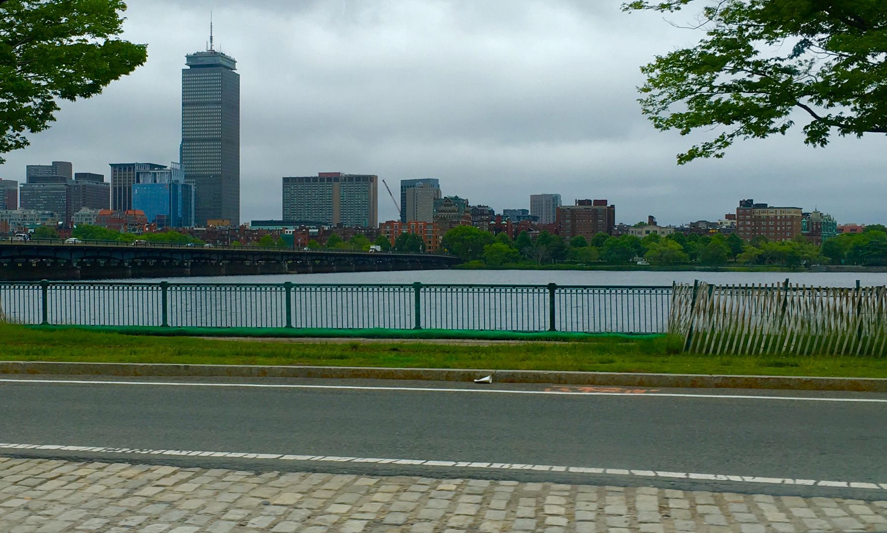
Actually this morning I had a bit of an epiphany about this. I saw it from the BU Bridge and thought it actually looked pretty good - the odd roofline (if you can call it that) adds texture to an otherwise very boxy back bay.

I think the issue is the proportions. The mech penthouse and wind turbine framing are too big relative to the rest of the building. When viewed from far away (e.g., BU Bridge), it looks fine. But at middle distances (e.g., across the Charles/MIT area or Mass Ave bridge), those top components of the building are awkward. The metal framing that sticks up at the top looks like some weird tall stilts structure. I think the major issue is that the proportioning is off.

BigPicture -- it's just another of the wierd offstpring of the strange union of Pru and Mrs Pru

the kids are all kinda disapointing :p
 
500% better than the previously non-accessible roof and poorly activated dead pocket of a plaza. The winds though... wonder if they'll be able to keep the glasses of Peroni and plates of tagliatelle on the tables...
 

Back
Top