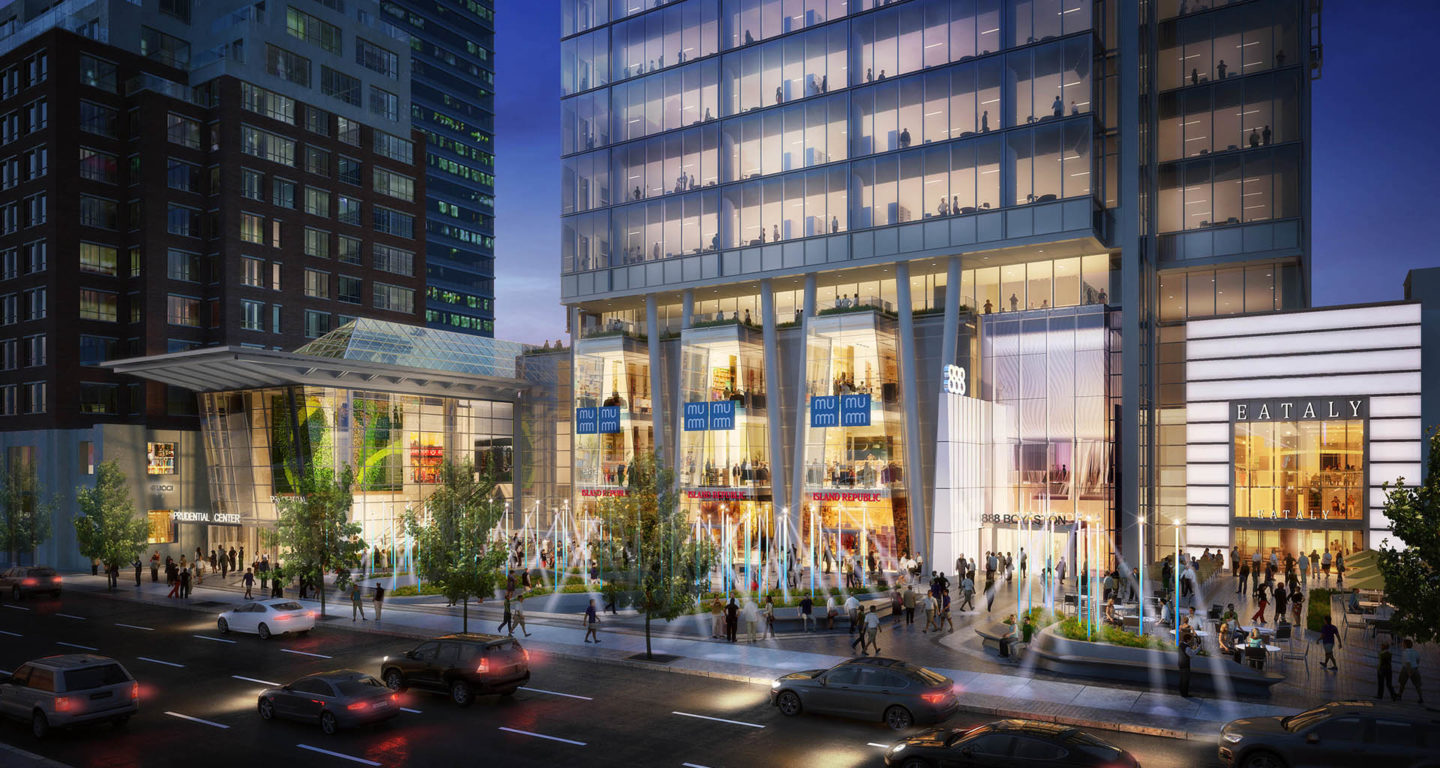
We're stuck with it so, i'll express my disappointment 1 last time. i was admonished for calling the 888 glass box the worst building in Boston, and was reminded of several 'worserr-still' examples (like, those apartment towers at 1 Emerson place show just how much bad is still possible). But, given it's location, '888' is a blow. Ok doesn't cut it in the heart of Back Bay so close to BPL, Trinity Church and Copley Sq. i know there are some who think the positives make up for the negatives. But we have enough good designers, and a layered review process that should have seen it's height, a/r, massing, cladding, roof, and how badly it would work with the rest of Back Bay – and forced changes. We shouldn't have to get beaned just to advance a runner to second base. We should be hitting home runs. This is perhaps the most detailed, polished turd since Copley Place. Sad to have something so bad done on such an important Back Bay site.