Boston Properties Office Tower | 888 Boylston Street | Back Bay

Every opinion matters, and we are each allowed our thoughts. However, I do remember WAY WAY WAY back when this was revised from the curved glass tower, most board members were quite happy with the new design. I think it's been said before, but street interaction is very important here and in many other "so called" design turds. I ABSOLUTELY despise the design of Parklane Seaport apartments, but I have to admit......the street retail and sidewalk activation is much better than most developments. So, I give it somewhat of a pass.

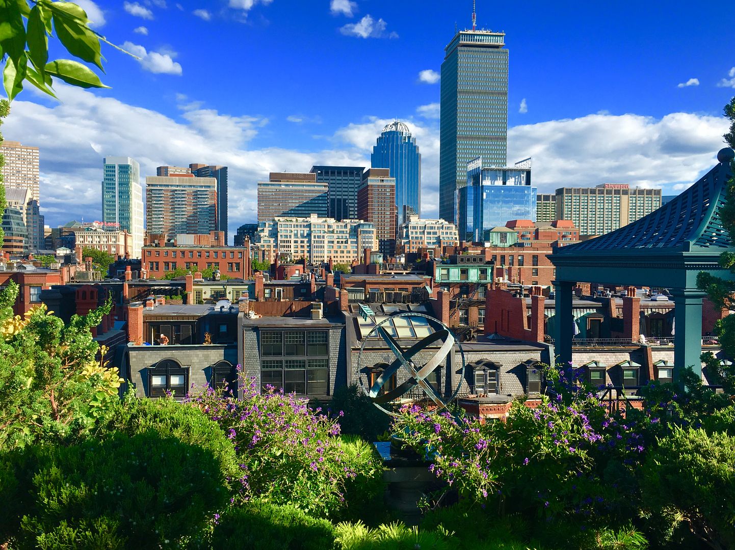
IMHO, 888 Boylston is light years ahead of most recent Boston development in design, materials, and street activation. That being said, yes, it could have been taller but I think the BCDC and the PruPac groups cut it down quite a bit.


Everybody does have an opinion. I bolded your comment concerning this is light years ahead.
I think 888 Boylston is not Backbay material. It's futuristic garbage.

When I think of the Backbay and their buildings I think of Prestige, Quality, Buildings that have stood the test of time.

888 Boylston is nothing like this. This would have been a better fit in a Downtown experiment.
Backbay is truly moving to second best in Boston. I'm starting to realize the North End is becoming more desirable location because of the Greenway activation.
 
Everybody does have an opinion. I bolded your comment concerning this is light years ahead.
I think 888 Boylston is not Backbay material. It's futuristic garbage.

When I think of the Backbay and their buildings I think of Prestige, Quality, Buildings that have stood the test of time.

888 Boylston is nothing like this.

I'm with you on this. I look at this and think 'this is what people thought the future looked like; in 1997; in Bahrain ...'
 
Yep, we've established that everyone can have their own opinion. :cool:

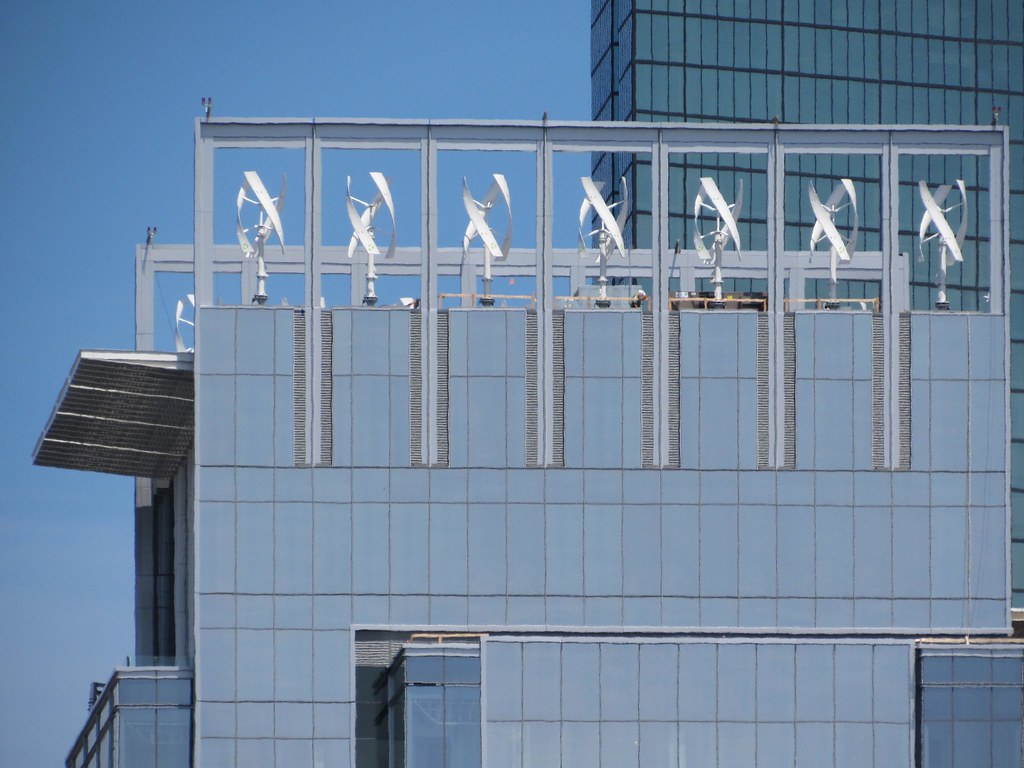
I think we've also established that this building is cacophony/mash-up/amalgam of different elements. Some people hate it precisely for that (the level of nit-picking is almost comic) but I think it creates a unique space that I haven't seen elsewhere in Boston--it's a bit whimsical (though as I've said before, the windmills are gimmicky) and not-at-all-"serious." Personally, I thank god we are spared yet another brain-dead glass box that looks like every other building being constructed in Austin, Columbus, and Phoenix. I too wish it were about 15 stories taller, but the plaza is amazing and provides a distinctive front door to the Prudential complex. If it were on a bigger scale, I would find it garish, but it's fun-sized :D

Actually, I was living in Bahrain just prior to 1997 and I can tell you that their "future" looked like Millennium Tower.
 
Actually, I was living in Bahrain just prior to 1997 and I can tell you that their "future" looked like Millennium Tower.

You missed this thing by only a few years then:

0fa06deb9f0095b161b4897fb5d33ece.jpg
 
You missed this thing by only a few years then:

0fa06deb9f0095b161b4897fb5d33ece.jpg

Not sure what point you are making... "This looks like 888 Bolyston" (yes, it is a building and, yes, it has unfortunate windmills) or "Here is an ugly building that is not a glassy box so...um... this is what Bahrain looks like."?
 
There is a lot not to like about details, but maybe the fun will be greater than the sum of the parts.
 
There is a lot not to like about details, but maybe the fun will be greater than the sum of the parts.

Yeah, I think we should keep the idea of "fun" in mind--not silliness, but quirkiness that engages the eye and creates an interesting/distinctive space. I'm equally loving the BPL exterior renovation as the suspended lighting is going to add interest and the recharging "counter" (that's what I was told it would be) will encourage interaction--maybe a little gimmicky, but again, fun.
 
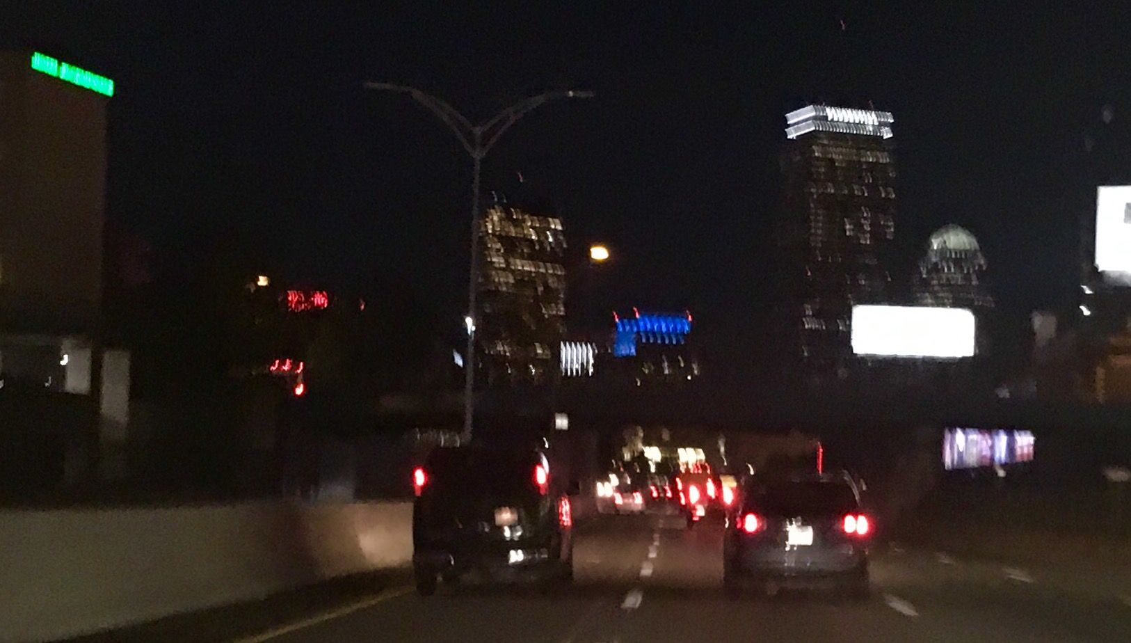
They've been lighting the top/ turbines for about a week now (Mostly a "white" light that's tinting lavender).

The turbines were in motion the other night, playing with shadows and light ast they rotated; I liked lit up like that.
 
Sorry I was in a car, someone with a good camera should get over there!
 
From the Allston On ramp to the pike it glowed and up close it looked great!
 
I hate to bring negativity but when im driving over the bridge i cant help but say to myself the crown looks even worse than I thought it would. Ive gotten used to it from the pike side, but from across the river damn it looks bad.
 
I meant to say in the daytime the crown is even worse than I thought it would be.
 

Back
Top