CDubs
Active Member
- Joined
- Sep 9, 2008
- Messages
- 180
- Reaction score
- 0
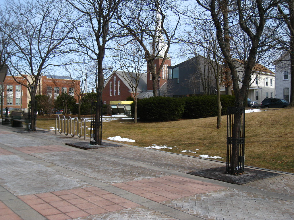
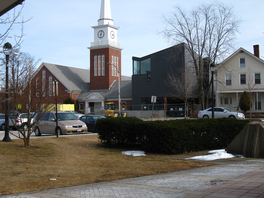
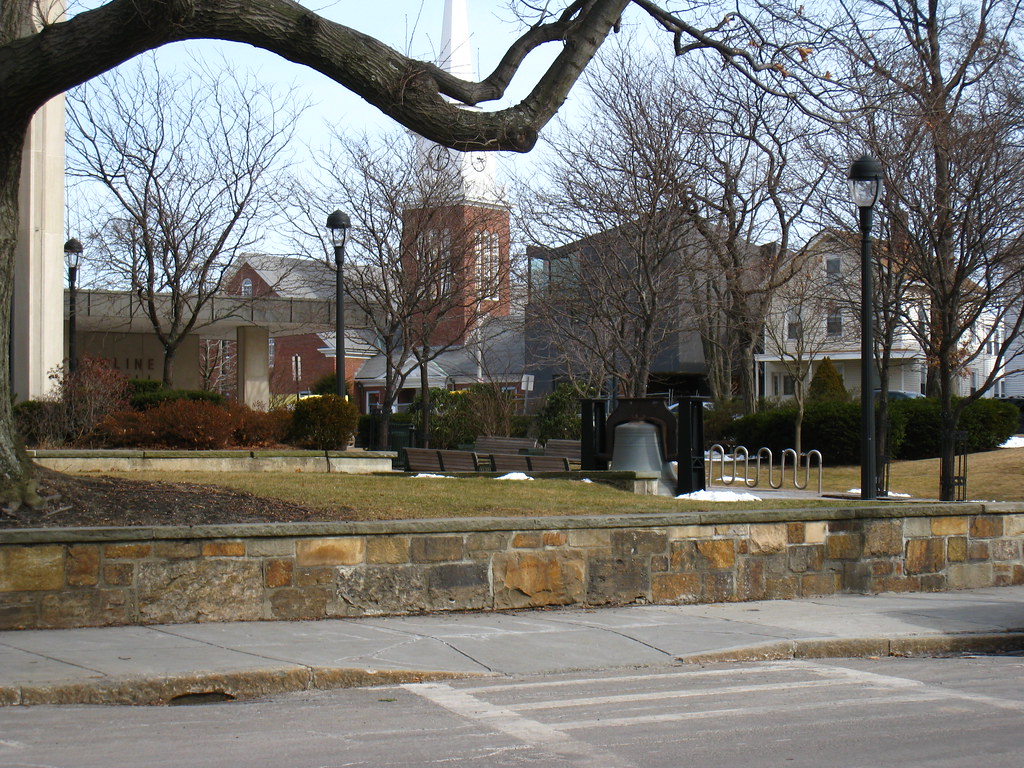
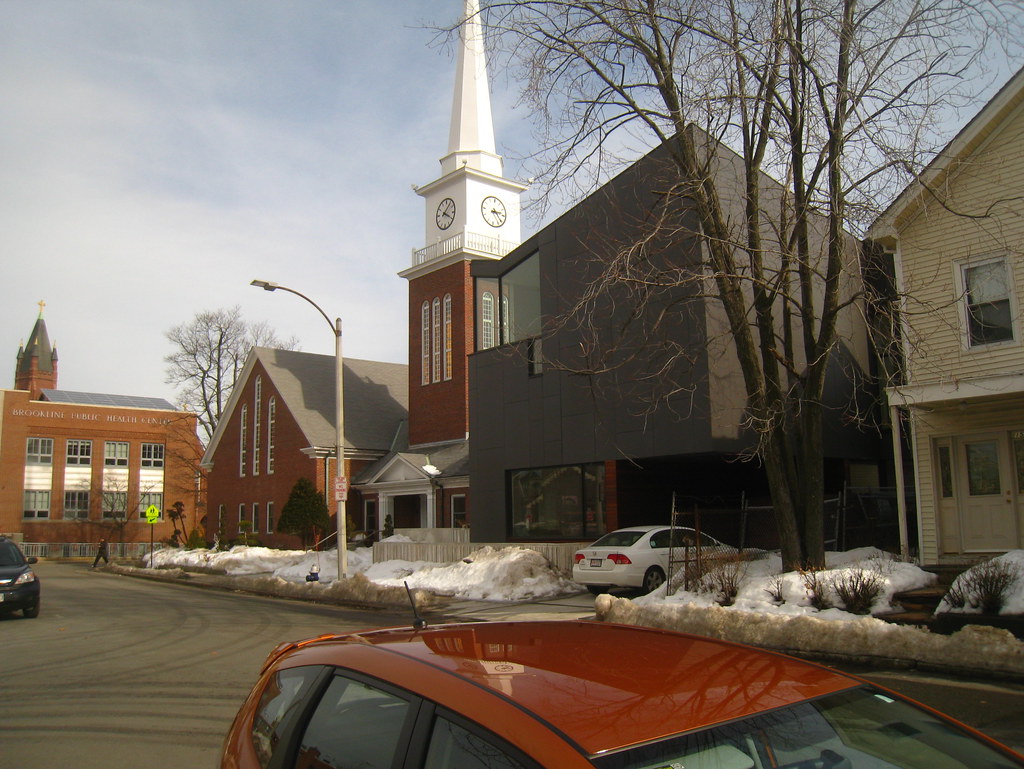
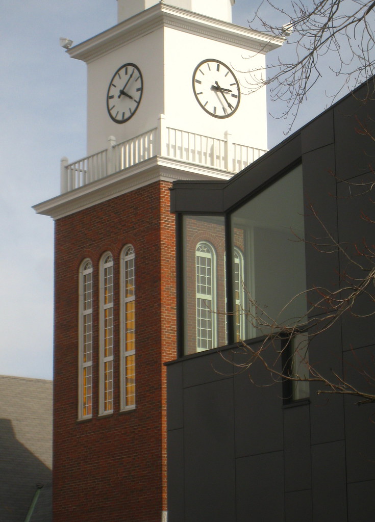
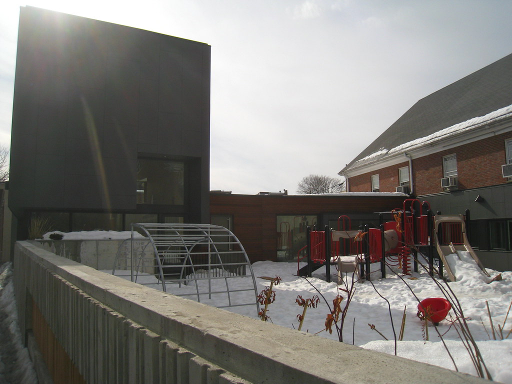
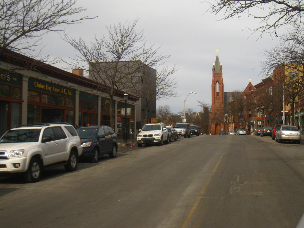
I hated this thing the first time I saw it. I still don't like how it looks in that first picture (a giant robot head?). But the other two - it looks halfway decent, and I kind of like the contrast with the surroundings. Too bad they couldn't have included more windows. And thank goodness for the wood in that third photo. Instead of the lights they should have put up a huge wreath.

