BU Development Thread

czsz said:
Is that additional parking lot getting developed?

This is the original plan. "West" and "middle" were combined, so we only have one more phase to go.

bostonubustvillage10pla.jpg
 
Looks like the Arena went where "West" and "Middle" were supposed to be. And that Rec. Center must be the location of the high-rise luxury dorm.

EDIT: Wait, no, I'm looking at it backwards. My bad.
 
I don't think you can deny that once finished, and if executed correctly, BU could have a very nice urban campus on their hands. A small grid of paths, athletic and residence facilities blended well, and easy access to at least some academic buildings. I can understand why they want to centralize everything.
Agreed the long range plan is promising; the current workaround is just a short-term headache.
 
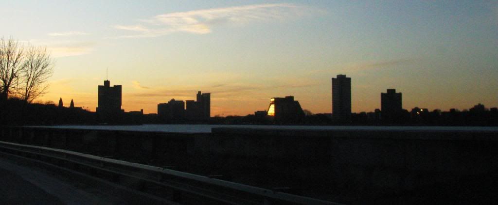
That Sert building has perfect proportions and great sculptural presence. All other buildings in the photo are not even architecture.
 
What do you think of the tip 'o the hat to Sert in the new dorm?

Too cheesy?
 
It's a bit too literal, but not having it would make the tower that much more atrocious.
 
egaads that building is ugly...no offense to the brutalist-philes but I just don't see the elegant, well proportioned, sculptural presence that you allude to.
 
^Keep looking at it, even if it takes you years, one day you will see it.
 
I don't dislike all brutalism...in fact I was waiting in the main lobby of city hall and decided to take a walk up the top of those nonsensical stairs and the soaring concrete forms and play of light make for quite beautiful architecture up there. (it's just the rest of the interior that sucks) And I like the 5 cent savings and the old crate and barrel building in harvard square. But I've always been very put off by that BU building. It looks like an battered space ship landed on comm ave to me.
 
By the time you're ready to totter into the grave, I can guarantee you it will have grown on you --if it still exists then.

But I'm sorry, I can't really show you how to like it --any more than I can show you how to like Picasso.

Or maybe I'm just getting too lazy.
 
^ Well, if that ain't sculpture, I don't know what is.
 
I'm not an expert on architecture but to me the reason why it's successful it has some qualities of a healthy tree. Strong core, sorta branches out and reaches for the sunlight subtly. I would appreciate a different skin but other than that it works.
 
Crikey, anything would look beautiful in that light with a reflection on the Charles
 

Back
Top