Bulfinch Crossing | Congress Street Garage | West End

Demolition permit pulled yesterday for a substantial portion of the garage.


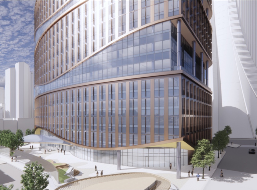
Screen Shot 2021-07-20 at 9.11.02 AM.png
 

I'm sticking with my first reaction to this design (especially based on this first render in your post) which is to say that this design needs at least 3 changes:
1) To be a bit shorter
2) To have the rooftop mechanicals integrated into the main facade, rather than in a cheap, ginormous mechanical top hat
3) To have a stepped, rather than horizontally continuous, roofline
 
the worst thing about this is it's gonna block the money-shot of the state street bldg -- like, by far the BEST angle of that glorious tower is gonna be totally fucked by this nonsense.
 
the worst thing about this is it's gonna block the money-shot of the state street bldg -- like, by far the BEST angle of that glorious tower is gonna be totally fucked by this nonsense.

I'm not really sure what your complaint is... there was always going to be a structure sitting on that lot... this is just a different form-factor
 
maybe i misread/saw the renders of the earlier planned project for this parcel, but to my eyes this seems to be distinctly taller. if i'm wrong, so be it; if not, then that would be my "complaint."
 
They need to keep the design language of the previous design. This project was forged in the fire of over a decade of design alterations that had literal years to be critiqued, sat on, and iterated upon until it was finally right. You dont just crumple all of that up and plop this thing down from the sky one day and just move on… Not here. They need to get back to the drawing board and really deliver here. This building is out in front of the whole complex, one congress is beautiful but it takes a huge dent with a half assed mess out in front of it.
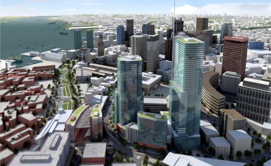
 
They need to keep the design language of the previous design. This project was forged in the fire of over a decade of design alterations that had literal years to be critiqued, sat on, and iterated upon until it was finally right. You dont just crumple all of that up and plop this thing down from the sky one day and just move on… Not here. They need to get back to the drawing board and really deliver here. This building is out in front of the whole complex, one congress is beautiful but it takes a huge dent with a half assed mess out in front of it.

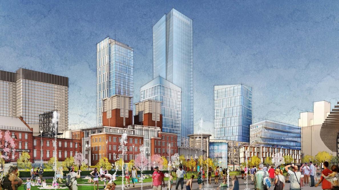
That part of the previous design was a concept that hadn't been iterated at all, just as the second residential tower has never been formally rendered, designed, or proposed.
 
That parcel was rendered all the way back in one of the earliest proposals, it was pretty rough, and changed drastically over time as the design progressed.

539w.jpg


Not sure what you mean about the second residential tower but its a similar story there too.
government-center-development-proposal-rendering*1200xx1188-668-35-0.jpg
 
All the other renders/proposals/sketches/fever dreams have had smaller masses and more permeability than the lab proposal. It’s like they feel the need to memorialize the GC garage by building a vertical monolith on part of the site.
 

Back
Top