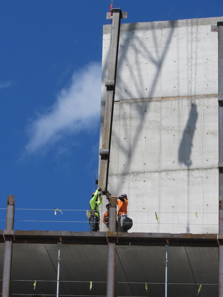
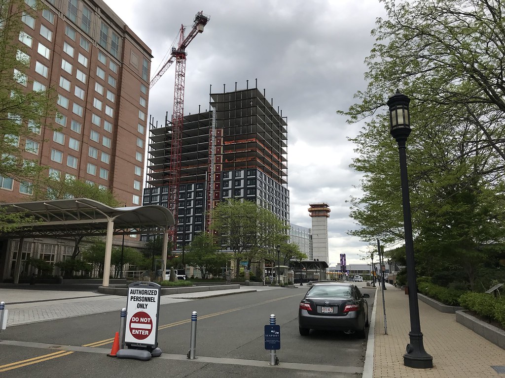
A ha, thanks.
You are using an out of date browser. It may not display this or other websites correctly.
You should upgrade or use an alternative browser.
You should upgrade or use an alternative browser.
Gables Seaport (née Waterside Place 1B) | 505 Congress Street | Seaport
- Thread starter goldenretrievers
- Start date
- Joined
- Jan 7, 2012
- Messages
- 14,172
- Reaction score
- 23,677
- Joined
- Jan 7, 2012
- Messages
- 14,172
- Reaction score
- 23,677
atlantaden
Senior Member
- Joined
- May 31, 2006
- Messages
- 2,675
- Reaction score
- 3,323
Maybe I'm in the minority, but I love this!
Me too, will be a very handsome addition to the neighborhood!
Czervik.Construction
Senior Member
- Joined
- Apr 15, 2013
- Messages
- 1,959
- Reaction score
- 1,223
Nice facade and not a small building, that.
Are the developers learning from the first wave of Seaport developments and adding more detail (thinking this and Echelon)?
Are the developers learning from the first wave of Seaport developments and adding more detail (thinking this and Echelon)?
JumboBuc
Senior Member
- Joined
- Jun 26, 2013
- Messages
- 2,789
- Reaction score
- 1,923
Nice facade and not a small building, that.
Are the developers learning from the first wave of Seaport developments and adding more detail (thinking this and Echelon)?
There's no question in my eyes that Seaport architecture has evolved significantly over the last twenty years or so. People often group "Seaport" architecture together in one clump as if it's all from the same era, but there have been significant distinct shifts in "Seaport" style over its recent history.
- The first "New Seaport" wave in the 90s (e.g., Seaport Hotel, Seaport East, Seaport West, even the Moakley Courthouse) was all brick and largely separated from the street by private landscaping and driveways in an anti-urban fashion.
- The second wave was designed and built in the 2000s just before and immediately after the recession (e.g., BCEC, Westin Waterfront @ BCEC, One Marina Park Drive, Renaissance Boston Waterfront, Park Lane Seaport, Waterside Place Phase I). This stuff is more urban in that it no longer has landscaping separating the buildings from the street, but it still doesn't incorporate varied multi-use ground floors very well at all. This wave also has the worst of across-the-board flat, bland, pre-cast facades.
- Next came the "glass box" era of buildings designed in the immediate post-recession years (e.g., the Vertex buildings, PWC, Goodwin Procter). This was one little step forward in terms of ground floor activation, but the retail spaces still ended up looking like office lobbies from the street (think Babbbo and Committee). The facades remained flat but the pre-cast of the previous wave was replaced with glass.
- The latest wave of buildings designed in the 20-teens have been the best (e.g. One Seaport Square, Watermark Seaport, Echelon, future Amazon / Seaport Square plans, etc.). These have the highest quality, most varied facades. They also specifically address ground floor activation rather than turning their collective back on it. Retail spaces have distinctive, detailed, pedestrian-oriented facades. I'm hopeful that there's still a lot more room to run here before the economy takes a turn for the worse sometime in the coming years.
Obviously these "waves" aren't 100% distinct and there's some overlap and overflow between them (e.g., I feel like the the Pier Four projects lag their contemporaries by one wave: the apartment building was built in wave 3 but feels like wave 2, the office building was built in wave 4 but feels like wave 3, the current condo building has finally caught up with its peers). Also, I think the John Hancock building was ahead of its time, with wave 3 style built in wave 2. But generally, I think these shifts in style hold up pretty well.
Walk around this area and it's clear. The streets around the Seaport Hotel feel nothing like those on Fan Pier which feel nothing like those around One Seaport Square. Even just the south side of Seaport Boulevard itself changes from Morton's/Rosa Mexicano (wave 1) to J Pace and Son (wave 2) to bluemercury (wave 3) to Shake Shack (wave 4).
But to bring it all back to Czervik's comment, the Seaport's prevailing architectural style has changed a lot from Waterside Place Phase I to Phase II. It follows that the two faces would reflect their times.
FitchburgLine
Active Member
- Joined
- Nov 5, 2013
- Messages
- 666
- Reaction score
- 403
Great post Jumbo- the classification feels accurate to me. The biggest effect of Omni, Waterside 1-B and Massport A-2 will be connecting the earlier phases of development to the modern section (basically Seaport Square south of Seaport Blvd)
Last edited:
FitchburgLine
Active Member
- Joined
- Nov 5, 2013
- Messages
- 666
- Reaction score
- 403
Czervik.Construction
Senior Member
- Joined
- Apr 15, 2013
- Messages
- 1,959
- Reaction score
- 1,223
Jumbo - excellent summary. I lived in Boston for the first two phases and agree completely.
FormFollowsBudget
Senior Member
- Joined
- Jan 15, 2015
- Messages
- 2,309
- Reaction score
- 4,100
I don't like the white stripe on this side, but the rest is well done, I'd say.
Brad Plaid
Senior Member
- Joined
- Jan 17, 2013
- Messages
- 1,310
- Reaction score
- 1,559
Saw this on Saturday and the oil-canning was in full effect all over. Really unfortunate choice of materials for the window panels. An otherwise decent building looks like it's partially clad in vinyl siding.
Saw this on Saturday and the oil-canning was in full effect all over. Really unfortunate choice of materials for the window panels. An otherwise decent building looks like it's partially clad in vinyl siding.
What's your overall opinion and impression on the effect that the oil-canning has on the appearance of the building having seen it in person? Is it just as bad or more so than some of the earlier photos depicted? I personally think they really dropped the ball on this one, probably to the point of being irrationally upset over its mere existence.
Brad Plaid
Senior Member
- Joined
- Jan 17, 2013
- Messages
- 1,310
- Reaction score
- 1,559
Most people will probably never notice, it's not screaming at you, but once you do notice it just kind of cheapens your impression of the building. Guessing they wanted the panels to add some kind of "vertical texture" to the window frames. A good intention but in this case they would have been better off with just 2 alucobond panels, a full-width vertical and a full-width horizontal instead of the 7 narrow-width they went with. Most likely that would have avoided this warping. On an overcast day the oil-canning would be much less obvious than on a sunny day.
Most people will probably never notice, it's not screaming at you, but once you do notice it just kind of cheapens your impression of the building. Guessing they wanted the panels to add some kind of "vertical texture" to the window frames. A good intention but in this case they would have been better off with just 2 alucobond panels, a full-width vertical and a full-width horizontal instead of the 7 narrow-width they went with. Most likely that would have avoided this warping. On an overcast day the oil-canning would be much less obvious than on a sunny day.
Ah.. the silver lining for Spring being cancelled in Boston this year.
- Joined
- Jan 7, 2012
- Messages
- 14,172
- Reaction score
- 23,677
FitchburgLine
Active Member
- Joined
- Nov 5, 2013
- Messages
- 666
- Reaction score
- 403
odurandina
Senior Member
- Joined
- Dec 1, 2015
- Messages
- 5,328
- Reaction score
- 266
Nimby's be horrified yo.
Looks like a God damned City finally.
Looks like a God damned City finally.


