- Joined
- Jan 7, 2012
- Messages
- 14,172
- Reaction score
- 23,677
This design is the opposite of "innovation".
This design is the opposite of "innovation".
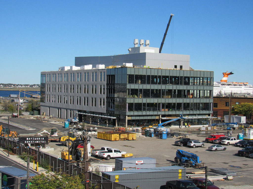 https://flic.kr/p/29pf92C
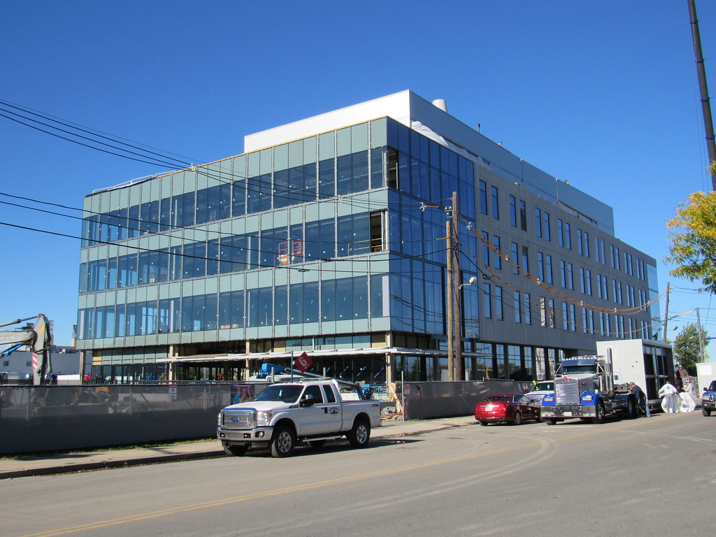 https://flic.kr/p/NpAjFv
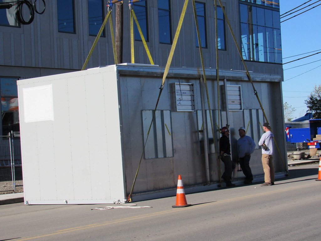 https://flic.kr/p/2c6hNd9
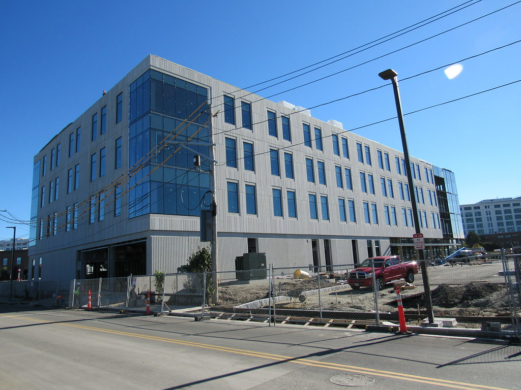 https://flic.kr/p/NpAkxR
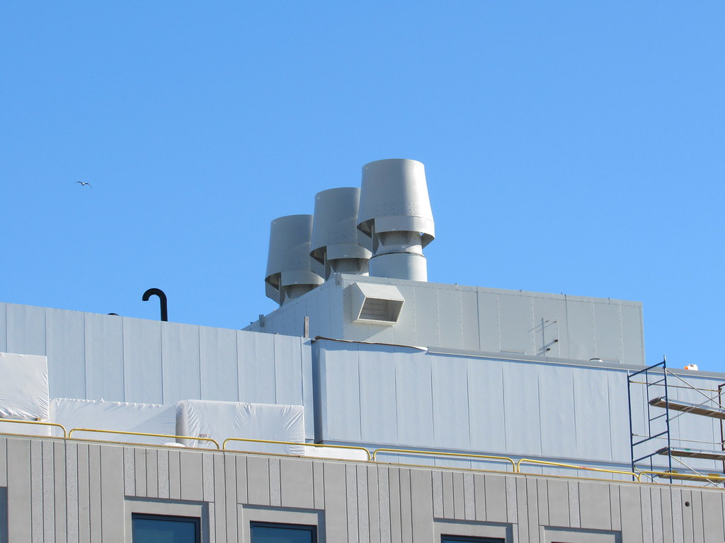 https://flic.kr/p/2b4Pwuq
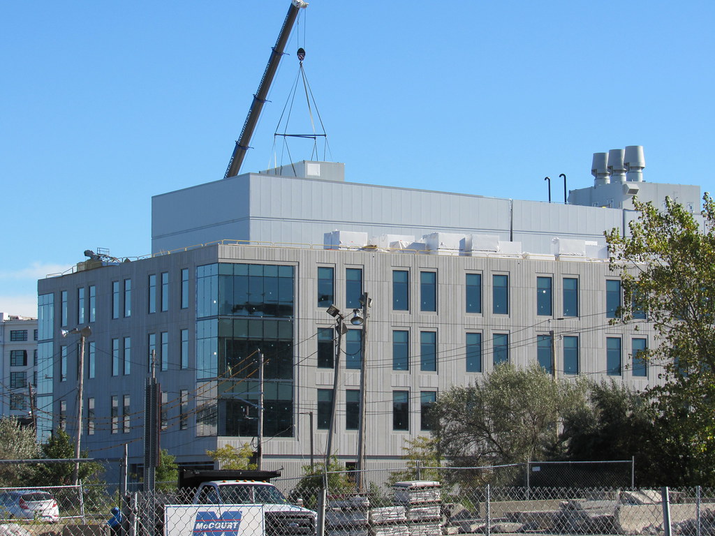 https://flic.kr/p/2caKRpv
Although it screams "Kendall Square outskirts, 2003", and too short, I think it is a tidy little building. Yes, it is bland, but seems well put together.
Although it screams "Kendall Square outskirts, 2003", and too short, I think it is a tidy little building. Yes, it is bland, but seems well put together.
I like the buildings, but they must realllly be playing the long game to locate here. Pretty crappy spot surrounded by warehouses in every direction and 0 transit.
 https://flic.kr/p/RKjdG4
 https://flic.kr/p/2epK9oW
 ISQ Phase II
Maybe the sampler is for another building elsewhere, being stored there. Lot of brick detail for this part of town.
....but WTF with that suburban front yard in the rendering on the fence. What is this Waltham in 1988?
Well, isn't Innovation Square basically sited in a glorified office park (the Ray Flynn Industrial Park) with commercial, retail, and industrial components thrown in? So why is it wrong to have sidewalks, some seating, a few trees, and some patches of green out front?
