Lovejoy Wharf | 131 Beverly Street | West End

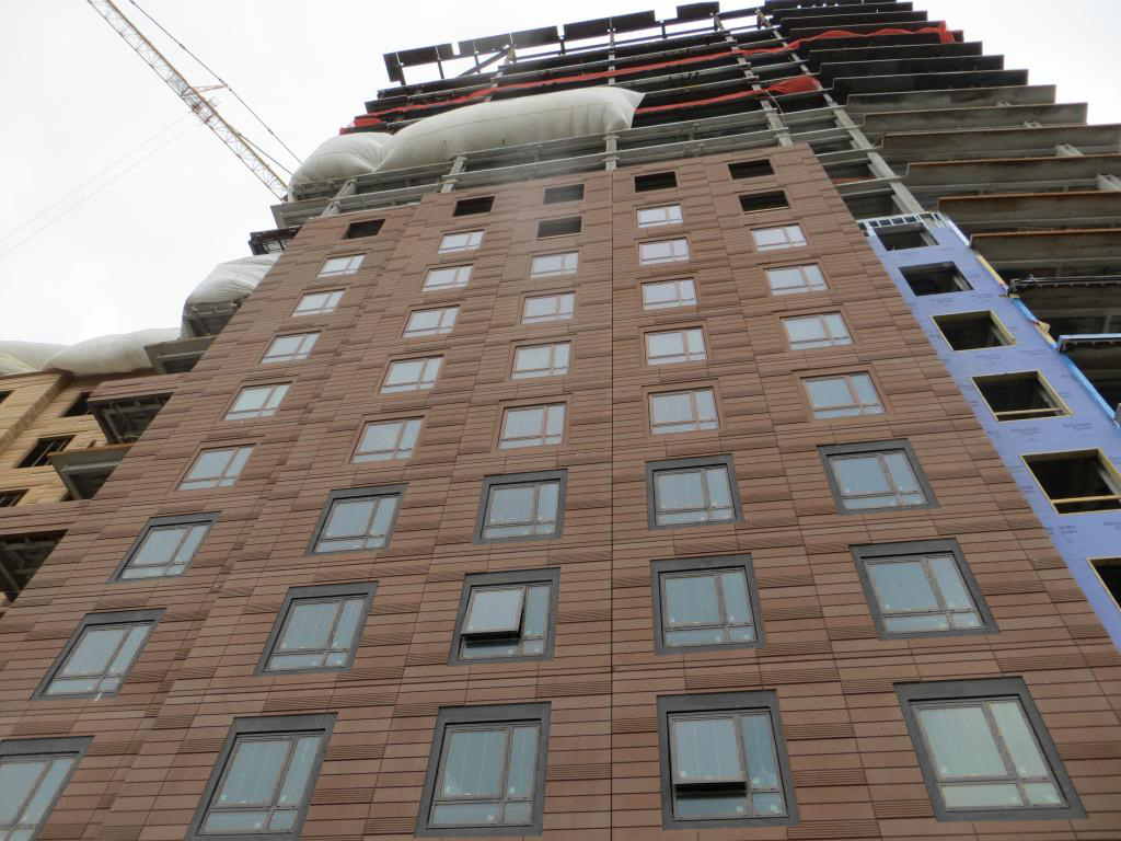
Does anyone know why the 11th floor has taller windows than all the other upper floors? Luxury units? Mechanicals?
 
^ Probably because of how it and the floor above it interact with the top floor and roof of the shorter section.

BTW: This building looks fantastic from the Charlestown Bridge.
 
This building looks incredible in person. To me this is the West Ends Rowes Wharf.
 
Beeline,

thanks for the great pics.

Change the cladding on the 17 story Chinatown hotel and the 20 story Ft Point/Berkeley Investment tower to this and they'll have 2 more stunners with just enough separation that hardly anyone will notice.
 
This project is the perfect example of how buildings don't need to have height to make a difference. This project will be much more transformative than Avalon while being much shorter. Materials, context, and attention to detail really do matter. I'm hoping that Related Beal continues this at the Merano site even though it isn't luxury.
 
Saw this over the weekend and was absolutely blown away. Last time I saw it was probably a month ago. Real quality development here.
 
This project is the perfect example of how buildings don't need to have height to make a difference. This project will be much more transformative than Avalon while being much shorter. Materials, context, and attention to detail really do matter. I'm hoping that Related Beal continues this at the Merano site even though it isn't luxury.

I feel like the Merano site is pretty different, but this does keep my hopes high for the Quaker Lane Development, awkward hat and all.
 
My only issue with this building is how the window mullions match the color of the "brick" siding. It makes everything look fake (which the brick is, after all). I wish all the mullions were black like they are in the glass curtain portion and the Converse building next door.


davem wrote about this same thing over in the One Greenway thread.

I do like the building in general, but it could be improved. If the mullions weren't color-matched to the fauxcotta I think it would be worlds more successful. People know window frames aren't made of masonry, painting them to match calls undue attention to an already subpar design element (cheap windows).

See also: pretend copper frames at Wentworth's largely disappointing new dorm.


Edit: quick and dirty edit of a few floors. I think it adds some debth to the facade, but Idunno.
15593636145_bb62e2f1e0_b.jpg
 
i like almost* everything about this building. The texture of the facade is head and shoulders above what we usually get. My only quibble, I don't like the setback/ staircase effect of the brick vs glass transition on the high rise portion of the building. IMO the glass facade should just be vertically aligned with the brick for the entire height of the building similar to one greenway at on Kneeland St. The set back effect where the building gradually transitions to glass at higher floors just looks a bit cartoonish to me.
 
i like almost* everything about this building. The texture of the facade is head and shoulders above what we usually get. My only quibble, I don't like the setback/ staircase effect of the brick vs glass transition on the high rise portion of the building. IMO the glass facade should just be vertically aligned with the brick for the entire height of the building similar to one greenway at on Kneeland St. The set back effect where the building gradually transitions to glass at higher floors just looks a bit cartoonish to me.

I respectfully disagree. That is one of the reasons this building reminds me of Rowes wharf. Rowes Wharf uses the exact same staircase effect that you are talking about and it is one of the best developments in Boston. When you are up close to this and look up its almost like a modern/taller version of the effect you get when you look up at Rowes Wharf.
4417249-view-of-boston-harbor-and-rowes-wharf-and-skyscraper-buildings-in-boston-massachusetts-Stock-Photo.jpg

Rowes_Wharf,_Boston,_MA_-_2.JPG


edit: Im not saying this is a copy of Rowes Wharf or better in any way. In my opinion Rowes Wharf is a far superior development. Im just saying that when I look at this it gives me certain "Boston" cues that I like, just like how when I look at Millennium Tower it does the same. The way it fades from grey concrete at the base into the brick tower is another along with the concrete pass through- which is nowhere near as impactful as Rowes Wharf pass through is.
 
Last edited:
I see the analogy of Rowes Wharf with the setbacks, however, I think the distinction is the mixing of modernism and it's liberal use of glass and it's transition with more traditonal brick in Lovejoy wharf. Rowes wharf overall looks more "solid" and the different facade treatments are more complimentary with each other. Lovejoy's liberal use of glass seems to relegate the brick facade (that steps down) to be for decor only. In other words, the brick seems to convey that it has no structural reason for being there as if it's just glued to the surface of glass high rise for transitional effect. That being said, overall, I think the brick work looks great, it's just the glass/brick transition on the high rise portion only that looks a bit awkward, in my subjective opinion.
 
I gotcha and I agree to each his own. I just get a "Boston" feel from it like I do from Millennium due to certain elements, but I can see where you feel the glass is kind of overpowering the amazing brick work. Either way its a solid development and the West End needs some solid development. I feel like the neighborhood is kind of going from the red headed step child of Boston to coming into its own with its own vibe and feel in a good way. Seeing those shots from The Town is stunning how far we came in a couple years. Once the Merano and the Hub are done well have to get some comparisons to see how drastically different this area has become. Part of me likes the run down forgotten parts of cities because its like a time capsule standing there in front of you, but another part is very happy that our waterfront is becoming even more incredible. All thats left is East Boston and I was there a few days ago and even that is getting taken over. Its a blessing and a curse.

Off topic: By the way the water taxi ramp at I think it was called pier 4 in East Boston is the best views of the city I have ever seen. Im not sure the name of it but theres a new park there with apartments and it blew me away. Pier 2 has always been my go-to spot because its extremely dangerous to get out there so nobody is ever out there, but Im sure that will be gone in a few years. I was happy to find a new spot- that surprisingly had even better views- although its a tourist destination.
 
I hope this building has turned a new page on whats possible in Boston with precast. Hopefully this building sets a new precedent and others try to emulate/improve upon this. I was hoping the same when Liberty Mutual pulled off a stunner with the limestone precast, but that was a 1 of 1. Hopefully when it comes to brickwork this becomes the rule and not the exception.
 

Back
Top