You are using an out of date browser. It may not display this or other websites correctly.
You should upgrade or use an alternative browser.
You should upgrade or use an alternative browser.
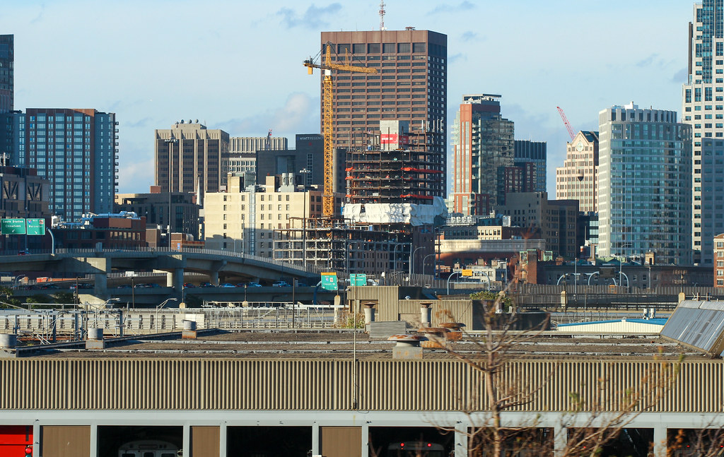
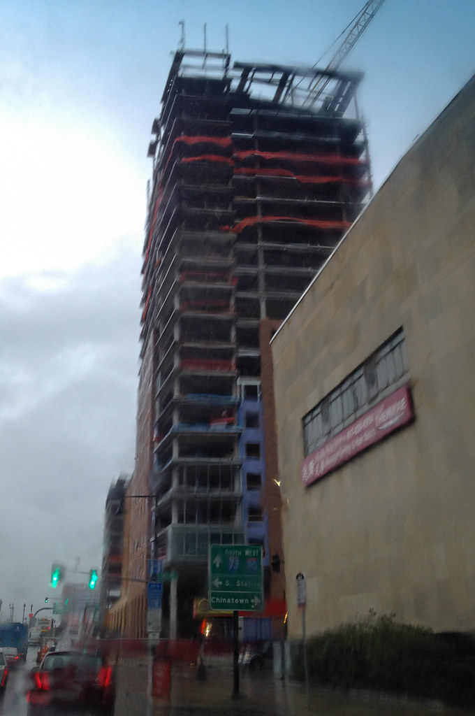
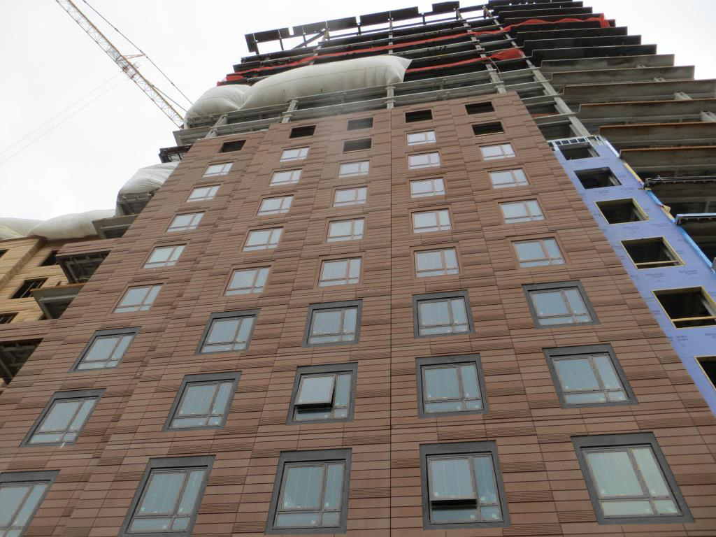
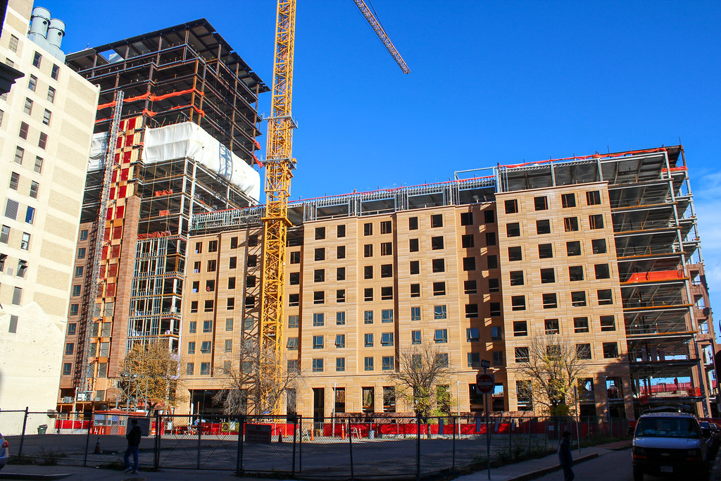
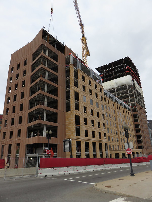
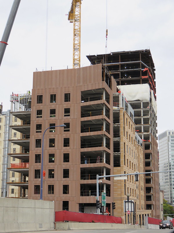
One Greenway (Parcel 24) | 0 Kneeland Street | Chinatown
- Thread starter Mike
- Start date
kz1000ps
Senior Member
- Joined
- May 28, 2006
- Messages
- 9,187
- Reaction score
- 13,720
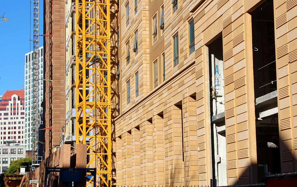
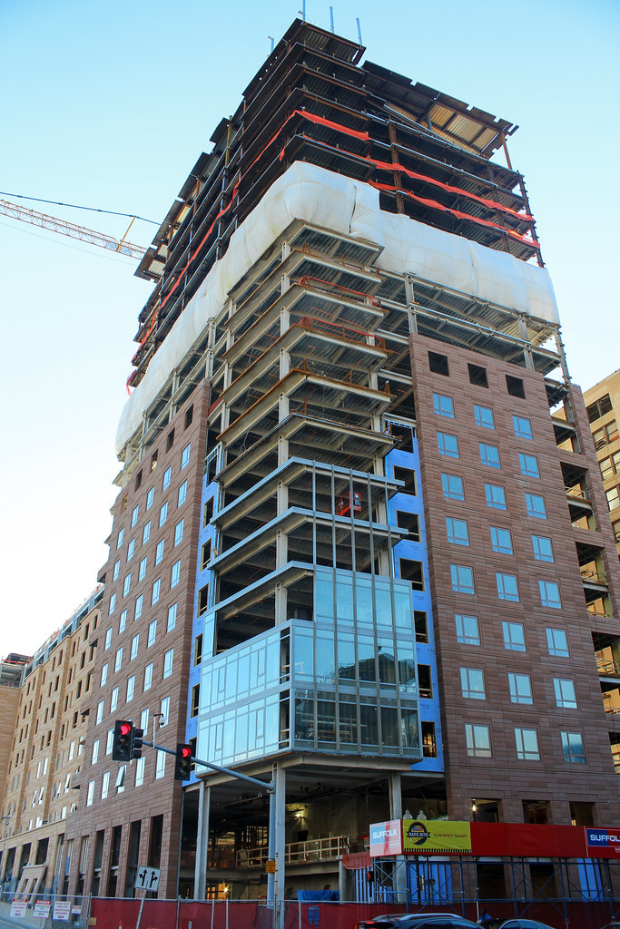
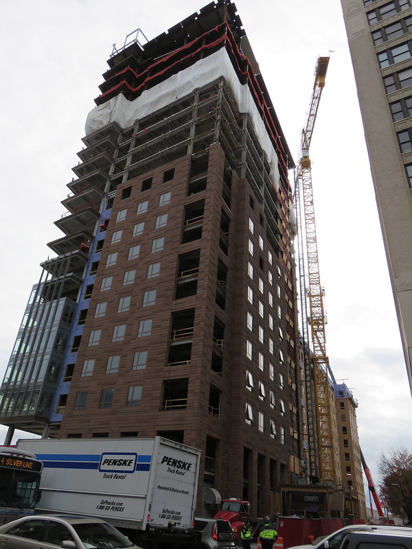
For what it's worth, I'm liking the precast--even up close--and think it's light years ahead of the featureless crap used on the Kensington or Jacob Wirth, and between the textures and the deep, earthy colors it has a real visual weight to it that *almost* suggests stone or terra cotta.
And once again ADD Inc manages to eke out some decency from otherwise cruddy materials.
And once again ADD Inc manages to eke out some decency from otherwise cruddy materials.
- Joined
- May 25, 2006
- Messages
- 7,064
- Reaction score
- 1,990
This looks nicer than most of the market rate stuff going up!
Boston02124
Senior Member
- Joined
- Sep 6, 2007
- Messages
- 6,936
- Reaction score
- 7,088


cca
Senior Member
- Joined
- Aug 19, 2008
- Messages
- 1,408
- Reaction score
- 12
For what it's worth, I'm liking the precast--even up close--and think it's light years ahead of the featureless crap used on the Kensington or Jacob Wirth, and between the textures and the deep, earthy colors it has a real visual weight to it that *almost* suggests stone or terra cotta.
And once again STANTEC manages to eke out some decency from otherwise cruddy materials.
Fixed for architect firms current name.
SeamusMcFly
Senior Member
- Joined
- Apr 3, 2008
- Messages
- 2,050
- Reaction score
- 110
Wasn't even aware.Fixed for architect firms current name.
Shame.
- Joined
- Sep 15, 2010
- Messages
- 8,894
- Reaction score
- 274
Fixed for architect firms current name.
The building was designed by ADD Inc. though before the merge. It was their design. Buildings designed after the merge are clearly Stantec.
cca
Senior Member
- Joined
- Aug 19, 2008
- Messages
- 1,408
- Reaction score
- 12
Yeah, so take that, cca!
My question is ...who's site do the marketing materials go on. Not ADDinc.
")
cca
Boston02124
Senior Member
- Joined
- Sep 6, 2007
- Messages
- 6,936
- Reaction score
- 7,088


cca
Senior Member
- Joined
- Aug 19, 2008
- Messages
- 1,408
- Reaction score
- 12
This looks nicer than most of the market rate stuff going up!
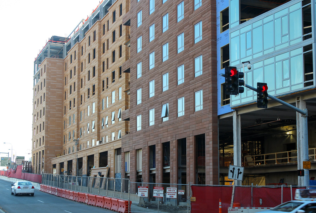
You are right I am sure, and I respect your opinion. I will stay on the side of that it is still not a good design choice. The rustication is too pronounced and there is a lack of human scale to the coursing. (all this is subjective of course)
I am going to say that this was not nearly as successful as some of the recent res-towers that ADDinc has been doing lately.
cca
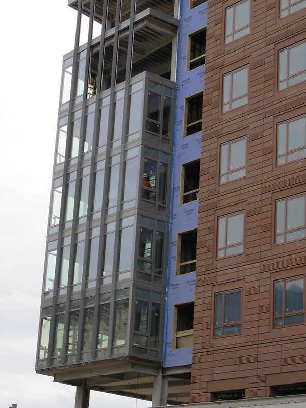
I do like the building in general, but it could be improved. If the mullions weren't color-matched to the fauxcotta I think it would be worlds more successful. People know window frames aren't made of masonry, painting them to match calls undue attention to an already subpar design element (cheap windows).
See also: pretend copper frames at Wentworth's largely disappointing new dorm.
Edit: quick and dirty edit of a few floors. I think it adds some debth to the facade, but Idunno.
See also: pretend copper frames at Wentworth's largely disappointing new dorm.
Edit: quick and dirty edit of a few floors. I think it adds some debth to the facade, but Idunno.


- Joined
- Jan 7, 2012
- Messages
- 14,173
- Reaction score
- 23,688
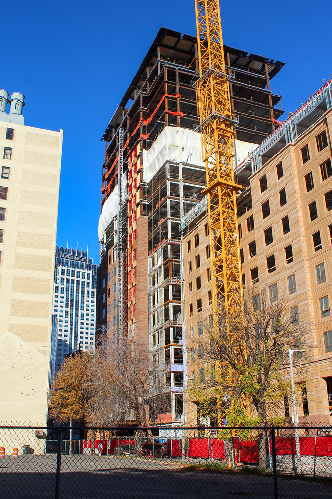
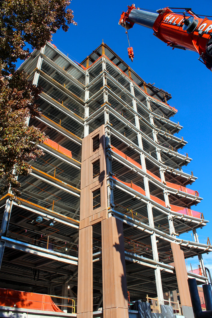
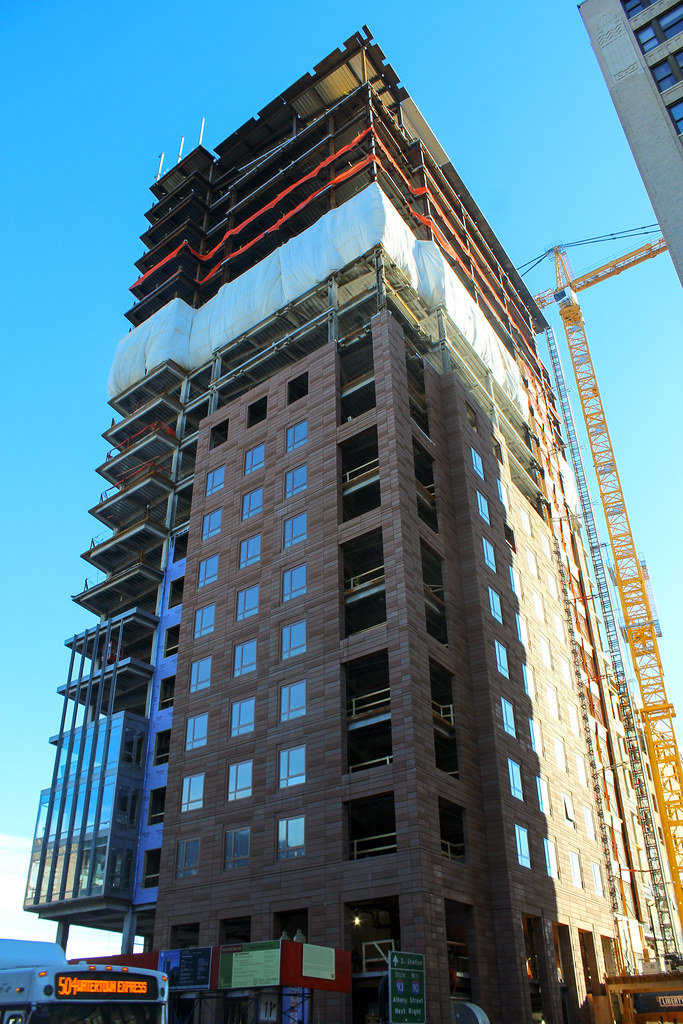
https://www.flickr.com/photos/beelinebos/15493394620/
https://www.flickr.com/photos/beelinebos/15654661426/

https://www.flickr.com/photos/beelinebos/15679964302/

https://www.flickr.com/photos/beelinebos/15492979628/
https://www.flickr.com/photos/beelinebos/15493156367/
https://www.flickr.com/photos/beelinebos/15493555730/