You are using an out of date browser. It may not display this or other websites correctly.
You should upgrade or use an alternative browser.
You should upgrade or use an alternative browser.
One Greenway (Parcel 24) | 0 Kneeland Street | Chinatown
- Thread starter Mike
- Start date
Boston02124
Senior Member
- Joined
- Sep 6, 2007
- Messages
- 6,936
- Reaction score
- 7,088


I hope this project succeeds and I hope Marty pushes for similar density residential on the next parcel over (25?), which would utilize air rights and also cover up the central artery. I expect we'll be seeing something soon on Parcel 25 proposals.
- Joined
- May 25, 2006
- Messages
- 7,064
- Reaction score
- 1,990
Building reminds me of a miniature version of the North Pier Apartment Tower in Chicago. Wish the tower portion was 10 floors taller.

That is fucking hideous. It makes 432 Park Ave look elegant.
JeffDowntown
Senior Member
- Joined
- May 28, 2007
- Messages
- 5,048
- Reaction score
- 4,226
Building reminds me of a miniature version of the North Pier Apartment Tower in Chicago. Wish the tower portion was 10 floors taller.
I guess this takes over the old line about Volvo:
"Boxy but safe"
Building reminds me of a miniature version of the North Pier Apartment Tower in Chicago. Wish the tower portion was 10 floors taller.
This Chicago building resembles the latest iteration of the tallest tower by North Station. (albeit without the fat side)
citylover94
Senior Member
- Joined
- Oct 27, 2012
- Messages
- 1,140
- Reaction score
- 58
This Chicago building resembles the latest iteration of the tallest tower by North Station. (albeit without the fat side)
It is also missing the skinny side though. I find part of the reason it looks awkward is that the lower parts don't step down from the taller section gradually enough compared to how vertical the tower portion is.
BostonDrew
Active Member
- Joined
- Mar 2, 2014
- Messages
- 487
- Reaction score
- 0
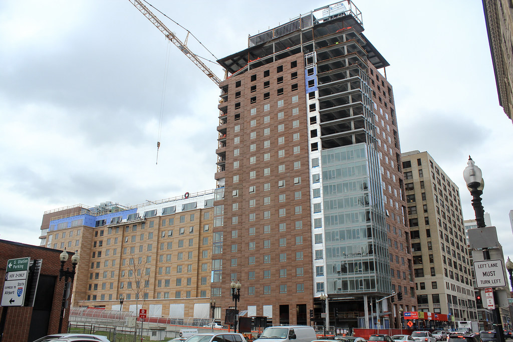
Noticed they were taking down the big yellow crane today!


- Joined
- May 25, 2006
- Messages
- 7,064
- Reaction score
- 1,990
It could be better, for sure, but it could have been much worse (like all the market rate shit down the block!)
Sorry folks ... the texture on this thing really makes me squirm a bit. I know it is subjective but I do not think I am going to get over this one.
cca
Lets vary the texture and darkness of the color so it looks like natural brick.
Should we vary the pattern at all, or just make one and repeat it across the whole building?
We don't have money for that nonsense! just use the same one, nobody will notice.
Last edited:
I have to say I like this one - the tones are what make it but I like the texture and dont mind the obvious repetition. The only I really dont like is the glass part on the corner. That's rather yucky and looks cheap to me.
J
Justin7
Guest
...makes me squirm...
Something about the uniform texture and altered color of the two portions in combination gives a negative visceral reaction. I think either part of the building would be passable on it's own, but together it's hard to look at.
Also, the lack of detail/size/spacing of the windows isn't helping.
cca
Senior Member
- Joined
- Aug 19, 2008
- Messages
- 1,408
- Reaction score
- 12
It is almost 100% a scale issue for me. The proportions of the Terra Cotta panels plus the attempt at varied texture is just sitting wrong for me.
Just to be fair. I have tried this sort of thing in the past on certain projects and found similar results. It happened when there was a proposed material that did exactly what we wanted to do, then the material got Value Destroyed (I mean engineered) and we tried to make another material match the original intent ... MOSTLY because we were not given the proper time to redesign the exterior. So ... it happens that what the client wanted in the first place was too expensive and it was recognized too late in the process to redesign so ... this sort of thing happens.
One again ... I am not putting the blame on any one person (because you cant) ... in our case ... it was all circumstance.
cca
Sorry folks ... the texture on this thing really makes me squirm a bit. I know it is subjective but I do not think I am going to get over this one.
cca
I am right there with you with that sentiment.
stellarfun
Senior Member
- Joined
- Dec 28, 2006
- Messages
- 5,726
- Reaction score
- 1,586


The sampler is on the site for phase 2, but it's ppssibly an artifact from phase 1. Though there is a cornice.
- Joined
- Sep 15, 2010
- Messages
- 8,894
- Reaction score
- 274
I don't mind this facade at all. I actually really like it. The texture helps it pop by giving it some depth and avoid looking flat like a lot of cardboard box facades we've seen go up recently. I also find the scale of the faux-bricks to be really nice. They create their own facade language instead of trying to mimic a traditional masonry facade.