One Greenway (Parcel 24) | 0 Kneeland Street | Chinatown

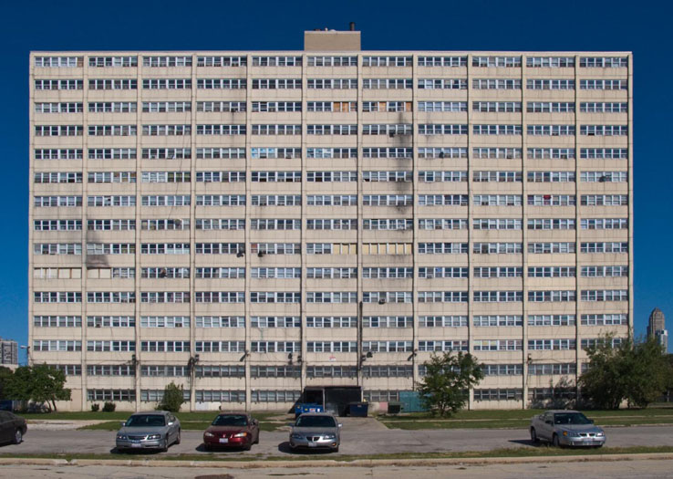
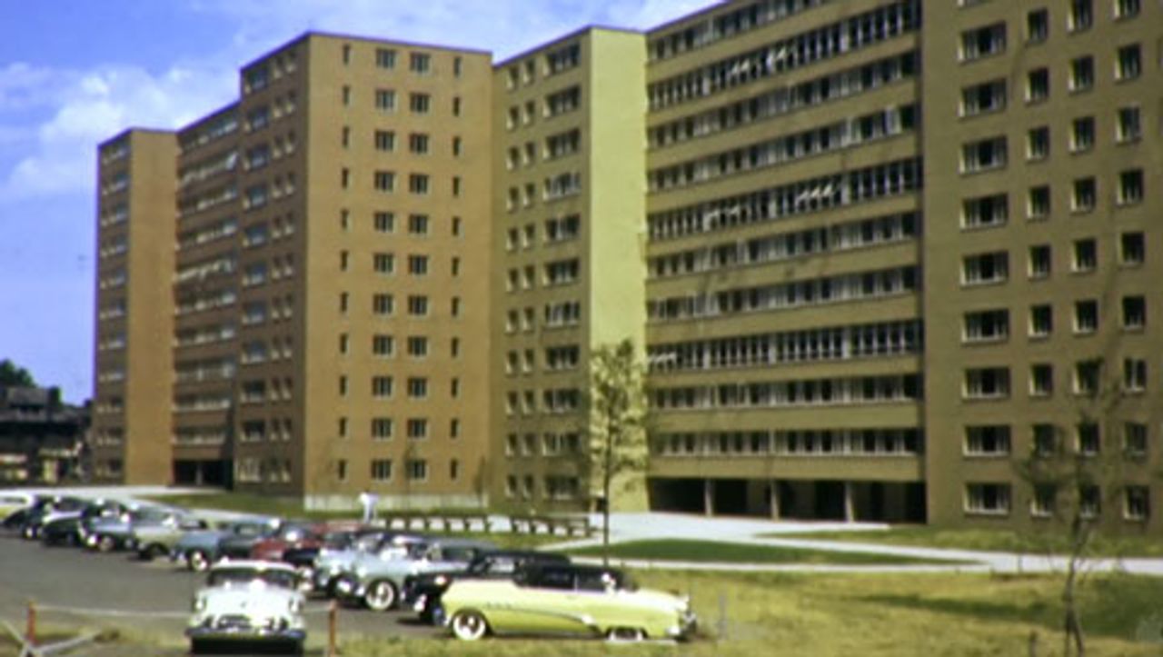
It looks a helluva lot like a 1950's public housing project; Cabrini-Green, etc.
 
The color certainly has that effect, thought the line of BMW's, Mercedes, Mustang GTs and Volvos dropping off residents will counter that.
 
Cabrini Green with balconies

d7ced14ba212f3818b65ee4c7021c887.jpg


The original

PCG_1230burling05.jpg


Cabrini Green NOT.

f01-prui-apts-480.jpg
 
I'll prob get flamed for this, but I really don't hate it. In fact compared to a lot of the Seaport (save 319A) or other shit that has gone up on Lower Washington, I really like it. The colors and textures give it a very Hayden Building/Richardsonian vibe to it. The stepped down rendering was cool, but if built, probably would have become an even bigger wall between Chinatown and South Bay.
 
I drove by it yesterday in a cab, and I like it a lot.
 
I think of it as 315 on A's downmarket cousin. (and yes that's a compliment)
 
In general I do not hate the building, its massing, or its scale. I am a bit upset with the cladding but as we all know that is extremely subjective.

cca
 
What excites me about this building is the way it is rebuilding a destroyed area.
 
Between One Greenway, the Ink Block, the Troy, and even the Macallen, a lot of progress has been made to sew the city back together visually and experientially. Before these building,s the pike onramp and elevated portion of 93 made Kneeland St. feel like the very edge of the city. At least now there is a visual reminder of how close portions of the South End and South Boston are. Even if little has been done to make the pedestrian experience better when traveling between the areas, at least now you feel like it is possible.
 
I think this is a high quality building including the cladding. It's different from the typical 'luxury' glass curtain wall / alucobond highlights or Seaport precast but provides texture, contrast and broken up massing. Still need to wait to see final finished product and the joints might stand out a bit. But I think over time this will be well liked.

I couldn't find any prices but it seems to be less of a luxury place then other recent additions. I will say the windows seem very small.
 
Even if little has been done to make the pedestrian experience better when traveling between the areas, at least now you feel like it is possible.

Indeed.

Those on this board who are nostalgic for grit would likely enjoy a walk down the sidewalk on the albany st viaduct between kneeland and herald sts. after dark...
 
Between One Greenway, the Ink Block, the Troy, and even the Macallen, a lot of progress has been made to sew the city back together visually and experientially. Before these building,s the pike onramp and elevated portion of 93 made Kneeland St. feel like the very edge of the city. At least now there is a visual reminder of how close portions of the South End and South Boston are. Even if little has been done to make the pedestrian experience better when traveling between the areas, at least now you feel like it is possible.
Yes, absolutely. Let's hope projects like these keep on coming.
 
The subtle kick-out at the corner is a nice move. I appreciate a little move that makes a big visual impact.

cca
 
I really wish those windows were bigger, especially on the tower portion of this project. I remember seeing earlier in the thread that even different colored casings would have made a visual difference. The windows, in my opinion, just look so tiny against the entire facade.
 
Walked by this morning... it looks better in photos than it does in person. Fortunately when (if) the lot between the highway ramps next door is ever built we won't see much of it.
 

Back
Top