Home / A&E / Theater/Arts
Filling a gap on Boylston
By Robert Campbell
Globe Correspondent / October 19, 2008
The Mandarin Oriental fills a gap on Boylston Street in the Back Bay with a mix of uses but it's not easy on the eyes.
The original Prudential Center, along Boylston Street in the Back Bay, was so awful that for some years this column named a prize after it. The prize was called the Pru Award and was given to the worst new piece of architecture in Greater Boston.
What made the Pru so bad? There are a lot of ways to put it. But one of them is simply that the Pru had no streets. It was a huge superblock of mostly empty, miserable, windswept plazas, among which a few buildings poked up like cactus plants in the desert. The life of a good city is the life of its streets, and the Pru didn't have any.
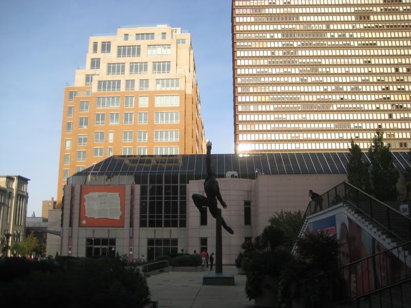
It's in memory of that example of urban design at its worst that I'm inclined to feel kindly toward the new Mandarin Oriental. The Mandarin is a vast new brick-and-limestone complex of retail shops and restaurants, hotel rooms, luxury condos, and rental apartments that now stretches along much of the old Pru site between Exeter and Gloucester streets. As a chunk of urbanism, the Mandarin is a winner. The architecture is less successful, but we'll get to that later.
First the urbanism. The creators of the Mandarin - the large Boston firm of architects that calls itself CBT, working for a development entity that calls itself CWB - clearly understand why streets matter. To generate any life, a good street needs two sides, the way a fire needs to be kindled between two logs. One log doesn't do it, and, usually, neither does a single-sided street. The Mandarin gives Boylston the second side that it's always needed.
It's important to remember that everything suffered from the vacuous Pru complex. When it stood on Boylston's south side, the north side languished too. Cheapo clothing shops and at least one bar showing porn films provided what there was of life. Gradually, over time, the south side began to fill up, with a new shopping arcade and other uses, and the north side responded with steady improvement. But even quite recently, to walk past the Pru was to navigate a series of loading docks, garage ramps, empty spaces, steps to nowhere, and blank concrete walls.
So I'm glad that this rude gap in the city has at last been filled in. And I'm certainly a fan of the way the Mandarin mixes different uses. Condo owners and hotel guests enter by the same door, meeting and mixing with a sense of urbanity. A nearly unbroken row of retail shops and restaurants lines the front sidewalk, as it should. Besides the 50 condos and 148 hotel rooms, there are 35 rental apartments, including 10 at subsidized affordable rates. (Not a generous number, granted.) At least 80 percent of the condos were sold before the Mandarin was even finished, and owners were encouraged to suggest their own design ideas. As a result, no two condos are alike.
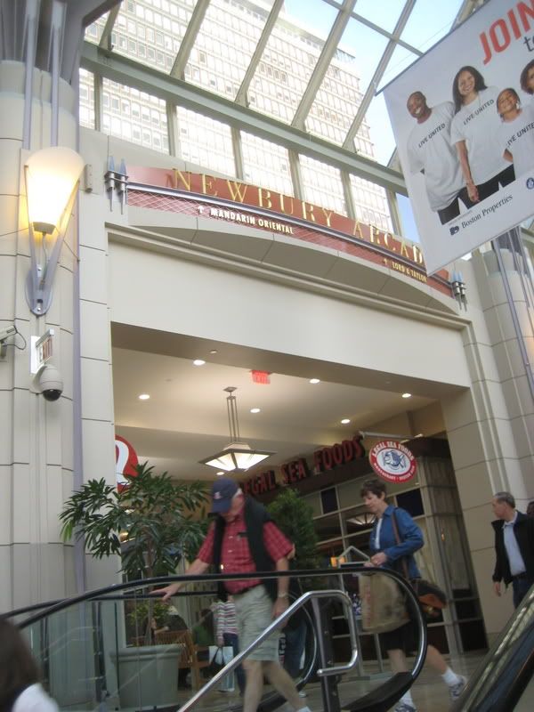
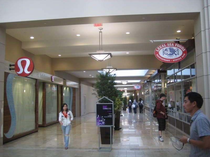
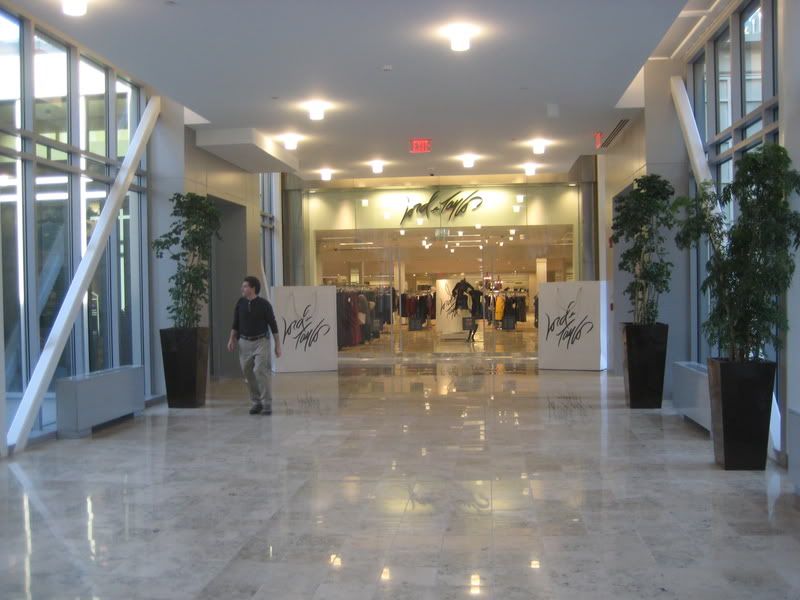
And unlike the buildings of the old Pru, the Mandarin connects to everything around it. An arcade along the rear links up with Lord & Taylor and with the Pru shopping mall. Condo elevators drop directly into the subterranean garage. Food from the Mandarin's several restaurants can be ordered to arrive at your condo via the service elevator. A garden at the Mandarin's rear, sitting atop the parking garage, is a space shared with the original Pru apartments. Sure it's mostly for the filthy rich, but cities need those guys too.
Discuss
COMMENTS (0)
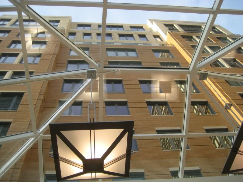
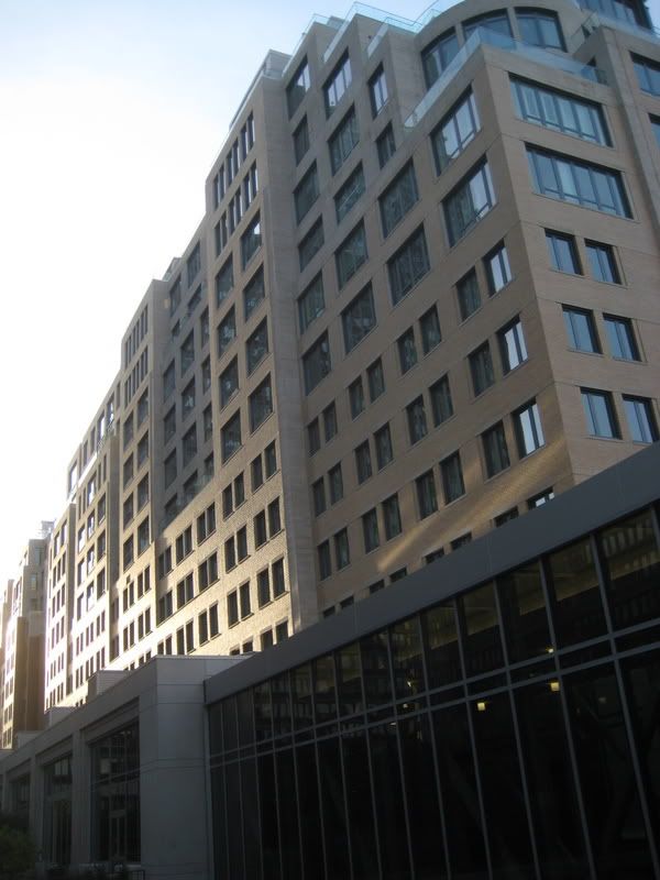
If the designers got so many things right, why couldn't the architecture be better? The Mandarin reads as a huge pale cliff that crowds the sidewalk and looms skyward with a seemingly endless monotony. The materials are not cheap - they're Indiana limestone and pale yellow brick, with accents in a honey-colored stone -but they all share the same bleached-out tonality. The principal architect, CBT partner Alfred Woyciechowski, points out that this architectural cliff isn't, in fact, as flat as it looks at first. The fa?ade pops forward and back, in an attempt at giving the building some of the life it would have if it were, in fact, a row of different buildings instead of just one. But those ins and outs never amount to more than a foot or two, and unless the light is at exactly the right angle, you don't notice them.
Woyciechowski has done what he can, too, to make the fa?ade express the functions behind it. Condo windows look different from hotel windows (they're bigger). Balconies at the penthouse levels terrace back like natural canyon formations. The hotel's second-floor ballroom gets a look of its own, faced in black glass. Brick and limestone trade places. None of this is enough. The Mandarin is just too much of one big single thing for a street and neighborhood that pride themselves on variety and intimacy of scale. It's a stranded white whale on the beach of the Back Bay.
Years ago - in 1942, to be exact - another blockbuster appeared on Boylston. This was the New England Life Insurance Building at the corner of Clarendon, designed by a firm led by a then-famous architect, Ralph Adams Cram. The poet David McCord didn't like the building - he thought it looked like a tomb - and wrote a poem about it in the comic verse form known as a clerihew:
Ralph Adams Cram
One morning said damn,
And designed the Urn Burial
For a concern actuarial.
The old New England is still there, alas, now partly converted to shops. So is the truly gross 500 Boylston Street of 1988 by the late Philip Johnson. When you compare the Mandarin to these, you have to conclude we've learned at least a few things about building cities. The Mandarin compares well, too, with the recent glass-palace InterContinental hotel on Atlantic Avenue. As urbanism the Mandarin is better than any of these, and as architecture it's certainly trying hard.
But you turn with relief from the Mandarin to look across at the sunny side of Boylston, with its mix of buildings new and old, tall and short, in many styles and materials, with many kinds of uses and activities. The architecture becomes a metaphor for the diversity of today's Boston. You can't match that kind of variety in a single gargantuan development.
Things will get better. When all the Mandarin's stores are rented they'll display, I'm told, a largely unregulated variety of signage (just as does the north side of the street). The hope is that the signs will be emblems of individual initiatives springing up against the corporate reality of the building as a whole. And when the sidewalk trees recover and grow - today, they appear to be sick - they will help too.
Maybe someone can persuade the hotel to remove the huge potted plants with which it has chosen to engulf the main Fairfield Street entrance. They look like scary blobs from a sci-fi movie.
Globe architecture critic Robert Campbell can be reached at
camglobe@aol.com.

