You are using an out of date browser. It may not display this or other websites correctly.
You should upgrade or use an alternative browser.
You should upgrade or use an alternative browser.
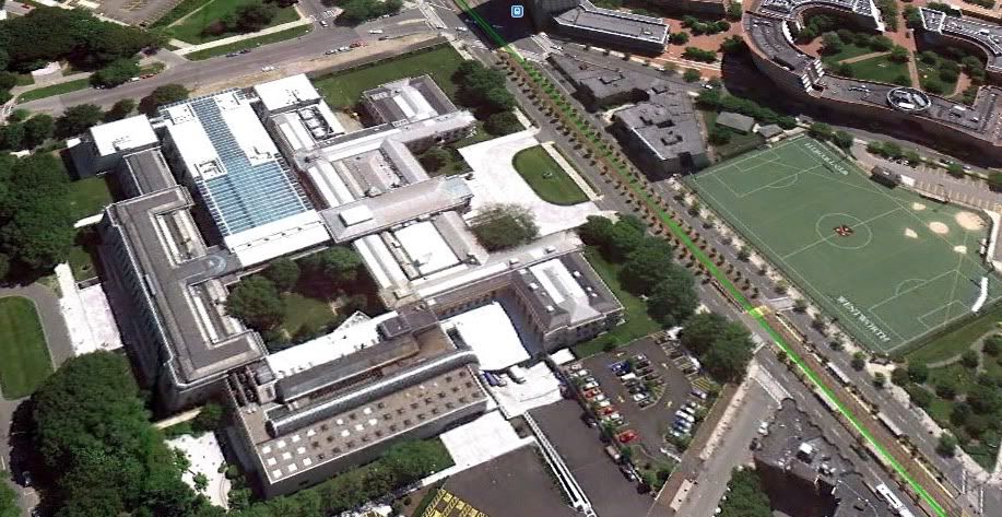
MFA Expansion
- Thread starter briv
- Start date
- Status
- Not open for further replies.
Tombstoner
Active Member
- Joined
- Mar 5, 2010
- Messages
- 707
- Reaction score
- 2
I quite like it. It's not cutting edge or daring or even particularly interesting, but it is elegant and understated, and it doesn't look cheap.
inspirationally underfunded.it doesn't look cheap.
gooseberry
Active Member
- Joined
- Nov 24, 2009
- Messages
- 550
- Reaction score
- 3
I barely notice the new addition is there, which is a good thing. Just keep it simple and let the focus stay on the original building and the decapitated baby head.
I barely notice the new addition is there, which is a good thing. Just keep it simple and let the focus stay on the original building and the decapitated baby head.
You havent experienced Boston until youve had a picture with the babies!
Boston02124
Senior Member
- Joined
- Sep 6, 2007
- Messages
- 6,893
- Reaction score
- 6,639
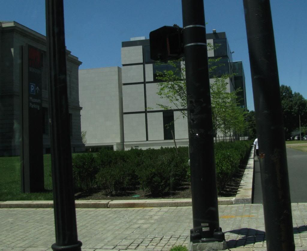
drive-by

Meadowhawk
Active Member
- Joined
- Jun 16, 2007
- Messages
- 265
- Reaction score
- 0
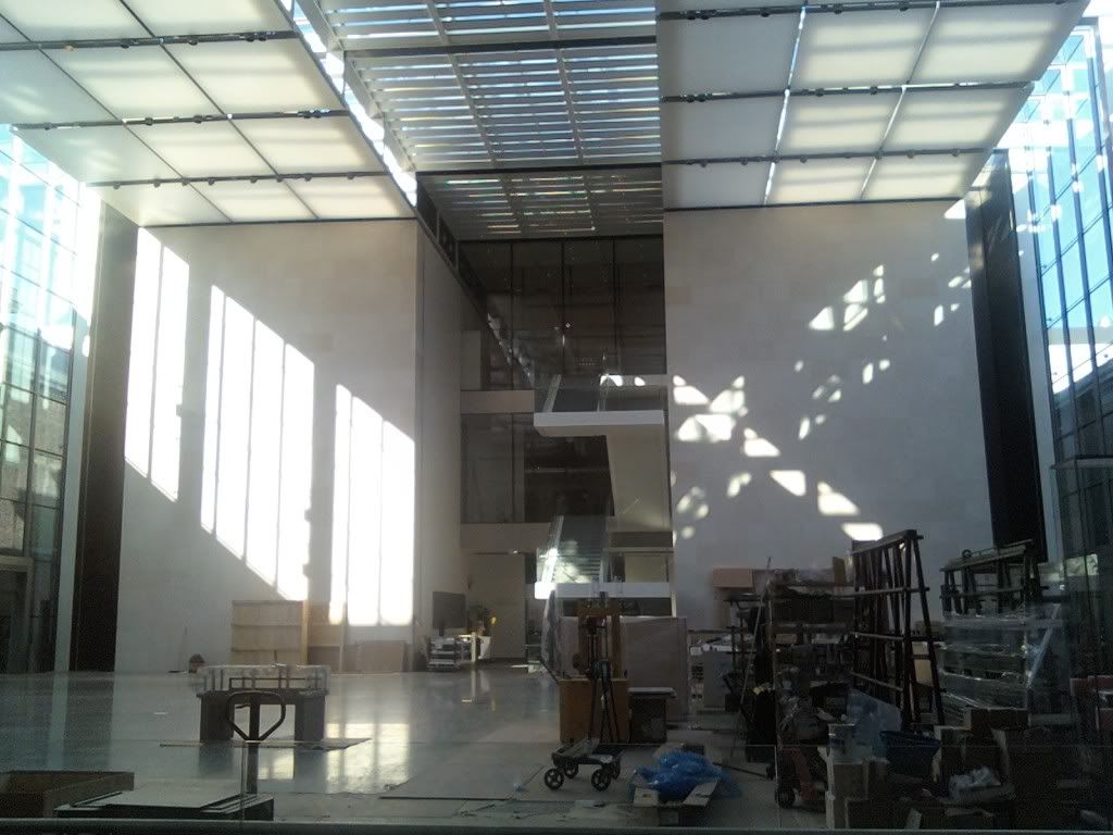
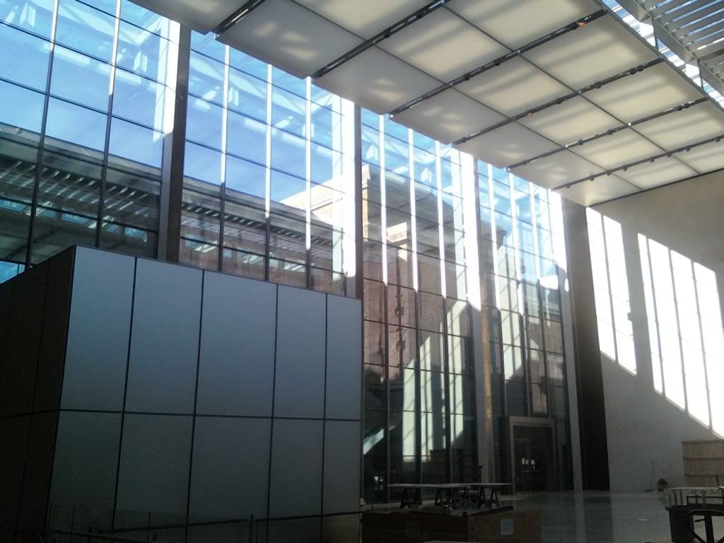
Thanks Boston 02124, interesting angle, I like it as it shows there is space to exhibit outdoor sculpture. I very much like the new addition. Granted it is not ground-breaking, but it impresses me as architecture which, as we know, is meant to protect its valuable collections. I think it succeeds. Bank vault-like, but not forbidding. The central glass atrium section is progressing quite well and I found it to be stunning in its simplicity, and very elegant. As a member of the MFA I am looking forward to the opening of this new wing.
Tombstoner
Active Member
- Joined
- Mar 5, 2010
- Messages
- 707
- Reaction score
- 2
Thanks Boston 02124, interesting angle, I like it as it shows there is space to exhibit outdoor sculpture. I very much like the new addition. Granted it is not ground-breaking, but it impresses me as architecture which, as we know, is meant to protect its valuable collections. I think it succeeds. Bank vault-like, but not forbidding. The central glass atrium section is progressing quite well and I found it to be stunning in its simplicity, and very elegant. As a member of the MFA I am looking forward to the opening of this new wing.
Exactly.
Tombstoner
Active Member
- Joined
- Mar 5, 2010
- Messages
- 707
- Reaction score
- 2
They turned on the exterior lighting tonight for the first time...I hope this is a trial run just to see how high they can crank up the wattage in case the MFA has to guide radarless airplanes through the fog. Really awful. The rest of the museum is so beautifully and subtly uplit--this looks like Fenway Park Part Deux.
Tombstoner
Active Member
- Joined
- Mar 5, 2010
- Messages
- 707
- Reaction score
- 2
I actually like the wing (and like it more the more I see it)...I just think the lighting is really inappropriate and harsh. Seriously, maybe this is just a testing phase; I can't believe that's something they paid a lighting designer to come up with. Very parking-lot-esque.
Boston02124
Senior Member
- Joined
- Sep 6, 2007
- Messages
- 6,893
- Reaction score
- 6,639
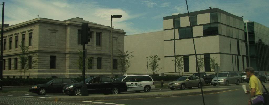
today another drive by

- Joined
- May 25, 2006
- Messages
- 7,033
- Reaction score
- 1,865
I don't really see why there is any hate for this (unless it is just hate of all things modern). The addition is nicely scaled and is way more contextual than the I.M. Pei addition. If anything it is too tame. But it's not like this side of the building is particularly important. The best part of the addition is reopening up the Fenway entrance. And of course we should save criticism until it is open.
Meadowhawk
Active Member
- Joined
- Jun 16, 2007
- Messages
- 265
- Reaction score
- 0
^ Does anyone know what that big box-like structure is?
AmericanFolkLegend
Senior Member
- Joined
- Jun 29, 2009
- Messages
- 2,214
- Reaction score
- 248
Is the stone going to fade to the same color as the old facade?
Not sure - that was the plan with the BPL addition and it still doesn't really match.
^ Does anyone know what that big box-like structure is?
Misplaced Silver Line headhouse. Or an attempt to fill the Alucobond quota necessary for BRA approval.
- Status
- Not open for further replies.

