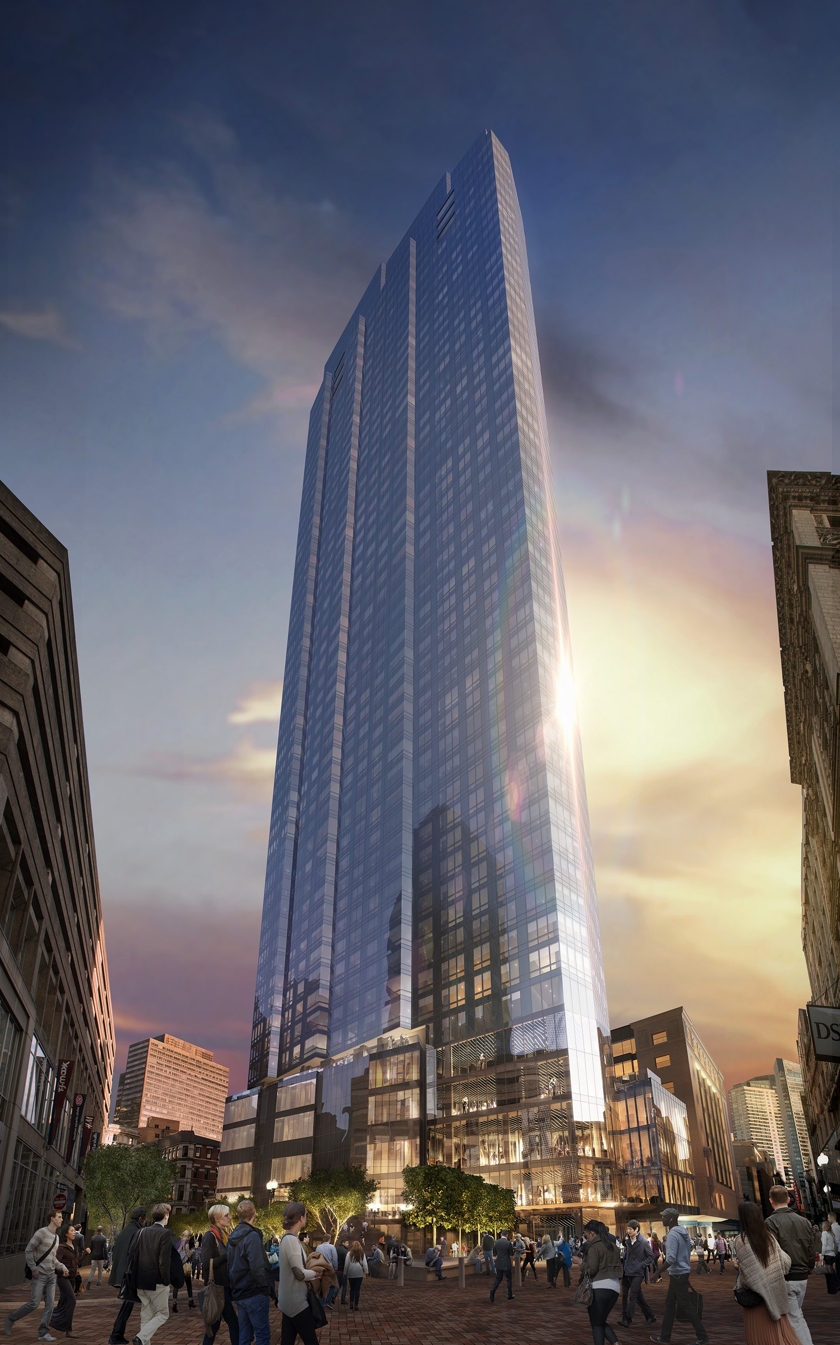
Millennium Tower (Filene's) | 426 Washington Street | Downtown

Status
Not open for further replies.
Re: Millennium Tower - Filene's

Quote:
Originally Posted by bostoneophyte
This might be a naive question, but is there anything that holds a developer accountable to the design that is accepted? What prevents them from presenting an architectural gem and then VEing it into an eyesore? Shouldn't developers be held accountable?

Nope. The only things that require a NPC to be filed are program, height, and massing changes.

Not true. The standard is broader, albeit more ambiguous, than that. Section 80A-6 of the Boston Zoning Code requires an NPC whenever there is "any material change in a Proposed Project" that is subject to Article 80 review. In addition, the plans for a project are subject to design review by the BRA as part of the process. Before a building permit is issued, the BRA must certify to the Inspectional Services Department that the plans filed with ISD are consistent with the approved project, including the plans approved during the design review process. Accordingly a developer is accountable to the design approved by the BRA. Projects are, of course, often, VEed, but VEing the design must be approved as part of the design review process.
 
Re: Millennium Tower - Filene's

anyone able to clear up which design is current? (aka should we be excited or annoyed at one of these designs if it's not even the one they're going with?)
 
Re: Millennium Tower - Filene's

^ The roof angle makes this whole project "quite disappointing" to you?

I don't know where you're getting that I said I was suddenly disappointed with the whole project because of the roof angle. I do feel that with the impact this building will have on the skyline that it not contribute another simply flat roof out of design convenience or negligible cost savings. I believe wind mitigation through design of the roof was also being considered as mentioned at past public meetings.

anyone able to clear up which design is current? (aka should we be excited or annoyed at one of these designs if it's not even the one they're going with?)

Yes, before we get carried away, do we have definitive information on which is the designed spec for the building at this time?
 
Re: Millennium Tower - Filene's

I think the "ridged" design (not seen in the video) is the final one. That design was the one shown in the approval meeting last year, and, IIRC, is also the one shown in the PNF. In particular, I remember a diagram of the tower's footprint, which featured the obvious ridges.

I can't access the PNF right now, but once I can I'll pull the diagram that describes what I'm talking about. Either way, I'm relatively sure the design seen in the video is old.
 
Re: Millennium Tower - Filene's

StickNMove posted the final renderings. The version from the video is older.

IMO this design is the far superior one.

a1e654d205a368cf8a826935158fbf5b.jpg


boston_millennium-tower-boston_1.jpg


boston-condos-millennium-tower.jpg
 
Re: Millennium Tower - Filene's

Lot of glass in that rendering, and it is rendered so "seamlessly".
Hopefully Millennium continues it's recent string of using high quality materials, particularly the good glass they been using.
 
Re: Millennium Tower - Filene's

I like the final better than the video version except for that video board that woulda been cool
 
Re: Millennium Tower - Filene's

^I was actually coming back here to post that same exact thing. That would be awesome to have that curved screen.

I suppose it's something they could always add in the future.
 
Re: Millennium Tower - Filene's

I love everything about it except the glass wall on the Burnham. It's wayyyy too light for such a heavy masonry building. For the amount that is going to be exposed I don't understand why they can't just replicate the other three facades.

The video screen was kind of cool, but I'll take good design over some tacky add on any day. Besides, as was already said it can always be added later. Perhaps behind some of that glass.
 
Re: Millennium Tower - Filene's

Exactly what the F are those people sitting in the stands in image 2 supposed to be looking at? The Payless across the street?
 
Re: Millennium Tower - Filene's

I love everything about it except the glass wall on the Burnham. It's wayyyy too light for such a heavy masonry building. For the amount that is going to be exposed I don't understand why they can't just replicate the other three facades.

The architect from Handel specifically said that the glass facade on the Burnham building is a response to the all-glass tower. It helps in the transition from old to new. I really like it for that reason. We've all loved seeing that side of the building exposed and lit for all the years that the project was stalled. This treatment of the 4th facade is pretty much the building revealing its section to the public. Quite beautiful. It also has a practical use for maximum daylighting too.
 
Re: Millennium Tower - Filene's

The architect from Handel specifically said that the glass facade on the Burnham building is a response to the all-glass tower. It helps in the transition from old to new. I really like it for that reason. We've all loved seeing that side of the building exposed and lit for all the years that the project was stalled. This treatment of the 4th facade is pretty much the building revealing its section to the public. Quite beautiful. It also has a practical use for maximum daylighting too.

Aren't these essentially two distinct buildings with an interior connection? Why does there need to be a transition between the two? It lessens the contrast between them, thereby cheapening what could have been a dramatic interaction between both. If every building that got an addition or new neighbor was modified to transition into the other we would have a pretty boring, homogeneous city. As I already said, it also profoundly lessons the perceived heft of the Brunham building by showcasing just how flimsy the structure holding up that burly facade really is.

There is no transition between the two wings of the BPL, or the additions to the State House. In both cases, they are distinct architectural styles that highlight each other by showcasing their differences. Imagine if they had bricked up the unused entrance and windows on the McKim building with that light colored sandstone of the Johnson building. Or if Brigham had replaced the federalist porch with a roman colonnade and stuccoed over Bulfinch's brick on the statehouse to ease the transition between the two halves.

If you notice, only the top floor between the primary and secondary cornice is all masonry, with the exception of the base (which is getting covered up anyway), the other floors are cast iron infill. A modern interpretation of that would have been far more respectful to the vocabulary of the original facade, especially not having the cornice just END. Even the shitty Hawley Street facade continues the general lines and window patterns of the primary sides of the building. Now it looks exactly like what it is, a building that had its back blown off and then covered up. A better solution could have been to have the base extend up the full height of the Burnham, covering up the wound completely. If there would be a place for a transition from new to old, this small protrusion would be it. Just as was done on the state house with the carrageway, or the small recessed section between the two halves of the BPL.
 
Re: Millennium Tower - Filene's

I am blown away how people can complain about this absolute gem that we are about to get built in Boston after all of these years of being let down and in all reality only having one true icon tower the John Hancock. Our street level is on a different level, but lets be honest our skyline is almost all filler with a couple stand outs. Can you imagine if things like these were proposed and built today how much outrage there would be.

One Post Office Square=40 story waterside place.
pict7199.jpg


Keystone Building= anything built in downtown Tampa
1211_13_55_web.jpg


We are about to upgrade from North Korean filler to gems like the Filenes Tower, Copley Tower, South Station Tower, Christian Science Tower. I am extremely thankful that we are actually getting what we have deserved all this time because Boston is a world renowned city and the skyline gets blown out of the water by nobodys all day every day and thats unacceptable.
 
Re: Millennium Tower - Filene's

I am blown away how people can complain about this absolute gem that we are about to get built in Boston after all of these years of being let down and in all reality only having one true icon tower the John Hancock. Our street level is on a different level, but lets be honest our skyline is almost all filler with a couple stand outs. Can you imagine if things like these were proposed and built today how much outrage there would be.

I wouldn't say we're complaining so much as scrutinizing a very permanent and prominent part of the skyline. I don't think this forum would exist if none of us really cared about what it looked like.

I'd like to argue that architects are getting lazy with the glass-clad Ronzoni boxes, prisms, and extruded triangles with rounded edges that they're building today. While they're shiny and pretty, they're every bit as contemporary 'filler architecture' as your examples. On the world stage, they don't really set design precedent or differentiate themselves from any of the more interesting designs being built even across Manhattan down the coast.

Going a bit more meta, I'm happy to see architects and engineers save money in construction costs if it keeps their bottom line low AND they pass that on to the rents/prices of the units within, but that's simply not happening for many reasons. If they're still going to charge prices that only foreign investors can afford (and subsequently leave their units vacant for most of the year, effectively reducing the number of actual new residents), I'd rather see them design buildings that aren't just modern, but also inspirational, radical, and respectful of the pedestrian realm/street wall. Height and glass alone aren't enough.

That said, I'm happy if Millennium Tower is the beginning, not the end of a growing skyline for Boston. The ceiling for the downtown zone is 1000ft and development is booming. I'd like to see Millennium Tower and its peers act as transitional pieces in an increasingly radical skyline. Many of its low-to mid-rise contemporaries are showing an increasingly monotonous conservative modernity.
 
Re: Millennium Tower - Filene's

Aren't these essentially two distinct buildings with an interior connection? Why does there need to be a transition between the two? It lessens the contrast between them, thereby cheapening what could have been a dramatic interaction between both. If every building that got an addition or new neighbor was modified to transition into the other we would have a pretty boring, homogeneous city. As I already said, it also profoundly lessons the perceived heft of the Brunham building by showcasing just how flimsy the structure holding up that burly facade really is.

There is no transition between the two wings of the BPL, or the additions to the State House. In both cases, they are distinct architectural styles that highlight each other by showcasing their differences. Imagine if they had bricked up the unused entrance and windows on the McKim building with that light colored sandstone of the Johnson building. Or if Brigham had replaced the federalist porch with a roman colonnade and stuccoed over Bulfinch's brick on the statehouse to ease the transition between the two halves.

If you notice, only the top floor between the primary and secondary cornice is all masonry, with the exception of the base (which is getting covered up anyway), the other floors are cast iron infill. A modern interpretation of that would have been far more respectful to the vocabulary of the original facade, especially not having the cornice just END. Even the shitty Hawley Street facade continues the general lines and window patterns of the primary sides of the building. Now it looks exactly like what it is, a building that had its back blown off and then covered up. A better solution could have been to have the base extend up the full height of the Burnham, covering up the wound completely. If there would be a place for a transition from new to old, this small protrusion would be it. Just as was done on the state house with the carrageway, or the small recessed section between the two halves of the BPL.
I guess the differences in our education are showing, mine being arch and yours, HP. You really won't even be able to see much of that facade from the street, only from very far away, due to the podium. The Burnham building is being repurposed for open-office space. The floorplates are deep and because that facade faces NE, it would never get any direct sunlight anyway. Replicating the original facade on that side of the building would result in very dark office space all day long.
 
Re: Millennium Tower - Filene's

Exactly what the F are those people sitting in the stands in image 2 supposed to be looking at? The Payless across the street?

They're watching the demolition of those buildings making way for 1 bromfield
 
Re: Millennium Tower - Filene's

They're watching the demolition of those buildings making way for 1 bromfield

Ugh.

However, I do wonder how much longer these downmarket stores are going to last after these million dollar condos start filling up.
 
Re: Millennium Tower - Filene's

I guess the differences in our education are showing, mine being arch and yours, HP.

Oh yeah, but that's half the fun isn't it? I enjoy arguing modern arch theory vs HP/vernacular construction to keep me on my toes, and I believe its an important conversation to be had for both sides. Otherwise you have the "cult of modernism" on one side, and stodgy museum curators arguing against installing things like central air on the other, which is good for no one.

SnM, I'm hardly complaining. The tower itself is fantastic and will be a great addition to the skyline, and even moreso to DTX. Especially this sleek iteration vs the kawaii multi-colored base shown in the video. The treatment of the Burnham is one of the only criticisms I have, and even so it is a very minor (and fixable) one at that. The only other qualm I have are the ripoff Times Square bleachers. A one story retail pavilion, like what Sameuls is doing at the Landmark Center, would be much more useful for the area. There could also be the opportunity for seating on top of it. Also fixable in the future, but harder since once the project opens it will be "public space" and much harder to argue for a building there. I'm assuming the T egress is in the rear of those bleachers? Or are they moving it into the tower?
 
Re: Millennium Tower - Filene's

I'm assuming the T egress is in the rear of those bleachers? Or are they moving it into the tower?

The bleachers/TKTS-ripoff is the new headhouse. The elevator will continue to stand alone off to the side.
 
Re: Millennium Tower - Filene's

That is spectacular

If built to that design it could be one of the best modern buildings in Boston

If there are any issues:

1) connection to the Burnham and the repair of the back of the Burnham
2) Roof design is sort of ignoreable -- needs a peak, spire, or something such as dramatic lighting
 
Status
Not open for further replies.

Back
Top