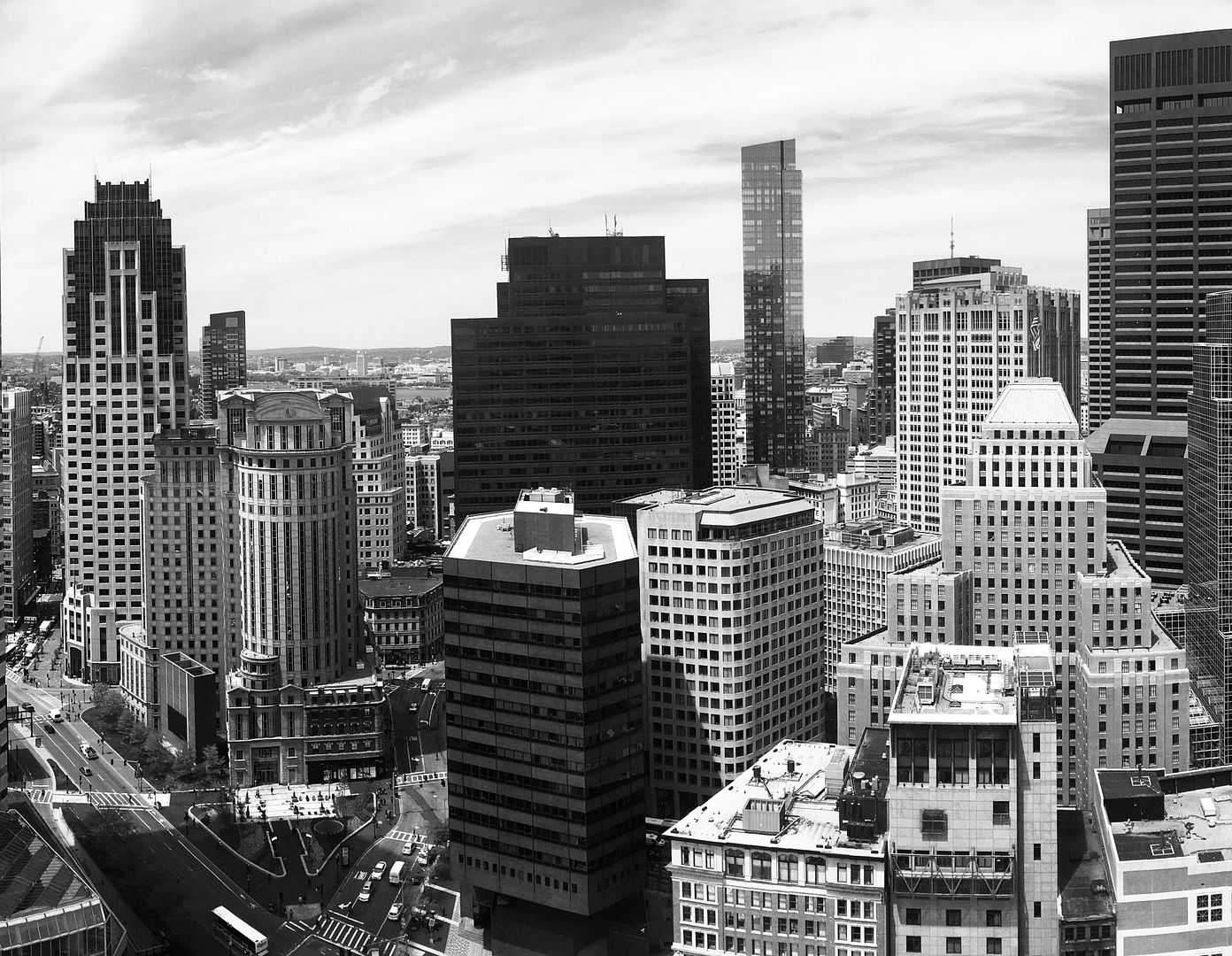
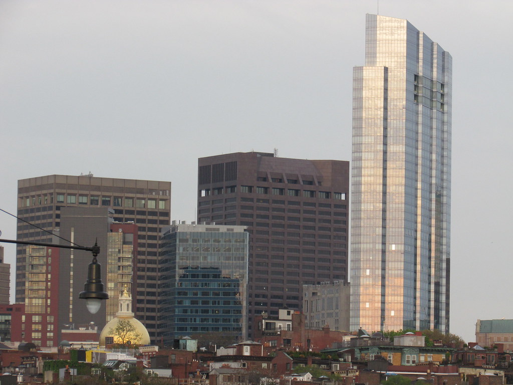
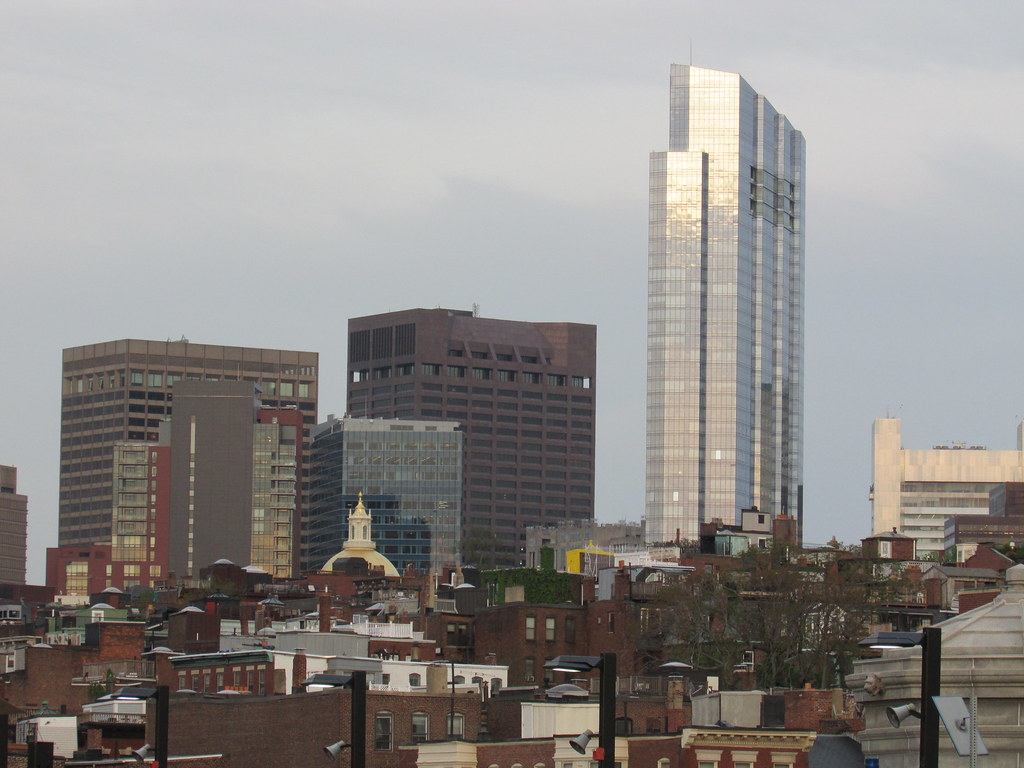
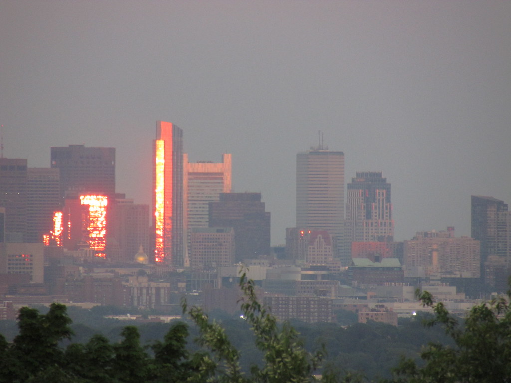
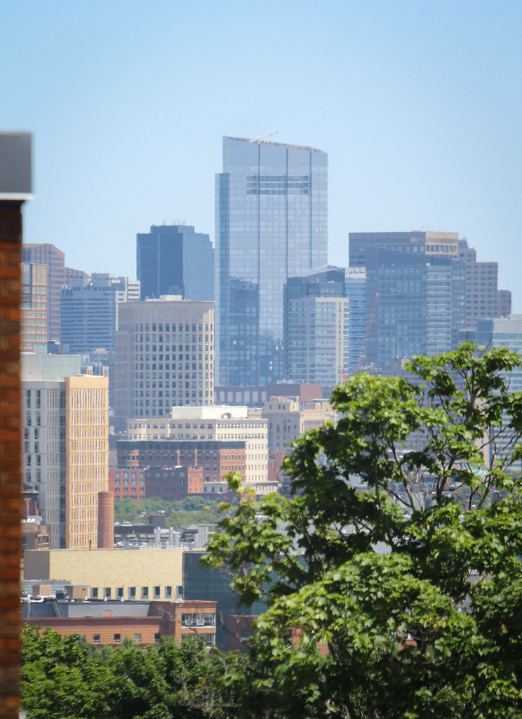
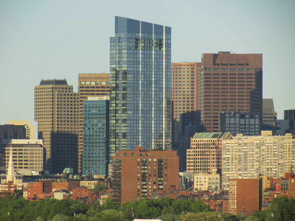
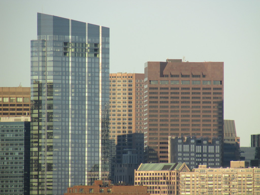
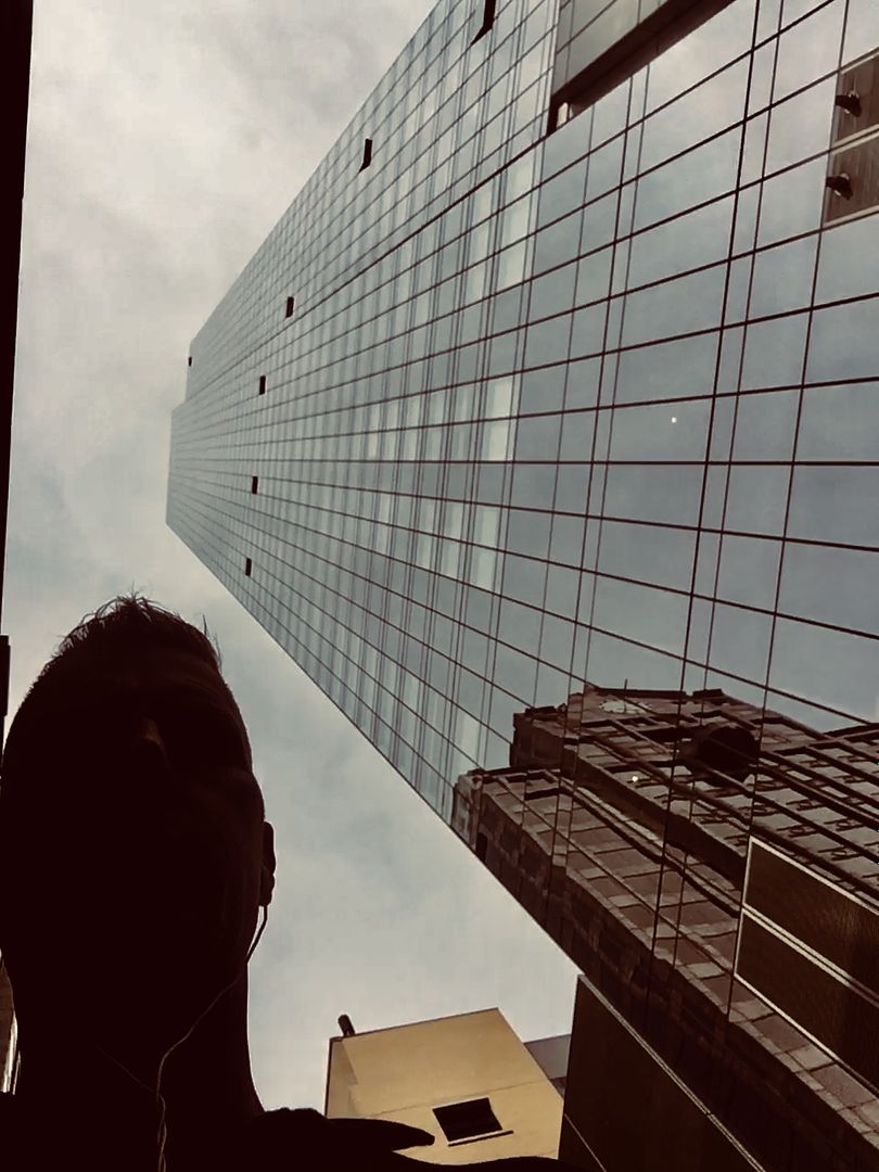
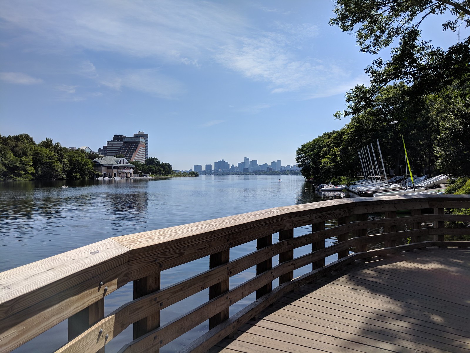
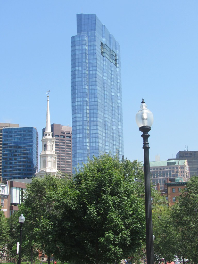
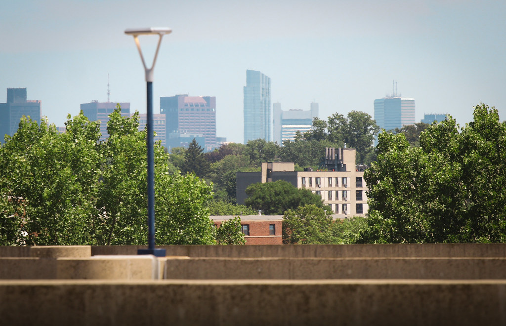
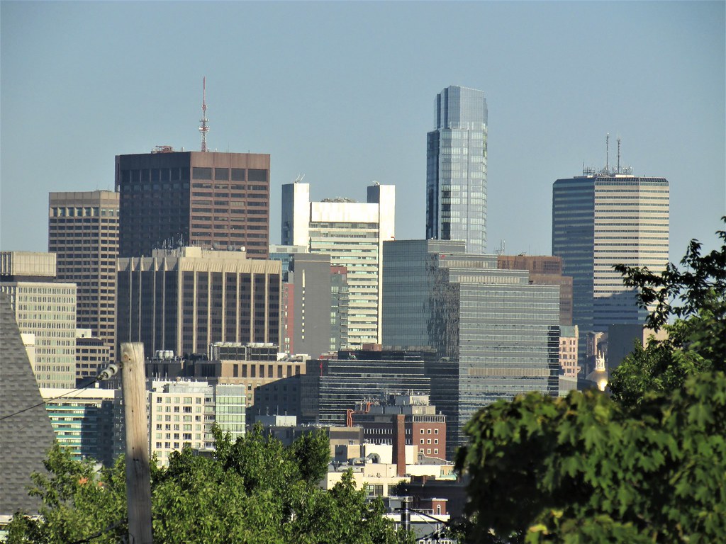
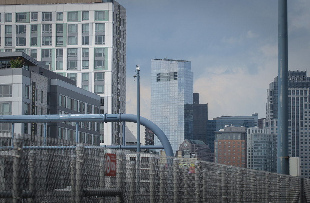
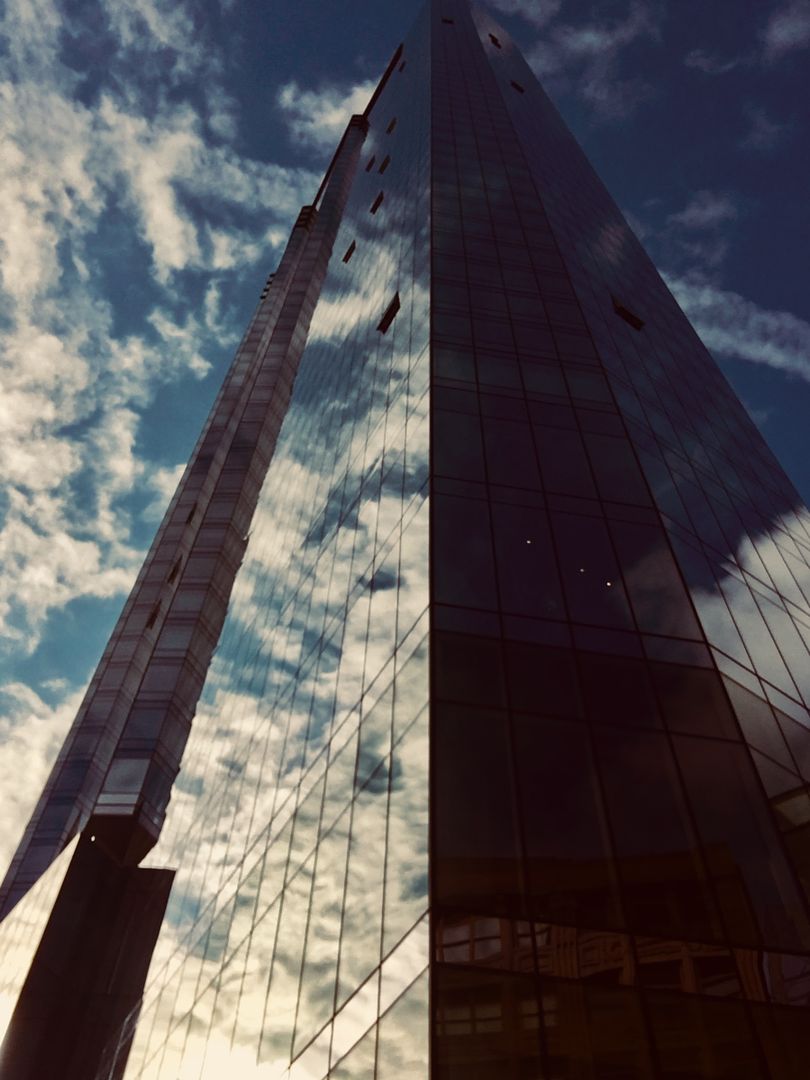
Great shot from the Fed! Bringing it to the new page. The view of MT from here isn't going to last much longer.
You are using an out of date browser. It may not display this or other websites correctly.
You should upgrade or use an alternative browser.
You should upgrade or use an alternative browser.
Millennium Tower (Filene's) -Discussion and Photo Thread
- Thread starter Boston02124
- Start date
stick n move
Superstar
- Joined
- Oct 14, 2009
- Messages
- 12,139
- Reaction score
- 19,055
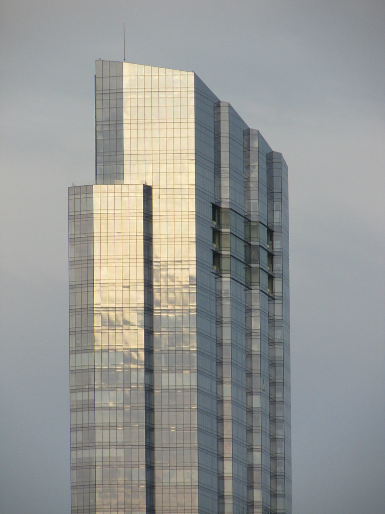
The word “dynamic” always comes to mind with this glass.
stick n move
Superstar
- Joined
- Oct 14, 2009
- Messages
- 12,139
- Reaction score
- 19,055
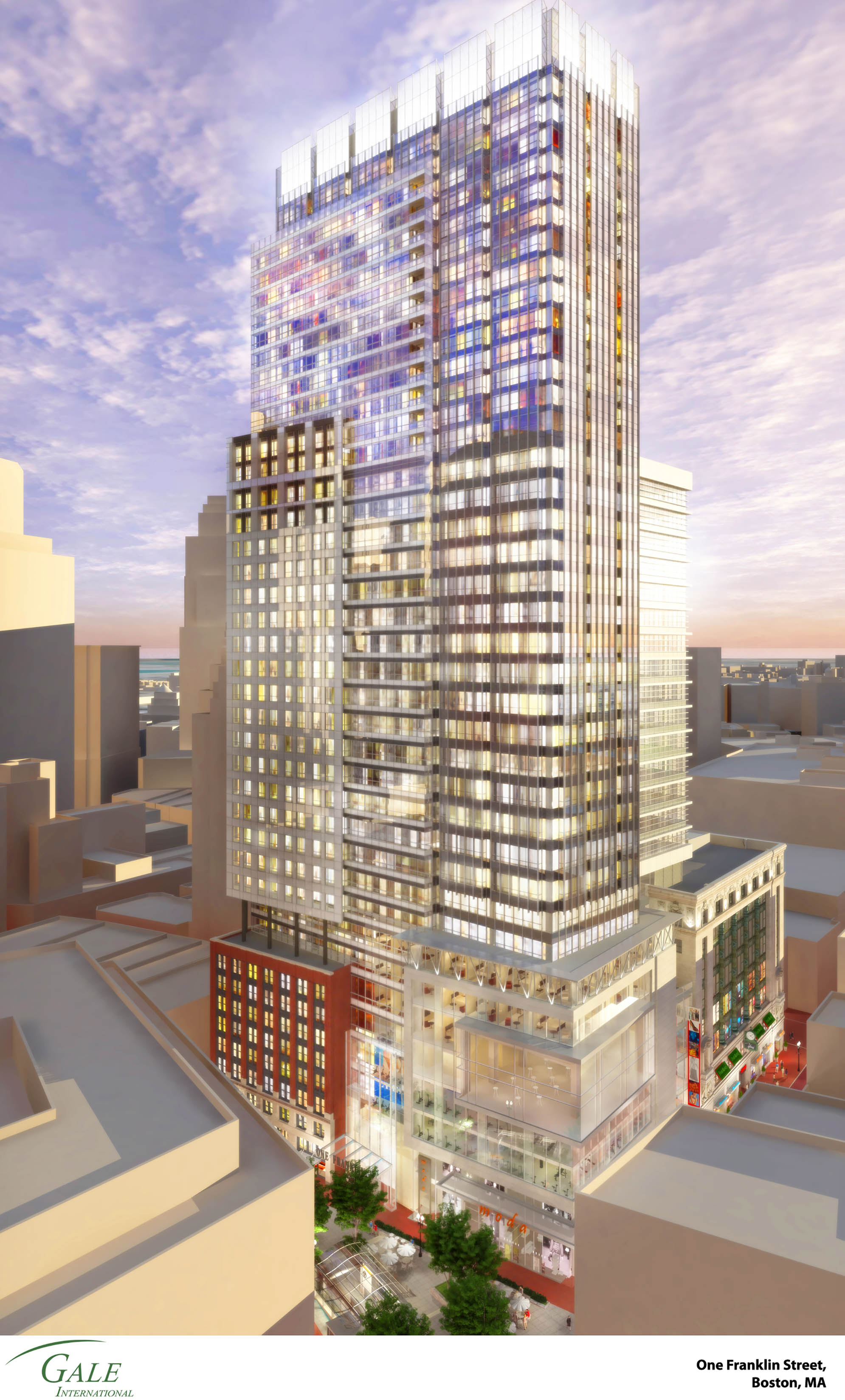
Detailed render of old proposal. You can zoom in a lot and get a real good idea of the detail of the project. Looks like the crown was lit white which was a win, hidden full length balconies, the Burnham building is integrated into the base level. Also looks to have a huge amount of retail and I can see a 2 story gym on like the 5th and 6th floors and what looks to be a massive restaurant above that. No car caul-de-sac out front, but no stair T head house either, just a glass canopy. It has cut outs running the length of the facade giving it depth that looks good. I think the Filenes building in this render is not as good at ground level as it came out in real life.
Please don't delete this its right at the upper limit of whats considered acceptable and its a high quality render of a piece of history on the site. Its wide but not tall so the 3k sounds worse than it is seeing its not 3k on both sides its only 1990 pixels tall so the rectangular shape makes it not ridiculous but sound bad if you only look at the 3k wide which when you expand it isn't bad and is pretty much perfect.
Please don't delete this its right at the upper limit of whats considered acceptable and its a high quality render of a piece of history on the site. Its wide but not tall so the 3k sounds worse than it is seeing its not 3k on both sides its only 1990 pixels tall so the rectangular shape makes it not ridiculous but sound bad if you only look at the 3k wide which when you expand it isn't bad and is pretty much perfect.

odurandina
Senior Member
- Joined
- Dec 1, 2015
- Messages
- 5,328
- Reaction score
- 265
That render narrowed a bit would be perfect tower rising at Landmark Ctr,
w/ the lower building nicely-preserved.
w/ the lower building nicely-preserved.
- Joined
- Sep 15, 2010
- Messages
- 8,894
- Reaction score
- 271
The crown jewel in a sea of blah.
Boston02124
Senior Member
- Joined
- Sep 6, 2007
- Messages
- 6,893
- Reaction score
- 6,639
stevebikes
Active Member
- Joined
- May 14, 2013
- Messages
- 277
- Reaction score
- 103
- Joined
- Jan 7, 2012
- Messages
- 14,072
- Reaction score
- 22,813
hmmm... I see no MT in this pic
Fixed thanks.
Boston02124
Senior Member
- Joined
- Sep 6, 2007
- Messages
- 6,893
- Reaction score
- 6,639
JeffDowntown
Senior Member
- Joined
- May 28, 2007
- Messages
- 4,798
- Reaction score
- 3,666
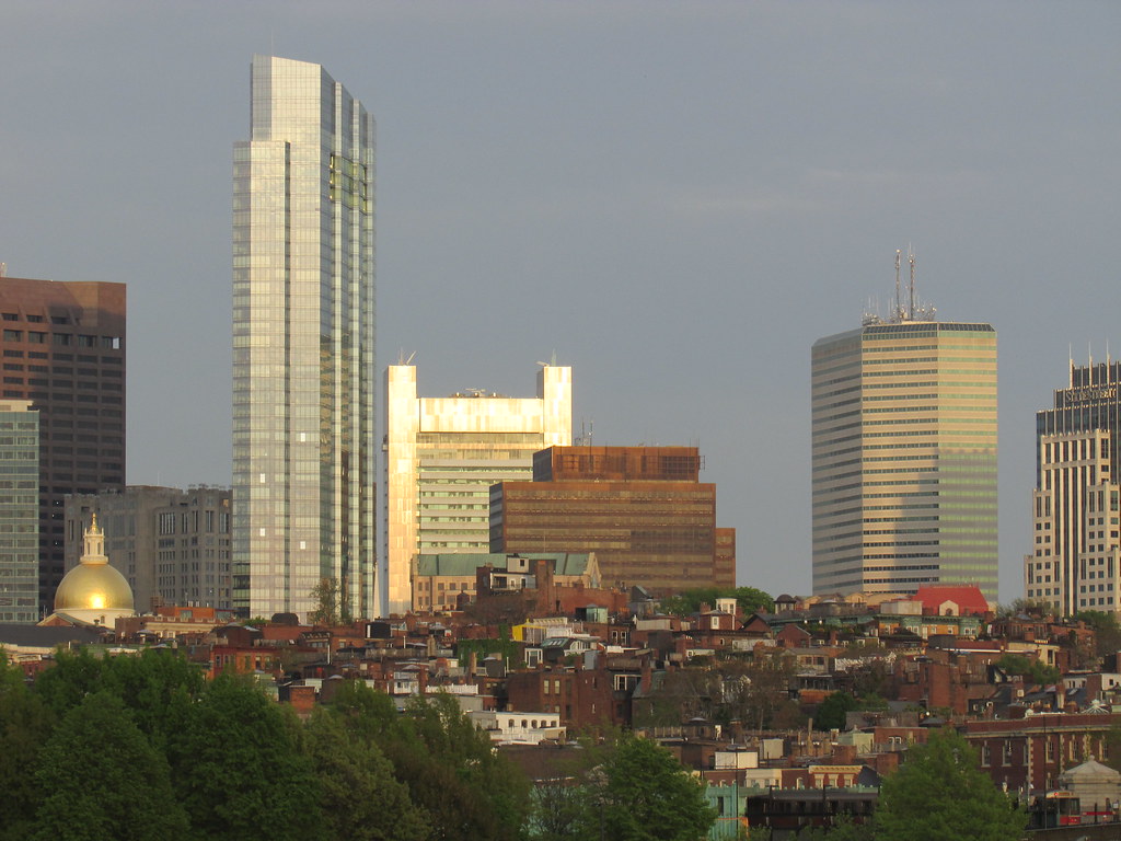
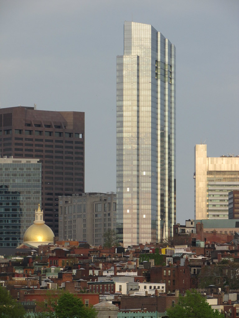
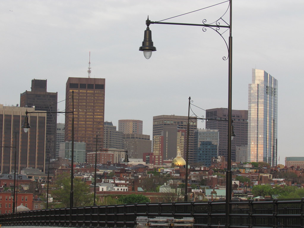
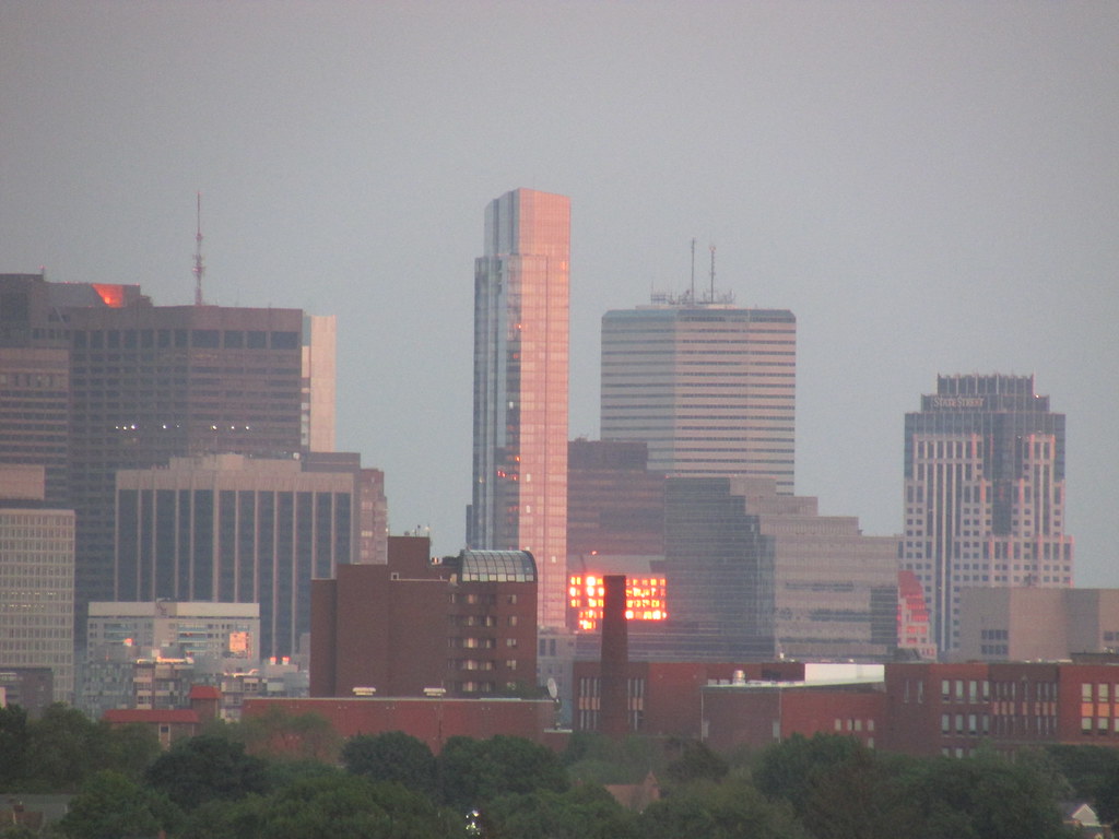
Recent fall sunset lighting Millenium Tower images:


