MIT East Campus - Kendall Square Gateway | Cambridge

So far, it's looking very promising from across the river. Yes, it is dark, but it's handsome and the portion of wavy window lines that's visible at this point doesn't look jarring. I'm hopeful about this one.

Wish the tower next to it was taller, though...
 
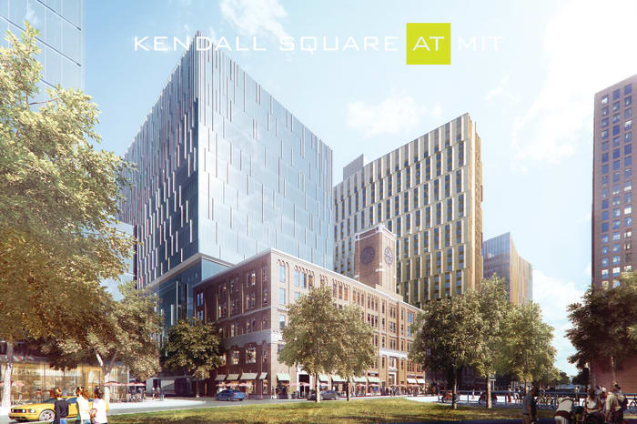
It seems to me a couple of new renders have been posted pertaining to yet-to-rise Building 3...this is the one that will sit behind the clocktower bldg at 238 Main.

For reminders:
rfmogal90pjlbjqivb3u


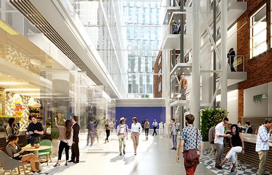
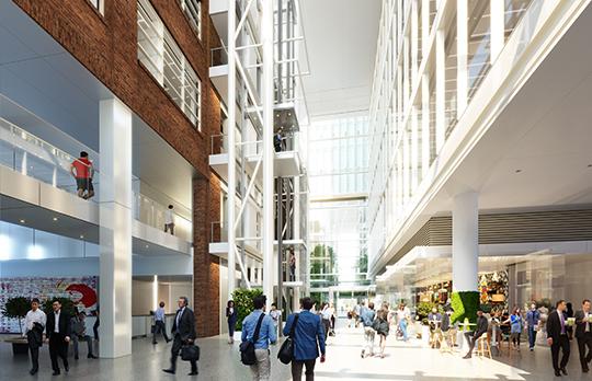
Now capital proj's page has posted these shots showing integration of old and new structures w/ exposed brick, etc.

MIT_VI_Interior_ID_02_R02%20crop.jpg


MIT_VI_Interior_ID_01_R03%20crop.jpg


The Site 3 (238 Main Street) project will combine new and existing structures, reflecting both the history of Kendall Square and its future of innovation.

A mixed-use building, Site 3 will incorporate the existing structure at 238 Main Street (known as the Kendall Building) with a 12-story addition providing new commercial laboratory and office spaces. At the main entrance, a front-to-back five-story atrium will bring natural light inside the structure and will connect the lower masses of the existing building and the new addition. The building’s ground floor will offer new retail opportunities on Main Street, Hayward Street, Wadsworth Street, and along its southern side, expanding on existing retail activity in this area. The design will allow for maximum visual transparency between the sidewalk and retail spaces and will optimize pedestrian flow in and out of the building.
https://capitalprojects.mit.edu/projects/kendall-square-site-3
 
^ This is going to be a Roche Brothers, right?
 
i think this looks great? what don't you like about it?

or do you only support "tall" buildings and complain about all others?
 
Yea this is great. Good massing, quality facade, great base with reuse of existing structures. When you look over at Cambridge now it actually has a cluster forming a core finally.


This is an old picture but shows how dramatic of a change the Cambridge skyline is going through. Theres a defined core now than this old picture. The buildings are much taller now too. There used to be short buildings scattered along the Charles, now theres a defined area for the “downtown”. This tower is going to be the peak and theres quite a few more going up that will add to the cluster.
 
Do you know where this photo of Cambridge was taken from?
 
Nice-looking bit of abstract minimalist sculpture but how is that roof going to handle the occasional dead weight of a foot-and-a-half of wet, heavy snow. Seems a bit under-engineered.

Snow would press straight down roughly uniformly, so I don't think it's a concern.

I'm more concerned that the snow will fall off the sides onto pedestrians during winter, and that we'll have to put up ugly scaffolding.
 
Nice-looking bit of abstract minimalist sculpture but how is that roof going to handle the occasional dead weight of a foot-and-a-half of wet, heavy snow. Seems a bit under-engineered.

Just a few degrees of pitch will solve any snow accumulation.

I like it a lot.
 
Just a few degrees of pitch will solve any snow accumulation.

I like it a lot.

And steel is strong last time I checked.

I like it also.

My ever so slight criticism is that in one of those shots the columns clutter the view of the MIT Museum entrance. It is always nice to have a clutter free line of sight for the pictures.
 
I want to like it, but it feels disjointed.

I like the super thin, slender columns/barely-there canopy Apple store thing. I like the stair and elevator headhouses a la South Station. I do not like that the approach is both rather than either.

I'd have preferred to see either a superminimal thing like Foster did at the Chicago Apple store, entirely enclosed--think of the new Government Center but more elegant, OR maybe something sculptural like Phifer did at Glenstone: monolithic or glass volumes emerging from a heavily-landscaped plaza.

It's really not bad, just my two cents.

Edit: Obviously something on the order of what I'm suggesting might be more appropriate at the scale of South Station than here celebrating middling Red Line service, but still.
 

Back
Top