You are using an out of date browser. It may not display this or other websites correctly.
You should upgrade or use an alternative browser.
You should upgrade or use an alternative browser.
MIT East Campus - Kendall Square Gateway | Cambridge
- Thread starter Equilibria
- Start date
bigpicture7
Senior Member
- Joined
- May 5, 2016
- Messages
- 4,068
- Reaction score
- 10,551
The squiggly signature artwork gets its companion piece (this time vertically oriented):


Gameguy326
Active Member
- Joined
- Aug 18, 2015
- Messages
- 390
- Reaction score
- 98
Oh god no why. Is there seriously no better artwork that they can come up with here?The squiggly signature artwork gets its companion piece (this time vertically oriented):
View attachment 24569
View attachment 24570
View attachment 24571
FormFollowsBudget
Senior Member
- Joined
- Jan 15, 2015
- Messages
- 2,318
- Reaction score
- 4,106
Doesn't seem overly offensive to me
Equilibria
Senior Member
- Joined
- May 6, 2007
- Messages
- 7,229
- Reaction score
- 8,759
I think it's just lazy more than anything.
Yeah, it looks slapdash. Needs to be bigger if they're going for that sort of thing.
Gameguy326
Active Member
- Joined
- Aug 18, 2015
- Messages
- 390
- Reaction score
- 98
Everybody who I've ever seen walk by it, including myself, has just been confused.what's wrong with it?
There is no context. There is no explanation. And, why, of all possible art, is this what they put? This has no contextual relationship to anything going on in the area. There is a huge space here practically begging for interesting, interactive or participatory art, or art that complements the work happening in the area.
No let's just hang some confusing squiggles from some cantilevers and call it a day. MIT's 1% for the arts is more like 1% effort.
I honestly don't know how more people here aren't offended by this.
I honestly don't know how more people here aren't offended by this.
Of all the things in the world -- architecture- or urban design-related -- to be offended by, this seems like a really odd place to take a stand, maybe?
It's "art" -- kind of by definition, some people will like it and others won't. You seemingly don't like this. Fair enough. "Offended"?!?! Yikes.


 IMG_1246
 IMG_1530
Gameguy326
Active Member
- Joined
- Aug 18, 2015
- Messages
- 390
- Reaction score
- 98
I'm offended because it (along with a lot of other parts of this project) flies in the face of what MIT said in community meetings for this project. They held a whole bunch of public meetings that were clearly just for show. They didn't take any feedback from it. I get that it wouldn't mean much to people who didn't actively participate in these meetings (I don't know if you did or not), but when a multi-billion dollar plan promises public art in the open space as part of the plan and then crams some very confusing, contextless lights three stories up and calls it a day, it feels kind of like a slap in the face to people who participated.Of all the things in the world -- architecture- or urban design-related -- to be offended by, this seems like a really odd place to take a stand, maybe?
It's "art" -- kind of by definition, some people will like it and others won't. You seemingly don't like this. Fair enough. "Offended"?!?! Yikes.
Yikes!
FormFollowsBudget
Senior Member
- Joined
- Jan 15, 2015
- Messages
- 2,318
- Reaction score
- 4,106
^ The "signature" roof comes in Fall, apparently. While things here have shaped up rather well/quickly for a new headhouse project, we're likely going to be waiting some time for a finished Kendall Square stop...
RandomWalk
Senior Member
- Joined
- Feb 2, 2014
- Messages
- 3,793
- Reaction score
- 6,817
And then they need to redo the northbound one.
- Joined
- Jan 7, 2012
- Messages
- 14,173
- Reaction score
- 23,688
 IMG_6646 by Bos Beeline, on Flickr
 IMG_6643 by Bos Beeline, on Flickr
 IMG_6644 by Bos Beeline, on Flickr
 IMG_6647 by Bos Beeline, on Flickr
 IMG_6645 by Bos Beeline, on Flickr
 IMG_1908
 IMG_1997
 IMG_1998
 IMG_1907
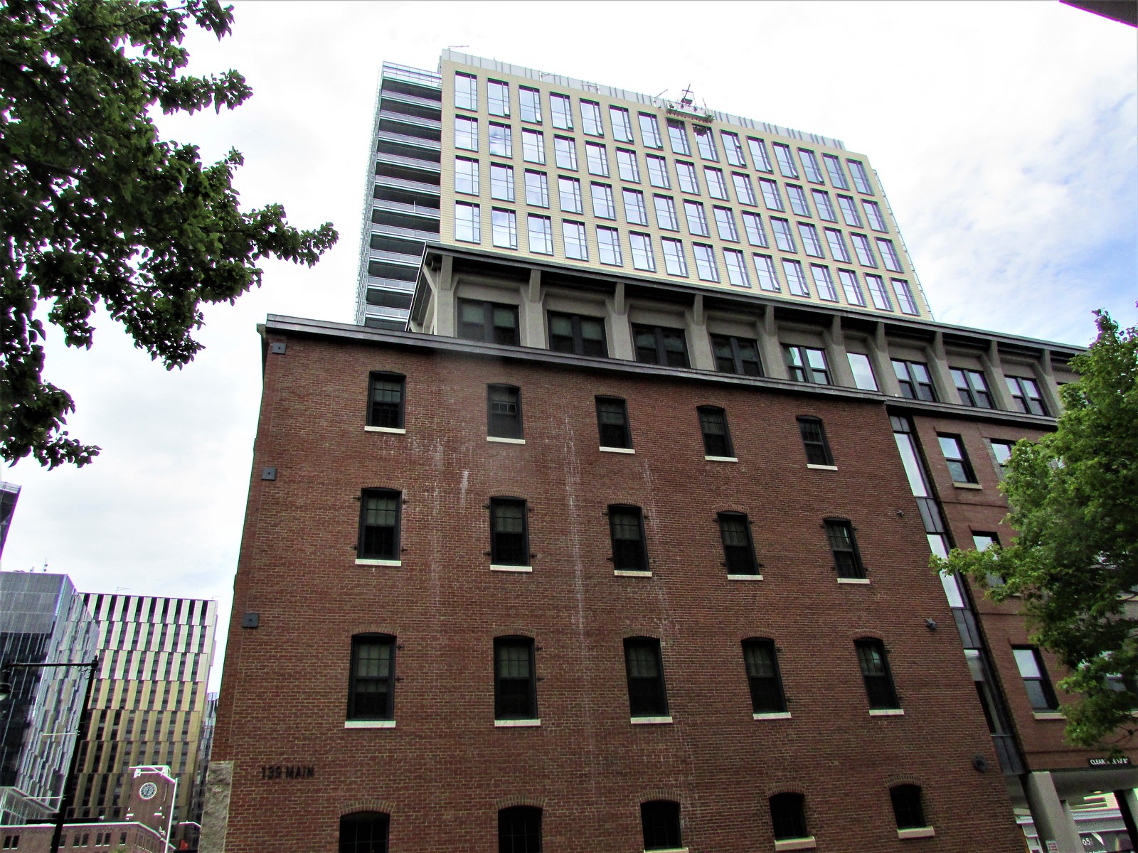 IMG_1913
 IMG_1914
 IMG_1916
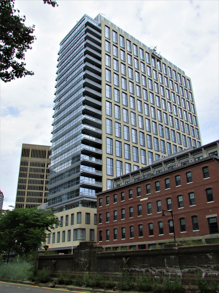 IMG_1925
 IMG_1993
 IMG_2000
 IMG_2003
stick n move
Superstar
- Joined
- Oct 14, 2009
- Messages
- 13,482
- Reaction score
- 24,540
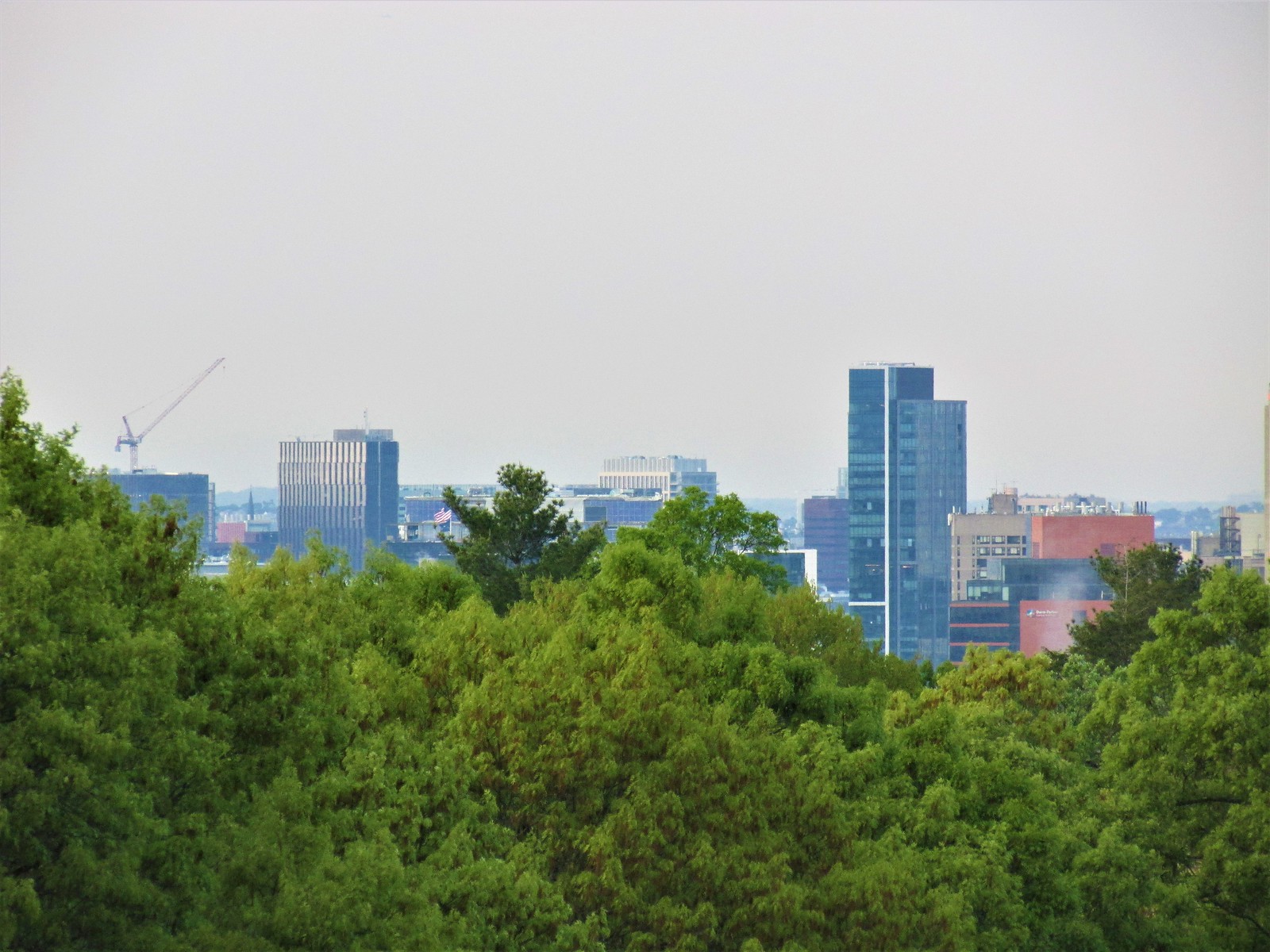
Havent seen this angle of the redesigned building yet
https://www.cambridgechamber.org/members-making-news/
https://www.cambridgechamber.org/members-making-news/