You are using an out of date browser. It may not display this or other websites correctly.
You should upgrade or use an alternative browser.
You should upgrade or use an alternative browser.
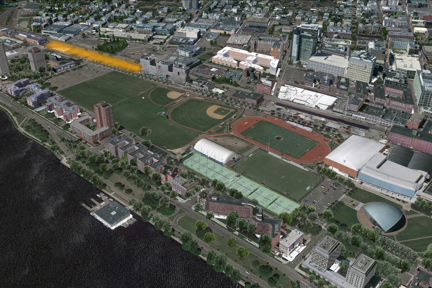
MIT New 450-bed Residence Hall | 121 Vassar St. | Cambridge
- Thread starter bigpicture7
- Start date
JeffDowntown
Senior Member
- Joined
- May 28, 2007
- Messages
- 5,048
- Reaction score
- 4,225
Someone was actually paid money to design this hot mess????
It is like they went to the Ikea kid's department, and bought a set of mismatched storage units, and just threw them together (with parts left over).
It is like they went to the Ikea kid's department, and bought a set of mismatched storage units, and just threw them together (with parts left over).
First, Beeline once again thank you for your wonderful pictures. I've said it before but your hard work on this forum is a reason many of us tune in here.
Secondly, it's a little early to say, but you know what... I think I like this. Seems to me an architect has taken a chance. There's every reason people may quibble - that's the nature of art, isn't it, make a statement - but to my eye there's craft evident here. An artist at work. This is not cookie cutter, by the numbers real estate development. How bloody rare is that in our city? Most of what we build barely rises to mediocre. Overstatement? Not by much.
Yes, I too can imagine the jokes, "My kid's serving time at MIT." Is that bad? Think about it. I bet that same kid, when he first lays eyes on the building says, "I'm gonna live there? Really? Cool! I think..."
Shouldn't student housing be an appropriate place for us allow whimsy in design - see Holl's fine example down the block. A little whimsy where our kids go to school? Makes sense to me. (I understand if allusions to prison seem less than whimsical to many. It's still courageous.) Maltzan happily tweaks tradition - color, windows, massing - and I think he gets away with it. Not to everyone's taste, okay, granted.
It's still too early to say for sure, and I may some day rue my words, but I don't think so.
Or maybe I'm just so thirsty for evidence of the craft in our city.
- Joined
- Jan 7, 2012
- Messages
- 14,173
- Reaction score
- 23,688
 IMG_5897 by Bos Beeline, on Flickr
 IMG_5901 by Bos Beeline, on Flickr
 IMG_5900 by Bos Beeline, on Flickr
 IMG_5905 by Bos Beeline, on Flickr
 IMG_5906 by Bos Beeline, on Flickr
 IMG_5907 by Bos Beeline, on Flickr
 IMG_5908 by Bos Beeline, on Flickr
- Joined
- Jan 7, 2012
- Messages
- 14,173
- Reaction score
- 23,688
 IMG_5911 by Bos Beeline, on Flickr
 IMG_5915 by Bos Beeline, on Flickr
 IMG_5916 by Bos Beeline, on Flickr
 IMG_5918 by Bos Beeline, on Flickr
 IMG_5919 by Bos Beeline, on Flickr
 IMG_5920 by Bos Beeline, on Flickr
 IMG_5922 by Bos Beeline, on Flickr
HBH
Senior Member
- Joined
- Apr 17, 2018
- Messages
- 1,564
- Reaction score
- 4,750
I don't know why but this is all I can see in that picture, give it 20 years.
Gameguy326
Active Member
- Joined
- Aug 18, 2015
- Messages
- 390
- Reaction score
- 98
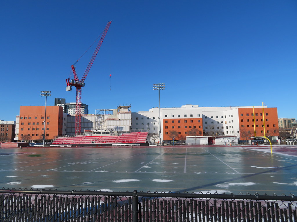
I also have mixed feelings about this design. The massing fits the area, but could have been much bolder. The orange in the color scheme is an homage to the fencing that was there before it. The height and width of this structure match the area.
However, the extremely bold white is far too loud for this area. The orange clashes with the color of the brickwork of the neighboring buildings. And worst of all, the texture, so flat, makes this facade look less like a brick building and more like sculpted clay.
It's well constructed. It will serve MIT well. It will be a fantastic place to live on the inside, I'm sure, and will be one of MIT's best dorms. Aesthetically, it's not the worst thing in the world. But this could have been so much more, especially sandwiched between a beautiful old building (The Metropolitan Warehouse) and a bold, newer building (Simmons Hall).
stellarfun
Senior Member
- Joined
- Dec 28, 2006
- Messages
- 5,726
- Reaction score
- 1,586
The orange is quite close to the University of Texas orange.

 brand.utexas.edu
The design is in the rich tradition of MIT's specimen architecture, 'we'll have one of these, and one of that,....'
Brand Center - University Marketing and Communications
Explore UT’s brand standards and design resources to help campus communicators tell bold, consistent stories across every platform.
brand.utexas.edu
The design is in the rich tradition of MIT's specimen architecture, 'we'll have one of these, and one of that,....'
 IMG_8774
 IMG_8918
Gameguy326
Active Member
- Joined
- Aug 18, 2015
- Messages
- 390
- Reaction score
- 98
This should probably be its own thread, but I felt like there were a lot of individual MIT projects in independent threads, and I was wondering if west campus should maybe be consolidated under one thread. Maybe renaming this thread would be good, or mods can feel free to spin off this post as its own topic?
New graduate student dorm coming on west campus. Looks like it's going to be huge.
MIT is embarking on a project to design and construct new graduate housing at the west end of campus on the site of the West Lot parking area and Building W89 (MIT Police). Currently in an early planning stage, the apartment-style residence hall is expected to provide 550 new graduate student housing beds, completing the October 2017 commitment MIT made to add 950 beds to the graduate housing system on campus.
 news.mit.edu

New graduate student dorm coming on west campus. Looks like it's going to be huge.
MIT is embarking on a project to design and construct new graduate housing at the west end of campus on the site of the West Lot parking area and Building W89 (MIT Police). Currently in an early planning stage, the apartment-style residence hall is expected to provide 550 new graduate student housing beds, completing the October 2017 commitment MIT made to add 950 beds to the graduate housing system on campus.
New project advances commitment to expanding graduate housing
MIT is embarking on a project to design and construct new graduate housing on Vassar Street at the west end of campus. Currently in an early planning stage, the apartment-style residence hall is expected to provide 550 new graduate student housing beds.
news.mit.edu
odurandina
Senior Member
- Joined
- Dec 1, 2015
- Messages
- 5,328
- Reaction score
- 266
They are going for the Northeastern U freshman dorm look with those white panels.
The red brick looks like a lazy attempt w/ better ways to break up all that white.
Beeline, thanks for all these great photos.
- Joined
- Jan 7, 2012
- Messages
- 14,173
- Reaction score
- 23,688
 IMG_8933 by Bos Beeline, on Flickr
 IMG_8935 by Bos Beeline, on Flickr
 IMG_8942 by Bos Beeline, on Flickr
 IMG_8952 by Bos Beeline, on Flickr
 IMG_8951 by Bos Beeline, on Flickr
 IMG_8946 by Bos Beeline, on Flickr
 IMG_8947 by Bos Beeline, on Flickr
Last edited:
- Joined
- Jan 7, 2012
- Messages
- 14,173
- Reaction score
- 23,688
 IMG_8953 by Bos Beeline, on Flickr
 IMG_8954 by Bos Beeline, on Flickr
 IMG_8957 by Bos Beeline, on Flickr
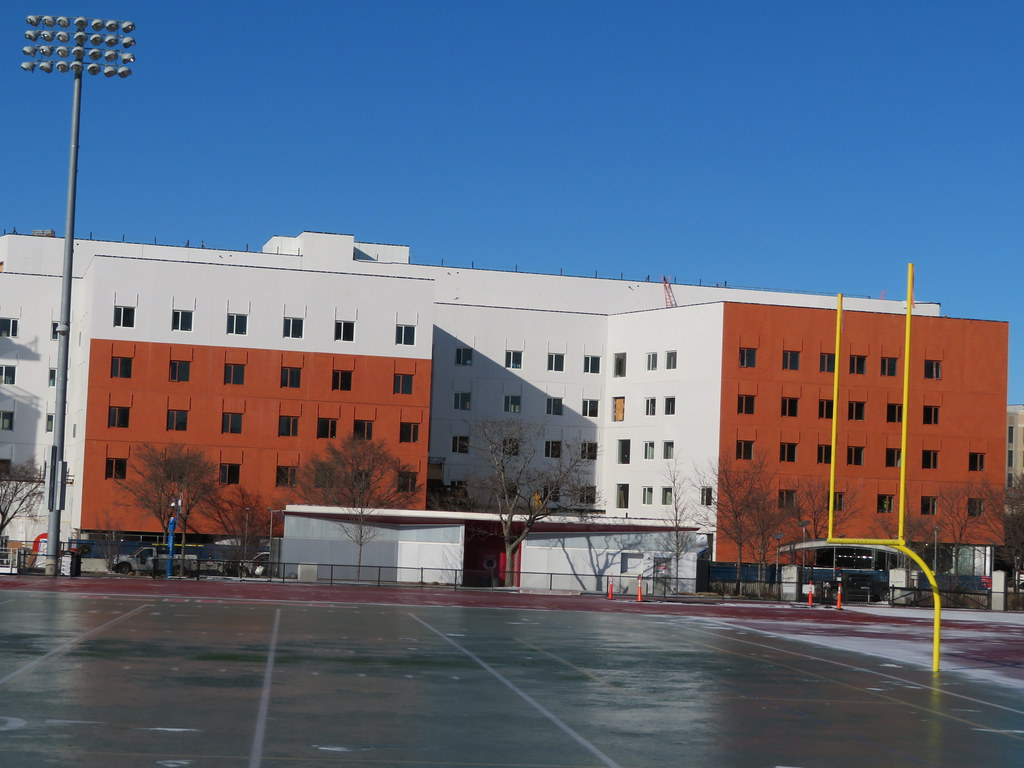 IMG_8955 by Bos Beeline, on Flickr
stick n move
Superstar
- Joined
- Oct 14, 2009
- Messages
- 13,479
- Reaction score
- 24,519
Its not hideous. It will fade into the surroundings once complete and fills in further this part of Cambridge so it works..
odurandina
Senior Member
- Joined
- Dec 1, 2015
- Messages
- 5,328
- Reaction score
- 266
The red brick is too red.
It should well be something else.
The white brick is too white.
It should well be something else.
They clash.
It should well be something else.
The white brick is too white.
It should well be something else.
They clash.