You are using an out of date browser. It may not display this or other websites correctly.
You should upgrade or use an alternative browser.
You should upgrade or use an alternative browser.
New Red and Orange Line Cars
- Thread starter bostoneophyte
- Start date
Believe I saw a set of new cars pulling out of the garage while riding through Wellington tonight. Looked like a service engine was towing it out of the shed in reverse; its bright lights were shining off the metal body. I only got a passing glance, but it was stunning. Light years ahead of the plastic looking buckets we’ve been riding in.
Equilibria
Senior Member
- Joined
- May 6, 2007
- Messages
- 7,079
- Reaction score
- 8,302
Today's update presentation:
https://cdn.mbta.com/sites/default/...1-28-fmcb-red-orange-line-update-original.pdf
https://cdn.mbta.com/sites/default/...1-28-fmcb-red-orange-line-update-original.pdf
cadetcarl
Active Member
- Joined
- Sep 11, 2012
- Messages
- 432
- Reaction score
- 31
It's definitely too late for these changes now but it looks like a couple of things I noticed from the pre-production show car haven't been addressed:
-Is the new thin circle circumscribing the T in the logos canonical? It looks like a knock-off but maybe they've gone in a different direction with the identity design and I didn't notice.
-The outward-facing screens for travel direction seem goofily oversized (though this is a personal aesthetic observation. I'm sure they improve visibility. But how big does FOREST HILLS have to be? You're already standing on the Forest Hills platform and there are no branches). They eat up almost half of the big new windows.
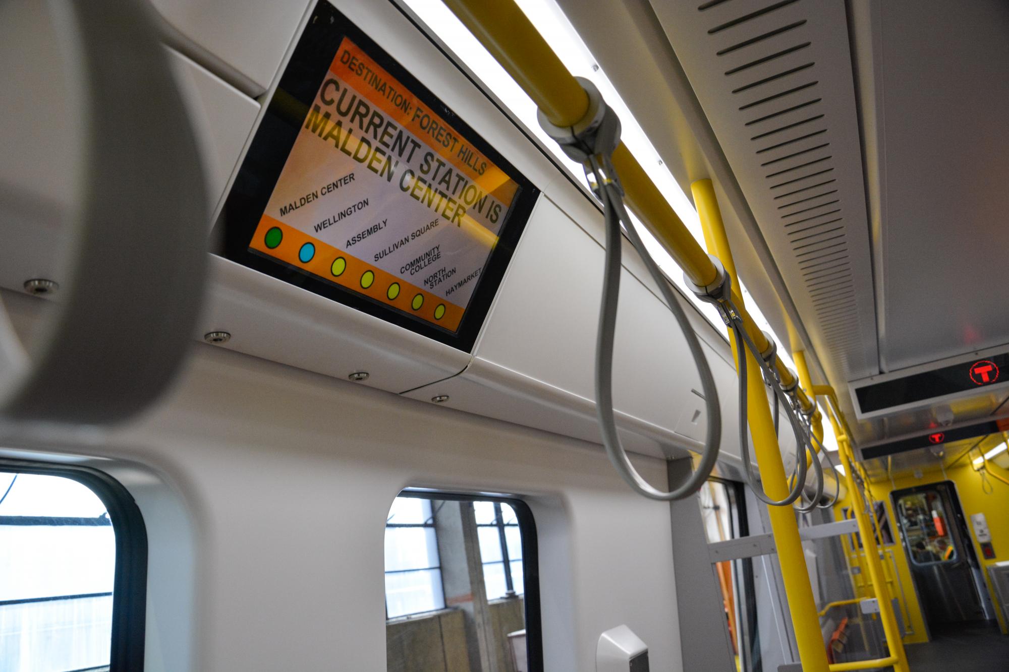
-The software on the interior screens that display the line information also looked a bit rough and less-than-professional, though again that was on the test mule.

-The outward-facing screens for travel direction seem goofily oversized (though this is a personal aesthetic observation. I'm sure they improve visibility. But how big does FOREST HILLS have to be? You're already standing on the Forest Hills platform and there are no branches). They eat up almost half of the big new windows.
When they were showing the mockup at City Hall they explained that those screens needed housings that large "because". They didn't have an explanation when I pointed out that buses didn't seem to have the same issue with their destination screens, which are very compact.
When they were showing the mockup at City Hall they explained that those screens needed housings that large "because". They didn't have an explanation when I pointed out that buses didn't seem to have the same issue with their destination screens, which are very compact.
There is no reason they couldnt just be the exact same size as the next stop displays on the ceilings of the very same vehicles.
Jahvon09
Senior Member
- Joined
- Oct 2, 2011
- Messages
- 3,358
- Reaction score
- 824
The MBTA is requesting to have the 70-y-o- trolleys replaced with Type 9's on the Mattapan High-Speed Line. 
https://www.wbur.org/news/2019/01/28/mbta-ashmont-mattapan-trolley-plan
https://www.wbur.org/news/2019/01/28/mbta-ashmont-mattapan-trolley-plan
HelloBostonHi
Senior Member
- Joined
- Apr 17, 2018
- Messages
- 1,480
- Reaction score
- 4,113
The MBTA is requesting to have the 70-y-o- trolleys replaced with Type 9's on the Mattapan High-Speed Line.
https://www.wbur.org/news/2019/01/28/mbta-ashmont-mattapan-trolley-plan
Wrong thread
Jahvon09
Senior Member
- Joined
- Oct 2, 2011
- Messages
- 3,358
- Reaction score
- 824
Wrong thread ��
It's part of the Red Line, since the trolleys start & end at Ashmont Station!!!!
Or did you not know that!! You didn't know that. Don't like it, don't read it!!
HelloBostonHi
Senior Member
- Joined
- Apr 17, 2018
- Messages
- 1,480
- Reaction score
- 4,113
It's part of the Red Line, since the trolleys start & end at Ashmont Station!!!!
Or did you not know that!! You didn't know that. Don't like it, don't read it!!
Part of the red line sure, still has nothing to do with the new RL/OL cars my friend, there's several threads discussing the new trolley proposal, how about you try general which has a heated debate about them.
- Joined
- Sep 15, 2010
- Messages
- 8,894
- Reaction score
- 271
When they were showing the mockup at City Hall they explained that those screens needed housings that large "because". They didn't have an explanation when I pointed out that buses didn't seem to have the same issue with their destination screens, which are very compact.
Both the interior and exterior signage marquees appear to be sized for Chinese characters, not Western character sets. Another example of poor oversight from the T with a Chinese manufacturer.
Jahvon09
Senior Member
- Joined
- Oct 2, 2011
- Messages
- 3,358
- Reaction score
- 824
Part of the red line sure, still has nothing to do with the new RL/OL cars my friend, there's several threads discussing the new trolley proposal, how about you try general which has a heated debate about them.
I've just seen talk in this thread about the Green Line trolleys, especially the new Type 9's, a few pages back, & now you guys wanna flip the script, saying it's the wrong thread!
Go get a life & go grow up somewhere..
Both the interior and exterior signage marquees appear to be sized for Chinese characters, not Western character sets. Another example of poor oversight from the T with a Chinese manufacturer.
That is actually a pretty amusing observation.
- Joined
- Dec 10, 2011
- Messages
- 5,599
- Reaction score
- 2,717
When you say "sized" that's really "Proportioned," right?
Is the idea that the signs are "too square" and that an English sign would be proportioned 12:1 (12 units wide vs 1 tall) because English words are much wider than they are tall? (like "Kenmore Sq" being 10 characters wide).
Whereas Chinese characters are slightly taller and there are fewer of them, with a typical place name being about 4 to 6 characters wide, so you end up with a good Chinese sign proportion more 6:1
- Joined
- Sep 15, 2010
- Messages
- 8,894
- Reaction score
- 271
When you say "sized" that's really "Proportioned," right?
Is the idea that the signs are "too square" and that an English sign would be proportioned 12:1 (12 units wide vs 1 tall) because English words are much wider than they are tall? (like "Kenmore Sq" being 10 characters wide).
Whereas Chinese characters are slightly taller and there are fewer of them, with a typical place name being about 4 to 6 characters wide, so you end up with a good Chinese sign proportion more 6:1
I actually didn't know the exact proportions and it sounds like you've got a good handle on them, but yes that is my general jist. Also, when Western characters/numbers get mixed into Chinese, the Western characters tend to be awkwardly large/tall (and have weird serifs) to match the proportions of that char set. You can see exactly how those Chinese characters and MBTA would fit perfectly on those signs.

Both the interior and exterior signage marquees appear to be sized for Chinese characters, not Western character sets. Another example of poor oversight from the T with a Chinese manufacturer.
I'll accept the premise that it's proportioned for Chinese characters, but I'm not sure why it represents poor oversight. Imperfect collaboration maybe - but its not clear that this is some kind of failure?
Is this actually a problem? Or just a quirk?
- Joined
- Sep 15, 2010
- Messages
- 8,894
- Reaction score
- 271
I'll accept the premise that it's proportioned for Chinese characters, but I'm not sure why it represents poor oversight. Imperfect collaboration maybe - but its not clear that this is some kind of failure?
Is this actually a problem? Or just a quirk?
They had sample text up in the mockup. It just looked strange and out of common proportion/stretched. As stated, the exterior signs also block nearly half the window they are in. I'm a design guy, these things matter to me, but probably not to others.
