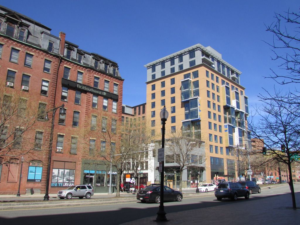
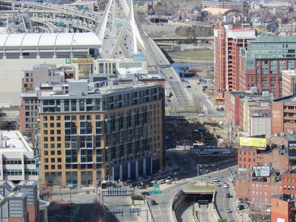
One Canal (formerly Greenway Center) | Bullfinch Triangle | West End

I get your point, and you are correct, but look at the building next door. That's the kind of ornament I was referring too. You almost never see that kind of detailing on a Modern (or modern) building and I miss it.

But isn't that the whole point, they're totally different style buildings, one is traditional and one is modern. Why would an architect place the sort of ornamental detailing found on the white building onto the modern One Canal building? It wouldn't work. Or am I reading your post too literally?
 
It was more a point about modernism/modern architecture in general. I just thought that photo illustrated it pretty well. I like the human-scaled fussy stuff. But it's not to everyone's taste.
 
It's that very thing, the mix of different styles, new construction built along side/incorporated into, a much older building of a differing style, that makes Boston so unique. Russia Wharf/Atlantic Wharf is my favorite example of this. I do like the mix of One Canal styles as well. It's a good compromise, keeping the older instead of destroying it, while building new into it.
 
I walk by this place daily. As a very visible bookend to the Greenway, I find it to be very disappointing. Further, I find that it does not integrate well with the surrounding North/West End neighborhood and will look even odder once the new Government Center Garage development is completed. Overall, I give this place a C and then drop it to a C- for looking to charge $3200+ for 650sf apartments.
 
I honestly think this looks much better in person than in pictures, and fits the area fine.
 
This thing looks amazing compared to the victor and avenir especially from the GCG side.
 
I think this turned out just fine and certainly serves its purpose. It's got decent scale and massing and also creates the illusion of separate buildings with the use of different materials. It's respectful to it's neighbors and fits in with the rest of the neighborhood without being too outlandish. It's essentially a modern (if not admittedly simplistic) take on the other buildings in the BFTriangle. The windows on the south side may not be for everyone, but they don't detract THAT much.
 
I honestly think this looks much better in person than in pictures, and fits the area fine.

I walked from North Station down to Seaport Blvd last Friday along the Greenway. I was surprised at how good this looks in person... both by itself and in context to its surroundings.
 
I get your point, and you are correct, but look at the building next door. That's the kind of ornament I was referring too. You almost never see that kind of detailing on a Modern (or modern) building and I miss it.

Its expensive and pointless ... and often at odds with the performance criteria set down by code.

That is a very broad statement but as a practicing designer I can tell you that there is a serious path of resistance to anything considered even a little bit decorative. The market and culture of building things does not support it.

cca
 
Well, all art is pointless....

Correct .. but design has problem solving behind it and architecture is design ... not art .. unless you are an artist like Zaha who uses buildings as medium for her art.

It can get confusing.

cca

Ps. By the way ... there are things on the adjacent building that LOOK like ornament but are not. The corbled cornice was a device used to solve a technical water drainage problem using the best technology of the time. We just happen to nostalgize it as ornament because it is symbolic of craft to us today.
 
I'm curious what code performance criteria ornamentation affects. Care to elaborate?
 
I'm curious what code performance criteria ornamentation affects. Care to elaborate?

Much ornamental elements of the building need to cross through the parts of the wall that performs environmentally. (Keeps the building, warm, cool, dry, comfortable, inside an energy budget).

Many of these criteria are code driven. For instance. You cannot by energy code build a cast in place concrete wall where the interior and exterior faces are part of that wall. Having said that, buildings like City Hall, Rudolph's Gov Center Service Building, and everything at the Christian Science Center are impossible to build under today's code.

Love a deep set window in a brick wall. Not unless you have tons of money to spend. Love those granite sills? Sure you can have those as long as they are thermally detached from the back-up wall.

Today's requirement for comfort and durability make elements that add richness to a project hard to do, thus expensive. This is exactly why we see so many buildings like Zinc that try to have visual richness by having multiple panel colors, or the Suffolk U buildings that adds visual interest by creating fake depth, or why staggered windows are almost a given. They happen because these are the architectural tool at hand that give the best visual bank for the given buck.

It is simply a direct expression of our values. We value comfort and low operation costs way more than we value architectural richness or urban connections.

As a designer, I am interested in how the criteria and values of a client/owner/project drive these choices and it is always a wild and often surprising ride to see what story the building has to tell. A good designer tries to be honest with these values and does not try to bend and twist them to some uncomfortable form. Unfortunately we see way to often an attempt to meet all the requirements, but add on some scrim of nostalgia, or aesthetic desire that is counter to the other criteria of the project. What you then get is the proverbial "awkward mess". Do a search for that term on AB and you will likely see my name next to it ... and you will likely understand better when architectural values are misaligned.

Sorry for the long post. I often try to have these types of explanations in Private Messages so I don't make peoples eyes start to bleed.

cca

Please don't apologize. This was a very thoughtful and insightful post!
 
It isn't amazing, but it's good enough. It adds a different color to the area while still respecting its neighbors, and helps stitch the North Station area with the North End. (still an ongoing process)
 
Love these pics and that view. Thanks, DZ!

One Canal does look good from there.


Will they ever get around to building something on that big parking lot in the North End?
 

Back
Top