You are using an out of date browser. It may not display this or other websites correctly.
You should upgrade or use an alternative browser.
You should upgrade or use an alternative browser.
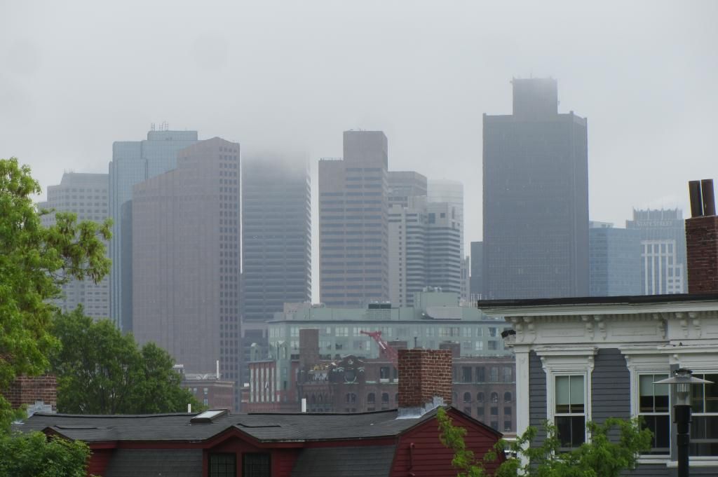
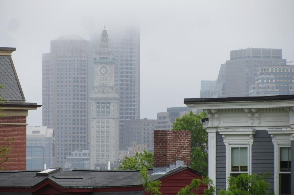
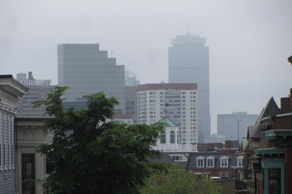
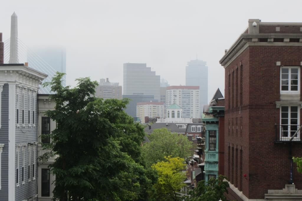
Photo of the Day, Boston Style: Part VI (2013)
- Thread starter JohnAKeith
- Start date
- Status
- Not open for further replies.
kz1000ps
Senior Member
- Joined
- May 28, 2006
- Messages
- 8,983
- Reaction score
- 11,839
Welcome back! This one's pretty awesome.
Thanks! Nice to be back. Not sure if it's for good yet or if there's another blip to come.
- Joined
- May 25, 2006
- Messages
- 7,034
- Reaction score
- 1,875
Dude, where is the "Like" button?
gooseberry
Active Member
- Joined
- Nov 24, 2009
- Messages
- 550
- Reaction score
- 3

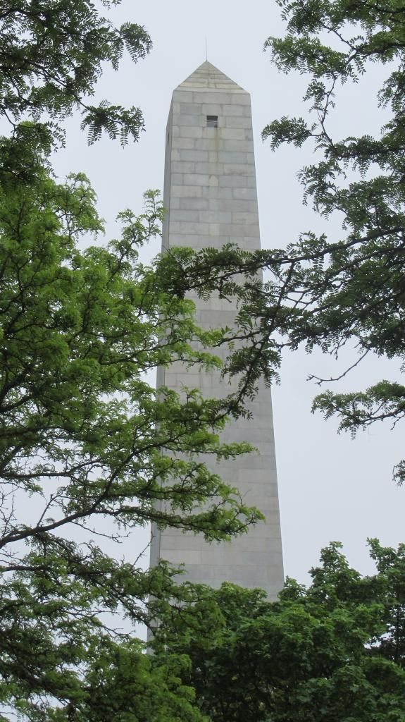
This scene is going to be really nice later afternoon looking up towards the monument.

Last edited:
atlantaden
Senior Member
- Joined
- May 31, 2006
- Messages
- 2,606
- Reaction score
- 2,753
WOW!!
Boston02124
Senior Member
- Joined
- Sep 6, 2007
- Messages
- 6,893
- Reaction score
- 6,639
- Joined
- May 25, 2006
- Messages
- 7,034
- Reaction score
- 1,875
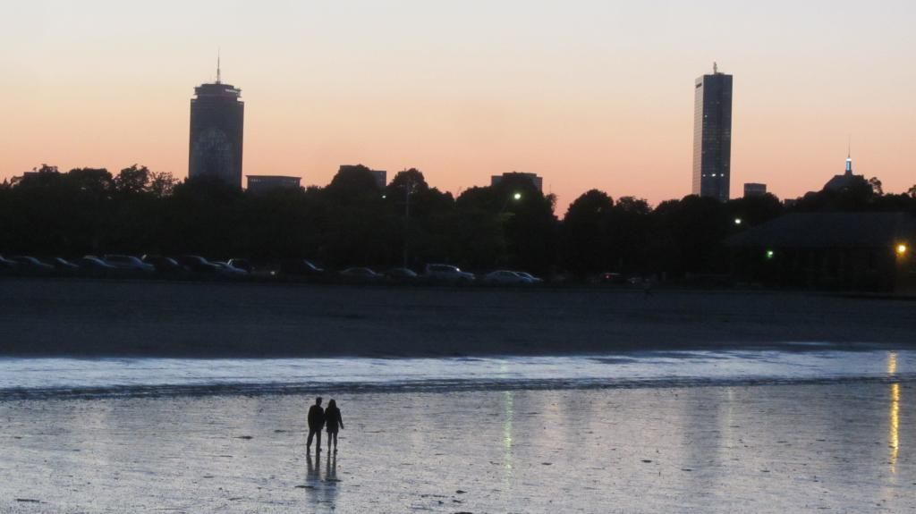
Love that one of the Pru.
I want to say Boston should standardize its traffic light arms, but I guess it has and is just slowly replacing the old diagonal arms with horizontal ones.
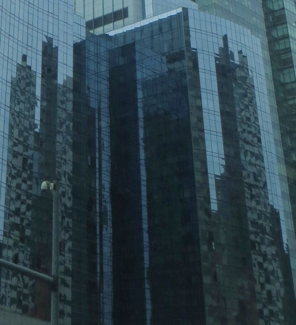
Not sure I like.
Nice, moody shot though.
I know that concentrating on getting our signals to actually work correctly is the bigger issue, but does anyone else find Bostons traffic light masts to be unusually ugly? Maybe they stand out more because of the contrast with the historic-y street lights, but it seems like they could be better looking. Maybe a coat of black paint would help?
BostonUrbEx
Senior Member
- Joined
- Mar 13, 2010
- Messages
- 4,340
- Reaction score
- 130
I know that concentrating on getting our signals to actually work correctly is the bigger issue, but does anyone else find Bostons traffic light masts to be unusually ugly? Maybe they stand out more because of the contrast with the historic-y street lights, but it seems like they could be better looking. Maybe a coat of black paint would help?
Black certainly looks better. I'm not sure why they don't do it more often in Boston.
Also, I think it might be better to simply string a cable diagonally with one main light suspended in the center. A cable is much more nondescript, and you can have better looking posts for the corner stop lights.
czsz
Senior Member
- Joined
- Jan 12, 2007
- Messages
- 6,043
- Reaction score
- 7
Also, I think it might be better to simply string a cable diagonally with one main light suspended in the center. A cable is much more nondescript, and you can have better looking posts for the corner stop lights.
No way. You see this in poor Upstate New York cities and it looks cheap and hideous.

I think it's a practice that's being discontinued due to wind issues making it unsafe, too.
If we're going to choose a less safe type of traffic light, I'd rather go back to the poles at the side of the road that don't reach over. They've maintained those in Paris for a good aesthetic reason.
found5dollar
Senior Member
- Joined
- Aug 27, 2007
- Messages
- 1,149
- Reaction score
- 404
i vote down painting traffic light posts black. This is an accident waiting to happen, followed by a lawsuit in which the person crashing into it claims if the pole was any other color the accident wouldn't have happened.
- Status
- Not open for further replies.

