You are using an out of date browser. It may not display this or other websites correctly.
You should upgrade or use an alternative browser.
You should upgrade or use an alternative browser.
Radian (Dainty Dot) | 120 Kingston Street | Chinatown
- Thread starter PaulC
- Start date
JeffDowntown
Senior Member
- Joined
- May 28, 2007
- Messages
- 4,800
- Reaction score
- 3,667
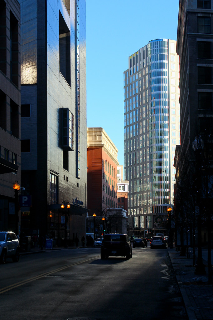
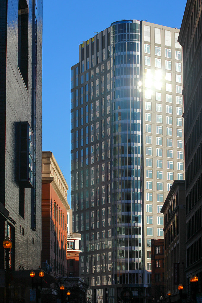
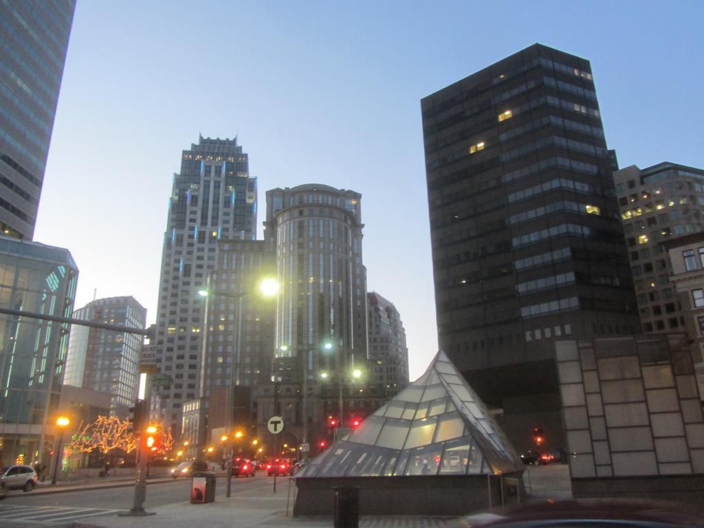
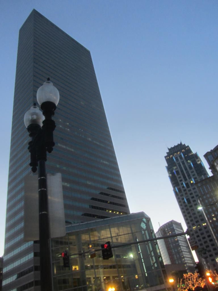
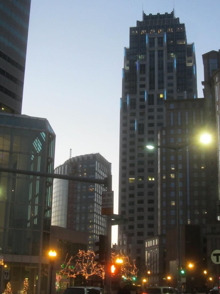
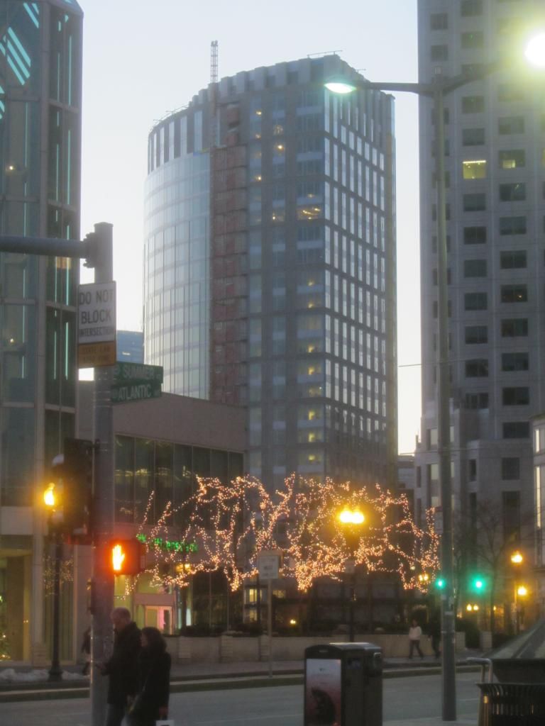
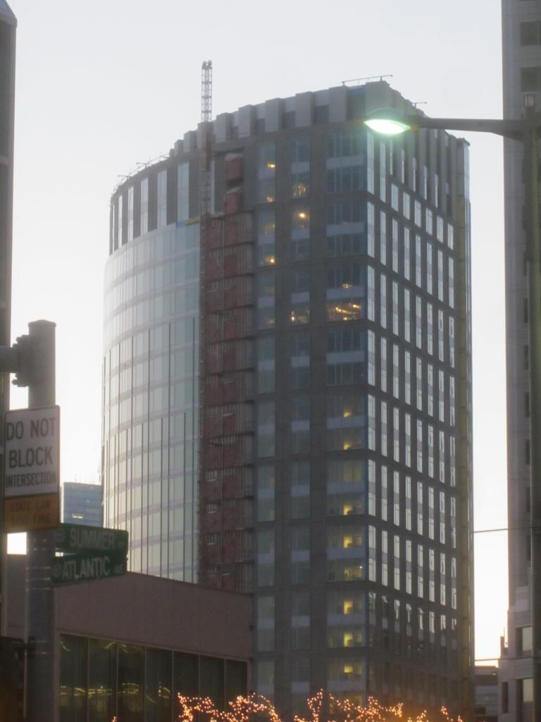
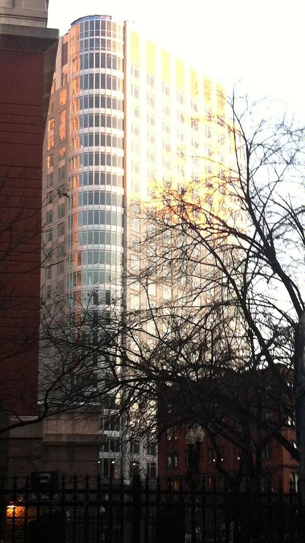
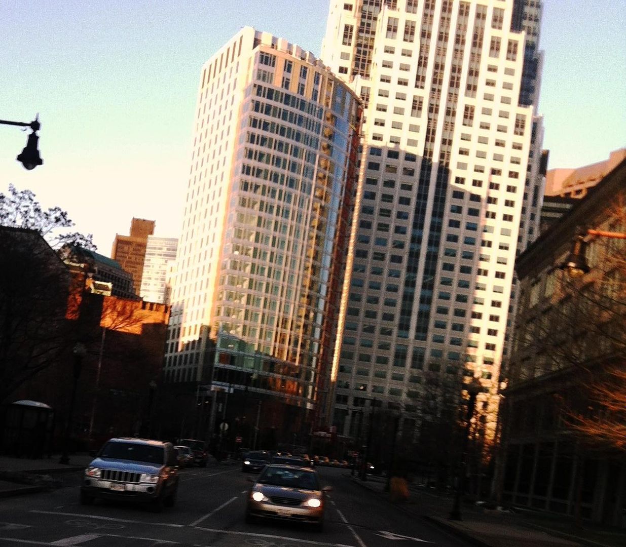
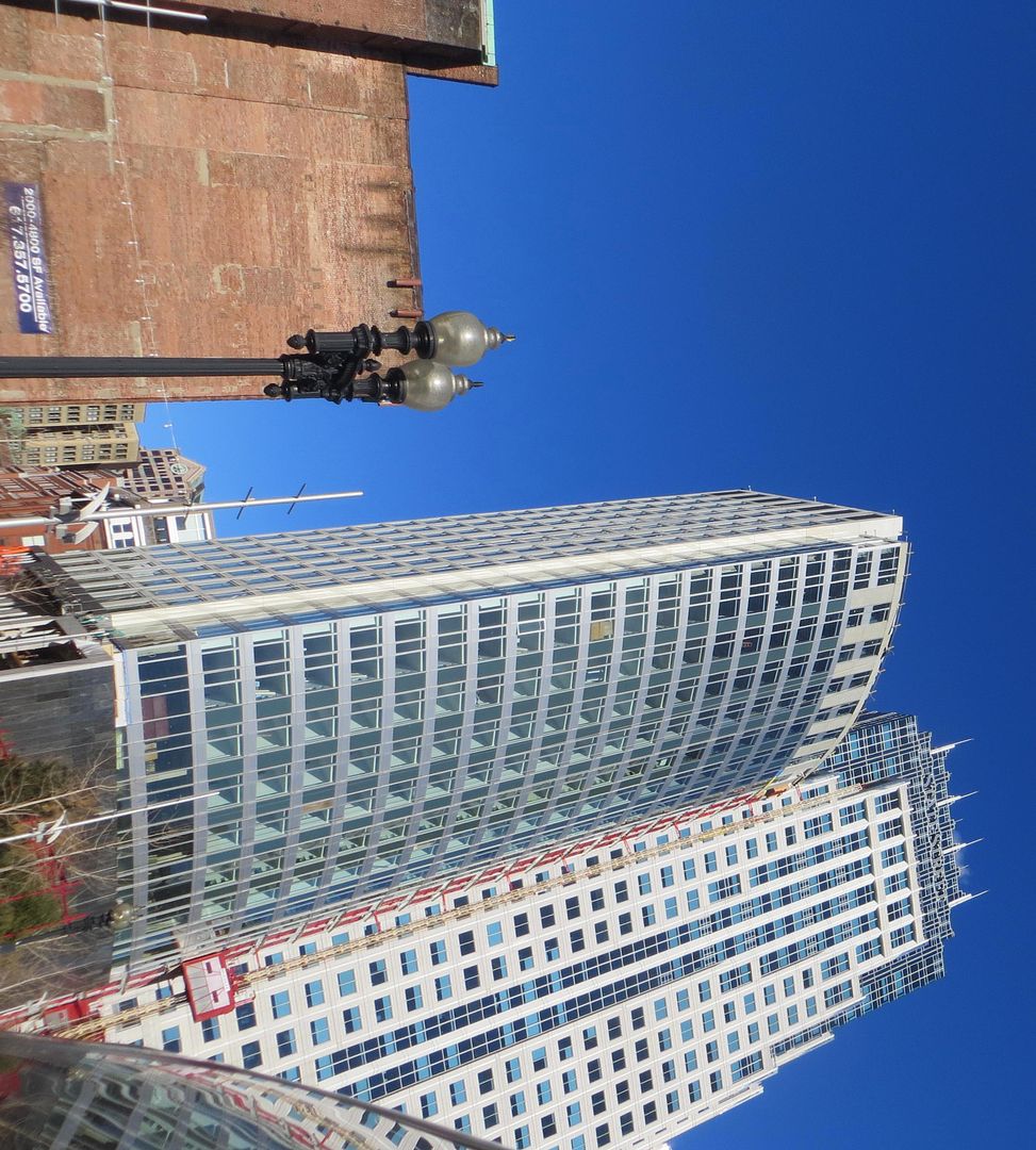
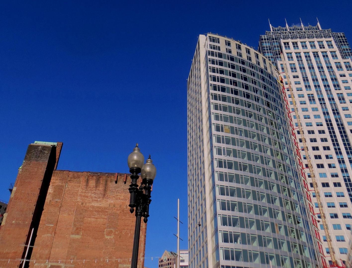
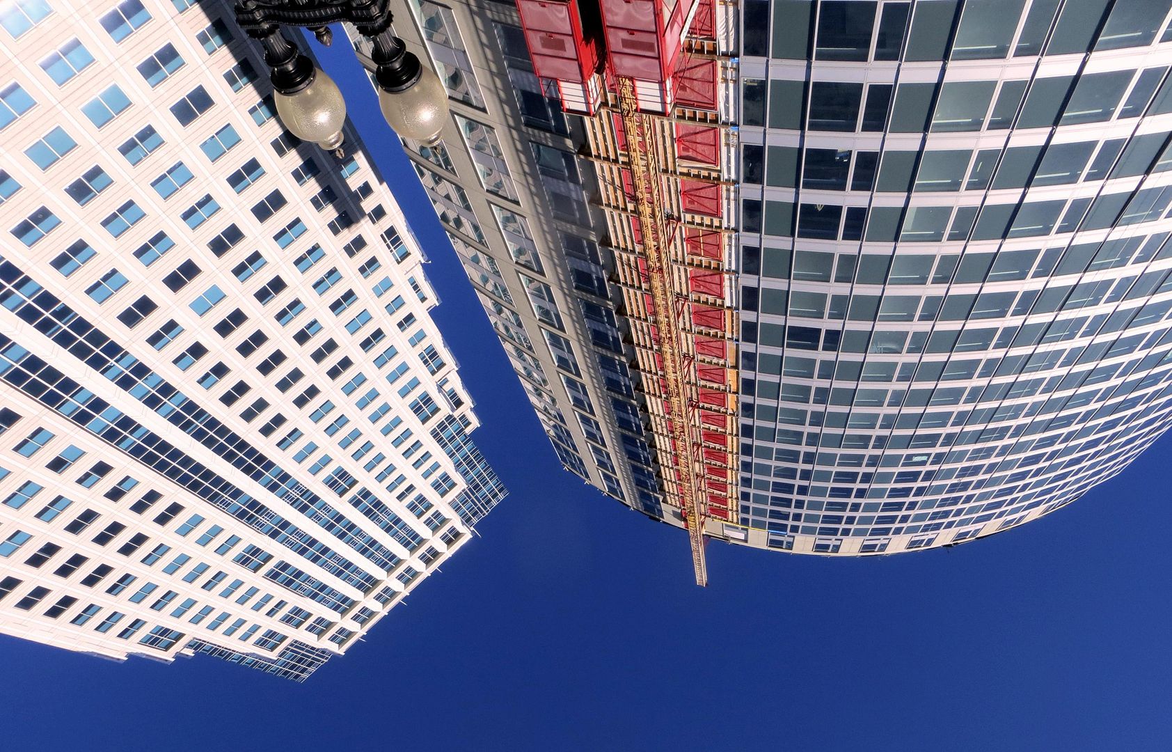
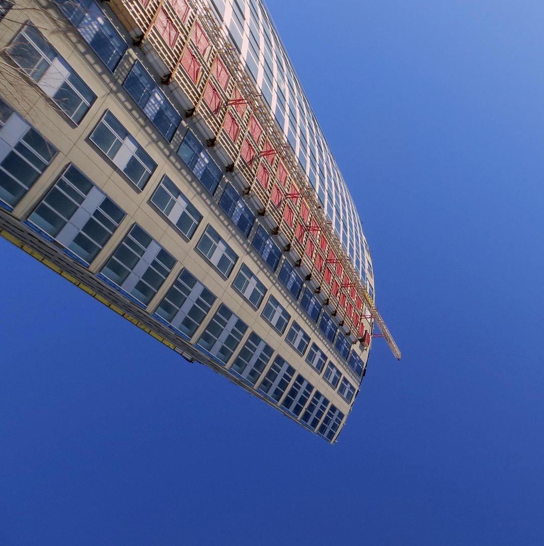
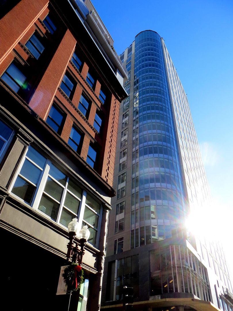
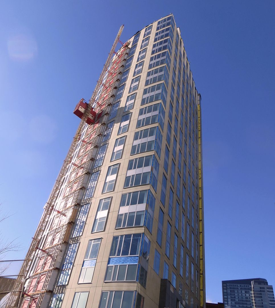
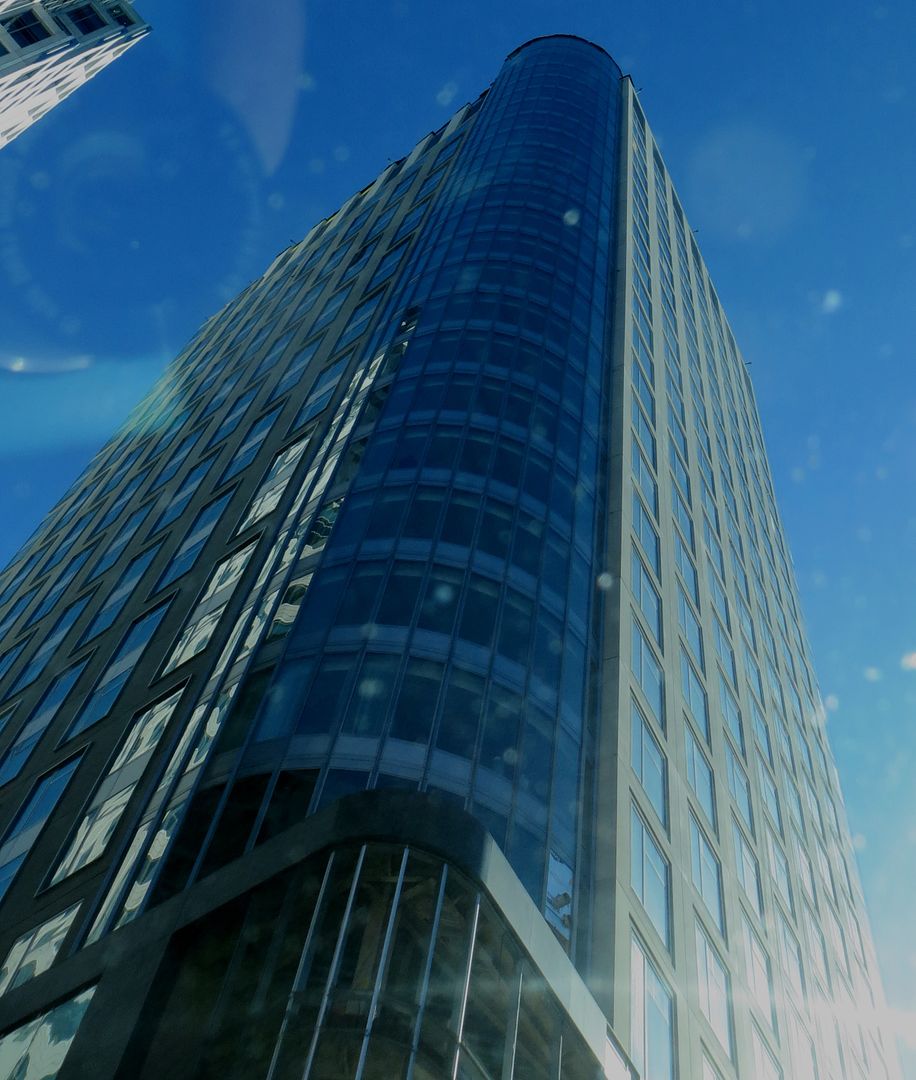
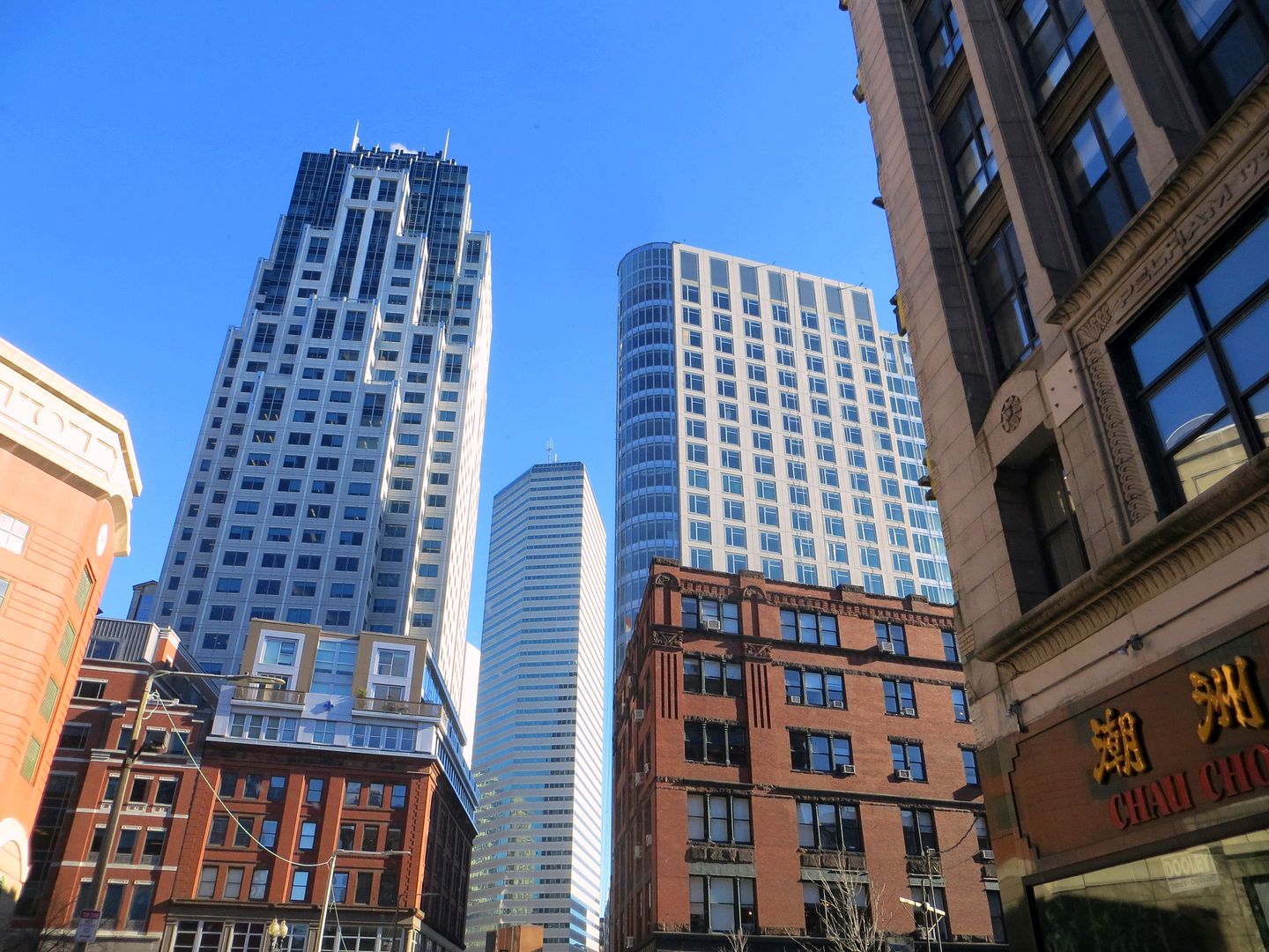
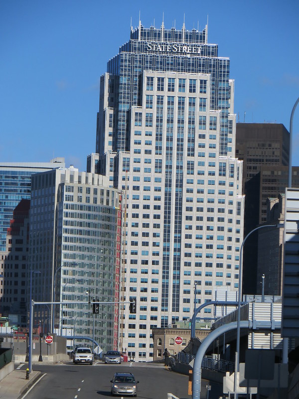
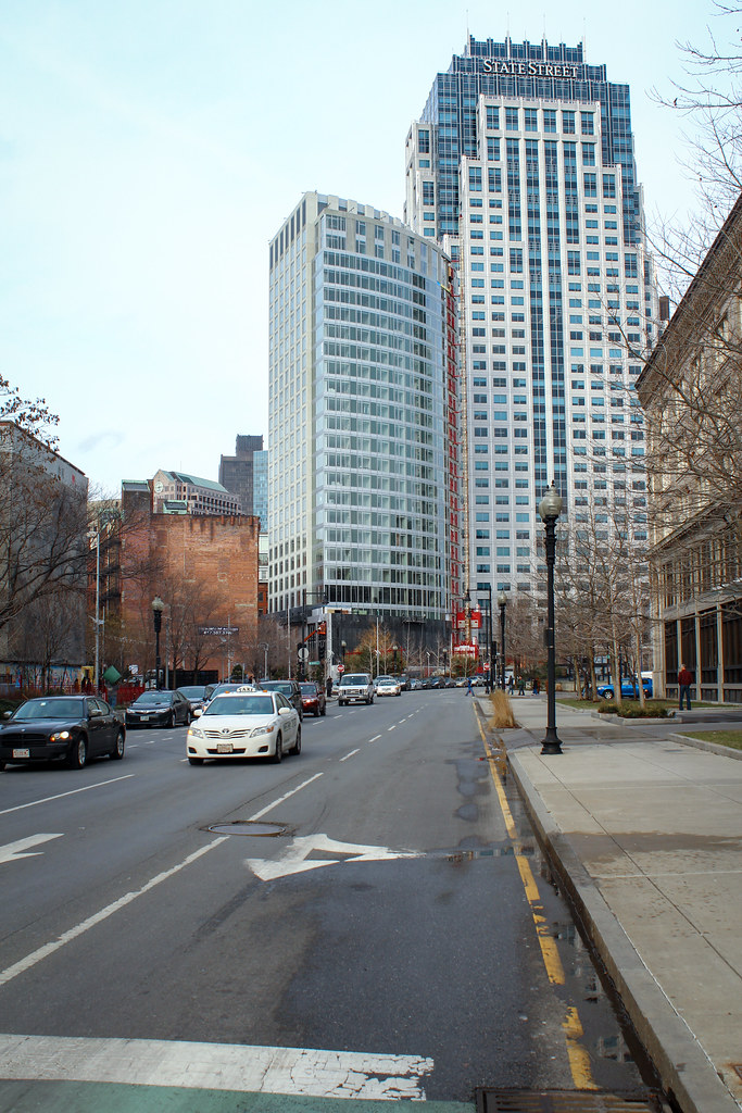
I think the back side looks better than the front. The curve glass in front is great....until where the glass ends.
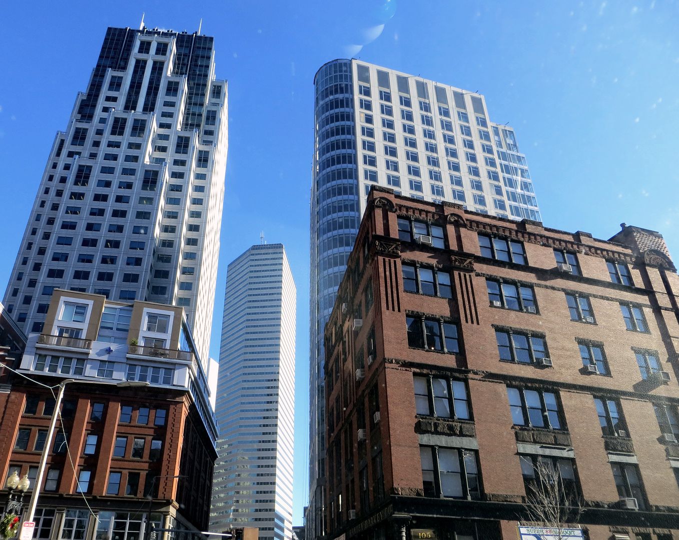
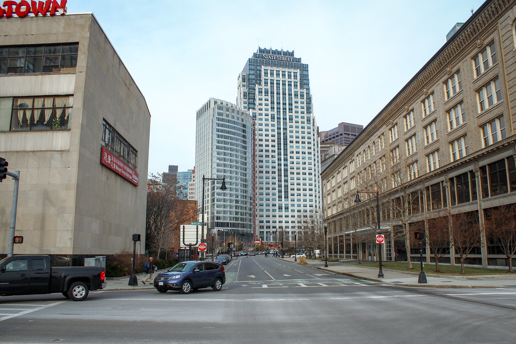
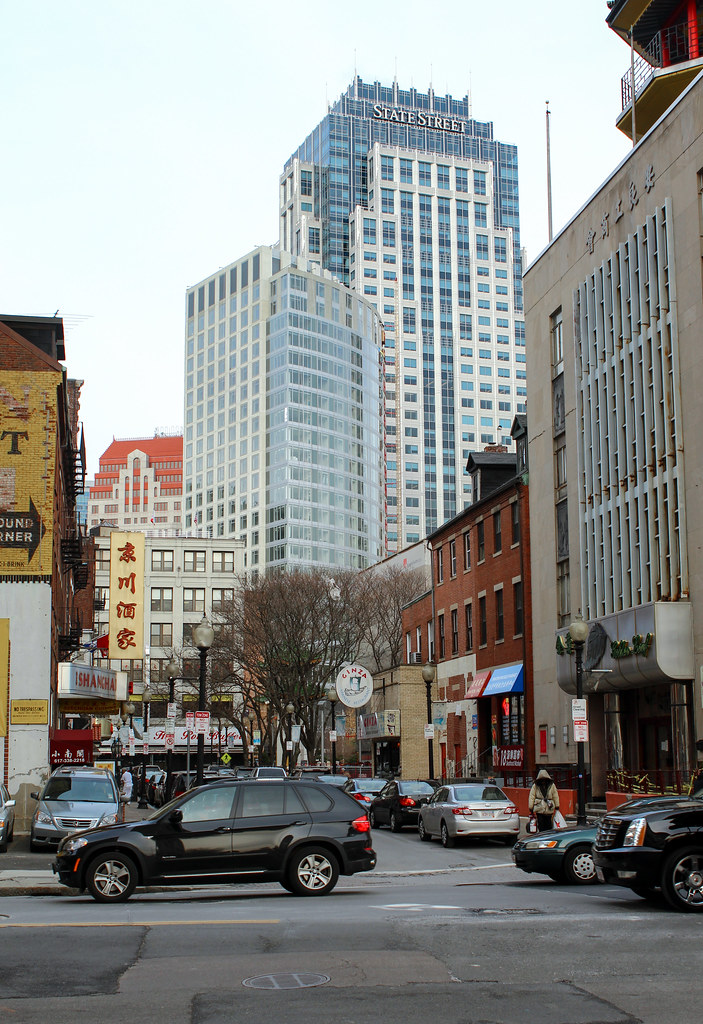
I am not really sure that this building has a front or a back side. It seems it has three equally prominent sides, two flat and one curved, but all are major exposures. Plus the apex of the two flat sides with the rounded glass is very prominent looking down Avenue de Lafayette from Washington Street, but that is not exactly a "side".
atlantaden
Senior Member
- Joined
- May 31, 2006
- Messages
- 2,606
- Reaction score
- 2,752
I like every side of this building with the curved glass side facing the Greenway being my favorite side!
- Joined
- Jan 7, 2012
- Messages
- 14,072
- Reaction score
- 22,823
Boston02124
Senior Member
- Joined
- Sep 6, 2007
- Messages
- 6,893
- Reaction score
- 6,639
Boston02124
Senior Member
- Joined
- Sep 6, 2007
- Messages
- 6,893
- Reaction score
- 6,639
- Joined
- Jan 7, 2012
- Messages
- 14,072
- Reaction score
- 22,823
Boston02124
Senior Member
- Joined
- Sep 6, 2007
- Messages
- 6,893
- Reaction score
- 6,639
A question for the brokers out there...with this, the Kensington, Avalon Exeter, the Victor, 315 A street, Watermark 2 in Kendall, the assorted monoliths on the seaport all opening in the next 12 months, what kind of concessions and rental rates do you expect? Kensington is offering 1.5 months free rent on a year lease at $3100 for a 1 bed. Basically $2700/year. I tend to think the market will be saturated and these places will struggle to fill up.
whighlander
Senior Member
- Joined
- Aug 14, 2006
- Messages
- 7,812
- Reaction score
- 647
Boston02124
Senior Member
- Joined
- Sep 6, 2007
- Messages
- 6,893
- Reaction score
- 6,639
thanks just sitting in traffic ^ 
kz1000ps
Senior Member
- Joined
- May 28, 2006
- Messages
- 8,983
- Reaction score
- 11,836
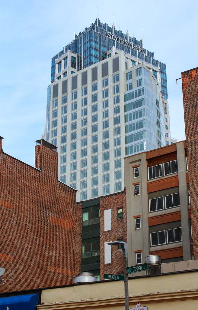
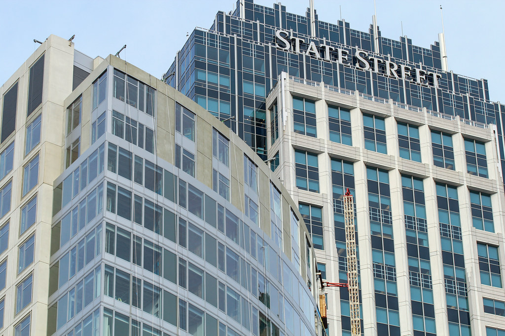
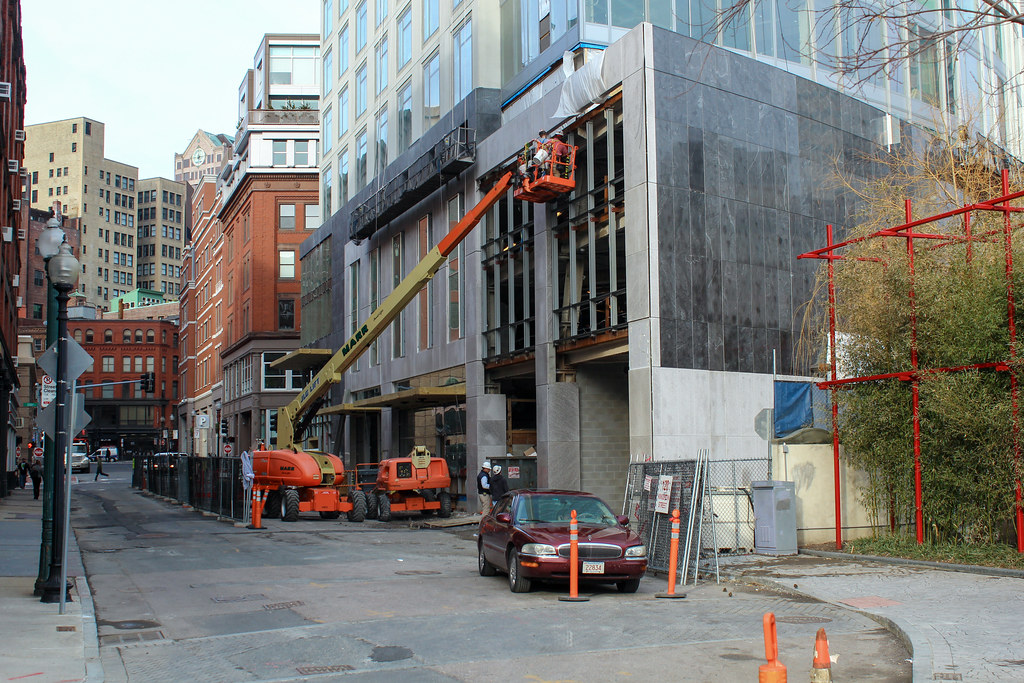
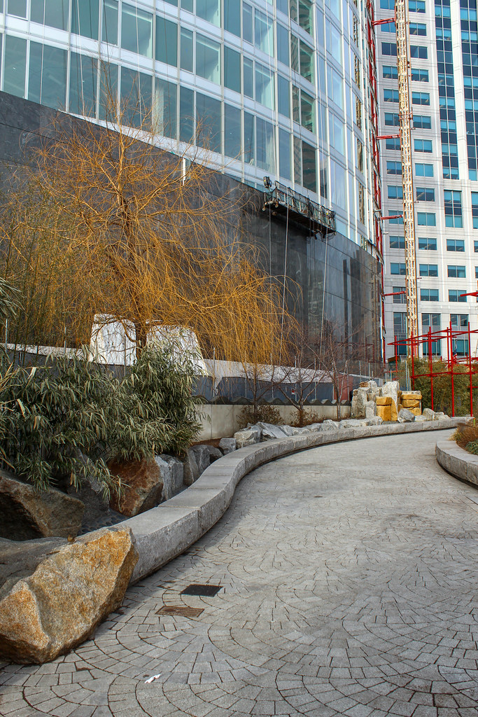
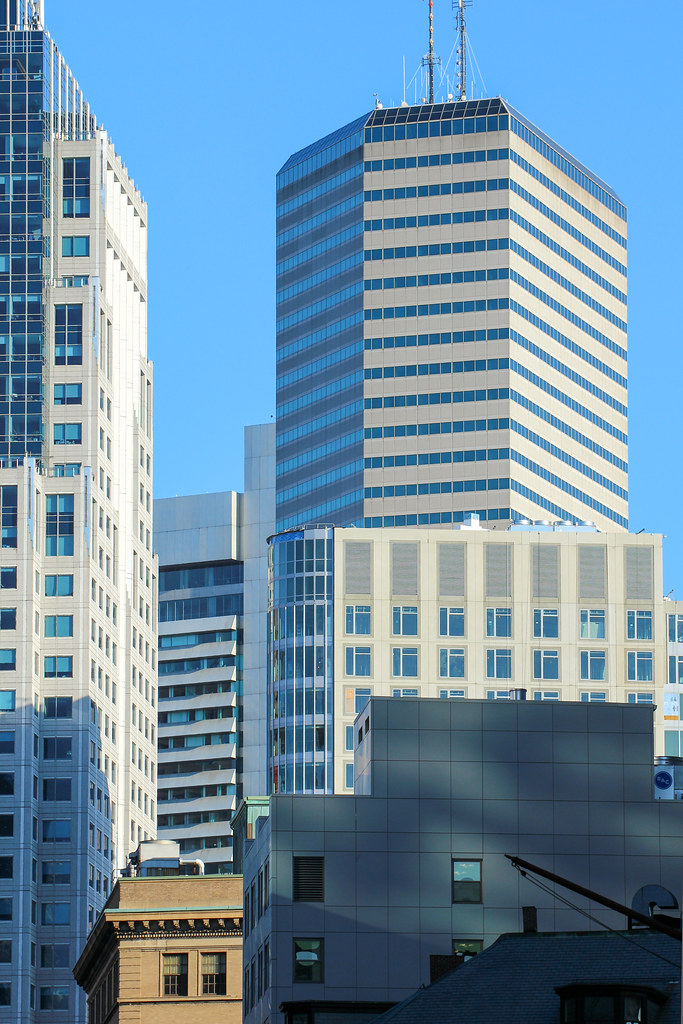
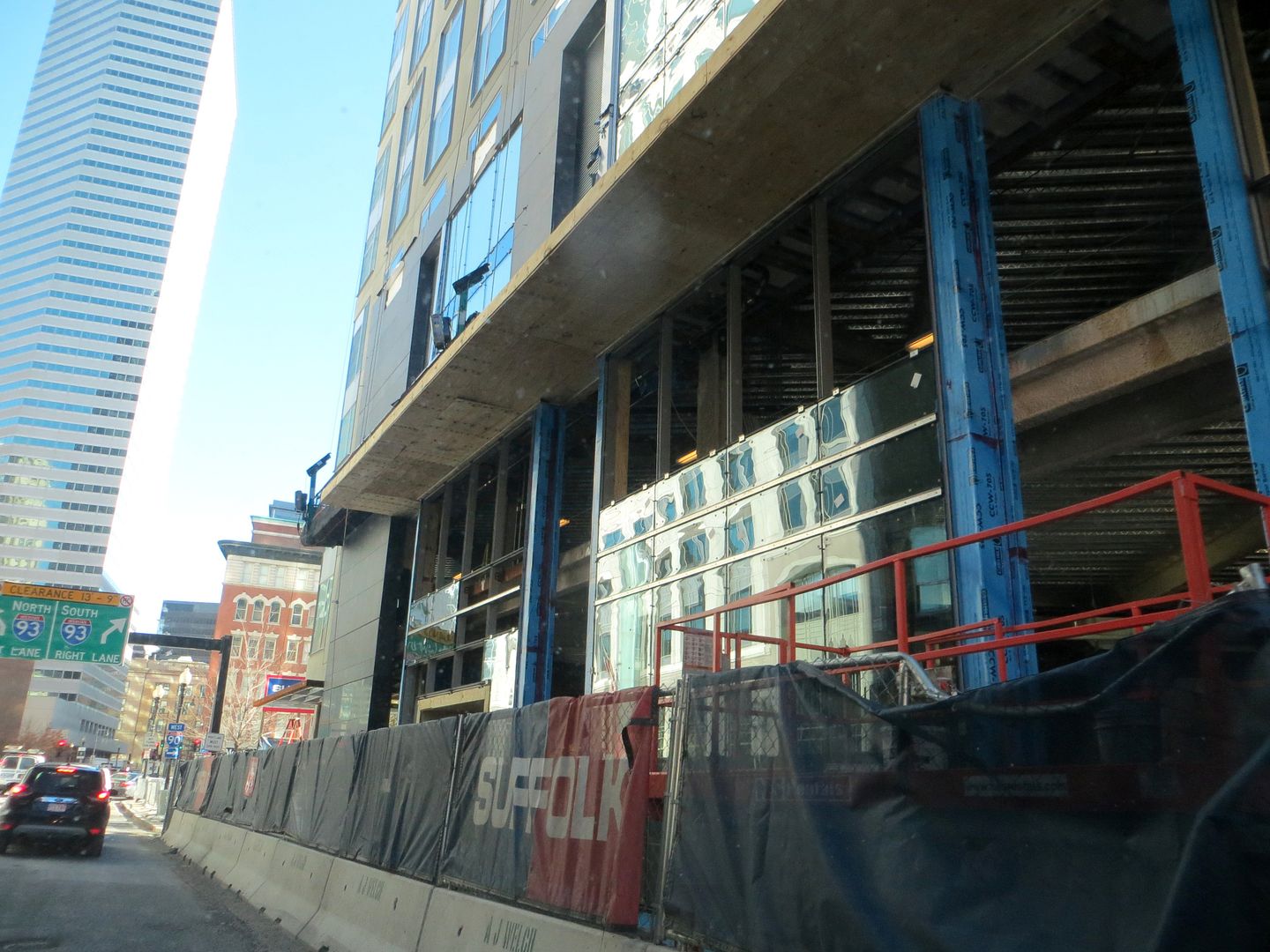
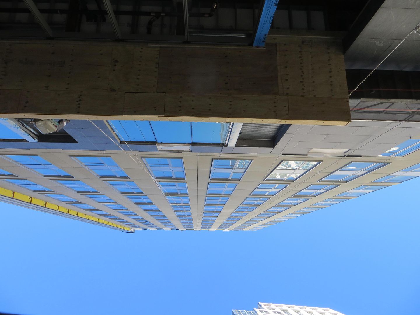
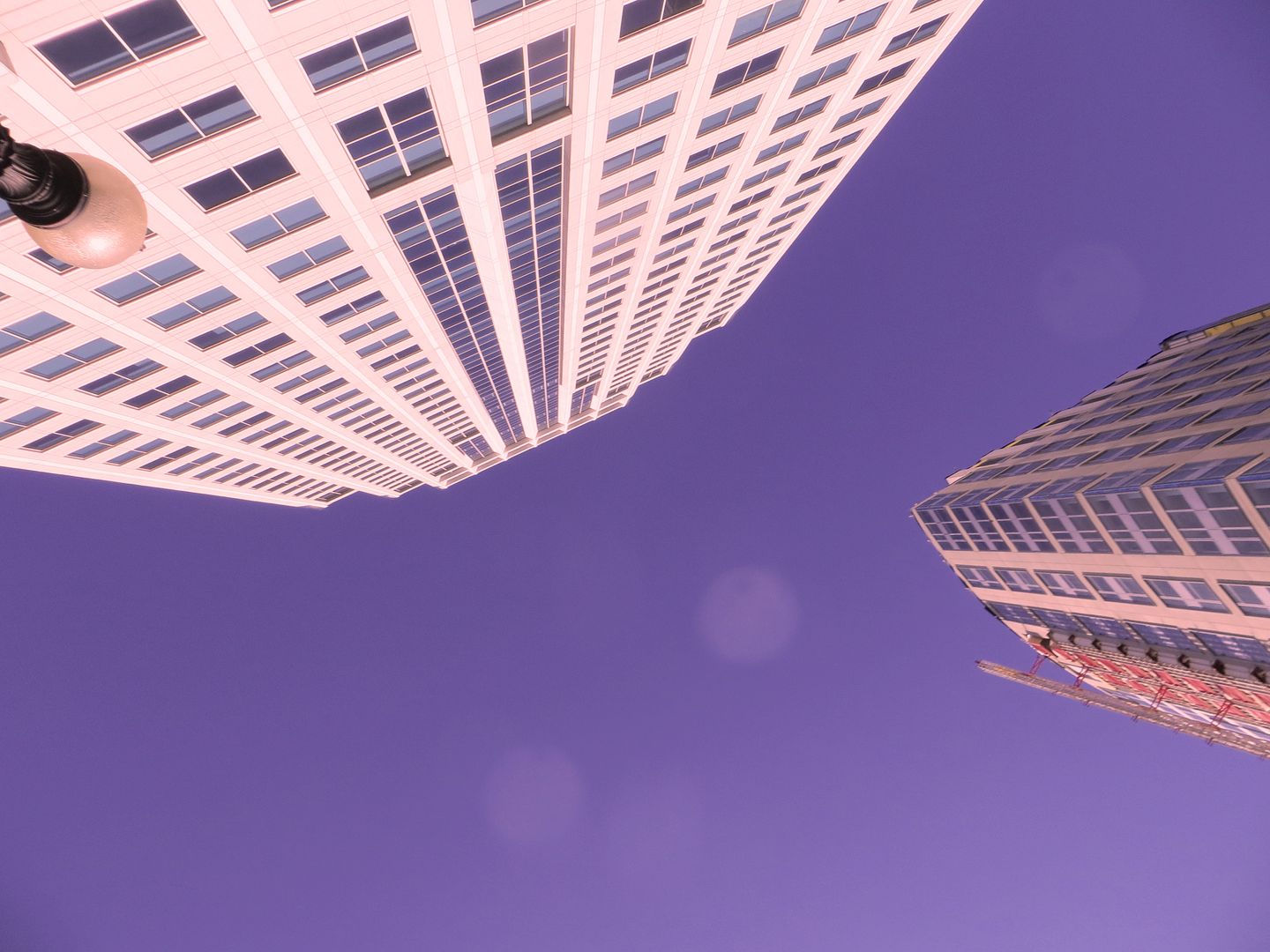
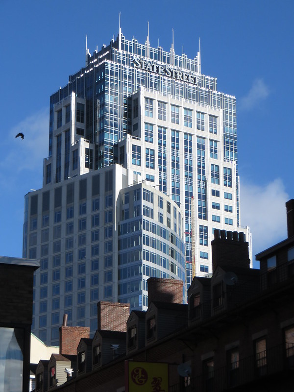
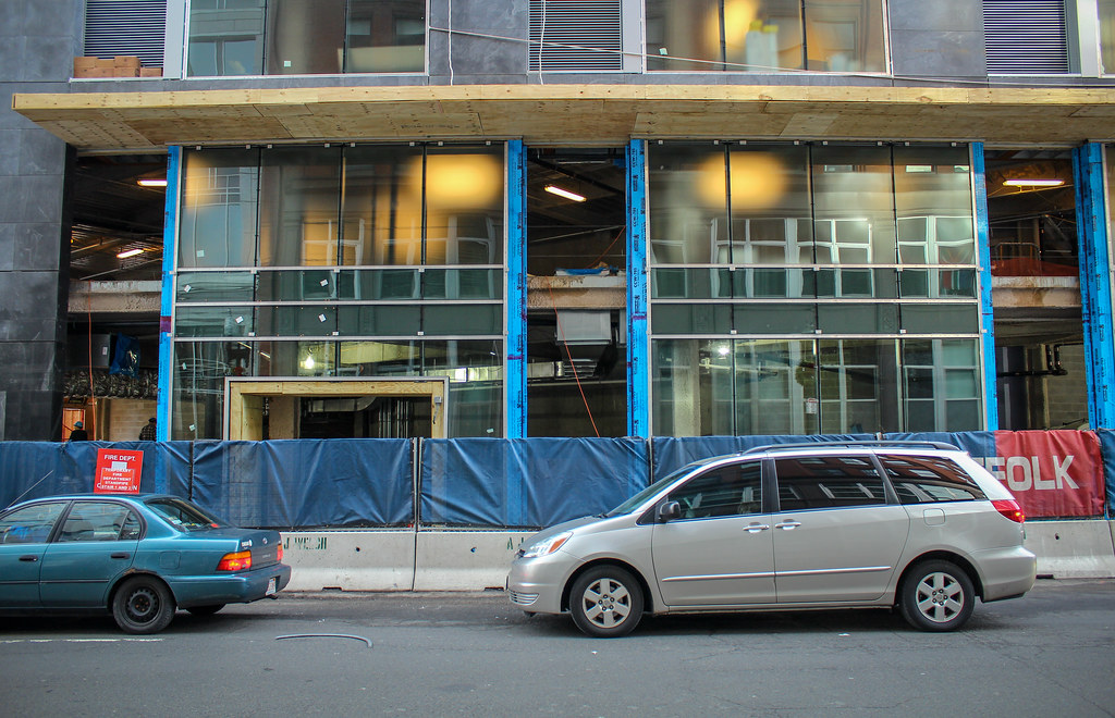
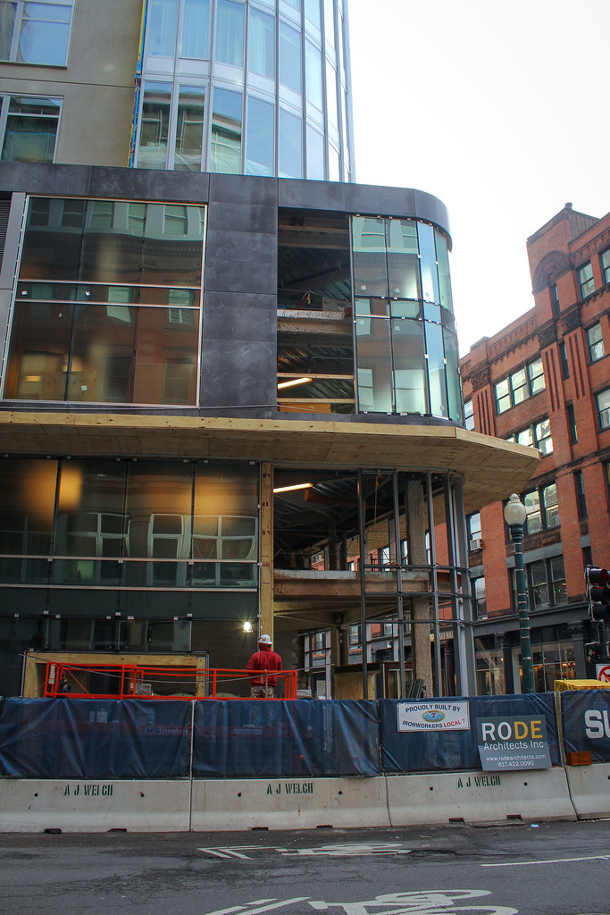
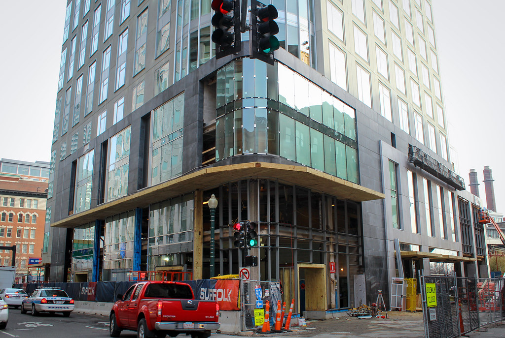
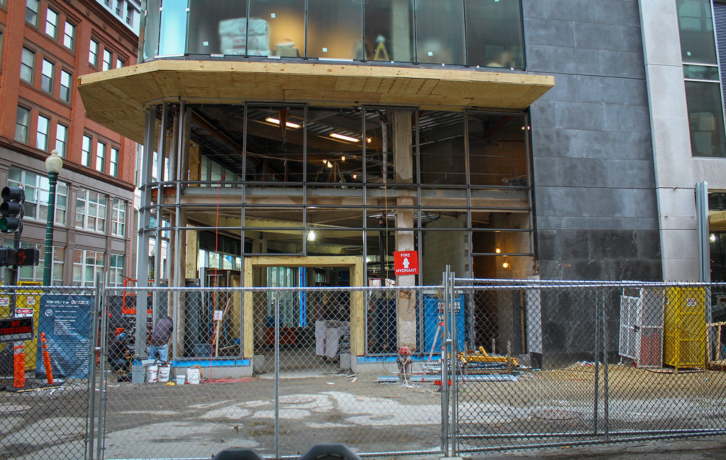
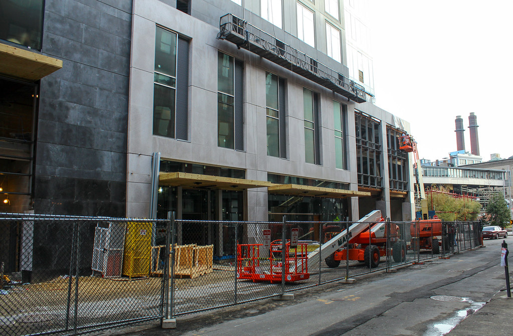
^ I gotta say, I agree with Armpits and his calling this the "wall of death"...it's antiseptic and lifeless and bears down on one of the few parts of the Greenway that actually has some life to it. Go figure.
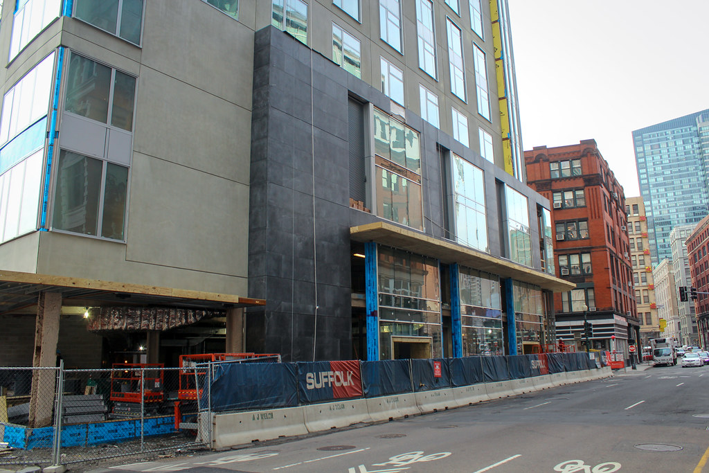
^ Also, note how any illusions of depth in the black stone is completely undone by the cardboard precast. The smeary grey look does it no favors either.

Last edited:
I gotta say, I agree with Armpits and his calling this the "wall of death"...it's antiseptic and lifeless and bears down on one of the few parts of the Greenway that actually has some life to it. Go figure.
C'mon, KZ, you wouldn't want to risk upstaging the Greenway with architecture that is "iconic," now, would you?
... I still literally cannot believe that "logic" was used and will have a major impact on how this corner of the city looks and is for the next many, many decades. Mind-numbing.
type001
Senior Member
- Joined
- Jun 29, 2006
- Messages
- 1,773
- Reaction score
- 323
Despite liking the end result, it is hard to believe that an extra 3 floors and 1 slanted side would have made any greater imposing impact that Kairo Shen felt it necessary to further destroy whatever reputation he might have ever had.

