You are using an out of date browser. It may not display this or other websites correctly.
You should upgrade or use an alternative browser.
You should upgrade or use an alternative browser.
Rose Kennedy Greenway
- Thread starter callahan
- Start date
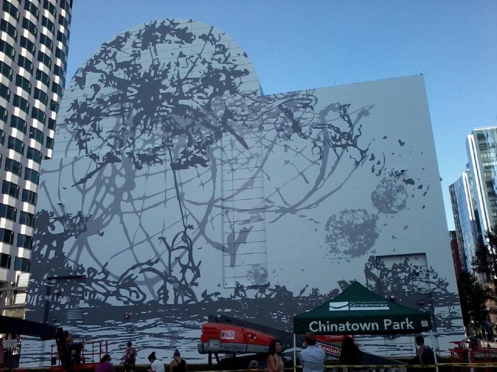
I'll have to see it in person to pass true judgment. I like it and completely agree with the "dandelions blowing in the breeze..." comment (definitely better than super snail). However I don't think it makes as much use of the uniqueness of the building shape as the Os Gemeos piece and find the amount of empty space to be distracting. Contradictory as this sounds, I actually think it would look better with more open space / a typical canvas shape and think that the building stunts the piece rather than working with it (which I thought the Os Gemeos piece did really well).
Last edited:
TheRifleman
Banned
- Joined
- Sep 25, 2008
- Messages
- 4,431
- Reaction score
- 0
I'll have to see it in person to pass true judgment. I like it and completely agree with the "dandelions blowing in the breeze..." comment (definitely better than super snail). However I don't think it makes as much use of the uniqueness of the building shape as the Os Gemeos piece and find the amount of empty space to be distracting. Contradictory as this sounds, I actually think it would look better with more open space / a typical canvas shape and think that the building stunts the piece rather than working with it (which I thought the Os Gemeos piece did really well).
Wow....Hutchison thinks he's Da Vinci?
tobyjug
Senior Member
- Joined
- Jul 21, 2007
- Messages
- 3,408
- Reaction score
- 473
Seeing the pictures made me think that this would be a great spot for a summer outdoor movie series. Paint that sucker white for a screen, you've got your seating area, cart vendors already around, maybe even put a small stage in front of it for some concerts. Fire it up on Thursday nights and the "crowd" at the DTX events can wander over at dusk.
stellarfun
Senior Member
- Joined
- Dec 28, 2006
- Messages
- 5,711
- Reaction score
- 1,544
atlantaden
Senior Member
- Joined
- May 31, 2006
- Messages
- 2,604
- Reaction score
- 2,743
Already looking forward to the next mural.
- Joined
- Sep 15, 2010
- Messages
- 8,894
- Reaction score
- 271
Good god, I love this mural.
atlantaden
Senior Member
- Joined
- May 31, 2006
- Messages
- 2,604
- Reaction score
- 2,743
Ain't Art grand! 
kz1000ps
Senior Member
- Joined
- May 28, 2006
- Messages
- 8,975
- Reaction score
- 11,753
I too really like this piece. It's a nice break from the sustained lunacy of The Giant. But...
DHZ had to go and ruin for me. No reminders, please!!
It reminds me that winter is coming
DHZ had to go and ruin for me. No reminders, please!!
armpitsOFmight
Active Member
- Joined
- Oct 10, 2009
- Messages
- 870
- Reaction score
- 13
Why do you guys love the RKG so much? It's a piece of crap!
kz1000ps
Senior Member
- Joined
- May 28, 2006
- Messages
- 8,975
- Reaction score
- 11,753
First off, the last three pages have been focused on the art, not the park. But to answer your question, maybe because it's beaten the super low expectations we've all set for it? I never said I love it, but I would say I'm pleasantly surprised and that things are clearly getting better, however slowly.
armpitsOFmight
Active Member
- Joined
- Oct 10, 2009
- Messages
- 870
- Reaction score
- 13
I think this thread needs to be moved to existing development. All the RKG is doing right now is adding new art, a carousel, and food trucks to an already existing "park."
- Joined
- Jan 22, 2012
- Messages
- 5,078
- Reaction score
- 1,661
Awesome, I love all the skating around the city in the winter.
Harbor Towers - history and future
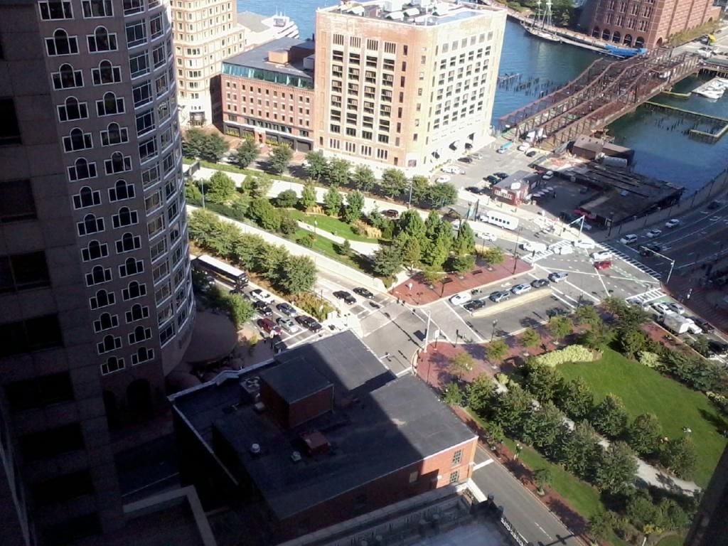
I don't think there is a separate thread for Harbor Towers:
presentation on the history and future of Harbor Towers:
http://northendwaterfront.com/2013/09/harbor-towers-reviews-its-history-and-future-plans/
I don't think there is a separate thread for Harbor Towers:
presentation on the history and future of Harbor Towers:
http://northendwaterfront.com/2013/09/harbor-towers-reviews-its-history-and-future-plans/
TheRifleman
Banned
- Joined
- Sep 25, 2008
- Messages
- 4,431
- Reaction score
- 0
Re: Harbor Towers - history and future
Any mention of removing the pool for better access to the Harbor for the citizens of Ma?
I don't think there is a separate thread for Harbor Towers:
presentation on the history and future of Harbor Towers:
http://northendwaterfront.com/2013/09/harbor-towers-reviews-its-history-and-future-plans/
Any mention of removing the pool for better access to the Harbor for the citizens of Ma?
TallIsGood
Active Member
- Joined
- May 30, 2006
- Messages
- 539
- Reaction score
- 129
I love the picture of the third Harbor Tower where Rowes Wharf sits now. I have never seen that picture before.
tobyjug
Senior Member
- Joined
- Jul 21, 2007
- Messages
- 3,408
- Reaction score
- 473
Re: Harbor Towers - history and future
It should be called Forty Stories of Suck
I don't think there is a separate thread for Harbor Towers:
It should be called Forty Stories of Suck


