You are using an out of date browser. It may not display this or other websites correctly.
You should upgrade or use an alternative browser.
You should upgrade or use an alternative browser.
Rose Kennedy Greenway
- Thread starter callahan
- Start date
- Joined
- Sep 15, 2010
- Messages
- 8,894
- Reaction score
- 271
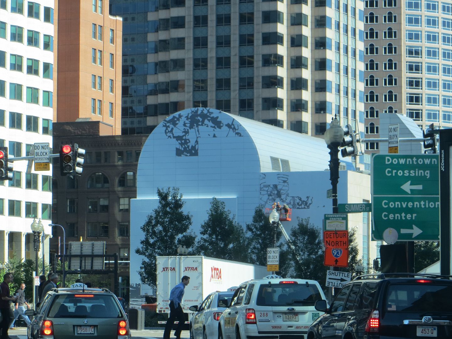
I love it! Can't wait! It might not disguise the rather ugly features on the side of that building as well as the Os Gemos mural though.
Boston02124
Senior Member
- Joined
- Sep 6, 2007
- Messages
- 6,893
- Reaction score
- 6,639
<--- waiting for the " my three year old can do that" comment.
My 7 year can do that.
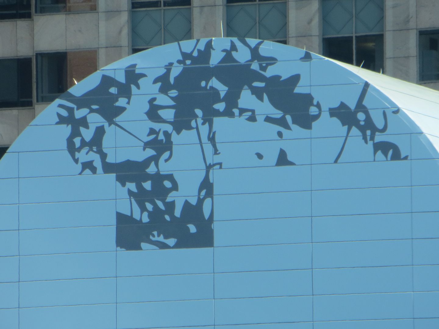
"Ritchie uses abstraction on a very grand scale to visualize information about systems of time, the creation of the universe, theories in physics, and the history of art"...yada, yada, pretentious art-babble, yada yada...really??? I don't buy it. It looks like a snail spitting out crumbs.
Still...it's better than the terrorist in his pajamas.
fattony
Senior Member
- Joined
- Jan 28, 2013
- Messages
- 2,099
- Reaction score
- 482
Meh. Abstract art is proudly devoid of any ... anything at all, really.
Gives people who don't know what they are talking about something to talk about.
I does look kinda cool though. Its like clouds - we can all stare at it an see something different. Too bad for the artist - his "talent" is imitating a fun effect that nature does infinitely better, for free, with new works debuting every second.
Let them have their pretense. It looks better than a blank wall or an advertisement.
underground
Senior Member
- Joined
- Jun 20, 2007
- Messages
- 2,390
- Reaction score
- 3
I think I get what the artist is doing here. He's replaced an unintentional Rorschach Test with a real one, right?
pixelsand8
Active Member
- Joined
- Mar 16, 2013
- Messages
- 467
- Reaction score
- 2
Even though I believe the modern art world is filled with scammers whose real talent lies in selling their ideas as opposed to creating useful work, there is the flip side of those who write off all abstract art in a knee jerk manner as crap. Just cause something is not technically advanced to the untrained eye doesn't mean it's not a great piece of art, the matter is more complex. I hate to bring up the old cliche but people said similar stuff about Van Gogh in his time and countless others.
Either way, can we at least see this piece completed and have some time to experience how it fits with it's surroundings before blasting the artist as a hack with the talent of a 7 year old?
This is one of the most run on back handed compliments I've ever read. So you are basically saying the artist did a good job considering the context in which he's working, am I right?
And not to nitpick but while this piece is influenced by nature it's not in any way an imitation. Nature - and especially clouds - move and change all the time. This mural is static, at least until they put up the new one. Huge difference.
Either way, can we at least see this piece completed and have some time to experience how it fits with it's surroundings before blasting the artist as a hack with the talent of a 7 year old?
Meh. Abstract art is proudly devoid of any ... anything at all, really.
Gives people who don't know what they are talking about something to talk about.
I does look kinda cool though. Its like clouds - we can all stare at it an see something different. Too bad for the artist - his "talent" is imitating a fun effect that nature does infinitely better, for free, with new works debuting every second.
Let them have their pretense. It looks better than a blank wall or an advertisement.
This is one of the most run on back handed compliments I've ever read. So you are basically saying the artist did a good job considering the context in which he's working, am I right?
And not to nitpick but while this piece is influenced by nature it's not in any way an imitation. Nature - and especially clouds - move and change all the time. This mural is static, at least until they put up the new one. Huge difference.
atlantaden
Senior Member
- Joined
- May 31, 2006
- Messages
- 2,604
- Reaction score
- 2,743
Haha, nice find, Justin. Since I'm all about color, I would have loved seeing Racing Snail #5 on the Vent building. That would have been one, fun, mural.
Brad Plaid
Senior Member
- Joined
- Jan 17, 2013
- Messages
- 1,310
- Reaction score
- 1,559
“Matthew Ritchie uses abstraction on a very grand scale to visualize information about systems of time, the creation of the universe, theories in physics, and the history of art,” said Jill Medvedow, Ellen Matilda Poss Director of the ICA.
His abstraction may very well be any or all of these fine things but mostly it's just boring.
J
JoeBoston1
Guest
His abstraction may very well be any or all of these fine things but mostly it's just boring.
The excitement of Os Gemos was so shocking to frumpy Bostonians, that it nearly rendered the mural project politically stillborn. ICA is not going to run that risk again.
The public deserves what it wants.
pixelsand8
Active Member
- Joined
- Mar 16, 2013
- Messages
- 467
- Reaction score
- 2
I wasn't outraged by the Os Gemos piece but I did think it was garish and ugly for such a central location in Boston. The newer work is much more aesthetically interesting in my view, and better fits with our city's identity. That said I like the idea of the mural being changed up every couple of years. Gives more space to take risks artistically seeing that it's not going to be permanent.
pixelsand8
Active Member
- Joined
- Mar 16, 2013
- Messages
- 467
- Reaction score
- 2
The Os Gemeos mural had character and really brightened up an otherwise sterile area. While I find this visually interesting, I doubt it will have anywhere near the same effect.
I can see this point of view. The new piece does kind of remind me of an advertisement billboard. It might blend in a little too much, but I guess I'll just wait and see how it looks when finished.
TheRifleman
Banned
- Joined
- Sep 25, 2008
- Messages
- 4,431
- Reaction score
- 0
The Os Gemeos mural had character and really brightened up an otherwise sterile area. While I find this visually interesting, I doubt it will have anywhere near the same effect.
I was a fan of the OS Gemoeos mural. At first I was very unsure but when I visited the site I thought it fit in perfect.
kz1000ps
Senior Member
- Joined
- May 28, 2006
- Messages
- 8,975
- Reaction score
- 11,754
Put me down as another agreeing with Hutchinson--Boston's aesthetic sense needs to be challenged like that more often. I think the new design is quite nice but it's also going to blend into the background in no time.
So...I took a walk to check this out in order to confirm my predisposition against it, and I am man enough to admit that I am very pleasantly surprised how much I like it. The "snailishness" is much less apparent in person. It feels like dandilions blowing in the breeze...AND there's no way my 7 year old could have pulled this off.....


TheRifleman
Banned
- Joined
- Sep 25, 2008
- Messages
- 4,431
- Reaction score
- 0
I miss the Os Gemeos mural already.


