TheRifleman
Banned
- Joined
- Sep 25, 2008
- Messages
- 4,431
- Reaction score
- 0
the original often is the best plan....
Good comment. Most developments that are proposed for the first time are usually already thought out very well.
the original often is the best plan....
Dickhead! Not cool! Not cool!
Just realized how incredibly dense the residential component was originally. If my math is correct:
6500 units x 2 people per unit = 13,000 people.
"100 Acres" (isn't that roughly the size of the Seaport planning initiative) = .156 Sq Miles
So that works out to 83,200 people per square mile. Meaning the 1990's plan for the Seaport was almost 3x as dense as Hoboken???
Sicilian, come out of retirement and help me out. What's wrong with my math?
This week, the BRA presented a new goal: 6,000 housing units for the entire Innovation District. That is REALLY sparse as a goal.
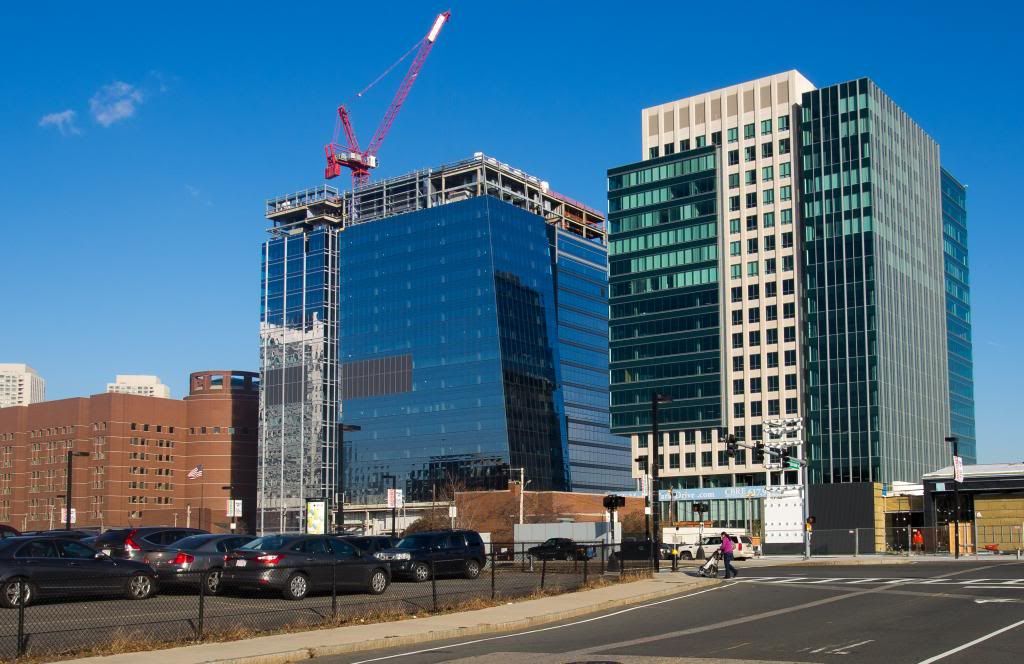
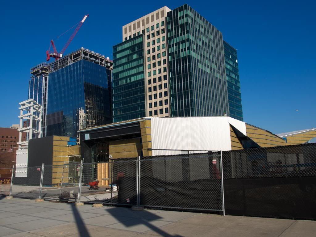
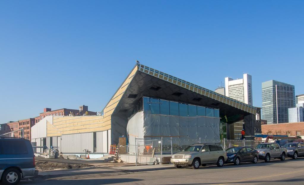
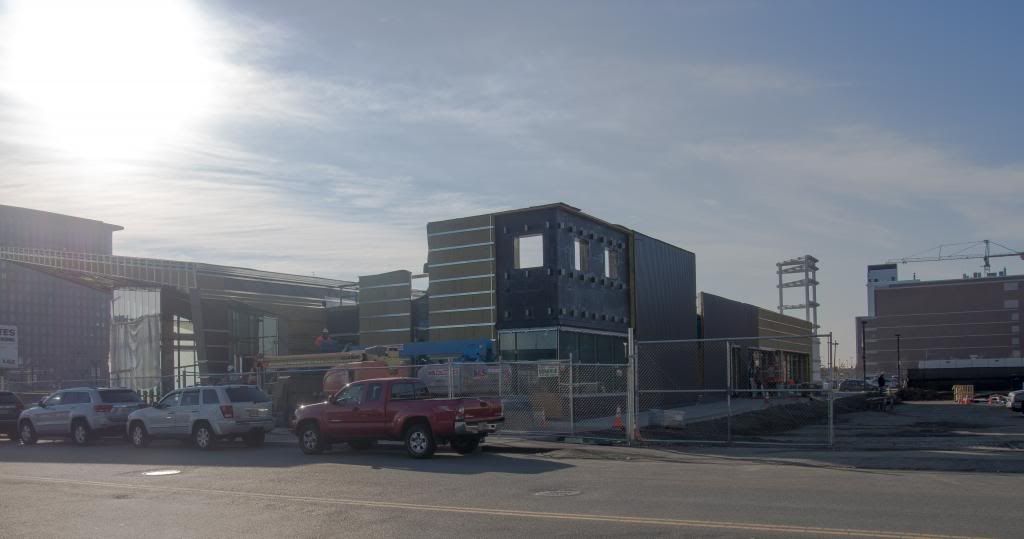
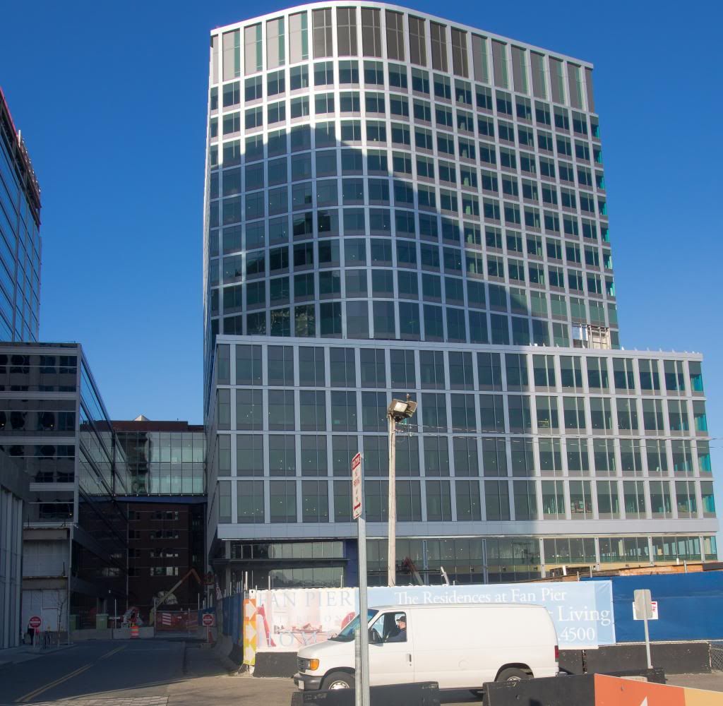
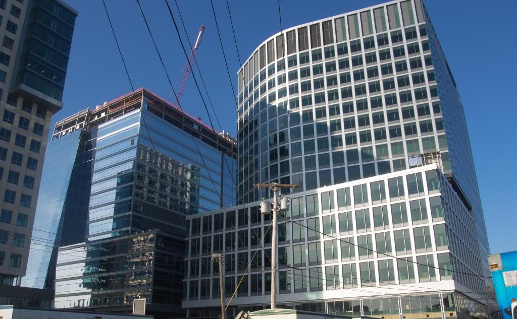
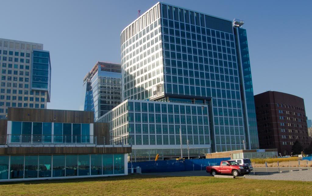
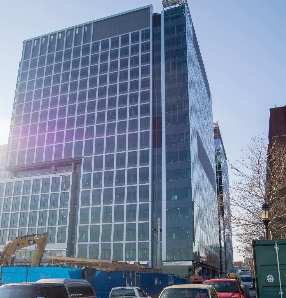
Suburban Dallas is wondering where the cheap suburban office buildings next to its highway interchanges went.
^^ Not really. After all, there's going to be another building between the Vertex checkerboard-facade building and the water--you can see the sales office in the second to last picture. There's going to be residences facing the water.
After a certain point, don't these +1 "these buildings suck" posts get redundant? Every time new pics are up we get the same gripes over and over and over again.

To the right is where you park and wait for the girls on roller skates to bring you your burgers and fries:

The horrible buildings are getting redundant, too. At a certain point, there's nothing to do but gape and try to outdo each other with snark. My only regret is that I'm not always the most creative at it.
(There's also a school of "it's good enough for me!" on this forum that is preemptively combatted by saying these things every so often.)
Thanks Dave. Now I'm hungry.
The horrible buildings are getting redundant, too. At a certain point, there's nothing to do but gape and try to outdo each other with snark. My only regret is that I'm not always the most creative at it.
(There's also a school of "it's good enough for me!" on this forum that is preemptively combatted by saying these things every so often.)
This building looks like it belongs at Yellowstone National Park. The only thing missing is a big totem pole. It is an embarrassment of epic proportion. Hopefully it becomes such a popular meeting space that a small high rise addition will be added in the future. But even in that scenario, the damage has been done. I hope the landscaping will help hide it.
