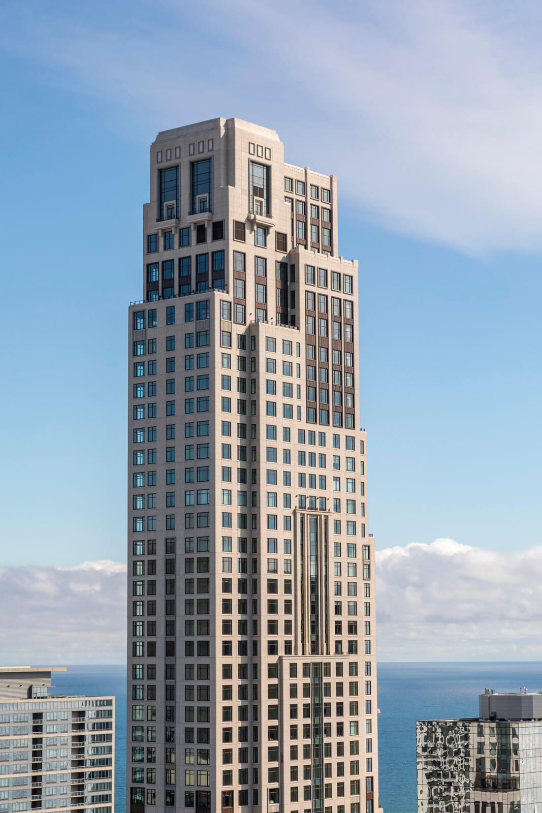
Shreve, Crump & Low Redevelopment | 334-364 Boylston Street | Back Bay

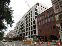
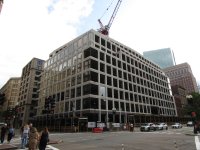
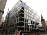
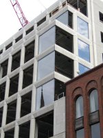
I feel like the windows look bigger than expected. The rendering (kind of) had a 501 boylston vibe to it. It even has that same notch near the roof.

1724963459957.jpeg


1724963473298.jpeg


The large windows though really just make it look like another low rise office building. The spandrels are limestone, if they had made them thicker it wouldnt have been too bad. I’m sure they really didnt have a choice though as class a office these days demands floor to ceiling windows, even though its horrendously inefficient and looks boring.
 
I work around the corner. Even incomplete, it is clear this building is stunning. The materials are excellent and the glass really pops.

The endless haterade being spilled is unnecessary. There's pages of documentation on why the old building was unsupportable. The idea that *design review* would somehow make anything new better despite legions of counterexamples, including the new building on Newbury at Dartmouth around the corner is absolutely wild.

Cities change and in this case the developer is doing a good job.
 
This building is on a par with the Whoop building in Kenmore Square for an ugly, cheap-looking building dumped into the middle of a neighborhood of fine older buildings.
 
This building is on a par with the Whoop building in Kenmore Square for an ugly, cheap-looking building dumped into the middle of a neighborhood of fine older buildings.
Here's the thing: It is a *much* nicer looking building in person than the Whoop building. It manifestly does *not* look cheap --- it looks like some of the new, slightly historicist modern construction on the Upper East Side in NYC. Dislike it all you like, but cheap it ain't.
 
Here's the thing: It is a *much* nicer looking building in person than the Whoop building. It manifestly does *not* look cheap --- it looks like some of the new, slightly historicist modern construction on the Upper East Side in NYC. Dislike it all you like, but cheap it ain't.
I agree the Whoop building is in a league of its own, with its pinkish faux brick paper thin panels, one of the cheapest looking buildings I've seen in my lifetime. This Shreve, Crump & Low redevelopment bothers me because it looks like a 1980s DC agency HQ building, or something from a Rte. 128 office park of the same era. Which in and of itself isn't so bad, but in the context of this classic, iconic locale, it is a bit jarring. But I agree, the Whoop definitely is far, far worse.
 
I agree the Whoop building is in a league of its own, with its pinkish faux brick paper thin panels, one of the cheapest looking buildings I've seen in my lifetime. This Shreve, Crump & Low redevelopment bothers me because it looks like a 1980s DC agency HQ building, or something from a Rte. 128 office park of the same era. Which in and of itself isn't so bad, but in the context of this classic, iconic locale, it is a bit jarring. But I agree, the Whoop definitely is far, far worse.

Context matters. Both are bad neighbors. Just like the Holocaust Museum across from Park Street Station.

Cities are SOCIAL. Cities are choreographed. There is a rhythm to public transportation, services and, yes, architecture.

It’s no accident why anti-social self-proclaimed “rugged individuals” live in rural areas and erect fences for their solitude.

Cities are all about humanity working together in context. Cities are about TEAMWORK. Buildings that don’t give a shit about their surroundings are just bad neighbors.
 
Last edited:
For some reason it seems that RAMSAS has a difficult time in recent years with Boston (they can certainly pull it off in other cities well enough).

For example - Shreve is clearly the sibling of the superior 900 16th Street, NW: https://www.ramsa.com/projects/project/900-16th-street-nw

I do like their work at Lovejoy Wharf.
I looked at their website, and something like their One Bennett Park masonry rower in Chicago would have been great for the South Station Tower:

A13062%202019A67_409_RT_1.jpg
 
I’m pretty sure the building this replaced was itself cheap and mediocre quality, right?

Not everything old is high quality, they had budgets back then too.
It's not that the new Shreve, Crump & Low Redevelopment building is actually built from cheap materials, it just looks cheap, mainly because of its poor visual fit into the context of the neighborhood, as discussed in the posts above.
 
For some reason it seems that RAMSAS has a difficult time in recent years with Boston (they can certainly pull it off in other cities well enough).

For example - Shreve is clearly the sibling of the superior 900 16th Street, NW: https://www.ramsa.com/projects/project/900-16th-street-nw

I do like their work at Lovejoy Wharf.
Perhaps ironically, 900 16th St. NW was built on the site of a demolished building. A building that was locally landmarked, and arguably, a much more important building, architecturally. that SC&L.

See:
https://historicsites.dcpreservation.org/items/show/594

3rd_Church_of_Christ_-_Christian_Science_Church_by_Matthew_Bisanz2.JPG.3124233.JPG


Photo credit:
https://www.sosbrutalism.org/cms/19132454
 

Back
Top