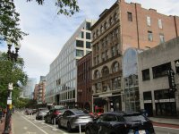
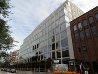
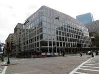
Agreed. The block that had been there was just fine and likely could have been converted — it was just a bunch of bow window-heavy brownstones. Gorgeous. Kenmore used to be cool. Now it’s nothing.Even the re-do wasn't that great. In the first iteration, the actual materials looked NOTHING like the renderings, which were OK......if even a bit Disney fake. However, the cheap materials and tacky installation is what really killed it in my opinion. They made it better, but still not great.
You are using an out of date browser. It may not display this or other websites correctly.
You should upgrade or use an alternative browser.
You should upgrade or use an alternative browser.
Shreve, Crump & Low Redevelopment | 334-364 Boylston Street | Back Bay
- Thread starter statler
- Start date
Smuttynose
Active Member
- Joined
- May 26, 2006
- Messages
- 741
- Reaction score
- 4,166
9/29/2024

- Joined
- May 25, 2006
- Messages
- 7,062
- Reaction score
- 1,976
This would be a great addition to the city if it wasn't for it's baggage.
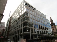
Yeah, this is kind of where I stand. I respect the angst about the loss of the old buildings, but I really dig the aesthetics of this, it hits a nice late-80s/early-90s nostalgia sweet spot for me. I think people who don't know what used to be there will think it's fantastic.This would be a great addition to the city if it wasn't for it's baggage.
HenryAlan
Senior Member
- Joined
- Dec 15, 2009
- Messages
- 4,446
- Reaction score
- 5,176
And what used to be there actually wasn't that great. The facade was highly over-rated in my opinion, and the structure itself was cheaply made and poorly maintained.I think people who don't know what used to be there will think it's fantastic.
Another significant about-face on aB! Not complaining - I enjoy when hand-wringing and teeth-gnashing over developments turn out to be either misguided or at the very least overblown.
Personally, I think the new building is fine, if a little ho-hum, and agree that if street-level is effectively activated it’ll be a net win.
Personally, I think the new building is fine, if a little ho-hum, and agree that if street-level is effectively activated it’ll be a net win.
stellarfun
Senior Member
- Joined
- Dec 28, 2006
- Messages
- 5,719
- Reaction score
- 1,563
IIRC, the architect for the original building was from Beverly, and his portfolio was mainly large (and expensive) residences on the North Shore. As the original tenant was a commercial school, it may well have been economically constructed. Again IIRC, the Art Deco overlay was added when SCL moved in.And what used to be there actually wasn't that great. The facade was highly over-rated in my opinion, and the structure itself was cheaply made and poorly maintained.
When you're right, you're right.I am not sure if I mentioned it in this forum, but I definitely told people that the original building wasn’t even close to being the best building on the block.
Haven't drunk the Kool-Aid Du Jour.
It looks like the HBO Building at the corner of 42nd and 6th in Manhattan - an International Style-with-a-dollop-of-PoMo landscraper that doesn't look great when new and looks terrible when a little worn.
It replaced a good stretch of historic buildings with moderate importance on their own right and essential for placemaking.
Druker still sucks.
stick n move
Superstar
- Joined
- Oct 14, 2009
- Messages
- 13,361
- Reaction score
- 23,945
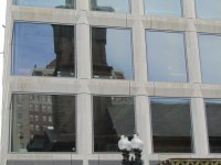
The facade does look pretty drab and dirty when you zoom in but hopefully that will just be washed off before opening.
Czervik.Construction
Senior Member
- Joined
- Apr 15, 2013
- Messages
- 1,959
- Reaction score
- 1,223
The bipolar nature of AB is on full display.
Charlie_mta
Senior Member
- Joined
- Jul 15, 2006
- Messages
- 5,088
- Reaction score
- 7,615
Some buildings grow on you. The BU computer science building, the Verizon Building, and now this one absolutely horrified a lot of people on here at first, me included. But the first two I've come to like, and now this one is coming around as well. Funny how that works.The bipolar nature of AB is on full display.
I think we're finally hitting the point where renders can only do so much to sell you on a building. The primary render for this place is so deep in Uncanny Valley territory that it's impossible to make any judgements on how the building will actually interact with the streetscape, plus they put the camera at an angle that you will literally never see it from. Architects are making their lives more difficult in some regards here.Some buildings grow on you. The BU computer science building, the Verizon Building, and now this one absolutely horrified a lot of people on here at first, me included. But the first two I've come to like, and now this one is coming around as well. Funny how that works.
RandomWalk
Senior Member
- Joined
- Feb 2, 2014
- Messages
- 3,713
- Reaction score
- 6,502
We need more Hugh Ferriss and less megaplex CGI in our renders.

