You are using an out of date browser. It may not display this or other websites correctly.
You should upgrade or use an alternative browser.
You should upgrade or use an alternative browser.
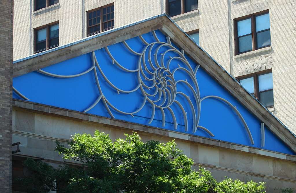
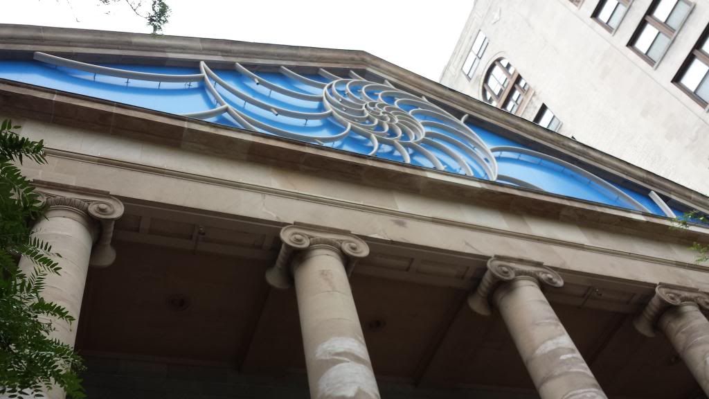
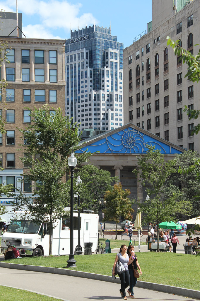
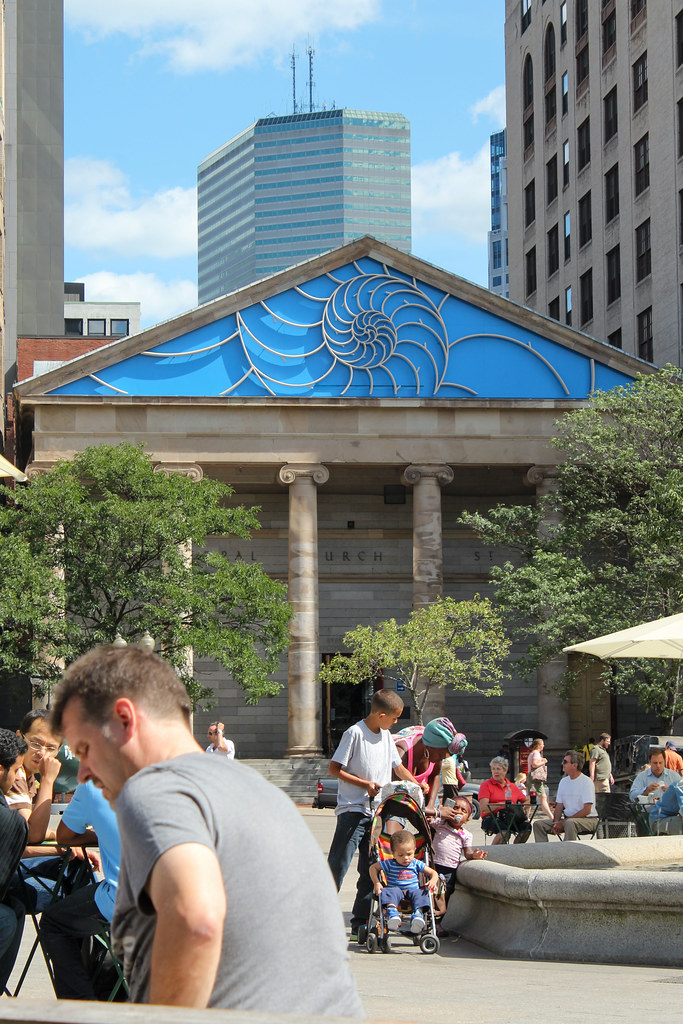
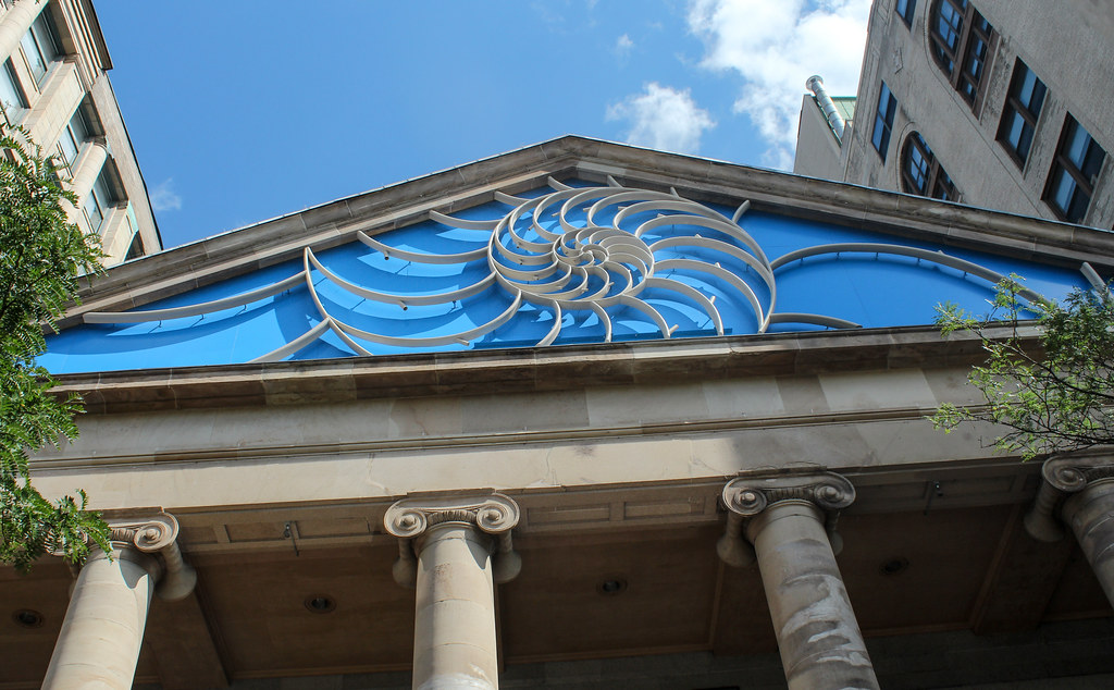
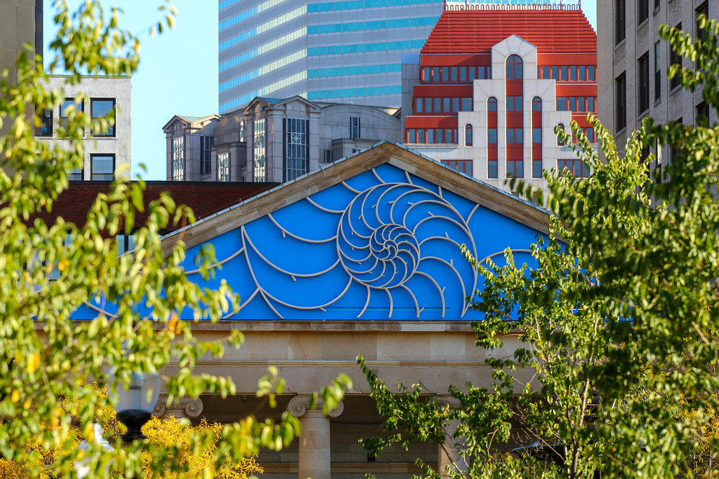
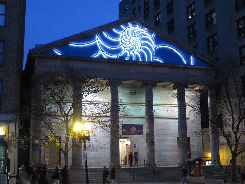
St Paul's Cathedral Alteration (Nautilus Pediment) | Tremont St | Downtown Crossing
- Thread starter briv
- Start date
There is an 'it should have been done better' thread running through the comments here. No amount of 'better' would have saved this mess. The swimming-pool-liner-blue background has been noted. Does it fit with the rest of the building? No. Do the curving lines of the design fit with the severe triangular space they've been confined in? No. Does the garish night-time lighting fit with the rest of the building? No. This design (absent the hideous blue) could work - on another, new building. In this case, it looks like vinyl siding on a Second Empire house. With neon lights.
As to the symbolism, it probably works. Given the way it eschews Christian iconography of any kind, I think we can assume that this is exactly what the congregation wanted. It's a good way to say 'don't confuse us with those Christians.' And it certainly is their right to say so. But did they have to say it in such an eye-poking way? It looks like the entrance to the Tri-Cities Mall.
As to the symbolism, it probably works. Given the way it eschews Christian iconography of any kind, I think we can assume that this is exactly what the congregation wanted. It's a good way to say 'don't confuse us with those Christians.' And it certainly is their right to say so. But did they have to say it in such an eye-poking way? It looks like the entrance to the Tri-Cities Mall.
- Joined
- Sep 15, 2010
- Messages
- 8,894
- Reaction score
- 274
Finally remembered to go see this today. It looks like shit in person too...
- Joined
- May 25, 2006
- Messages
- 7,063
- Reaction score
- 1,989
Is that still up? God, please take that down. It's not funny anymore.
I am by no means an expert on all things architecture...I just know what I like. This is just hideous. I don't understand what they were trying to do. It looks cheap and like something a HS art class would do...if they were from a school for the mentally challenged. And even then I think they'd do a better job than what this turned out to be.
fattony
Senior Member
- Joined
- Jan 28, 2013
- Messages
- 2,099
- Reaction score
- 482
I am by no means an expert on all things architecture...I just know what I like. This is just hideous. I don't understand what they were trying to do. It looks cheap and like something a HS art class would do...if they were from a school for the mentally challenged. And even then I think they'd do a better job than what this turned out to be.
The original concept looked good. It appears to have been VE'd to oblivion. Maybe it was the designer's fault though - maybe there never was budget for the original concept and they should have gone with something else entirely from the beginning.
Shepard
Senior Member
- Joined
- Mar 20, 2009
- Messages
- 3,518
- Reaction score
- 69
I'm still in shock that this is the finished result.
The cheap blue panels with seams behind the nautilus... what? Replace the background with a blue granite or marble and we'd be most of the way towards salvaging this. Kickstarter, anyone?
The cheap blue panels with seams behind the nautilus... what? Replace the background with a blue granite or marble and we'd be most of the way towards salvaging this. Kickstarter, anyone?
"Submit to the gods of State Street Bank! Bow to the deities in One Financial!"
commuter guy
Active Member
- Joined
- Feb 1, 2007
- Messages
- 937
- Reaction score
- 167
whatever that blue corkboard looking crap is, I swear the exact same stuff is popping up on the facades of local Diary Queens. I first saw it on the dairy queen in Brockton and now I see it has spread to the DQ in Natick.
gooseberry
Active Member
- Joined
- Nov 24, 2009
- Messages
- 550
- Reaction score
- 3
I hoped this thread popped up because there was news that this blemish was being removed.
Padre Mike
Active Member
- Joined
- Jan 27, 2007
- Messages
- 681
- Reaction score
- 1
Ditto! Trouble is raising scaffolding again to remove it costs an arm and a leg...wonder if anyone budgeted for it? DONATIONS??I hoped this thread popped up because there was news that this blemish was being removed.
- Joined
- Jan 7, 2012
- Messages
- 14,172
- Reaction score
- 23,683
whighlander
Senior Member
- Joined
- Aug 14, 2006
- Messages
- 7,812
- Reaction score
- 647
I think it will be a great photo op on some winter night with snow falling in front of the electric nautilus
JeffDowntown
Senior Member
- Joined
- May 28, 2007
- Messages
- 5,036
- Reaction score
- 4,201
I think it actually works at night. (It is horrible in daylight).