State Street HQ | One Congress | Bulfinch Crossing | West End

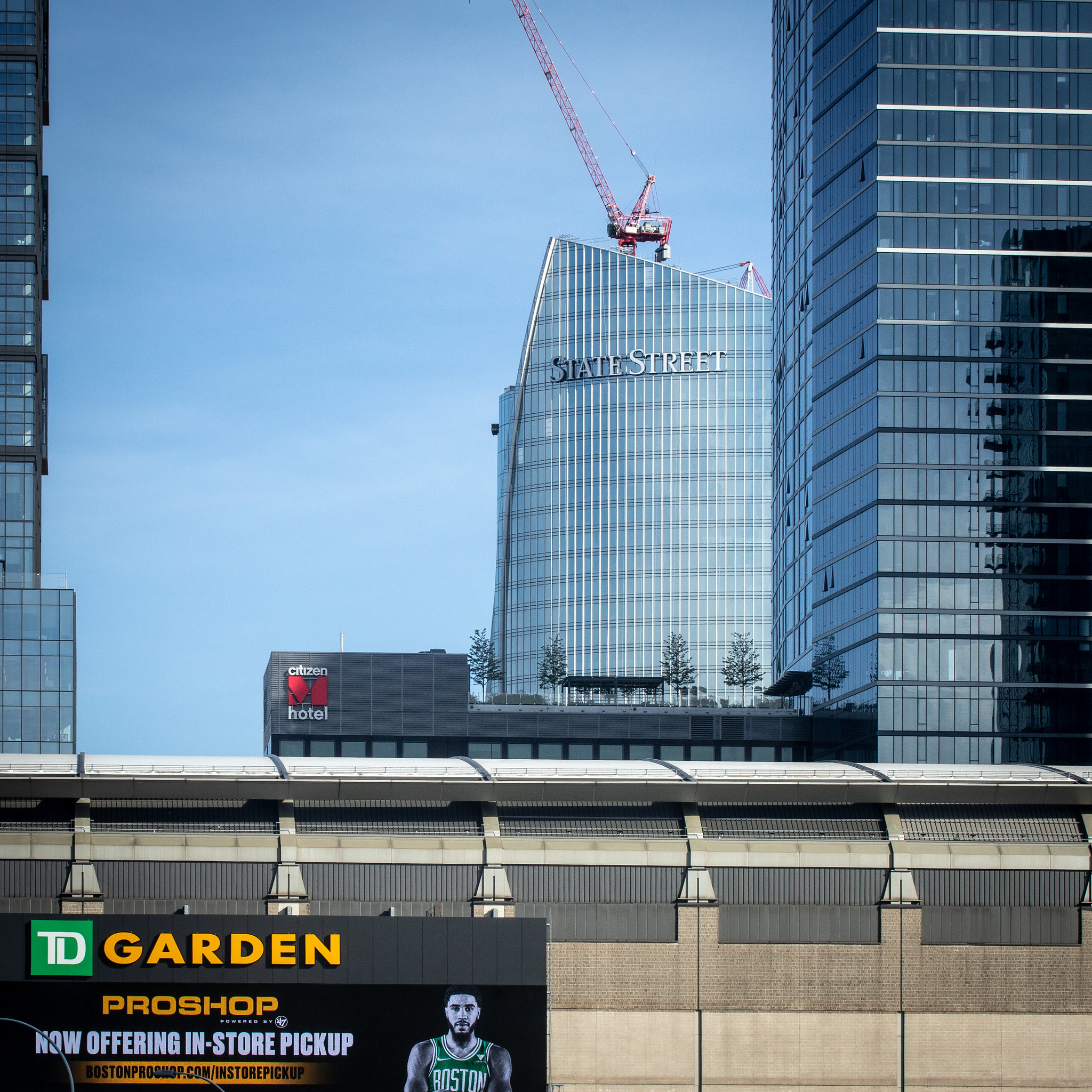
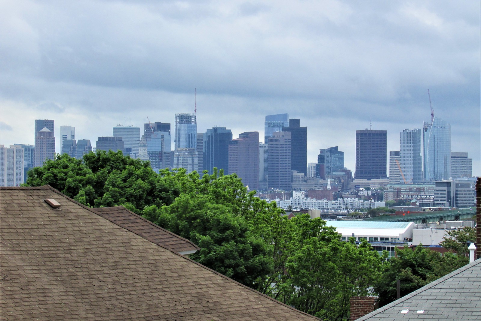
That temporary vertical shaft in the tower makes it look slimmer. There should have been a permanent feature of this type, maybe a wide line of darker glass or something similar.
 
52111500158_796baf05ff_k.jpg


(In Tatum we trust?)

52110431767_eb62003da7_k.jpg
 
Borrowing some photos from DZH22, I came up with this composite of how State Street HQ could be slimmed down a bit visually if it had stronger vertical elements like Millennium Tower (my apologies for modifying the photos):

52113427513_df3c968f5c_b.jpg
 
gotta say -- after doing lots of travel by car and plane the past couple weeks and seeing this bad-boy (fancy gal?) from the north, the familiar CRB view, logan, flight arrivals/departures, and from higher floors of avalon n. station -- i.... kinda even like the "fat" side. the proportions are 100% working imho. what a stunner.
 
gotta say -- after doing lots of travel by car and plane the past couple weeks and seeing this bad-boy (fancy gal?) from the north, the familiar CRB view, logan, flight arrivals/departures, and from higher floors of avalon n. station -- i.... kinda even like the "fat" side. the proportions are 100% working imho. what a stunner.
The fat side is the best side. It's great.
 

Back
Top