- Joined
- May 25, 2006
- Messages
- 7,062
- Reaction score
- 1,976
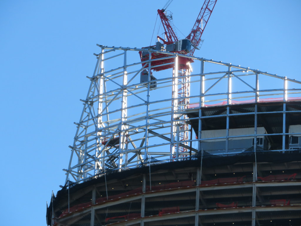
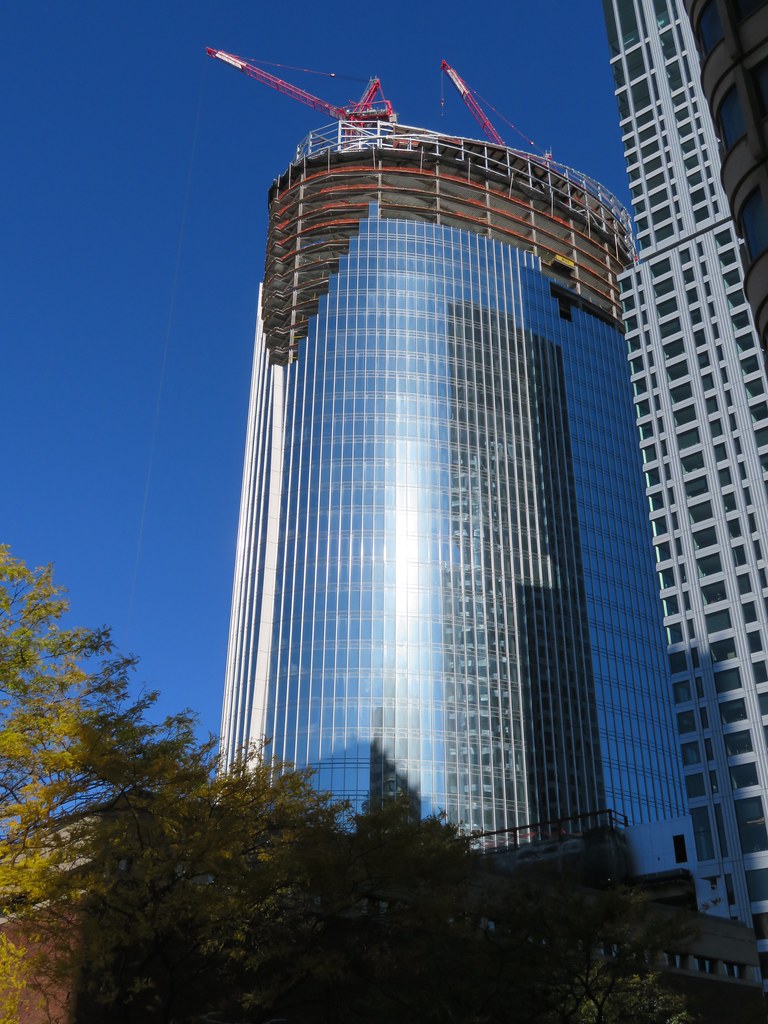
That netting makes it look like this has a cornice and I kind of wish it did now.
 IMG_7082 by Bos Beeline, on Flickr
 IMG_7092 by Bos Beeline, on Flickr
 IMG_7093 by Bos Beeline, on Flickr
 IMG_7083 by Bos Beeline, on Flickr
 IMG_7102 by Bos Beeline, on Flickr
 IMG_7140 by Bos Beeline, on Flickr
 IMG_7118 by Bos Beeline, on Flickr
 IMG_7117 by Bos Beeline, on Flickr
 IMG_7128 by Bos Beeline, on Flickr
wasn't it reported waaaaaaay back when -- relatively soon after the first renders were released -- that the scope and shape of the "fins" was going to be scaled back somewhat b/c the initial design was ultimately deemed to be unsafe/unstable in high winds?
i do not recall the source (or even if it happened. maybe i'm conflating things i've read with conversations i've had since this project was introduced), so i guess take that for whatever it's worth (or not worth). as a concept, it makes a degree of sense to me. the more extreme fins in that render you shared do kind of scream, "go ahead -- just try and blow this glass and steel 'sail' down! oh, it's a port city and the windiest city in america? hubris, you say? the gods themselves couldn't topple this design!!!"
Also the render seems to have a pretty extreme perspective correction applied.The render also doesn't include the mech, so we're visually comparing it against a different roofline. Plus the render isn't looking up at quite as much of an angle. It's close, but it also makes a difference in addition to the mech.
I see a similarity between the top of State Street HQ and the Roman Coliseum. Interesting how architectural themes run through the millennia (image reversed for comparison purposes):

Not so much a theme but the result of a huge earthquake. Imitation appears to be operating though.I see a similarity between the top of State Street HQ and the Roman Coliseum. Interesting how architectural themes run through the millennia (image reversed for comparison purposes):

The Coliseum was a complete round shell before it was um... partly destroyed lolI see a similarity between the top of State Street HQ and the Roman Coliseum. Interesting how architectural themes run through the millennia (image reversed for comparison purposes):


