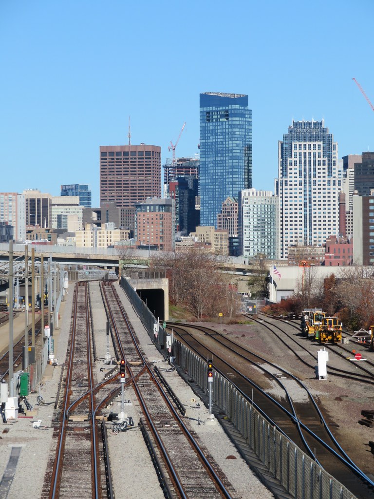
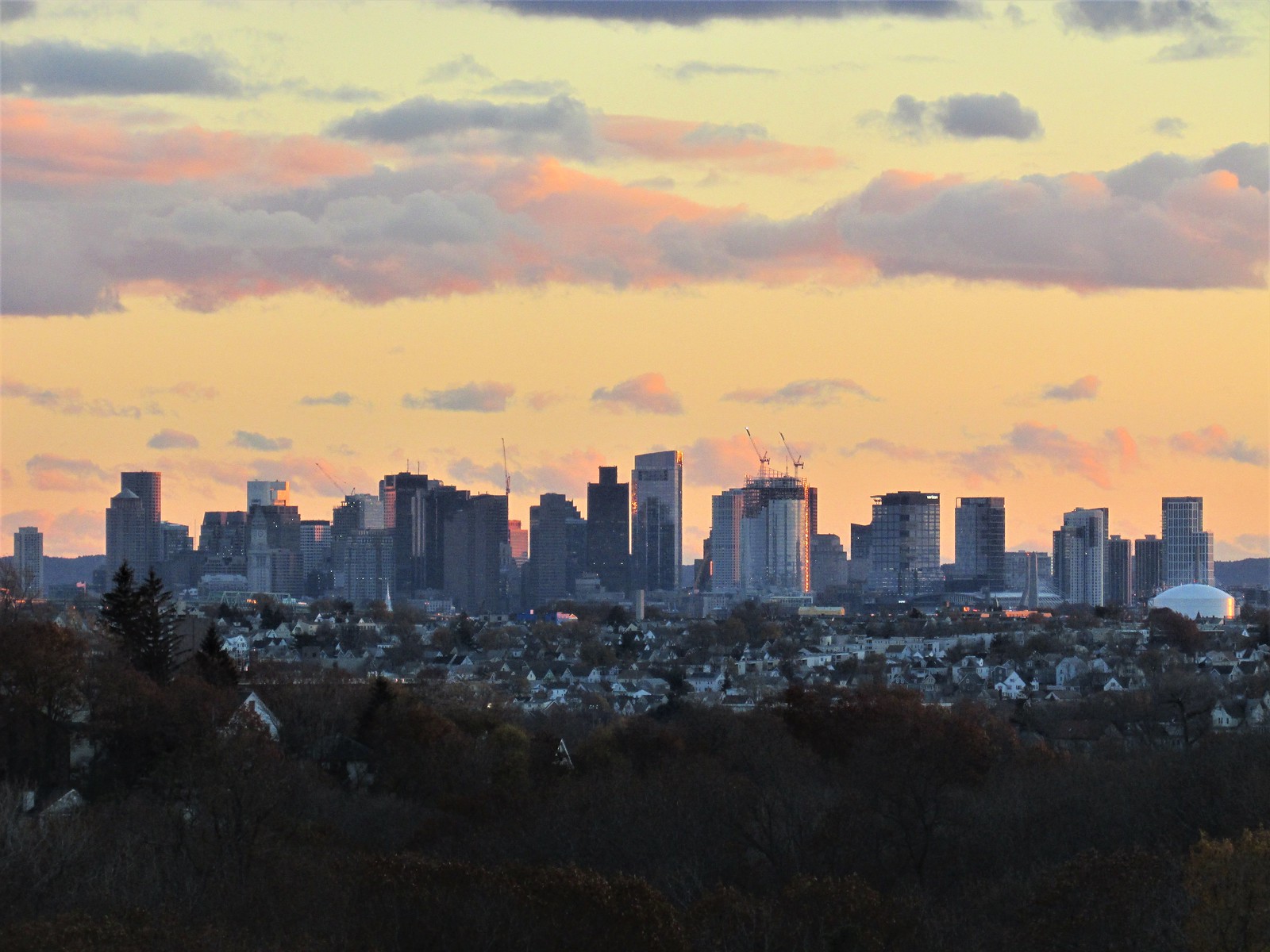
Wasn't it designed and built on spec, well before State Street was an anchor tenant? That's absolutely my memory of the timeline, including the (understandable) push-back to the clunky, Times New Roman "State Street" logo being awkwardly affixed to the exterior of easily the most "modern-looking" Boston high-rise.I assume the shape is meant to invoke sails as per State Street's logo, but what's funny is looking at it I get more of a Fleet Bank vibe.
You are using an out of date browser. It may not display this or other websites correctly.
You should upgrade or use an alternative browser.
You should upgrade or use an alternative browser.
State Street HQ | One Congress | Bulfinch Crossing | West End
- Thread starter FitchburgLine
- Start date
Equilibria
Senior Member
- Joined
- May 6, 2007
- Messages
- 7,083
- Reaction score
- 8,310
Wasn't it designed and built on spec, well before State Street was an anchor tenant? That's absolutely my memory of the timeline, including the (understandable) push-back to the clunky, Times New Roman "State Street" logo being awkwardly affixed to the exterior of easily the most "modern-looking" Boston high-rise.
I mean, we were just talking about how "New Roman" this building looks...
bigpicture7
Senior Member
- Joined
- May 5, 2016
- Messages
- 3,900
- Reaction score
- 9,523
Though we can't imagine anything hipper than sans-serif fonts at the moment, y'all know whatever generation comes after Z is gonna love them some Times New Roman and consider us hopelessly out of touch. This building will be ahead of its time.
BeyondRevenue
Active Member
- Joined
- Mar 13, 2020
- Messages
- 549
- Reaction score
- 1,148
Is it just me or does that building look like a modern woman in need of a nicotine addiction?I’m starting to worry that the swoop isn’t nearly as… swoopy as the early renders depicted. From this angle you have to look pretty closely to see that it isn't just a straight up oval. The “sheath” effect is less pronounced than I was expecting
View attachment 18868
Charlie_mta
Senior Member
- Joined
- Jul 15, 2006
- Messages
- 4,556
- Reaction score
- 6,475
It does look like a grande dame making a sweeping entrance into a room wearing a plus-sized evening gown.Is it just me or does that building look like a modern woman in need of a nicotine addiction?
Patrick Winn
Active Member
- Joined
- Aug 19, 2020
- Messages
- 256
- Reaction score
- 519
Best post ever.Is it just me or does that building look like a modern woman in need of a nicotine addiction?
View attachment 18975View attachment 18976
Boston02124
Senior Member
- Joined
- Sep 6, 2007
- Messages
- 6,893
- Reaction score
- 6,639
- Joined
- Jan 7, 2012
- Messages
- 14,062
- Reaction score
- 22,728
- Joined
- Jan 7, 2012
- Messages
- 14,062
- Reaction score
- 22,728
 IMG_7640 by Bos Beeline, on Flickr
Charlie_mta
Senior Member
- Joined
- Jul 15, 2006
- Messages
- 4,556
- Reaction score
- 6,475
I don't know, but when the glass gets all the way to the top of the fin, then I'll be excited.Was there ever a topping-out ceremony for the tower? If there was, I somehow missed it!!
Patrick Winn
Active Member
- Joined
- Aug 19, 2020
- Messages
- 256
- Reaction score
- 519
anyone know the name of that new building going up in the foreground in the last pic? (IMG_6681)
anyone know the name of that new building going up in the foreground in the last pic? (IMG_6681)
It's the one in Union.
Union Square D2.1 | 10 Prospect Street | Somerville
This is going to really stick out.
archboston.com

 IMG_6216
 IMG_6217
 IMG_6326
 IMG_6329
 IMG_6378
 IMG_7449
 IMG_7450
 IMG_6398
 IMG_6399
 IMG_6400
 IMG_6432
 IMG_6434
 IMG_6444
 IMG_6479
 IMG_6490
 IMG_6493
 IMG_6515
 IMG_6517
 IMG_6653
 IMG_6654
 IMG_6674
 IMG_6681