The Boulevard (née The Times/Littlest Bar) | 110 Broad St | Downtown

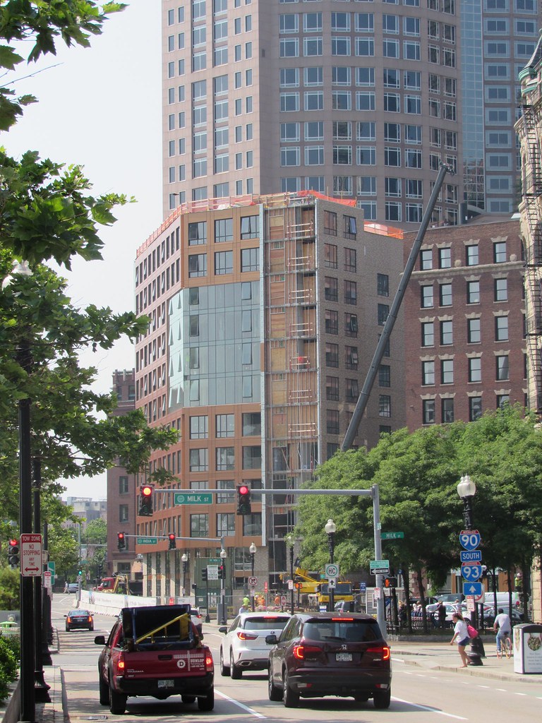
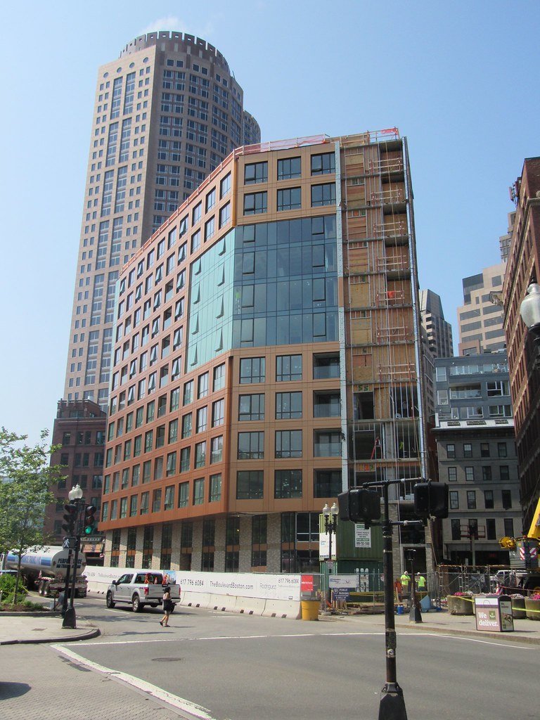
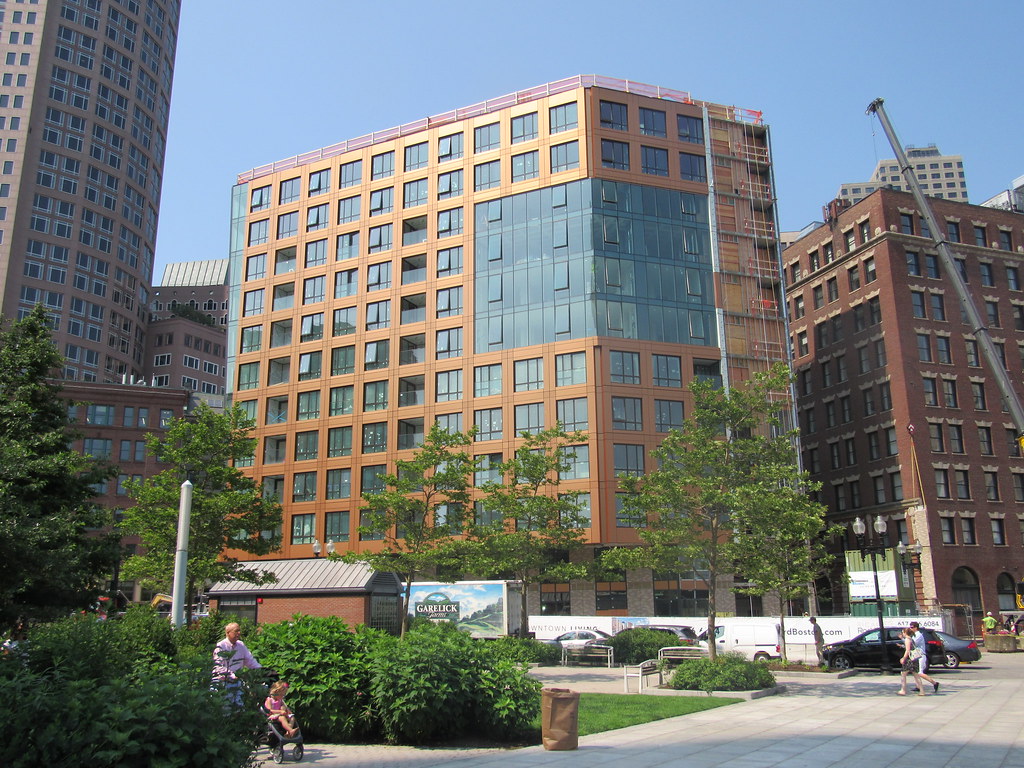
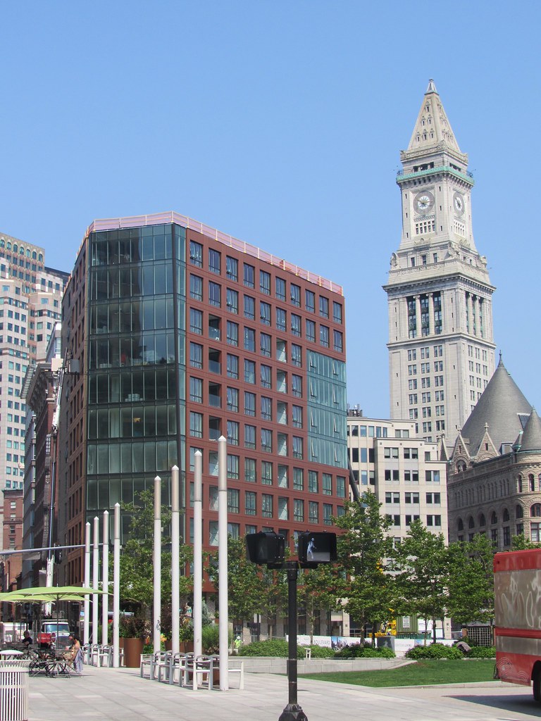
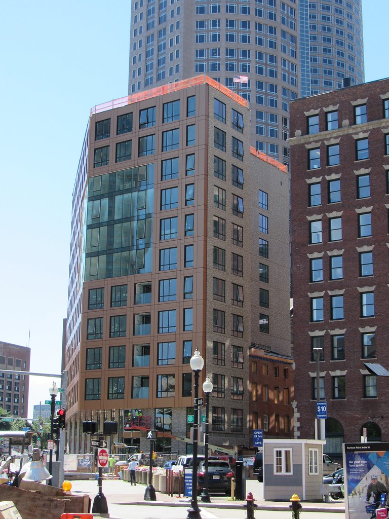
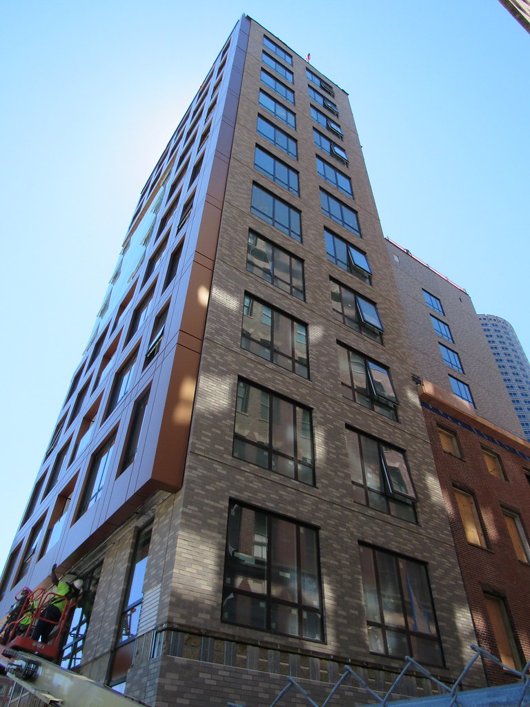
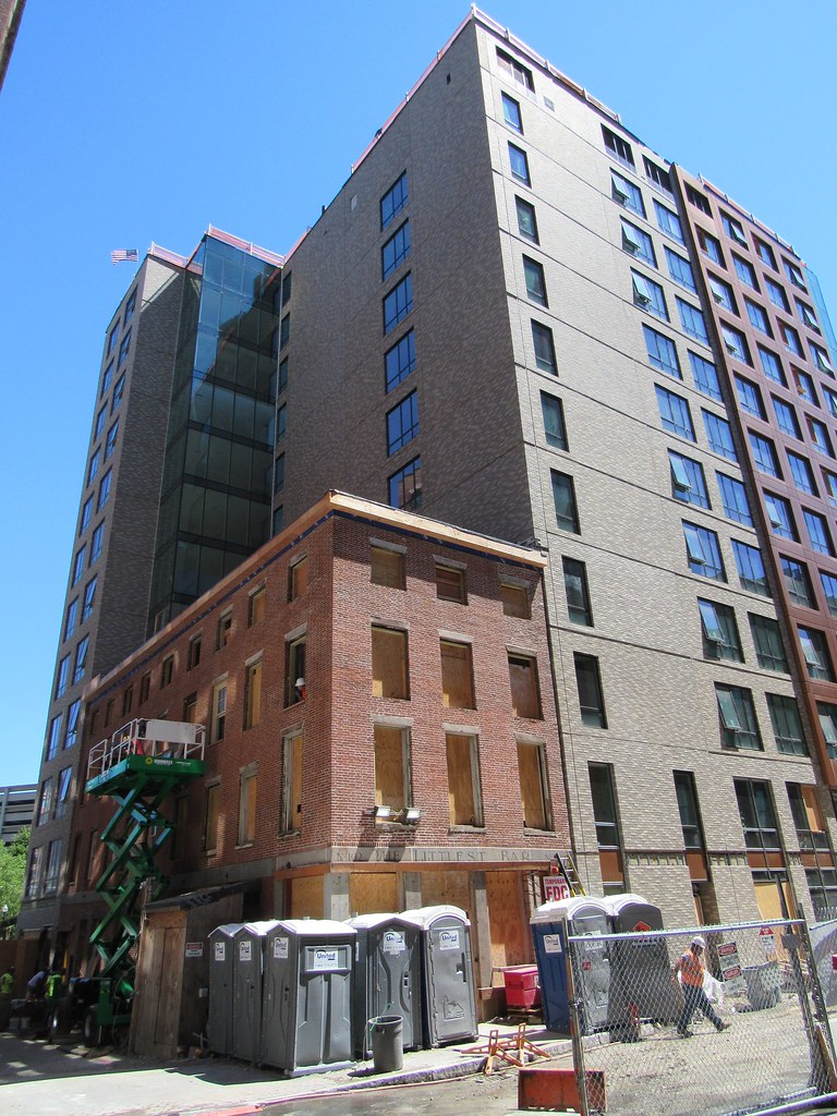
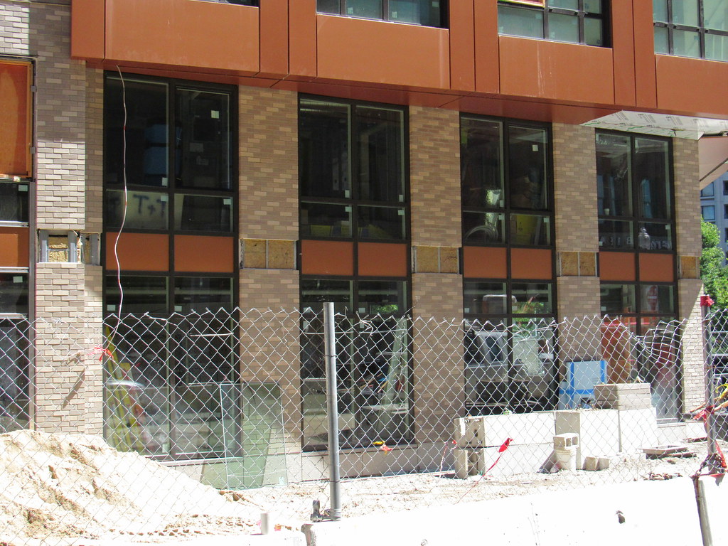
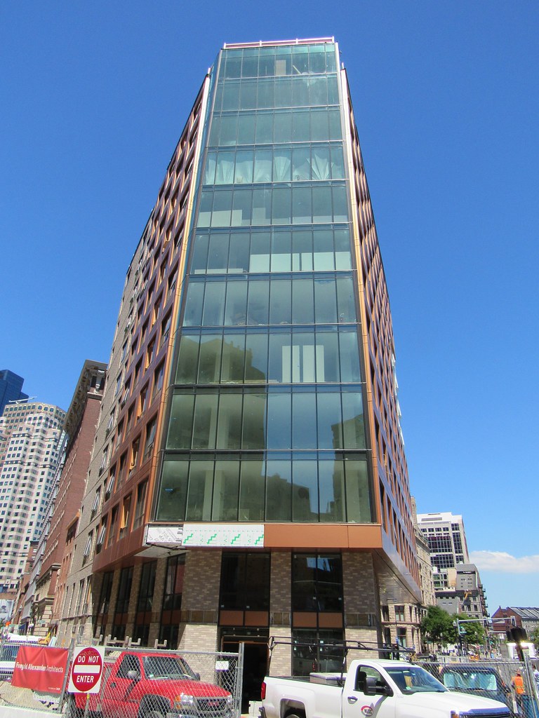
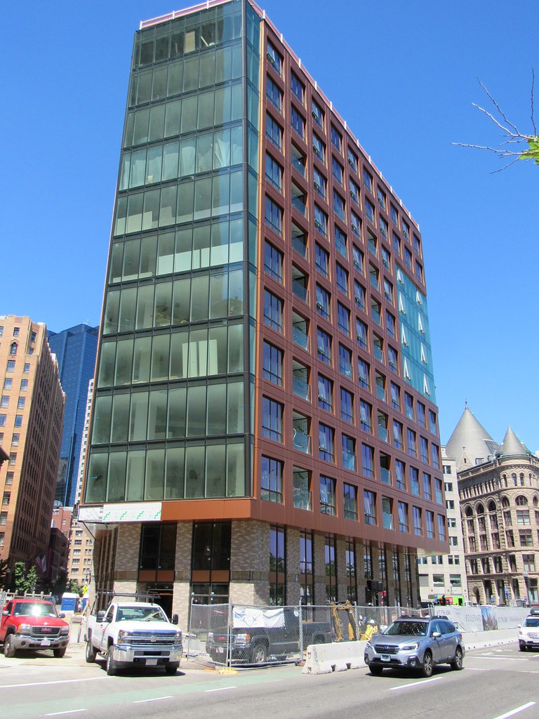
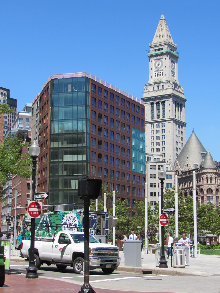
I hate what they did to the Times building and this will never be worth it but I don't mind this building, it's halfway decent

Ditto. This would be a nice addition in so many other places - but as it is, it erased a piece of history that nicely filled the urban tapestry.

I think the best thing the city can do for the built environment and quality of life for everyone in Boston is to safeguard historic structures - and otherwise just get out of the way.
 
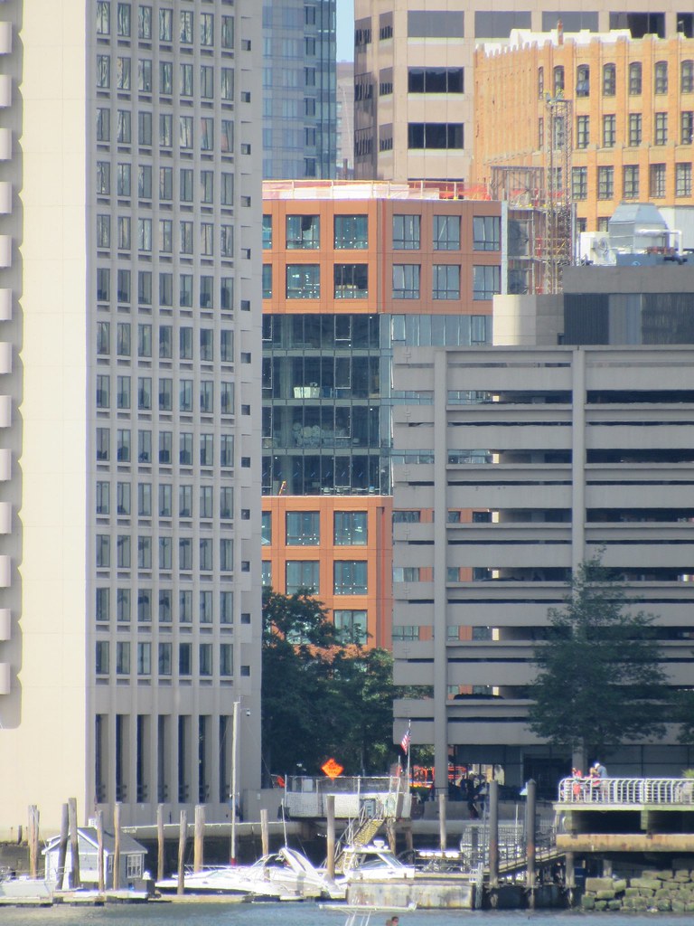
Hot damn! I love how this turned out! A welcome splash of color along the edge of the Greenway! No doubt, an ever changing splash of color depending on the time of day and how the light is reflecting off. Beeline, loving the photo update of so many projects this morning (hours of posting no doubt), a huge thanks for that, but this particular set of how the Boulevard turned out, wow! Such a surprise! Again, lovin the tour of Boston this morning!

Echoing every sentiment expressed in this post. I think the color is fantastic, love how it looks orange, burnt orange, or reddish from different angles. We generally bitch about the conservative use of color around here, so it's nice we got this one and in such a prominent location.

I try not to judge the current product by what was there before, but I agree with all the preservationist statements in this thread. The default position should be to never destroy something irreplacable. But it's encouraging how we went from destroying entire swaths of the city in the 1950's, to entire blocks in the 60's and 70's, to surgically removing specific buildings (and frequently preserving facades) in recent years. The trend has been positive. Thank god people came around on this. You could spend a lot of time mourning what was lost.

And welcome back BeeLine. You make this place tick.
 
Looking at it again I can see that the design is there and I kind of get it. I guess it's just being an engineer (wannabe architect) that makes it feel odd!

I'm also a civil engineer and wannabee architect. The color can be considered a bit jarring, but for me that's only because all the surrounding latter 20th century buildings are so grey and beige (which has been incredibly boring). This new building is a welcome beginning of some color in the neighborhood.
 
This turned out much better than I expected. I wish they continued the orange facade around to the back of the building. The precast brick panels look cheap.
 
This looks really nice in person. Walking down the Greenway it has a good presence.
 
That orange is going to look awesome in February. (not being sarcastic)
 
^ Nice one! I walk past it almost every day; I wouldn't hate it if it were about 65 stories tall.
 
It's amazing how much that shade of orange helps this building's case.
 
i have a mixed reaction. When the project started i was very enthusiastic. Then the Time's wall came down. i thought it was going to be saved. My dumb. That was a punch in the gut.

The outcome of the massing and land use.... filling this cavity along the Greenway so well–is fantastic. But, i just don't think the orange looks good. i'm not crazy about the grey brick pattern, or quite fancy the forceful glass work. i wish the glass got more of a "10 Farnsworth" type of treatment at such a highly visible location. Maybe i'm taking it a bit too far.

i'll try to love it for the massing, but overall, it's all just 'ok,' imo.

55 India should be getting started any minute no? The walls of 55 India looked good in the renders.
 
The brick has an unfortunate "garden center" feel to it.

cca
 

Back
Top