The Clarendon

Status
Not open for further replies.
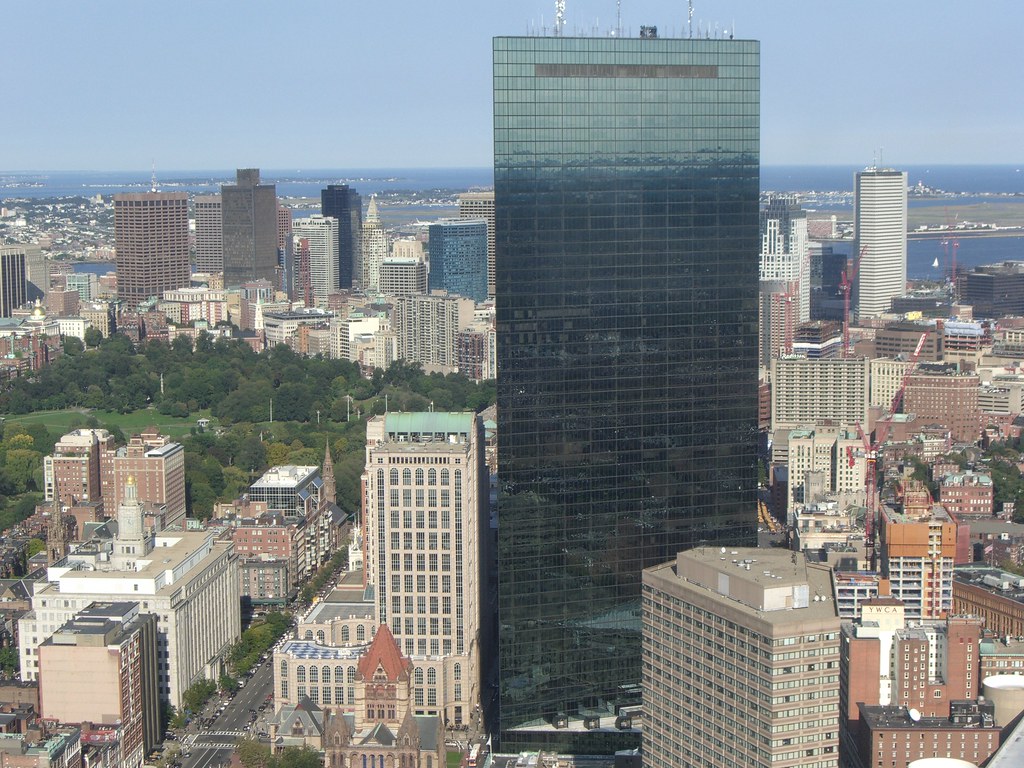
I actually like the the JHT being surrounded by highrises now since it will create a new cluster of skyscrapers there, similar to the Prudential Center. In fact, it creates a direct comparison to it. I just love looking out at the Prudential on the roofs of houses near Back Bay Station and see how tight and dense the Prudential Center is.
 
The Hancock will lose some of it's singular appeal from the south when(if) the Clarendon, Columbus Center and Copley Square towers are all completed around it.

I think part of what makes the Hancock so special is how it rises above everything so spectacularly. If the Hancock was on State Street, shoulder to shoulder with the Financial District Towers, I wonder if it would have the same appeal?

Which goes to prove that the most important aspect of a building's architecture is its context.
 
pic taken by Braham Ketcham on flickr:


2886962758_1b7de33892_b.jpg
 
Great picture! You can clearly see the Clarendon, W Hotel, and 45 Province all making an impact. I'll be curious to see which one of those turns out the best. That big black strip down 45 Province really isn't doing it for me, I sure hope they cover that up somehow.
 
I was thinking that the "black strip" on 45 Province was similar to the black covering on the Sack's Fifth Ave addition before they covered it with alucabond. I sure hope this isn't the case, it would be a major bummer. It's just too wierd though to remain black like it is, so it must be going to be covered with something, but what?
 
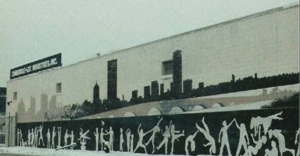
A mural painted by the same school children that designed the back of the Mass. state quarter.
 
I hate murals ,they're all over my Dorchester nieghborhood ,So ghetto!
 
I actually think murals can add a lot of character to an area. In certain contexts, I actually feel like they benefit their surroundings rather than detract from them. I'm not talking about random graffiti, but rather the well thought out ones that have a message to portray.
 
OK guys! Sing this to the tune of that immortal Three Stooges classic, "Swinging the Alphabet": "S..A..R, S..A..R, Sarc, Sarc.."
 
Trust me toby, I was aware that you were sarcastic. A mural covering the back of a 300+ building would look awful. I was just responding Boston02124's comment that murals are essentially ghetto.
 
Was the building demolished or was the mural just painted over? What's there now?
 
They updated the mural in the early 90's and then painted it over a few years later,the building is still there.
 
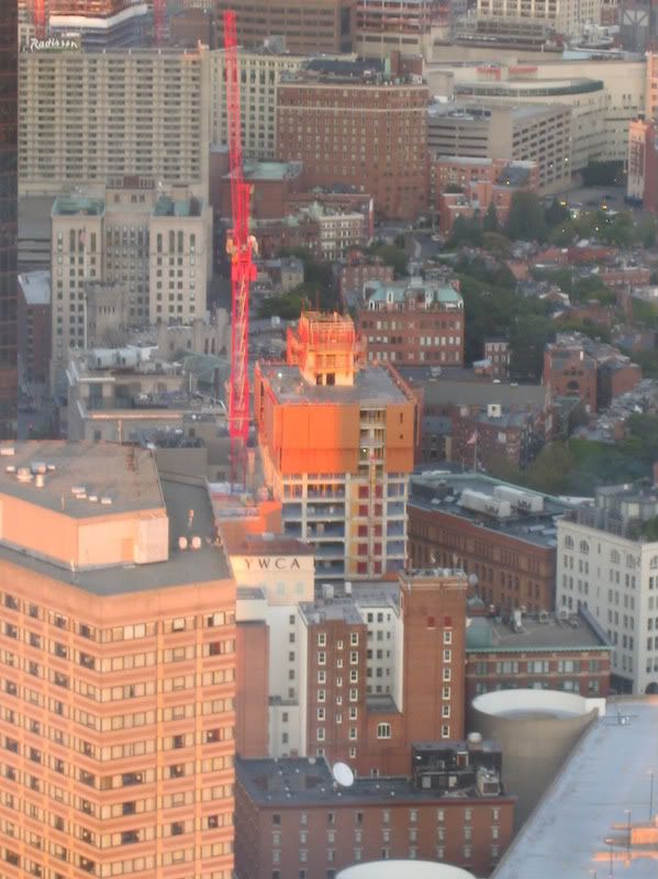
It seems like it hasn't really progressed/risen at all since a couple weeks ago.. What's up with that?
 
The best way is to count how many floors it's progressed over the 17-18 floor wing that has topped off. When I walked by a couple weeks ago it was probably 3 floors shorter than it is now.
 
Status
Not open for further replies.

Back
Top