The Clarendon

Status
Not open for further replies.
Please don't tell me those access driveways used to be real streets.

It seems the service alley with the loading dock was created around the time the Providence RR rerouted their lines (1910s) and has always been a service alley, while the one that slopes down leading to the parking garage is all new.
 
What a grate place for a vegetative buffer. Wtf?
Jass said:
IMG_3001.jpg

This building gets more people living in the Back Bay (theoretically) and adds a little heft and variation to the skimpy BB skyline. Other than this though, it hasn't got much else going for it. It's awkwardly proportioned, interacts poorly with the street and the surrounding fabric, and reeks of cheapness. A totally thoughtless design, IMO.
 
This building ruins the entire southern view of the back bay. Singlehandidly.

The worst new project of 2009.
 
Wonder why they constructed the sloping access drive to the garage in that manner. If your going to have a garage why not just have the entryway directly off the street allowing the building to be constructed to the lot line. From the developers point of view they lost a lot of square footage by constructing that driveway on the perimeter of the site. From a design standpoint, the drive is a more prominent gap in the streetwall. The side with the landscaping and grate is shame - should have just put the first floor right up to the sidewalk.
 
Last edited:
One thing that shocks me about this building:
How on earth did they get away with concrete sidewalks. Seems like every large development in the BB built in the last 25 years employed stone in all the surrounding hardscaping. City dropped the ball on this one . . .
 
This tower is plain-old awful. Wrong materials, poor street interaction, low quality construction, the list goes on. It's a poor tower with few redeeming features, opposite from a great tower with a bad feature (45 province, used the correct materials, but stupid black wall).
 
Reverse this.

Well lets see. Both towers at the bottom of it are basically boxes.

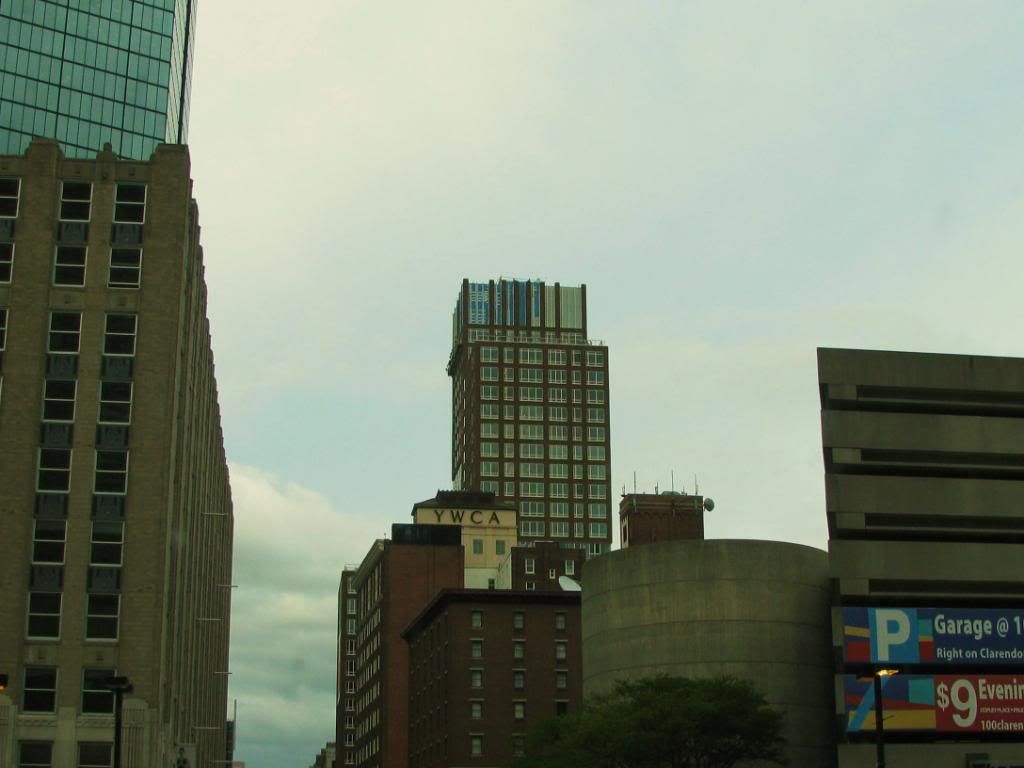
Clarendon is a brick box.
Atlantic wharf is a glass box.

Considering the Clarendon is made using crappy fake looking brick, and brick should pretty much never been used on anything over 5 stories [its hideous that way], i'd say, advantage Atlantic.

But then consider this.

The Clarendon adds in a "cool wrinkle" that ends up being hideous, those awkward glass sections randomly put into the side of the building. It makes the tower look like a giant brick zigzag. I can't get over how ugly that zigzag looks.

Atlantic Wharf has a similar "wrinkle" to make the tower a bit more interesting. The slightly slanted facade is subtle yet spectacular and looks perfect on the waterfront and in downtown.

Advantage. Atlantic.

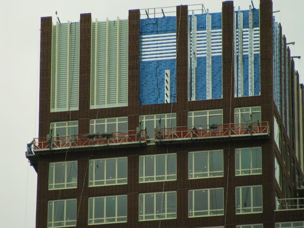
I just don't get what you see in this tower that makes it look stunning...i showed a picture of it in chat room and asked what year people thought it was from. I heard 1960, 1970 etc. Nobody said anything before 2000.

What pisses me off the most is how there is absolutely no rhyme or reason to the spacing and frequency of a) the mullions and b) the windows. Some gaps are 1 window, some are 2, some are 4, some are 3...some have skinny windows, some have wide windows...where is the pattern?
 
Considering the Clarendon is made using crappy fake looking brick, and brick should pretty much never been used on anything over 5 stories [its hideous that way], i'd say, advantage Atlantic.
False. The Archstone Boston Common is constructed with brick and in no way is it ugly aside from the tumor it has on the side. Anyways, I'm one of the people who like the Clarendon because the brick matches the YWCA building across the street from it. I say kudos to the developers for the extra effort to integrate it into it's surroundings.
 
^^Wow. You've had your curmudgeon dial set to 11 lately. :)
 
^ Just getting bummed. The last ten years of Boston architecture have been easily the most devoid of content of this once-great city's entire history.
 
The should-have-been-art-deco years were pretty bad too, as has been pointed out elsewhere on this forum.

Guess that means there's hope a downhill slope can't go on forever? Sometimes you hit rock bottom.

Sadly, I don't think the Clarendon is rock bottom.

Sadly, most of the Seaport probably is.
 
^ Just getting bummed. The last ten years of Boston architecture have been easily the most devoid of content of this once-great city's entire history.

Did you just realize that?
 
Sadly, I don't think the Clarendon is rock bottom.

I always thought the Hotel Commonwealth was the nadir. In the words of Michael Corleone, it "insults my intelligence, and makes me very angry." In its prominent context, it does more damage to Kenmore Square than this silly little tower does to its location.
 
The Hotel Commonwealth at least shocks one's consciousness. It was a wake up call even for the mayor.

I submit the 90s were a worse decade, actually. The Depression years had a good exuse. The naughts have brought us the ICA, at least, and maybe a couple other small gems.

But in the 90s the reign of the mediocre and the parochial was total.
 
I have to say that this projects design has always been most easily described by me by one word. Awkward. It is trying to contemporary and edge but simply comes off awkward.

cca
 
Status
Not open for further replies.

Back
Top