The Clarendon

Status
Not open for further replies.
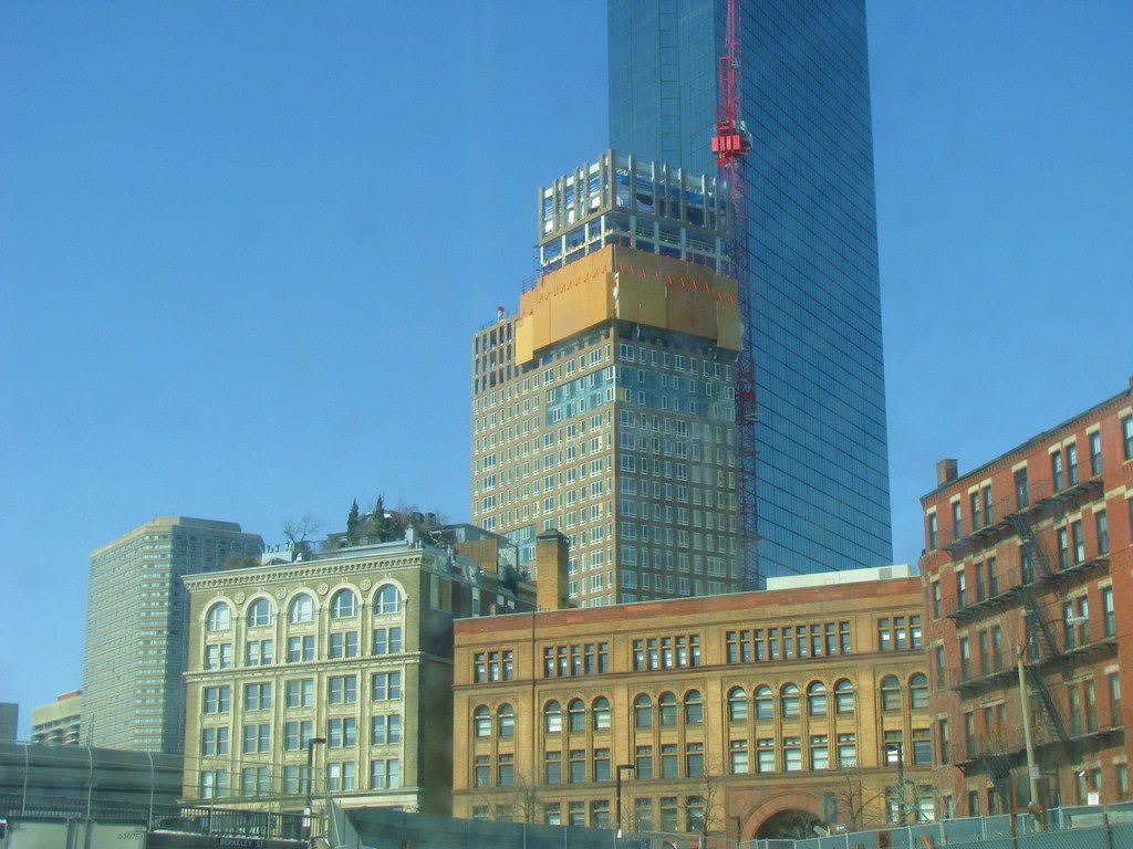
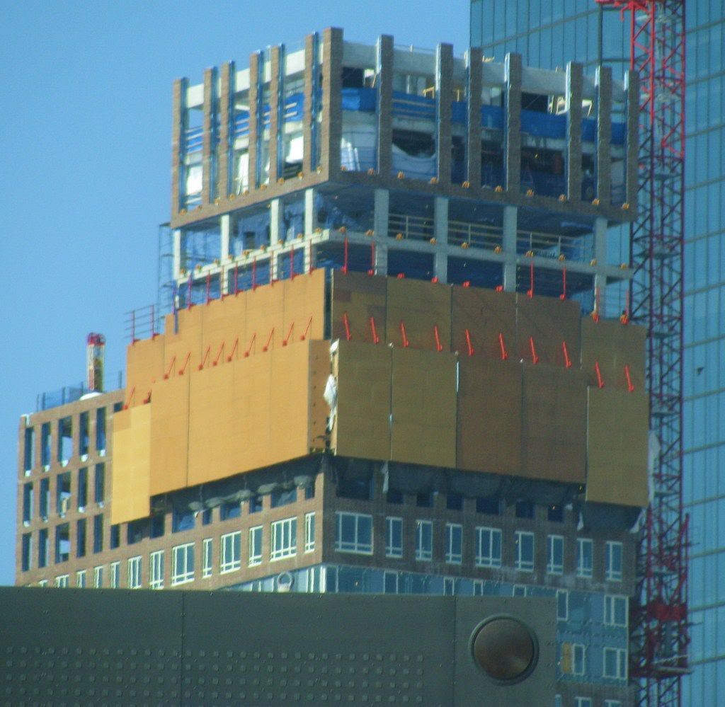
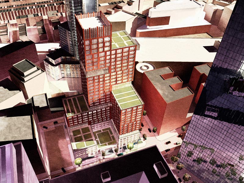
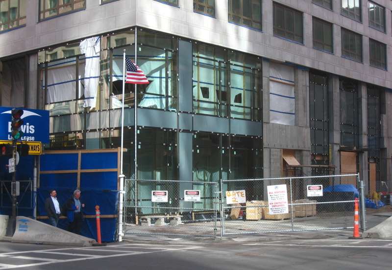
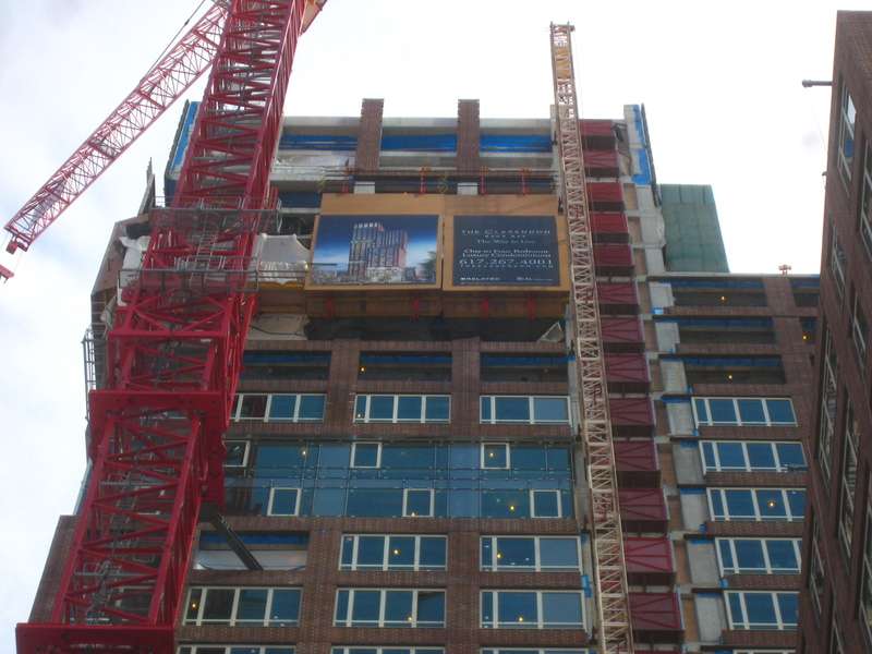
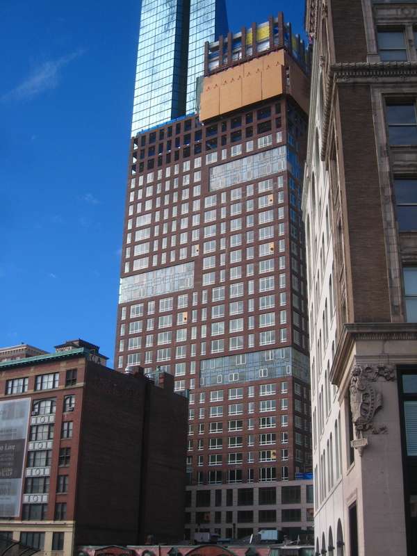
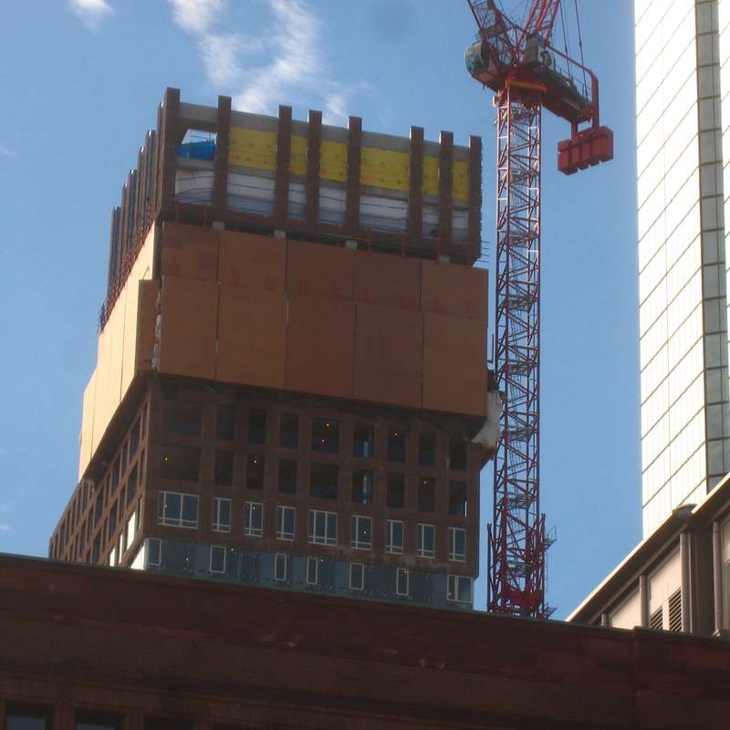
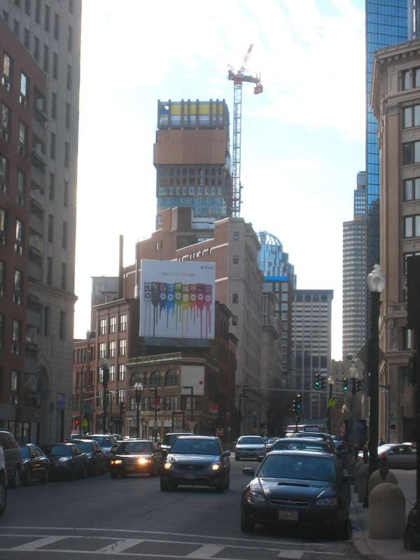
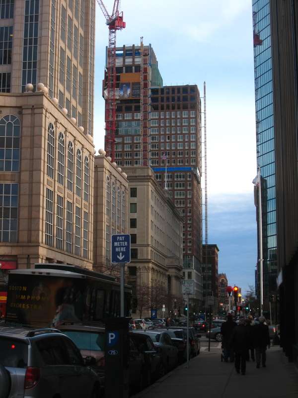
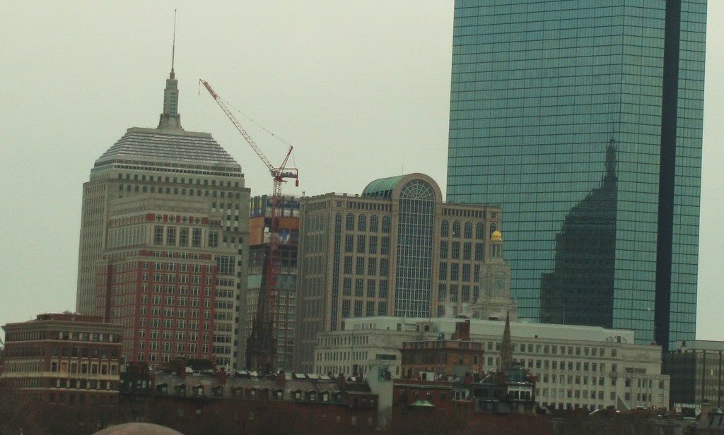
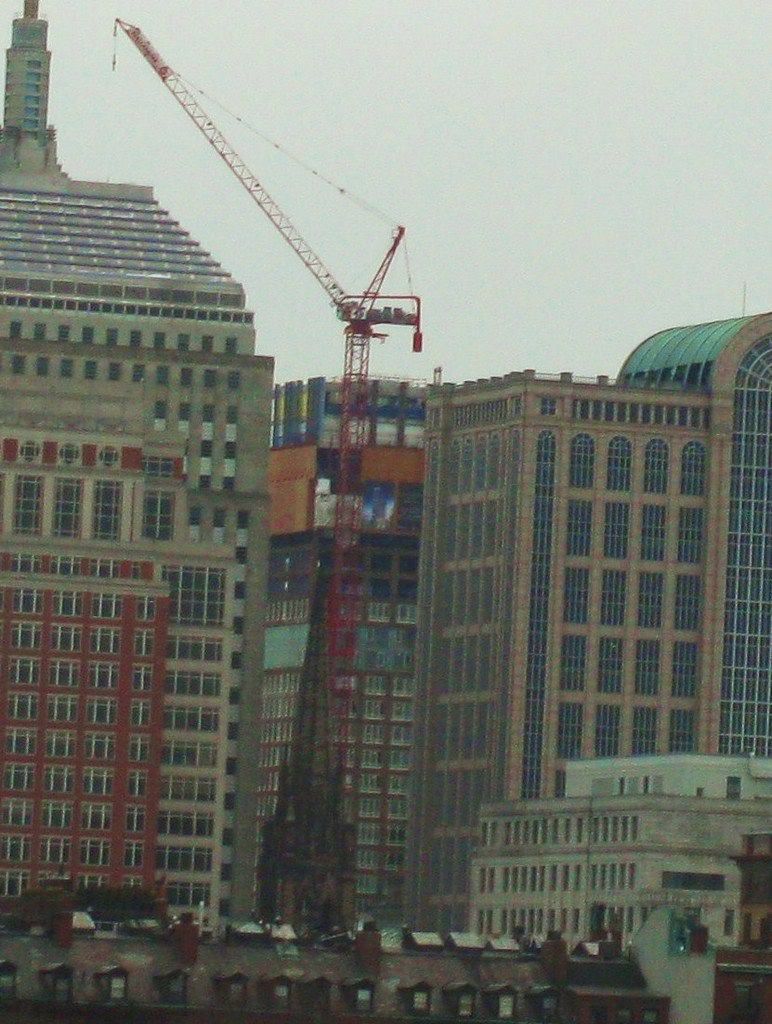
This is another design that looks a lot better in the mock up than in reality...

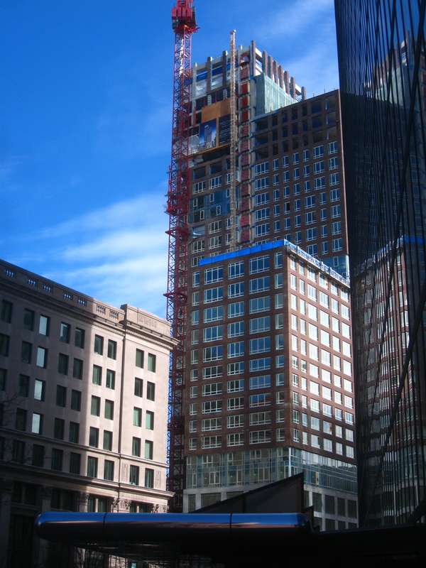
The windows are friggin horrible


Look at these pictures and re-think your last sentence.

IMG_7609.jpg

IMG_7610.jpg


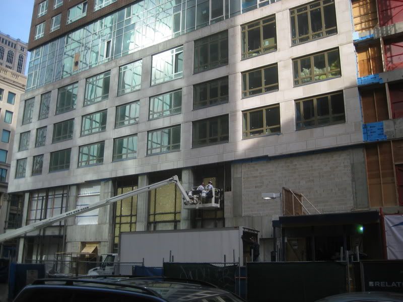
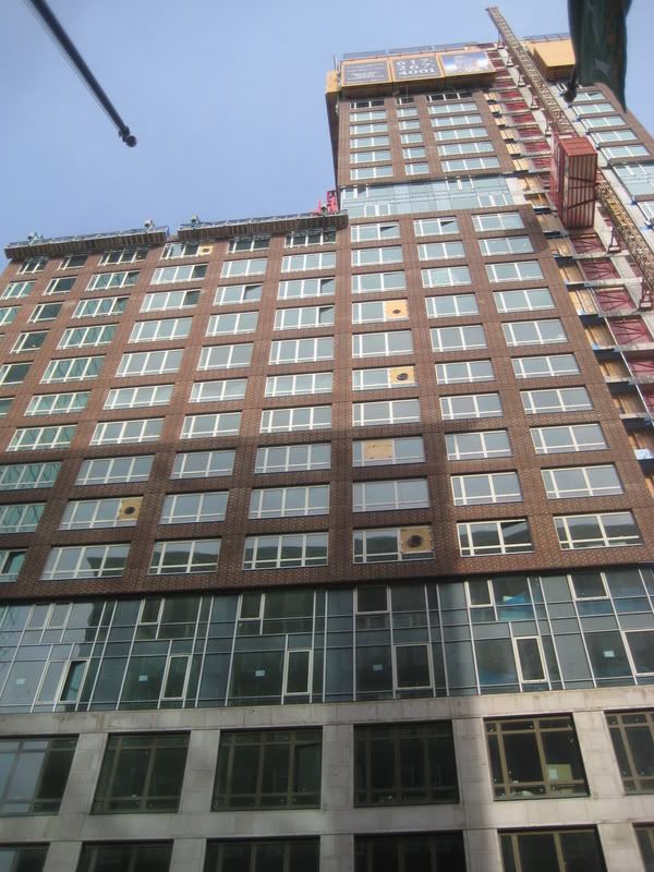
If those are prison windows I'm ready to be sent away for the next 5 yrs. I think they're simple and elegant. They change mullion variations as the building ascends, where the materials change, and doesn't make it such a one-liner.

IMG_7601.jpg


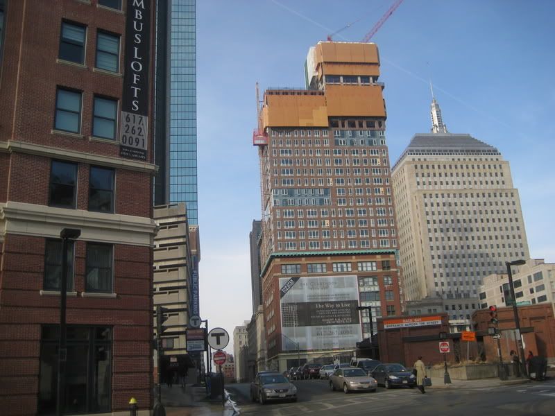
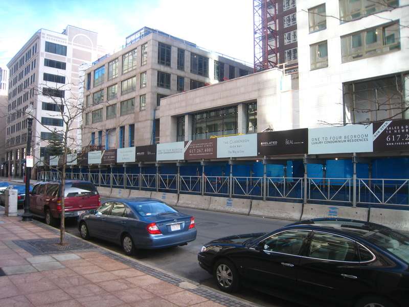
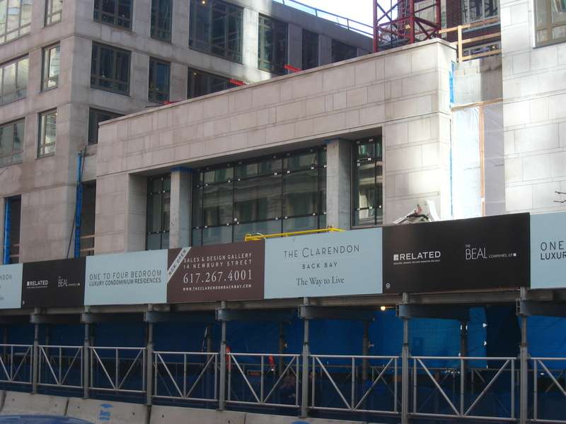
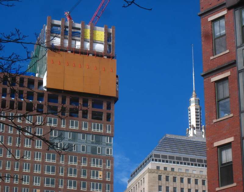
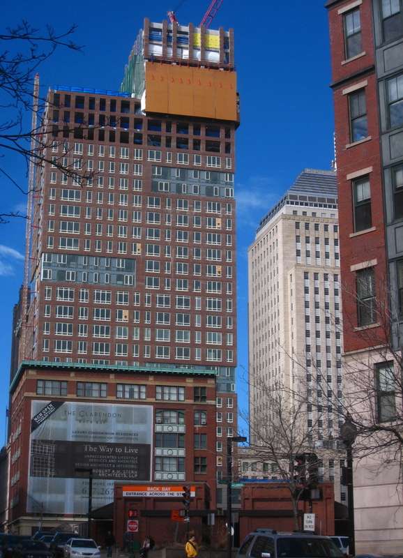
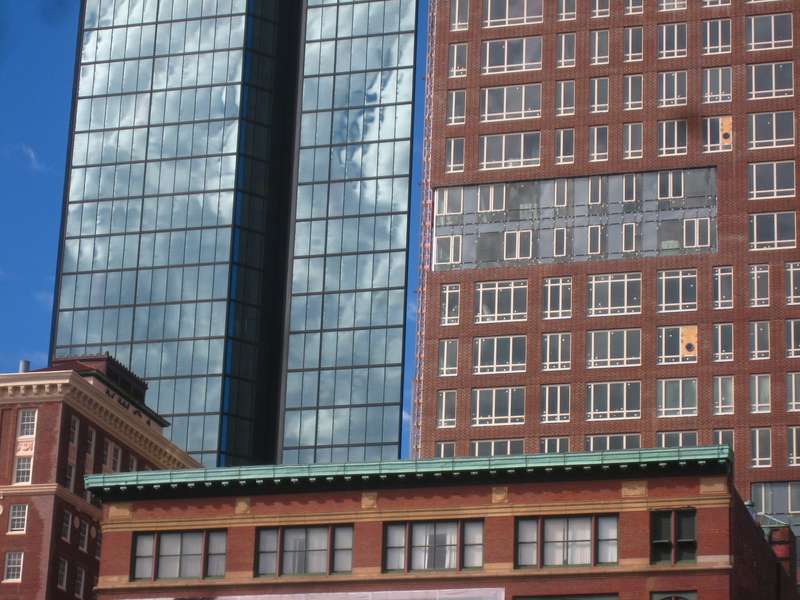
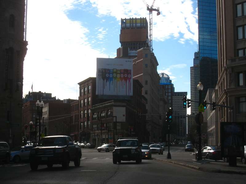
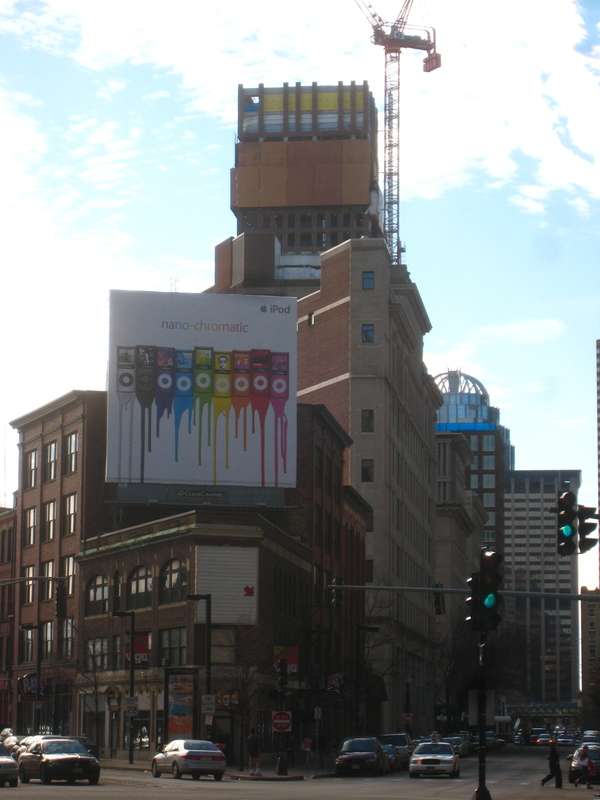
They definitely look different whether up close or far away. But in this last picture I think there's a nice transition between buildings (from right to left). From solid to transparent ... I think the building accomplishes this nicely.

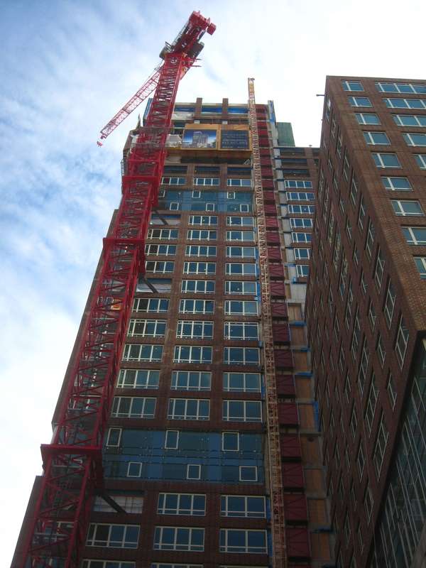
And of course, there's still the fact that he was taking the picture while hanging out a car window ...
 
The fake brick looks like a model with a low-resolution texture applied to it. It's the uncanny valley of prefab paneling.
 
I don't care for the brick either, but it's not fake, and those aren't prefab panels. It would be better looking if the brick was a smaller module and/or grout wasn't so white.
 
I wish it were 5 stories higher - it just looks unfinished with that height.
 
compare what we see to the original draft...it looks nothing like it....

this is basically a box with a crown

the original mock up had windows that were indented which allowed for a nice contrast between the brick and the glass....

the finished product comes off as being way too flat faced...

the colors are horrible and the glass gets lost in the design.

imagine the building without the added crown and you see what we get which is a very bland building.
 
At Clarendon St & Stuart St, Back Bay, a stone's throw from the Hancock & Columbus Center. To be "299 rental and ownership units, a restaurant and a new Back Bay post office" link- BRA

Any word on this project? Emporis & the BRA say nothing other than it's approved.

...I will admit that sometimes, when I'm feeling down, I look at these images on the wiki, and then I feel better. Gateway Center would too if it wasn't so much of a pipe dream.

97-Clarendon.jpg


Clare-05-Q.jpg


It's not the tallest building or the flashiest building, but it is pretty tall and pretty, er, pretty, at least in my opinion.
just wanted to bring back the renderings to compare to the almost completed building
 
Wow, this building really adds to the effect of the triangular corner of Stuart and Columbus.
 
I think this building detracts significantly from the JHT, and that's a real shame. It's ugly, boxy and graceless. In Boston Manhattanization must be avoided but borrowing from the worst of the Bronx is OK.
 
This isn't "the worst of the Bronx". It reminds me of a very-slightly-edgy Dutch office tower one would find in Rotterdam or the Hague.

The Tremont-on-the-Common-esque apartment building on Beacon St. does more to detract from the JHT...and resemble the Bronx' Co-Op City.
 
Status
Not open for further replies.

Back
Top