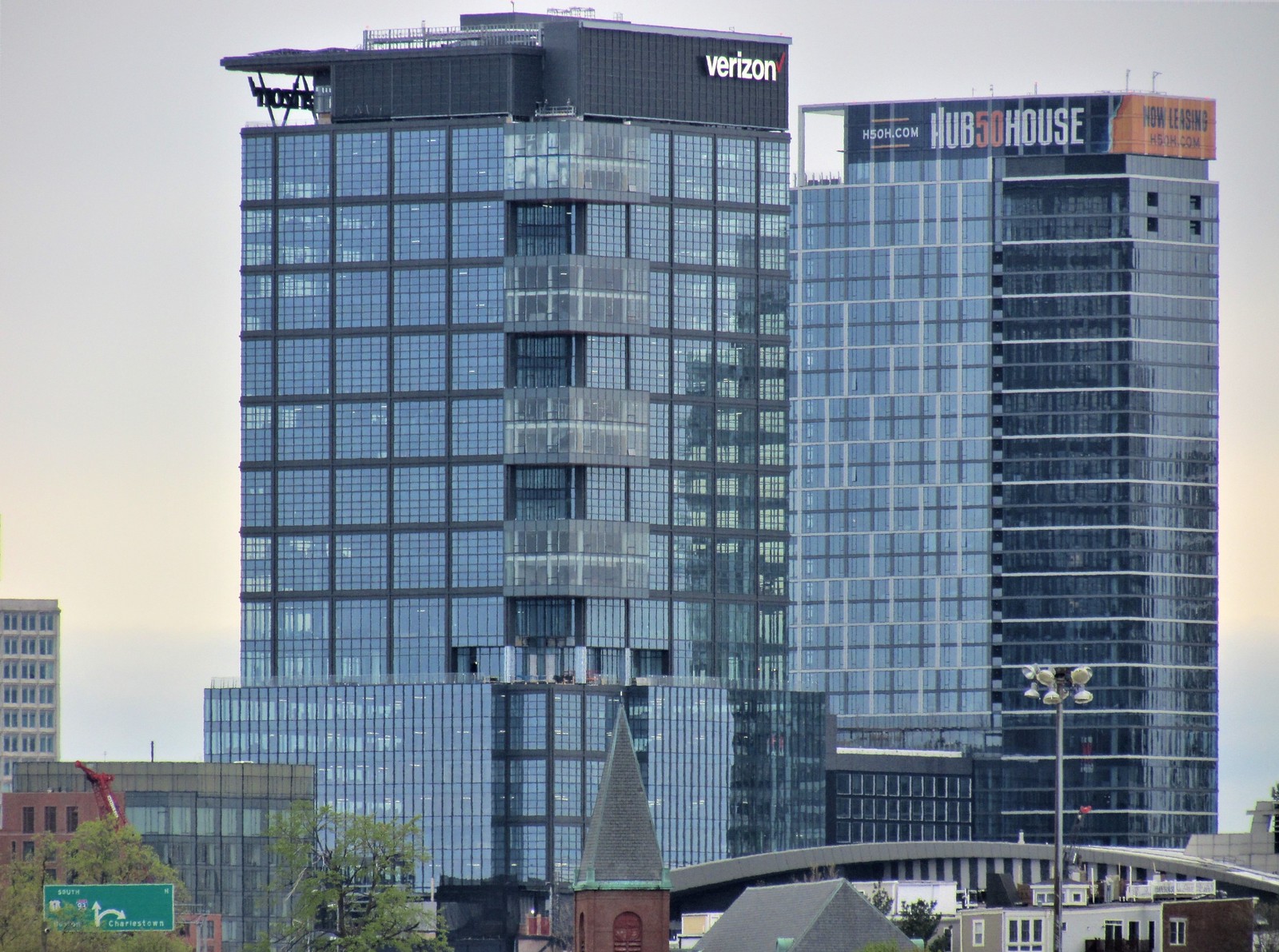
I've seen pictures of some of the interiors here and they are gorgeous, so congrats on a beautiful place, awesome location and sooo much to do once things get back to normal. They really should invest in alternate forms of advertising though...I live there, and yes I think it's the most obnoxious smug sign they could have put up. Hoping they remove it soon...
You are using an out of date browser. It may not display this or other websites correctly.
You should upgrade or use an alternative browser.
You should upgrade or use an alternative browser.
The Hub on Causeway (née TD Garden Towers) | 80 Causeway Street | West End
- Thread starter choo
- Start date
I know the Garden isn't the biggest arena around (space constraints), but it sure is dwarfed by all the new construction. This is a good thing since it's also one of the ugliest arenas I've seen from the outside. It was obviously designed with the idea that it would one day be encircled with future development; just took two-plus decades for it to actually happen.
bigpicture7
Senior Member
- Joined
- May 5, 2016
- Messages
- 3,906
- Reaction score
- 9,547
I know the Garden isn't the biggest arena around (space constraints), but it sure is dwarfed by all the new construction. This is a good thing since it's also one of the ugliest arenas I've seen from the outside. It was obviously designed with the idea that it would one day be encircled with future development; just took two-plus decades for it to actually happen.
The Garden was exceptionally well designed and executed at the time, given the extraordinarily challenging constraints. Its facades are blank and boring mainly because it was almost completely surrounded when built (IIRC, there were some areas with zero exterior workspace). Much of the exterior blockwork was done from the inside out:

^Boston Globe archive
It's capacity, while not in the biggest tier, is not small at all by NBA/NHL standards (it's solidly mid-pack). And its internal design/layout remains highly functional and well thought-out. This is what effective design under extreme constraints looks like. Exterior aesthetics can always be updated later; some of the major arenas have had significant exterior refreshes at their 20-30 year marks anyway (e.g. Target Center in Minneapolis). It didn't make sense to do that here before knowing what the new surrounding buildings plans were going to be anyhow.
RandomWalk
Senior Member
- Joined
- Feb 2, 2014
- Messages
- 3,333
- Reaction score
- 5,265
There were parts of the party wall that needed EIFS application on top of the bare concrete blocks when the original Garden was demolished.
KentXie
Senior Member
- Joined
- May 25, 2006
- Messages
- 4,195
- Reaction score
- 766
I know black and white photos are all the rage when depicting the past or for dramatic effect but Jesus, this building was constructed in the early 1990s, not the 1950s. I know, I know, first world problems.The Garden was exceptionally well designed and executed at the time, given the extraordinarily challenging constraints. Its facades are blank and boring mainly because it was almost completely surrounded when built (IIRC, there were some areas with zero exterior workspace). Much of the exterior blockwork was done from the inside out:

^Boston Globe archive
It's capacity, while not in the biggest tier, is not small at all by NBA/NHL standards (it's solidly mid-pack). And its internal design/layout remains highly functional and well thought-out. This is what effective design under extreme constraints looks like. Exterior aesthetics can always be updated later; some of the major arenas have had significant exterior refreshes at their 20-30 year marks anyway (e.g. Target Center in Minneapolis). It didn't make sense to do that here before knowing what the new surrounding buildings plans were going to be anyhow.
bigpicture7
Senior Member
- Joined
- May 5, 2016
- Messages
- 3,906
- Reaction score
- 9,547
I can assure you I didn't make it B&W for artistic effect. Just linked to the original. Either way, this is merely a fun reminder that in the early '90s newspapers were still fully print distributed, and aside from front pages and special sections, were still produced in B&W for pragmatic/cost reasons.I know black and white photos are all the rage when depicting the past or for dramatic effect but Jesus, this building was constructed in the early 1990s, not the 1950s. I know, I know, first world problems.
KentXie
Senior Member
- Joined
- May 25, 2006
- Messages
- 4,195
- Reaction score
- 766
Sorry, I wasn't suggesting you made it B&W and yes you are correct. I forgot that newspapers were the primarily channel for news in the 90s. How times have changed.I can assure you I didn't make it B&W for artistic effect. Just linked to the original. Either way, this is merely a fun reminder that in the early '90s newspapers were still fully print distributed, and aside from front pages and special sections, were still produced in B&W for pragmatic/cost reasons.
markhb
Senior Member
- Joined
- Oct 19, 2013
- Messages
- 1,565
- Reaction score
- 1,359
I remember, the old Garden and the then-Shawmut Center were only 3 inches apart in places. (I don't believe there was an actual party wall between them, was there?) And to fit it in between the Garden and the old Upper and Lower Deck to Leverett Circle while the trains were still arriving underneath it must have been an incredible challenge.
Here's the color version of that image, for the interested: https://media.gettyimages.com/photo...ston-in-1994-picture-id1066875730?s=2048x2048
The main crop of current NHL arenas were built from 1993 to 2000, largely to similar standards, and they all still look modern today. Once they fixed the sightline and basic comfort issues that were endemic to the old Garden/Montreal Forum/Buffalo Aud venues, they really haven't had to push for massive improvements since. Even the newest places, PPG Paints Arena in Pittsburgh and Little Caesars Arena in Detroit, don't look all that different from the '90s places on TV. There's no reason that a place like TD Garden can't be used for as long as the old Garden was, especially with periodic amenity upgrades like it just got.
The main crop of current NHL arenas were built from 1993 to 2000, largely to similar standards, and they all still look modern today. Once they fixed the sightline and basic comfort issues that were endemic to the old Garden/Montreal Forum/Buffalo Aud venues, they really haven't had to push for massive improvements since. Even the newest places, PPG Paints Arena in Pittsburgh and Little Caesars Arena in Detroit, don't look all that different from the '90s places on TV. There's no reason that a place like TD Garden can't be used for as long as the old Garden was, especially with periodic amenity upgrades like it just got.
North Shore
Active Member
- Joined
- Aug 19, 2014
- Messages
- 245
- Reaction score
- 278
I remember, the old Garden and the then-Shawmut Center were only 3 inches apart in places. (I don't believe there was an actual party wall between them, was there?) And to fit it in between the Garden and the old Upper and Lower Deck to Leverett Circle while the trains were still arriving underneath it must have been an incredible challenge.
IIRC, the closest measurement was 9" between the two buildings. There were no common walls.
Charlie_mta
Senior Member
- Joined
- Jul 15, 2006
- Messages
- 4,571
- Reaction score
- 6,506
I recall when the new Garden was built, it was designed a bit narrower than optimal to fit between the old North Station building and the old Central Artery ramps.
bigpicture7
Senior Member
- Joined
- May 5, 2016
- Messages
- 3,906
- Reaction score
- 9,547
I recall when the new Garden was built, it was designed a bit narrower than optimal to fit between the old North Station building and the old Central Artery ramps.
Yes, but they managed to keep the playing surfaces to regulation (unlike in the old garden, which was designed originally for boxing matches - hence very narrow with tall overhanging stands). Where the new Garden's somewhat-narrowness manifests is how the balcony bleachers extend right up against the exterior walls - an effect that was very hard to sense when you were inside, since the balconies nonetheless had decent concourses tucked beneath them.
Yet, this narrowness is effectively past-tense now: the exterior upper balcony walls have been blasted out along the Causeway side, with a new arena upper concourse extending into the footprint of the Hub on Causeway podium. Most arena-goers will never realize this is not within the footprint of the area itself.
^This makes me wonder if future causeway concourse expansion was always in the back of the mind of the arena designers in the early '90s.
I know black and white photos are all the rage when depicting the past or for dramatic effect but Jesus, this building was constructed in the early 1990s, not the 1950s. I know, I know, first world problems.
That IS in color - - the area was remarkably drab
AndrewOnTheMBTA
Active Member
- Joined
- Mar 12, 2021
- Messages
- 324
- Reaction score
- 634
Would anyone have any update on the Food Hall opening? With capacity limits ending, maybe something will come up. Time Out is consistently successful, even on Wednesdays - I really think this will do well
sign up for updates. much more likely to yield actual news than asking on AB: https://signup.e2ma.net/signup/1901193/1903315/Would anyone have any update on the Food Hall opening? With capacity limits ending, maybe something will come up. Time Out is consistently successful, even on Wednesdays - I really think this will do well

 IMG_8829
 IMG_8830
 IMG_8833
 IMG_8834
 IMG_8844
 IMG_8846
 IMG_8873
 IMG_9059
 IMG_9082
 IMG_9431
 IMG_9438