KriterionBOS
Active Member
- Joined
- Mar 18, 2018
- Messages
- 198
- Reaction score
- 79
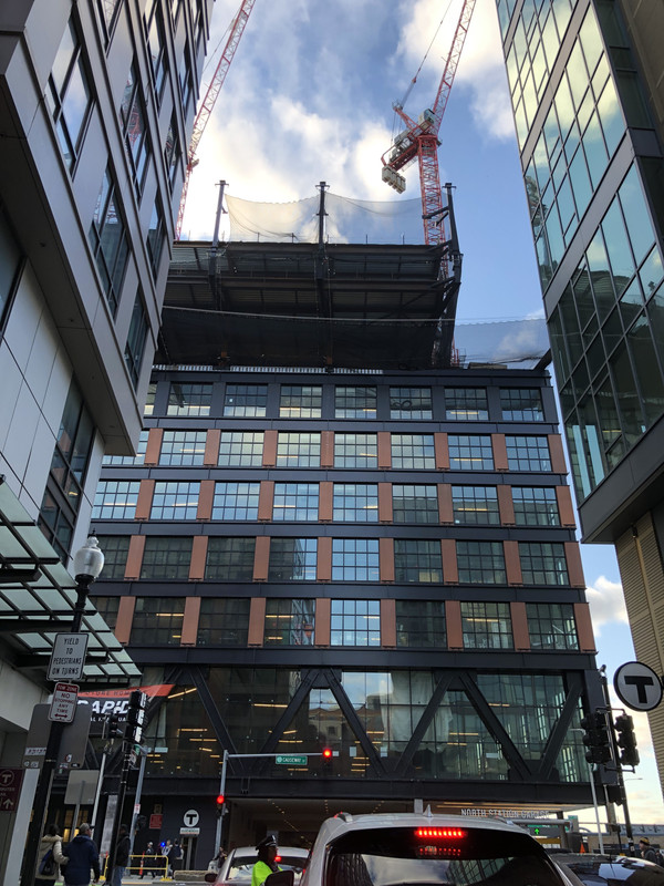
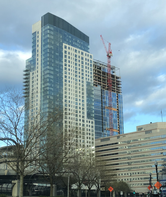
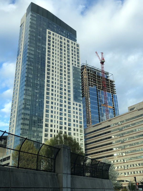
Yeah Avalon North looks pretty ordinary to say the least. I'm afraid Bulfinch Crossing Residential will be similalrly unimpressive. I guess they can't all be like MT, 1 Dalton, or TD Garden.