odurandina
Senior Member
- Joined
- Dec 1, 2015
- Messages
- 5,328
- Reaction score
- 266
Im not in the said it was crap camp, but I did say they definitely could have designed this better......
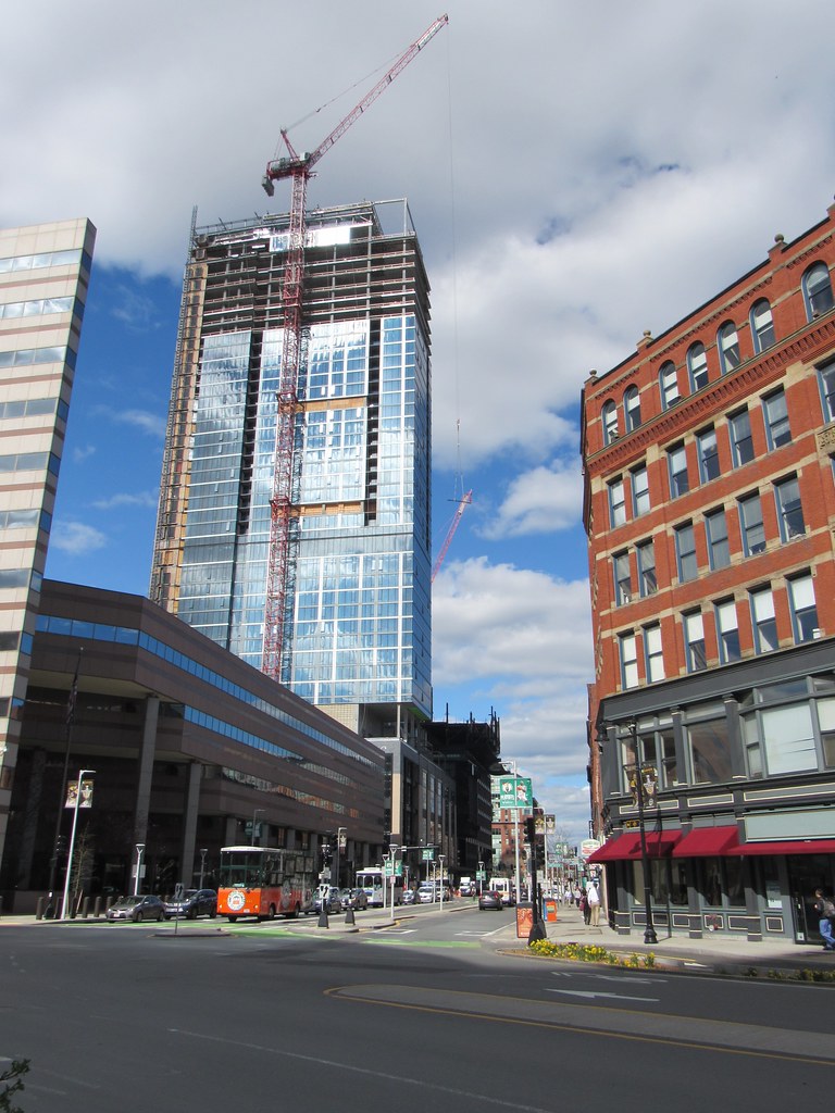
As far as the res it was either redesigned slightly or more likely the renders are just much lighter than reality. They saved it by outlining the floors between the colossal order pattern in black and the glass is a much darker blue than rendered. Imo that made it look a good amount better.
No way you gettin' off this easy bucko.
You were fully horrible to the Residential tower.
Just ribbing you a bit. All is forgiven. More momentum is definitely coming from this stage of the project nicely timed with the B's and Green playoff happenings.


