The Kensington | 665 Washington Street | Downtown

Re: Residences at Kensington
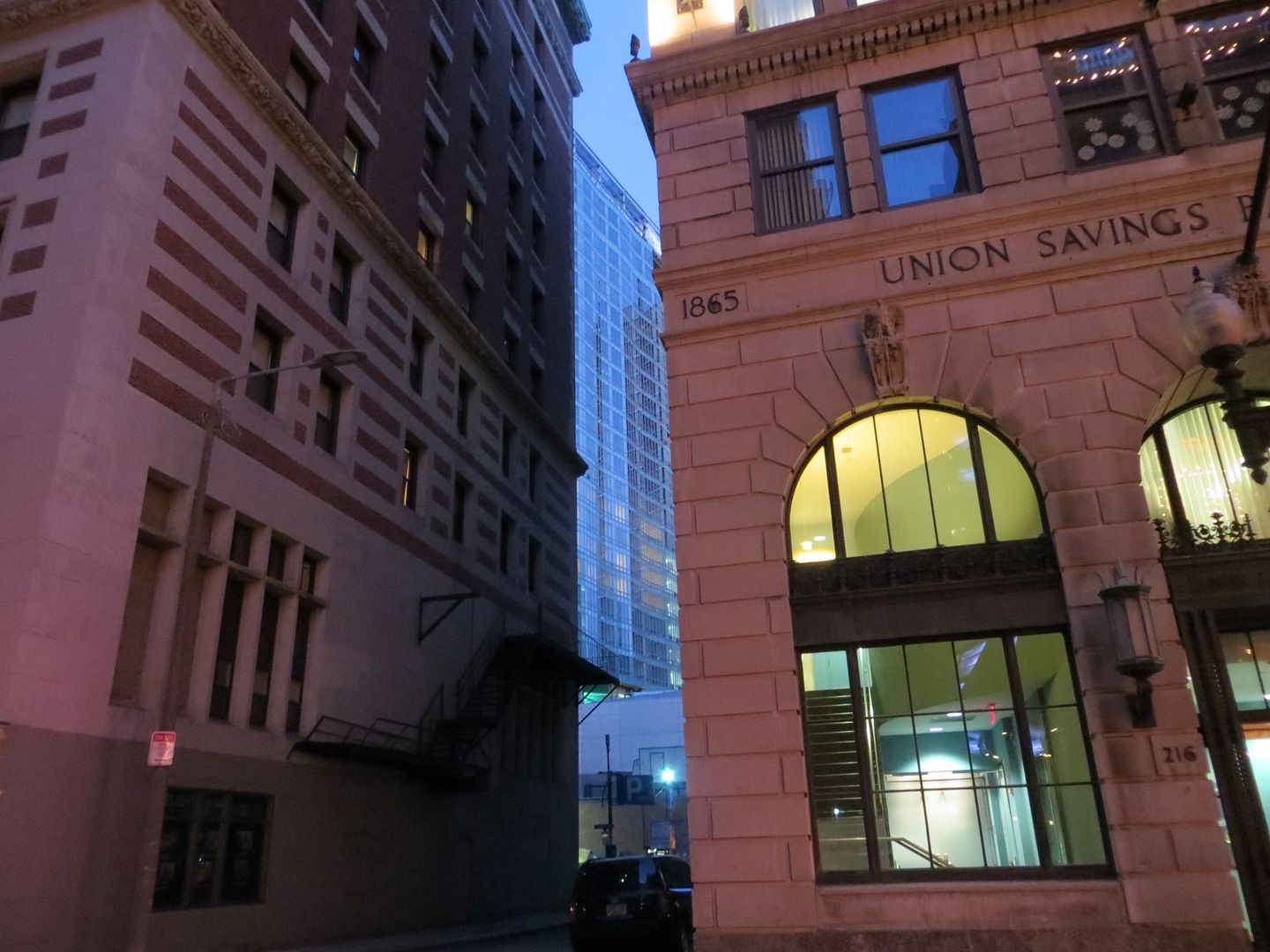
116_zps317e19d3.jpg
004_zps2f1a4cdd.jpg
006_zpsfc5b82ba.jpg
007_zps41af72f9.jpg
028_zps6dcf1494.jpg
 
Re: Residences at Kensington
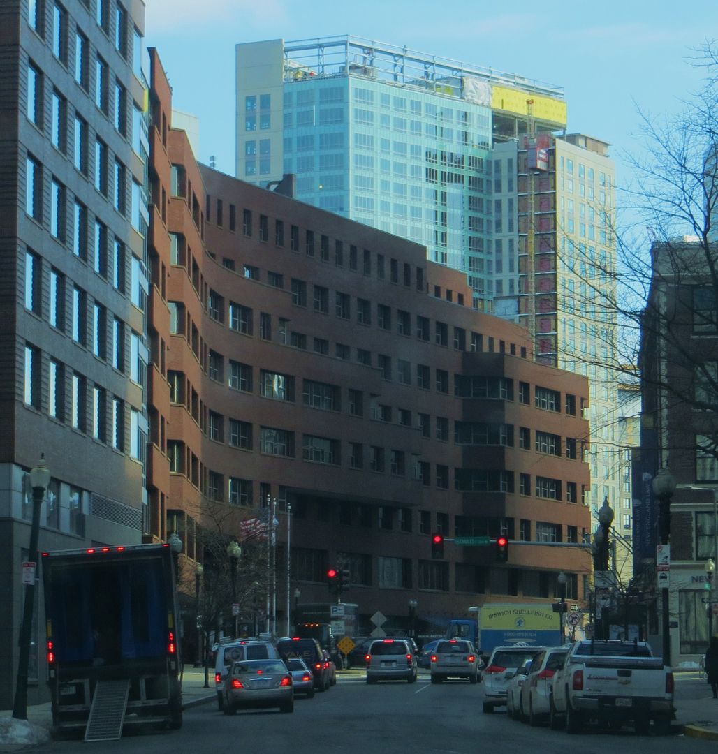
What an awful fucking mess.

Dogshit materials aside, a few better (i.e. competent) design decisions could have improved this vertical favela for the well-heeled.

• A gesture (in form or material) where the glass meets the precast;
• Details that enhance the vertical, to turn the eye upward;
• A cornice;

I'm not convinced that the three simple concepts I listed above would have significantly increased the cost to construct a building of this scale. This is just incompetent design, made worse by the materials.

By comparison, the original scheme looks like the Chrysler Building.
 
Re: Residences at Kensington
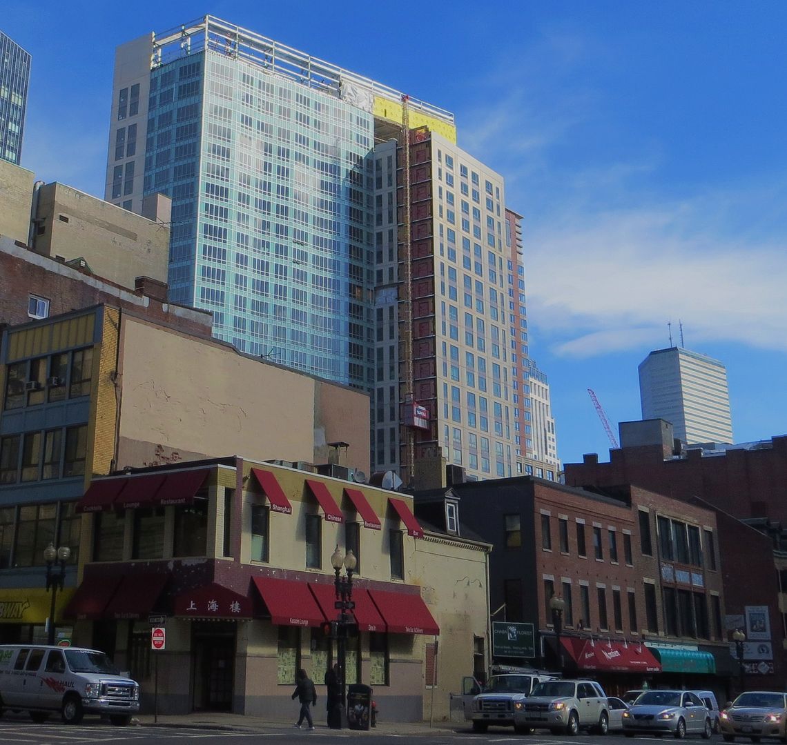
London is the capital, largest, wealthiest and most dominate city in the UK by a wide margin. Boston is maybe the 8th or 9th most important city in the US.

Boston is 11th worldwide in GDP. However, 8th or 9th in the US wouldn't be too shabby either.
 
Re: Residences at Kensington
Boston is 11th worldwide in GDP. However, 8th or 9th in the US wouldn't be too shabby either.

While some might go over board with the world class city line, quite a few seem to go to the other extreme when they express their sense of Bostons's place in the pecking order. We have a big, wealthy, important city, whether or not everybody at Archboston understands this fact.
 
Re: Residences at Kensington
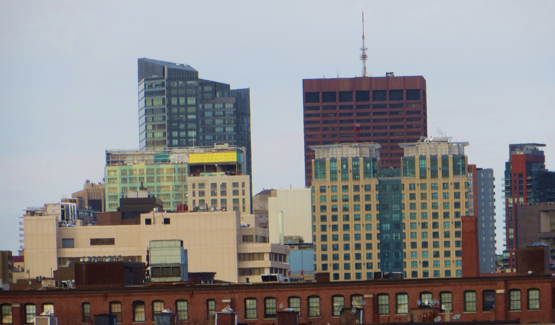
Beeline, thanks so much for your pics!! My question to you is...how does the Kensington look to you? I'm seeing lots of intense criticism but how does it look in real life and not from posted pics? Actually, the question is for anyone who has actually seen the building from street level!
 
Re: Residences at Kensington

Beeline, thanks so much for your pics!! My question to you is...how does the Kensington look to you? I'm seeing lots of intense criticism but how does it look in real life and not from posted pics?
A disappointment, but it does serve as a contrast the Ritz buildings. Bottom line is I would not live in it.
 
Re: Residences at Kensington

Obviously not a great building but not the worst building from a lot of angles.

State services building in foreground is really clunky and awkward...

004_zps2f1a4cdd.jpg


Tufts looks truly awful from this angle, and trinity(?) is also very weak...

028_zps6dcf1494.jpg

From the Common, Heritage on the Common is pretty ugly and also right on the park.

From a skyline perspective, a lost opportunity like so many others, but not prominent enough to do too much damage (I know a weak defense)
 
Re: Residences at Kensington


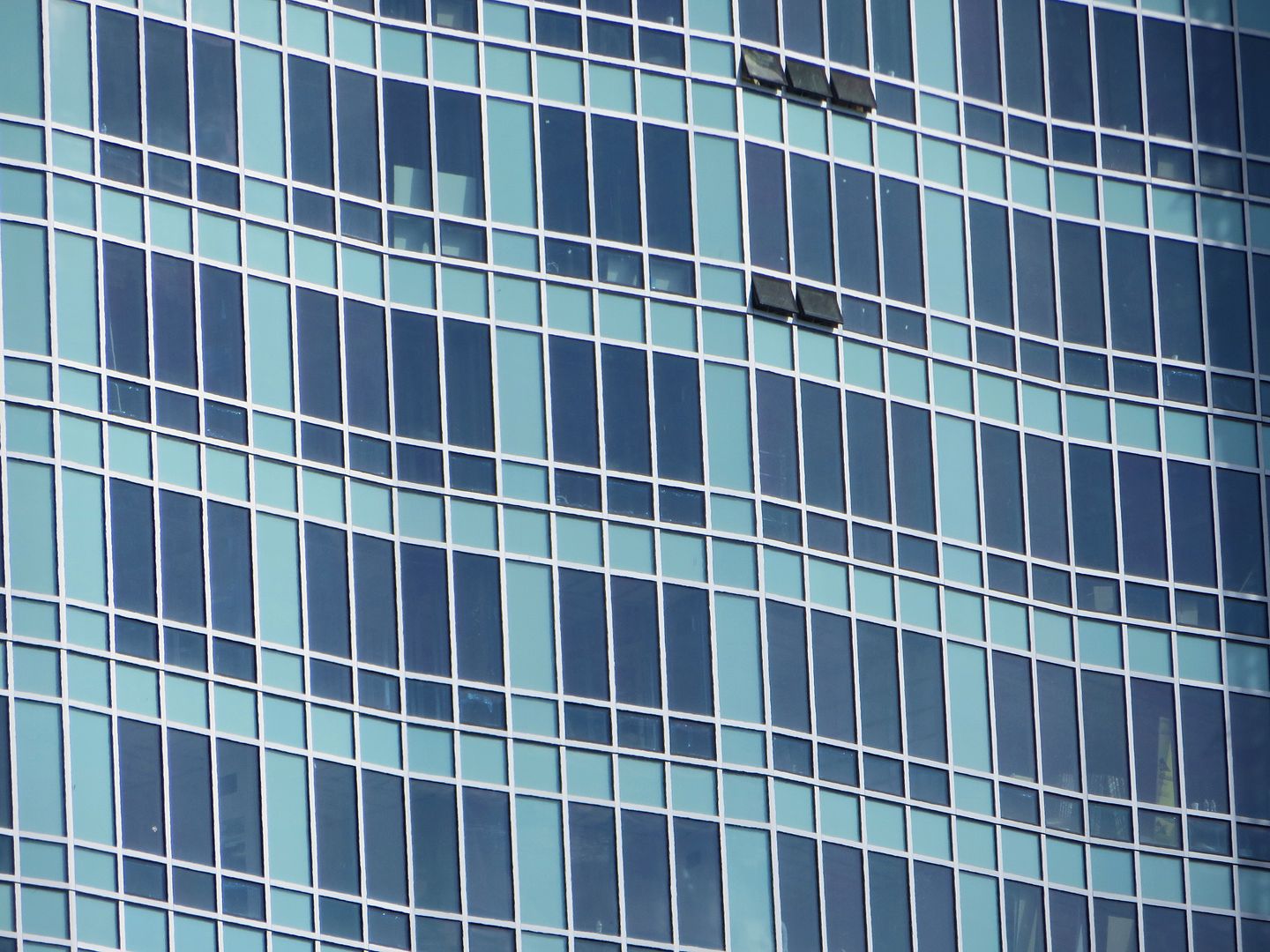
It isn't half-bad in this view...dare I say the waviness actually looks kind of good. But to answer atlantaden's question:

I'm seeing lots of intense criticism but how does it look in real life and not from posted pics? Actually, the question is for anyone who has actually seen the building from street level!
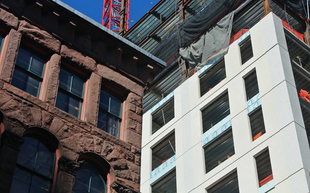
It doesn't really matter where you view it from...you could be 3,000 miles away or across the street and it'll look like a sham job. The skyline perspectives are lacking though not horrible, but it's up close where the wretchedness really shines through. Looking back, I think this older post of mine does a good job showing this thing for what it is. Also, this picture:

8083689845_7897d59b7d_b.jpg


Despite some people's valiant attempts to say "the tower is fine, stop whining", this thing deserves the all the criticism it gets.
 
Re: Residences at Kensington


If the glass shoots upwards -- covering the cornice, the yellow area and that entire plane -- this building might look … okay ? Dare I say?

It would be two blocks of different materials merging. This was the original intent of the building according to initial renders.

Put your pitchforks down, at least until the building is finished.

From yesterday.
And come on. That looks kind of cool. Admit it. Come on. Just a bit.
 
Re: Residences at Kensington

If you put just about anything modern right next to a red stone H.H. Richardson building, it's going to look bad.
 
Re: Residences at Kensington

From yesterday.


IMG_9110

From my layman's perspective the Washington Street facade is really a shame. No texture or visual relief, the windows appear to be stickers on a plastic facade. I'm assuming this more or less represents the final product as it relates to the curb level view. I can tolerate the building from afar in the skyline but the view for the pedestrian on Washington St., yikes!
 
Re: Residences at Kensington

This building is a fucking disgrace.
 
Re: Residences at Kensington

The ground level offends me in every possible way and it sits right across from one of my favorite Pho places so now I get to experience it on a weekly basis.

Tower portion... Definitely not good, but it's not offensive either.
 
Re: Residences at Kensington

The ground level offends me in every possible way and it sits right across from one of my favorite Pho places so now I get to experience it on a weekly basis.

This reminds me of a story I read about a Parisian journalist in the late 19th century who was vehemently disgusted by the Eiffel Tower. He frequently wrote columns saying what a negative dent it made in Paris' skyline. Years later, however, it was discovered that this same journalist went for coffee almost everyday at the cafe atop the tower. When asked why, he said it was because that cafe was the only place in all of Paris that he could enjoy the skyline without seeing it ruined by the Eiffel Tower.

Moral to the story: lets hope a new Pho restaurant opens at the Kensington Residences.

:)
 
Re: Residences at Kensington

You know, this is a mid-rise designed to add density, not to be a signature tower.
In 15-20 years, as this area gets more developed, this building will fold more and more into the background. I personally don't find it offensive, but I do see, at least at ground level, why people hate this.
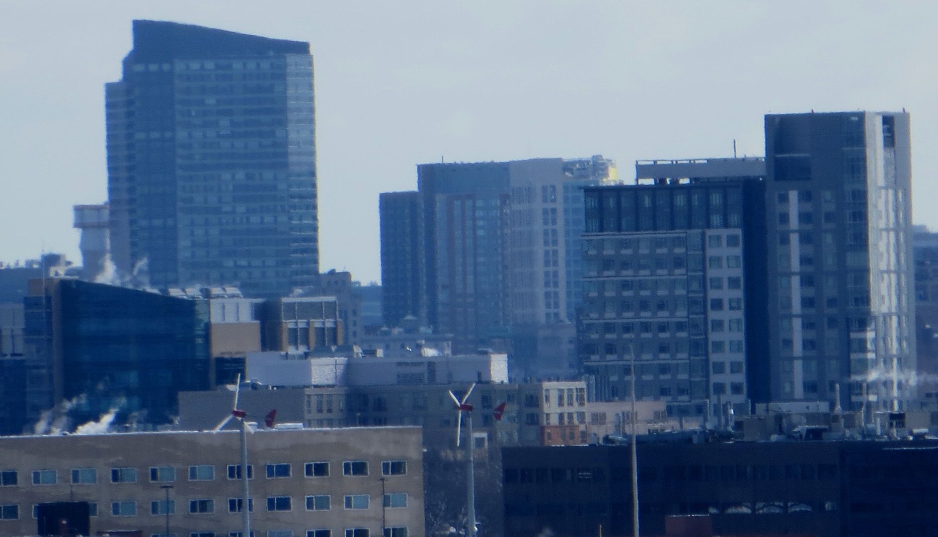


I don't think anyone's arguing for a signature tower here. There are acres of middle ground between a signature tower and a heap of uninspired cheap shit. On a qulity scale of 1-10 this thing's a -2.
 

Back
Top