StillInTheHood
New member
- Joined
- Feb 19, 2013
- Messages
- 41
- Reaction score
- 115
Re: Residences at Kensington
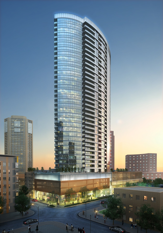
The above comments capture pretty well the disappointment associated with a large majority of projects pushed forward by the Kairos Shen-era BRA.
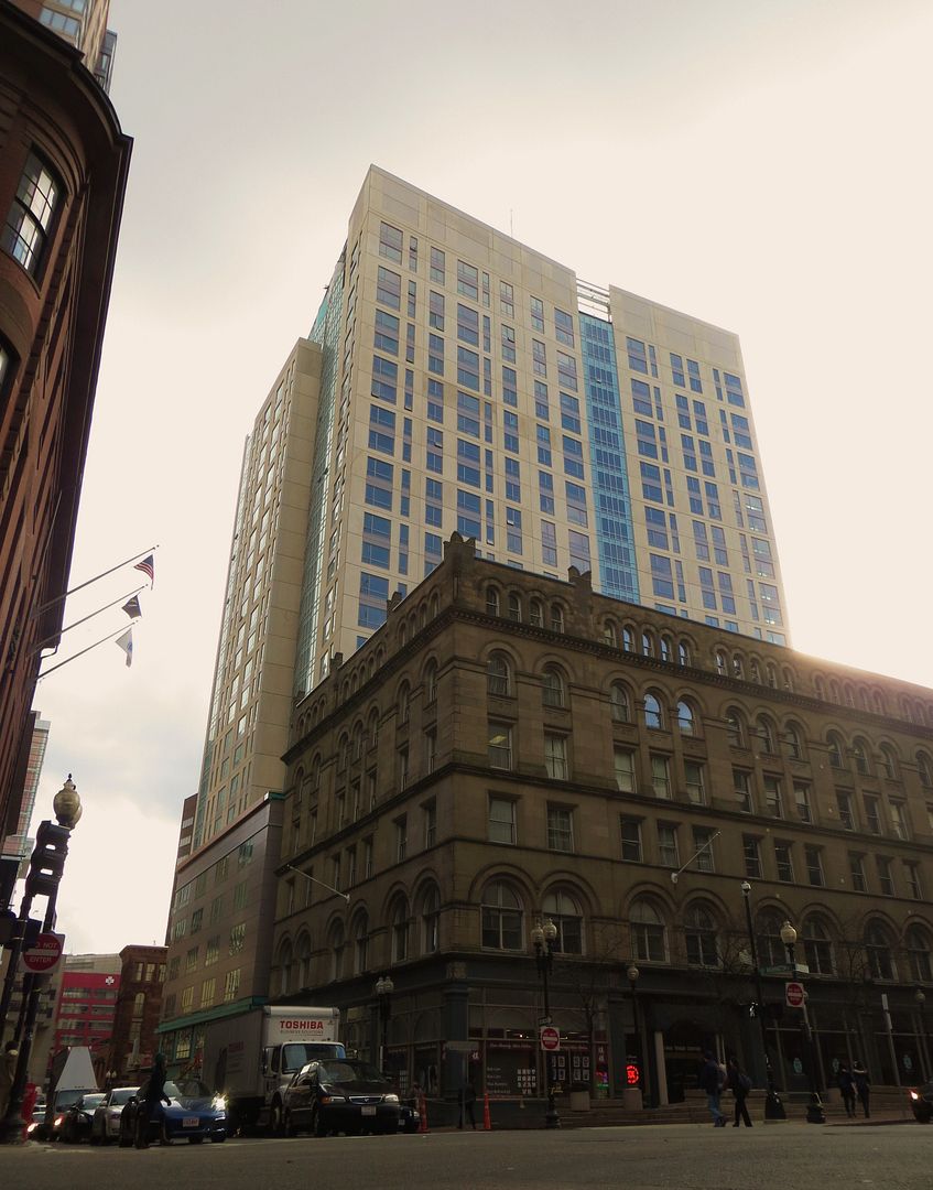
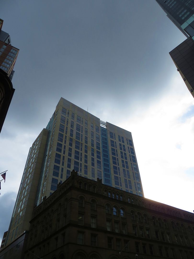
As commented above, no one suggests that this is a location for any sort of signature tower, and many commenters on this board are well aware of the financial constraints associated with a large downtown development in a still-shaky economy. It's OK for this to be a "background building" and it's serviceable from seven blocks away.
That said, the streetscape is terrible. It's not just that the panels don't offer any three-dimensionality ... they don't even line up well, and up close they look like they've been scavanged from an abandoned K-Mart. While thought seems to have gone into accomodating the incredibly ugly parking garage and an obtrusive loading dock, it doesn't appear that two minutes have been spent considering pedestrian experience on what was once (and the City insists will be again) Boston's most significant downtown shopping artery.
I'd contend that significant improvements could have been possible here with very modest additional investment. The question is, why doesn't the BRA, which has its fingers deep in every major development project, and which boasts of the "red pen" it brings to developers' design choices, ever seem to give a whit about street level interaction? In the '60s they gave us City Hall, with a brick wall along Congress Street and a desolate brick plaza; in the '70s they gave us concrete bunkers as at the 57/Radisson/Revere; in the '80s they ok'ed a car-port facing the Common at the Four Seasons; the '90s saw a thumbs-up to projects like One Charles, with six street deadening facades at ground level, dominated by garage doors, service entrances, ventilation grates and another massive carport; the '00s brought us gems like the bizarre retail configuration of the Hotel Commonwealth; and the '10s have heralded the return of above-ground garages (here, Wirth, former Dainty Dot) and service entrances on major thoroughfares, cloaked in precast panels that make the materials of their prior-era duds (like the Transportation or Tip O'Neill buildings) look like the Taj Mahal.
This is progress? Where's the red pen? Where are the design professionals? Doesn't our Planning Director, with his MIT Architecture degree, ever look at this stuff? Can he walk by these buildings without cringing?

