You are using an out of date browser. It may not display this or other websites correctly.
You should upgrade or use an alternative browser.
You should upgrade or use an alternative browser.
The Kensington | 665 Washington Street | Downtown
- Thread starter KentXie
- Start date
Brad Plaid
Senior Member
- Joined
- Jan 17, 2013
- Messages
- 1,310
- Reaction score
- 1,559
Re: Residences at Kensington
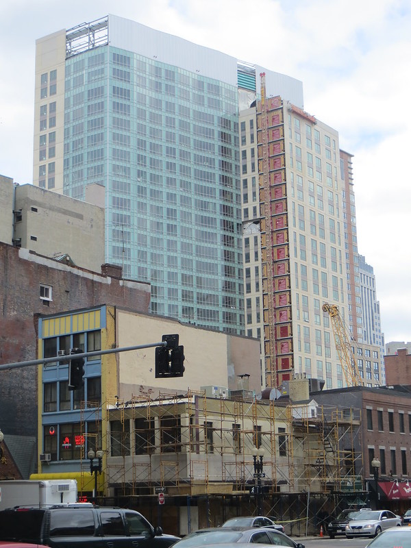
Pretty sure the panels are all the same color. They follow the zig zag of the curtain wall which gives the impression of different grays but it's just one panel in the sun, next one slightly in the shade, next one in the sun...
Pretty sure the panels are all the same color. They follow the zig zag of the curtain wall which gives the impression of different grays but it's just one panel in the sun, next one slightly in the shade, next one in the sun...
- Joined
- Jan 7, 2012
- Messages
- 14,072
- Reaction score
- 22,813
elleipsis
New member
- Joined
- Oct 4, 2012
- Messages
- 38
- Reaction score
- 0
Re: Residences at Kensington
Who wants to play.. What Fills In The Exterior Hoist Slot??
Will it be.. skinny windows in precast?
could it be... fat windows in precast?
it might be.. a glass corner?
let's hope it's not.. more metal panel?
Who wants to play.. What Fills In The Exterior Hoist Slot??
Will it be.. skinny windows in precast?
could it be... fat windows in precast?
it might be.. a glass corner?
let's hope it's not.. more metal panel?
Suffolk 83
Senior Member
- Joined
- Nov 14, 2007
- Messages
- 2,996
- Reaction score
- 2,403
Re: Residences at Kensington
I'm gonna guess skinny windows.
I try to be positive about new developments but this a pile of runny dog shit on the bottom of your shoew. This thing is a monumental failure the principals behind this should be hung.
I'm gonna guess skinny windows.
I try to be positive about new developments but this a pile of runny dog shit on the bottom of your shoew. This thing is a monumental failure the principals behind this should be hung.
- Joined
- Sep 15, 2010
- Messages
- 8,894
- Reaction score
- 271
Re: Residences at Kensington
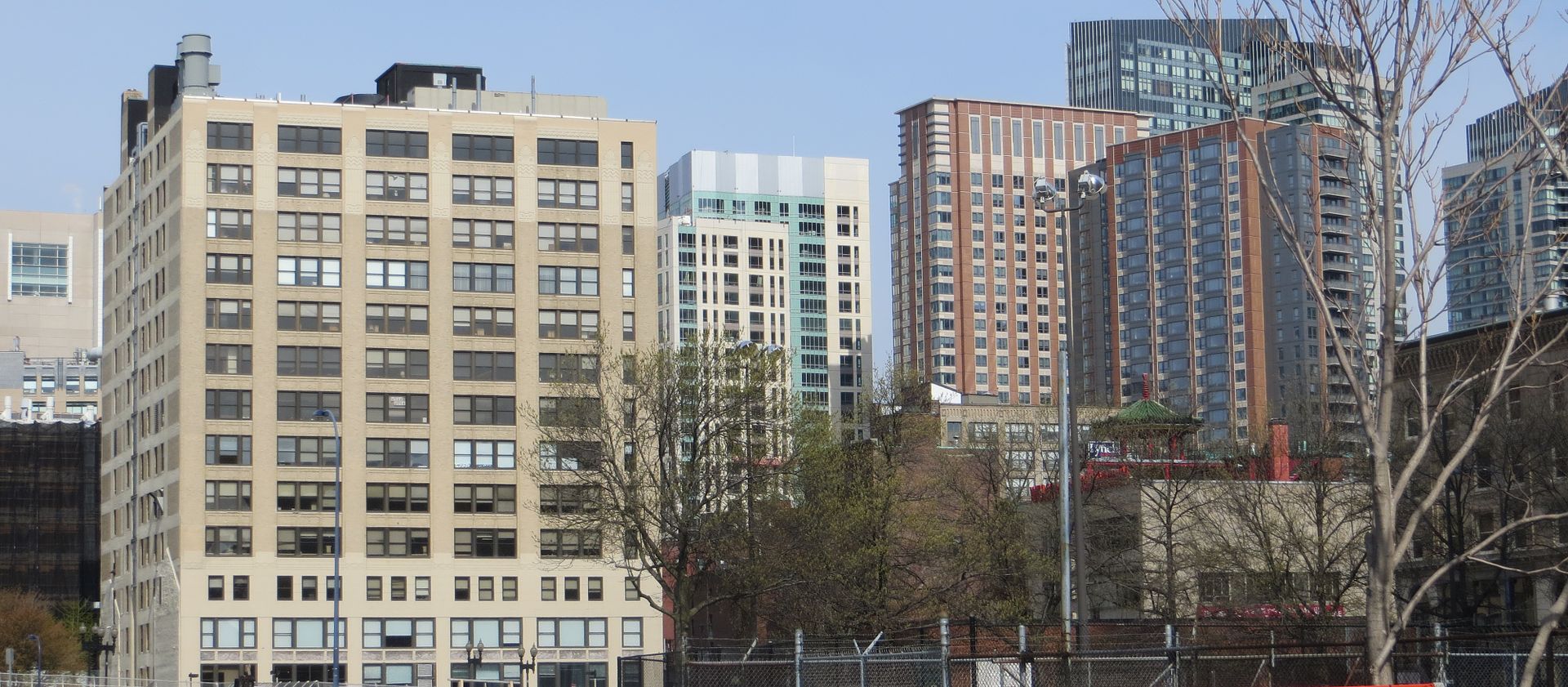
Have a backlog of photos I'm going through. From the Common on 04/13:


Have a backlog of photos I'm going through. From the Common on 04/13:


- Joined
- Jan 22, 2012
- Messages
- 5,078
- Reaction score
- 1,661
Re: Residences at Kensington
From that angle it's mostly inoffensive at least.
From that angle it's mostly inoffensive at least.
Last edited:
Boston02124
Senior Member
- Joined
- Sep 6, 2007
- Messages
- 6,893
- Reaction score
- 6,639
- Joined
- May 25, 2006
- Messages
- 7,034
- Reaction score
- 1,875
Re: Residences at Kensington
George Michael: "She's really funny"
George Sr: "Well lets hope so"
George Michael: "She's really funny"
George Sr: "Well lets hope so"
Re: Residences at Kensington
"Her?"
God I can't wait for the 26th...
George Michael: "She's really funny"
George Sr: "Well lets hope so"
"Her?"
God I can't wait for the 26th...
gooseberry
Active Member
- Joined
- Nov 24, 2009
- Messages
- 550
- Reaction score
- 3
Re: Residences at Kensington
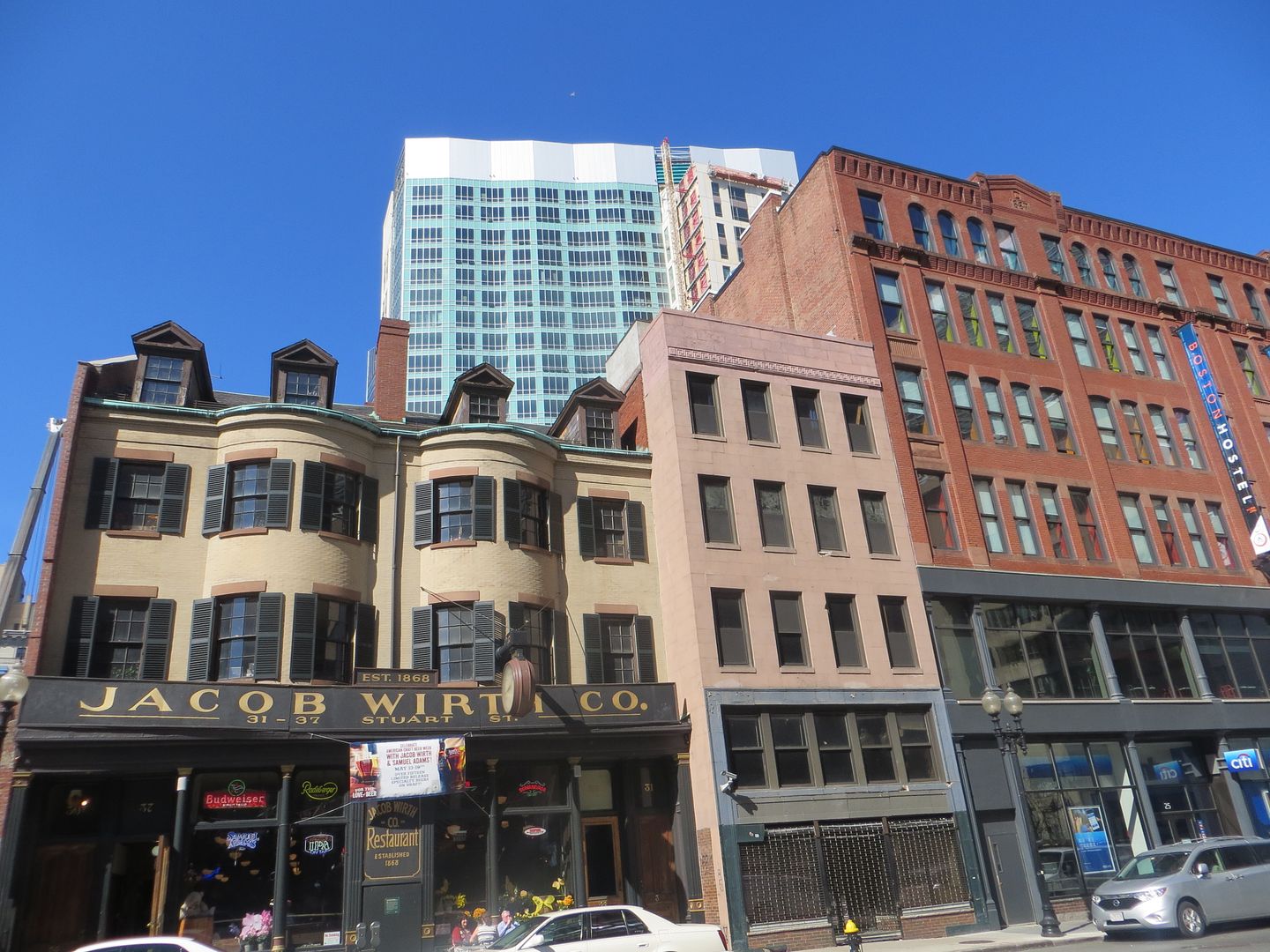
Walking around this building in person, I think the glass curtain wall really is the best part. Too bad that's going to be the least visible side when the Jacob Wirth building goes up.

Walking around this building in person, I think the glass curtain wall really is the best part. Too bad that's going to be the least visible side when the Jacob Wirth building goes up.

dshoost88
Senior Member
- Joined
- Apr 14, 2008
- Messages
- 2,168
- Reaction score
- 2,589
Re: Residences at Kensington
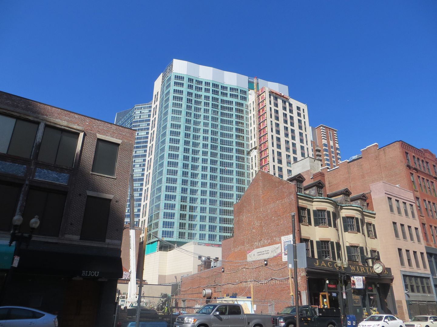
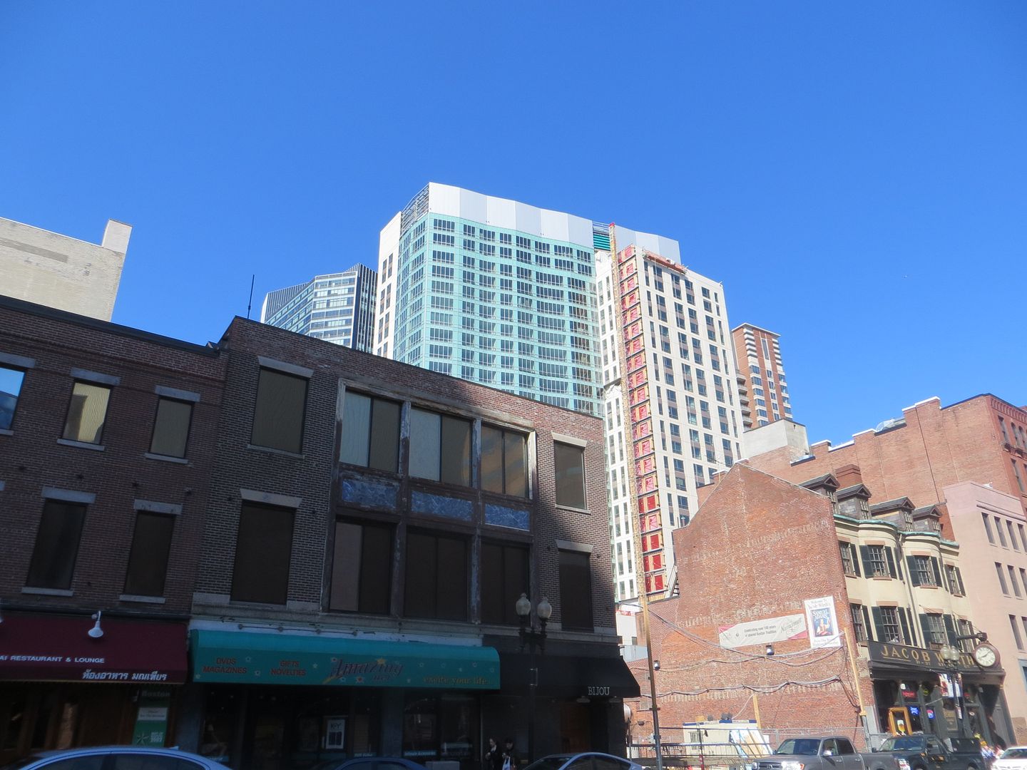
I'm nominating this as a contender for 2013 photo of the year.
Today:
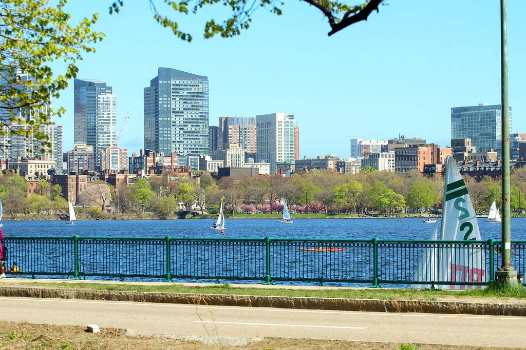
I'm nominating this as a contender for 2013 photo of the year.
- Joined
- Sep 15, 2010
- Messages
- 8,894
- Reaction score
- 271
Re: Residences at Kensington
Definitely. Content aware to remove that light pole would be great too. (Edit: I just tried a content aware fill and it did everything perfectly except for The W which it just makes blue where the pole was.. grr. The pole isn't bad at all though. It kind of frames the shot.)
What I took out of this photo is "Good god Millennium Place I & II are huge buildings!"
Last edited:
- Joined
- Jan 7, 2012
- Messages
- 14,072
- Reaction score
- 22,813
jdrinboston
Active Member
- Joined
- Oct 10, 2011
- Messages
- 672
- Reaction score
- 561
Re: Residences at Kensington
The Boston Business Journal has a story today about the prices that the Kensington is looking to charge for rentals. Could they really get $11,000 for a penthouse here??
Most of the content of this article is behind the pay wall. If anyone has a BBJ subscription and could summarize, that would be great.
http://www.bizjournals.com/boston/real_estate/2013/05/kensington-raising-stake-price-chinatown.html


