The New Retail Thread

Does anyone else think steakhouses seem really old fashioned? I’m a pretty avid foodie and eat at restaurants of all price points, but never at steakhouses. I don’t even hear people talk about them. And yet they seem to be popping up like weeds. Maybe tourists eat at them? Or an older demographic (I’m 38)?

I'm just slightly older than you. I have a different take. I certainly pick up on the same vibe (i.e., not a "fresh" concept, not many young people interested, etc)...but I definitely think there's still a market for this, including among not-particularly-old people. My wife and I tend to go to high-ish price point steakhouse a couple of times a year specifically when "it's not about the restaurant," meaning that we want to celebrate something and we want the restaurant to basically be invisible. And by invisible, I mean: you get amazing service, predictable/consistent food quality, you do not even need to THINK about the menu or what drink you are going to order...and everything just "works"...so that the anniversary/promotion/milestone birthday/etc can be all that matters. The same goes for business meals when the foody-ness of a restaurant can actually be a distraction; during a business meal, you want to be able to order in like 10 seconds so that it doesn't awkwardly interrupt the conversation (i.e., it's important that you not seem to care about what you're ordering). The classic steakhouse trades novelty/innovation/cutting-edge for, instead, impeccable service and consistency. There will always be a time and place for that, IMO.
(That said, there are definitely some "dusty" classic steakhouses out there that should be taken out to pasture, but that's a different point).

So back to your observation; yeah, foodies don't go to steakhouses. I distinctly step out of my foodie-personhood when I step into a steakhouse. But that's the whole point.
 
Last edited:
Does anyone else think steakhouses seem really old fashioned? I’m a pretty avid foodie and eat at restaurants of all price points, but never at steakhouses. I don’t even hear people talk about them. And yet they seem to be popping up like weeds. Maybe tourists eat at them? Or an older demographic (I’m 38)?
I basically think of steakhouses as nice restaurants for people who do not identify as "foodies." Like, the more "foodie" you are, the less interested in steakhouses you probably are. And people who identify as "foodies" are actually probably pretty rare, in the grand scheme of things.

Or pictured another way: steakhouses are kind of like the pickup trucks of restaurants. They can get obscenely expensive and it's quite possible that nobody in your Boston social circle has any interest in them, but they are consistently year-over-year the best selling vehicles in this country.

This isn't to judge people who like one or the other. To each their own. And there's nothing wrong with being a foodie who also likes steakhouses! I personally have a foodie streak in me and get excited about independent small-plates places, but I also like a good steakhouse every so often. But I also hang out on urbanism and transit message boards while having a huge affinity for cars and trucks.
 
I like steak. I like to eat in steakhouses every now and again but almost never order steak there. There is lots of good quality seafood to be had at most local steakhouses these days. Not cheap, but often better quality than can be found at other restaurants that specialize in fish/seafood.
 
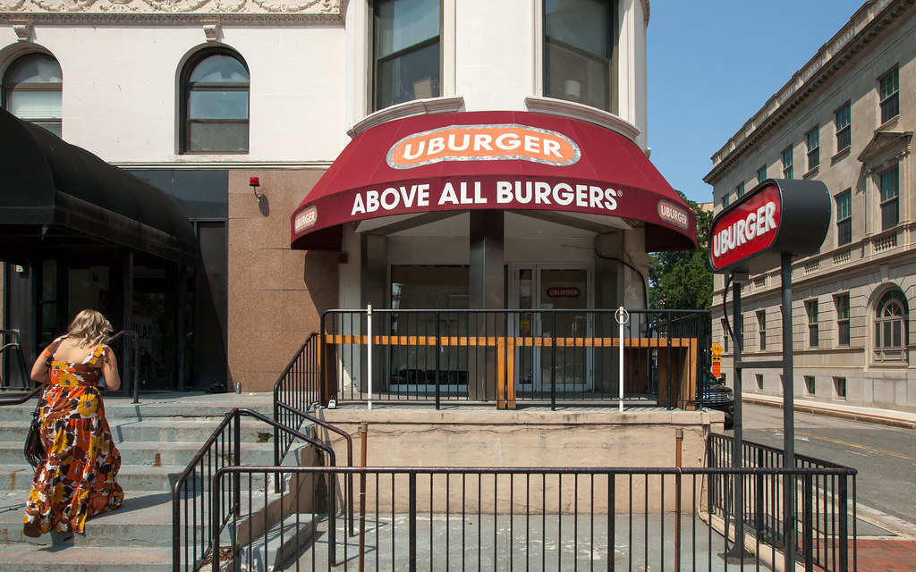
Pour one out for UBurger's original location closing

51403034508_0a541a16f9_b.jpg
 
Castle Island Brewery opens its second location on Dorchester Ave in South Boston. Yes, another brewery but one of few in Southie.

 
Is that the fried chicken from Lily P's and the feta fries from GreCo in the pic?
 
Contemporary interior design is really depressing. This is what a set from a dystopian 1970's movie where people live bleak underground lives after a nuclear holocaust would have looked like.

What's your ideal food court aesthetic (with pics please!)?
 
What's your ideal food court aesthetic (with pics please!)?
Answering for that guy because I feel similar about this one and have been trying to figure out why. It's not terrible, but a number of things are just on the cheap-looking side - particularly compared to TimeOut in Fenway.

- For one the shape of the space itself isn't great as just a low-ish straight shot back into the building. The Landmark center has the benefit of being a more grand, vertically-varied shell compared to Hub.
- The ceiling millwork and lighting are trying but just don't work to my eyes. It's supposed to be the unifying "designed" element in the space, but something about that maple-ish veneer color looks dated. It doesn't really do anything interesting and the pendant lights are just strewn about regardless of it.
- Those pendants... give off a lot of harsh direct light that flattens the space. Compare it to Timeout with more directed down-lights for illuminating table surfaces.
- The furniture and general color/material pallet is less refined and not as mature as it could be. What are the green chairs are suppose to match? The stall signage doesn't have a consistent theme or color like Timeout where black is the outer backdrop with some unique color within each of them (sorry to keep comparing it to that, but it's the most direct local comparison I can think of).
- And whoever signed off on black fabric around flexible ductwork should be fired. It looks like it's still under construction and the lighting just illuminates it all instead of working to hide it.

time-out-1-726x484.jpeg
 
Answering for that guy because I feel similar about this one and have been trying to figure out why. It's not terrible, but a number of things are just on the cheap-looking side - particularly compared to TimeOut in Fenway.

- For one the shape of the space itself isn't great as just a low-ish straight shot back into the building. The Landmark center has the benefit of being a more grand, vertically-varied shell compared to Hub.
- The ceiling millwork and lighting are trying but just don't work to my eyes. It's supposed to be the unifying "designed" element in the space, but something about that maple-ish veneer color looks dated. It doesn't really do anything interesting and the pendant lights are just strewn about regardless of it.
- Those pendants... give off a lot of harsh direct light that flattens the space. Compare it to Timeout with more directed down-lights for illuminating table surfaces.
- The furniture and general color/material pallet is less refined and not as mature as it could be. What are the green chairs are suppose to match? The stall signage doesn't have a consistent theme or color like Timeout where black is the outer backdrop with some unique color within each of them (sorry to keep comparing it to that, but it's the most direct local comparison I can think of).
- And whoever signed off on black fabric around flexible ductwork should be fired. It looks like it's still under construction and the lighting just illuminates it all instead of working to hide it.

Don't get me wrong, I love TimeOut. However your point about all of the stalls' signs looking consistent is actually a detractor for me. To me, it signals "some overarching corporate entity owns this whole place, and these vendors are but mere curated programming." A mishmash of signage, however aesthetically incongruent, suggests: "these businesses came together organically, and many separate creative minds and shop owners shaped this place" (however true or not that may actually be).

This is a pet peeve of mine regarding developments in general, particularly ones where exterior retail signs are super-muted, blend in with the architecture, and are formatted identically. It's just less inviting and feels more programmed. It looks pretty, but in my mind, is associated with pedestrian dead zones or parts of the city that vacate after 5pm. I'd prefer a stretch of streetscape with various signs, awnings (and shop facades for that matter) that invites me to explore what's going on.
 
Don't get me wrong, I love TimeOut. However your point about all of the stalls' signs looking consistent is actually a detractor for me. To me, it signals "some overarching corporate entity owns this whole place, and these vendors are but mere curated programming." A mishmash of signage, however aesthetically incongruent, suggests: "these businesses came together organically, and many separate creative minds and shop owners shaped this place" (however true or not that may actually be).

Couldn't agree more. I'm so tired of everything having to look "the same" because designers have some kind of crazy OCD.
 
I totally agree with everything being said...The aesthetic of hub hall is unappealing in person. It's not terrible, but it doesn't have much soul and the lighting is off. Time Out is a grand and interesting space, but the corporatized signage hurts the overall chemistry of the place in the same way that Eataly suffers from a homogenized corporate feel. More personality and a bit of grit would do wonders.
 
Don't get me wrong, I love TimeOut. However your point about all of the stalls' signs looking consistent is actually a detractor for me. To me, it signals "some overarching corporate entity owns this whole place, and these vendors are but mere curated programming." A mishmash of signage, however aesthetically incongruent, suggests: "these businesses came together organically, and many separate creative minds and shop owners shaped this place" (however true or not that may actually be).

This is a pet peeve of mine regarding developments in general, particularly ones where exterior retail signs are super-muted, blend in with the architecture, and are formatted identically. It's just less inviting and feels more programmed. It looks pretty, but in my mind, is associated with pedestrian dead zones or parts of the city that vacate after 5pm. I'd prefer a stretch of streetscape with various signs, awnings (and shop facades for that matter) that invites me to explore what's going on.
Actually yeah I feel that too. Don't get me wrong, I'd love more variety, but somehow the variety has to speak to some degree of quality and natural aggregation over time - some authentic grit. Like just knowing all the shops in hub hall showed up the same way under a parent corp, but the variety tries to obscure that and looks cheap doing so, rubs me the wrong way. Maybe I prefer the blunt honesty of Timeout that doesn't hide the corporatization, I dunno.
 
What's your ideal food court aesthetic (with pics please!)?

I've never thought about what an ideal food court aesthetic would be. Maybe because they're generally loud, crowded, can require you to stand in line forever, can be difficult to find a seat, the one you eventually find may be wet with spilled soda, and other operational things like that are unpleasant enough that any aesthetic, no matter how pleasant, would be lipstick on a pig.

Anyway, my comment wasn't about the Hub food court or food courts in general. It applies just as well to the photos members posted here way way back of the new office interiors at the renovated Filene's building. They both look like what Hollywood set designers of the 70's would have considered dystopian background scenery.
 
The problem for me is the "empty warehouse looking for a permanent purpose" esthetic that plagues nearly every food court I've ever visited, except the former one at the Pru. The need for the excessive noise vibe, for the feeling of the space's immanent vacancy, and for industrial lighting does give me the feeling of "hurry and try this place because in 6 months it will not be hear anymore.) I never got that impression at the Pru. The problem there was the terrible, repetitive food choices. That said, if the food is great and I'm hungry, I'll appreciate a clean table and a chair and enjoy my meal, despite the surroundings.
 

Back
Top