I like the JFK Building myself, but I also coincidentally went through that same list this week and found the order of many of the buildings to be arbitrary and ridiculous.
On another note, I concur with the way that certain new buildings can make existing buildings seem better, or at least fit in better with the neighborhood. A key example IMO is Atlantic Wharf, which provided the necessary step-down to the Intercontinental Hotel from the Fed. I thought the hotel stuck out like a sore thumb (a "cool" sore thumb but still didn't seem right) when it was first built. It now blends in 100x better with the Atlantic Wharf tower next door.
Regarding this tower here, it actually helps the JFK/Saltonstall/McCormick/Courthouse cluster blend in better to downtown from a skyline perspective. It used to just kind of trail off with these 4 buildings, but now it's all part of one (almost) continuation out to North Station.

 IMG_8507
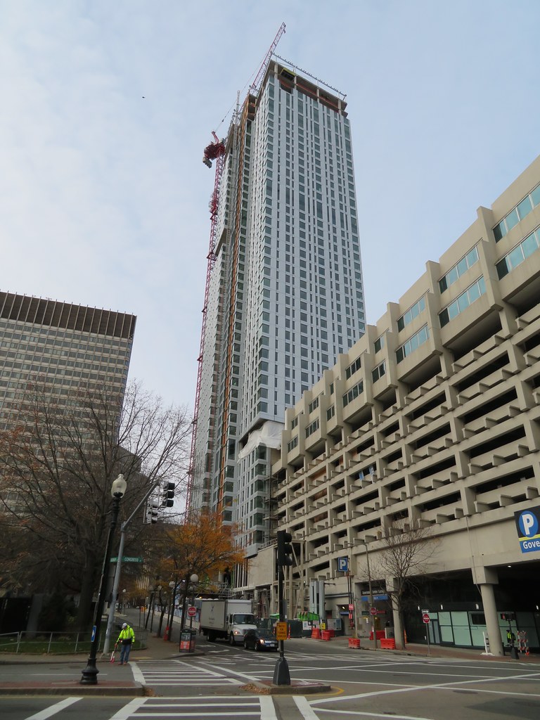 IMG_5505
 IMG_5507
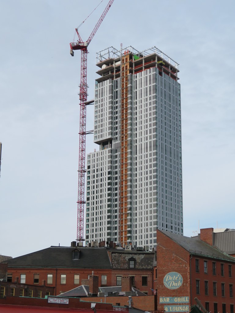 IMG_5514
 IMG_5548
 IMG_5728
 IMG_5775
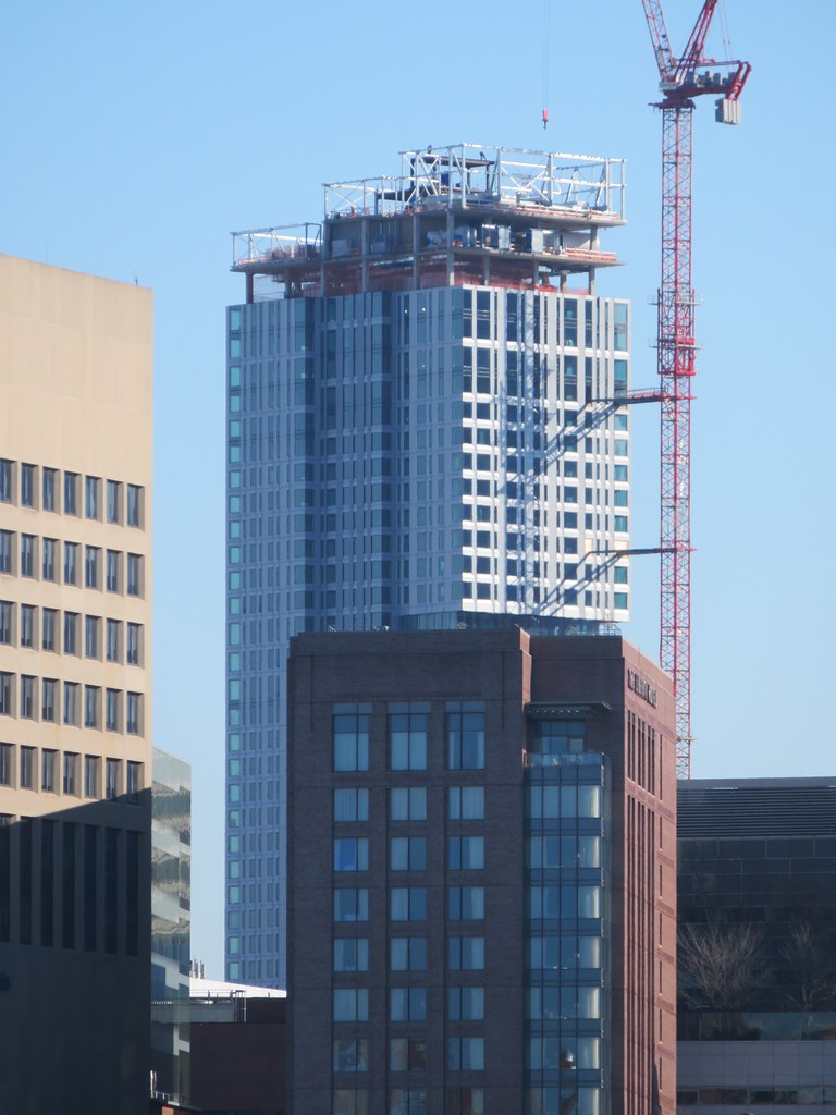 IMG_5776